ArtFonts: Stylish Text
- 667.00
- 4.7
- Installs
- 5.00M
- Price
- Free

Screenshots
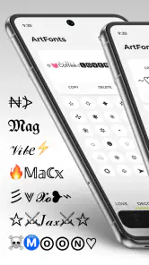
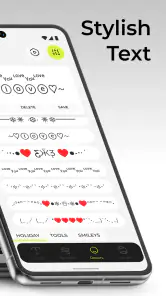
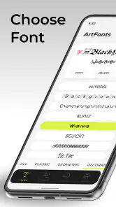
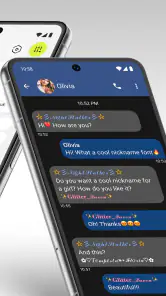
Analysis by Reviewed
I use decorative text sparingly, but it can make a short greeting, profile line, or group-chat announcement feel more personal. ArtFonts: Stylish Text is aimed at exactly that kind of small flourish: it lets me try different lettering styles and move a chosen result into a message or social post. It is a personalization app from Galaxy studio apps, and its appeal is less about changing how I write than giving a few words a distinct look.
What the quick workflow is good for
The basic idea is straightforward: type a phrase, preview it in a style, then copy and paste it where you want it. That makes the app useful when I already know what I want to say and would rather spend a moment choosing its appearance than build a graphic in a separate editor. For a birthday wish in a family chat, for example, I could test a few treatments for “Happy birthday” and paste the one that feels right without turning the task into a design project.
That workflow also shapes the speed expectations. I would treat ArtFonts as a quick styling step, not as a full creative suite: the practical work is choosing a look and transferring text, rather than laying out a finished image. Previewing first is worthwhile, especially for a bio or a short announcement that will stay visible. A style that looks appealing in the app may feel too busy once it sits beside ordinary text, so I would test the exact phrase before posting it.
Unleashing Creativity with Fonts
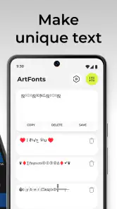
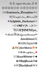
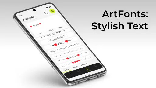
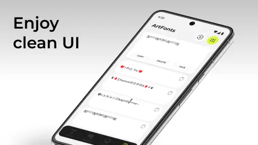
When I first opened ArtFonts: Stylish Text, I was greeted with a clean and intuitive interface. Navigating through the app was a breeze, and I was soon immersed in a world of font possibilities. The app offers a wide variety of styles ranging from the bold and dramatic to the subtle and elegant. It's like having a font library in your pocket!
One feature I found particularly nifty is the ability to preview text in different styles before deciding on the perfect one. This saves a lot of time and helps in visualizing how the final message will look. Plus, the app allows you to customize your text further, adjusting size and color to match your vibe.
Choosing styles with care
There is a useful distinction between making a phrase eye-catching and making it easy to read. I would save the more ornamental treatment for a name, a brief greeting, or a few words at the start of a post, then keep longer explanations in regular text. That balance gives the decoration a purpose instead of making every line compete for attention. It is also a practical way to avoid turning a useful message into something people have to decipher.
For repeated tasks, I would prepare a small set of short phrases in the app rather than style every sentence as I write. A shop owner answering a customer, for instance, might use a decorative heading for a seasonal announcement but leave product details plain. This is a more controlled use than changing the look of every reply, and it keeps the styled text from slowing down everyday communication.
You May Like

Clash of Clans Is Won Between the Battles

Android Auto Makes the Case for Quieter Car Software

MobiOffice: Transforming Mobile Productivity with Seamless Integration

EA SPORTS FC™ Mobile Soccer: Redefining Mobile Sports Gaming

How Microsoft OneDrive Became a Mobile Productivity Giant

How Google Translate Breaks Language Barriers Effortlessly
Easy Integration and Use
What really sets this app apart is its seamless integration with other platforms. Whether you're composing a tweet, updating your Facebook status, or sending a WhatsApp message, ArtFonts effortlessly integrates its stylish fonts into your texts. It’s as simple as copying the styled text from the app and pasting it wherever you need it. This feature is a game changer for those who love to personalize their online presence.
Moreover, the app doesn't require you to be a tech wizard. Everything is straightforward, and even someone with basic smartphone skills can navigate and use the app effectively. The user-friendly design ensures that anyone can become a text artist with just a few taps.
What to expect across apps and devices
Compared with the usual alternatives, such as leaving text plain or designing a post as an image in a separate graphics app, ArtFonts sits in the middle: it is a quick way to add visual character while keeping the result as text to copy and paste. That is convenient for a caption or profile line, but an image editor is the better choice when I need precise layout, several visual elements, or a polished poster. Plain text is still preferable for instructions, longer notes, and anything where universal readability matters most.
Because the method relies on copying and pasting, I would check the result in the destination app before sending or publishing it. If the style looks different there, or a recipient’s device displays it awkwardly, switching back to ordinary text is the sensible fix. This check is especially useful for important information; decorative characters should never carry the only copy of a date, address, or instruction.
The app is free to download and is rated for Everyone. It has a 4.7 average from around 68,000 ratings, with over 5 million installs. Those figures suggest broad interest, but I would still judge it by whether its styles suit the places I actually post. Optional in-app purchases range from $0.99 to $99.99 per item, so I would explore the free experience first and only consider a purchase if I find a specific option I genuinely want.
Heavy use, stability, and practical limits
If I were preparing several captions or greetings in one sitting, the main friction would likely be the repeated cycle of previewing, copying, switching apps, and checking the result. I would draft the wording first, then style only the parts meant to stand out. That small change in workflow makes a batch of posts easier to manage and prevents visual decoration from becoming the slowest part of writing.
I would not assume a font app needs heavy resources, but I also would not make claims about its speed or battery use from the styling workflow alone. In ordinary use, the useful reliability test is simple: can I get the chosen text into the destination app and confirm it still looks right? If a paste does not behave as expected, copying again or using plain text is a practical recovery route. For a time-sensitive message, I would keep the wording ready before experimenting with styles.
Who will enjoy it, and who may prefer another tool
ArtFonts is best for people who regularly personalize short social text and enjoy comparing visual options without opening a full design editor. It may also suit someone who wants a distinctive greeting or profile detail but does not need control over a complete graphic. I would skip it if I rarely use decorative text, need a consistent professional type system, or want every recipient to see the same appearance; a conventional editor or plain text is more dependable for those jobs.
The current version is 2.1.0 and requires Android 7.0 or later. That gives Android users a clear compatibility check before installing; the app is a less natural fit for anyone outside that device range. Galaxy studio apps has kept the experience focused on styling and transferring text, which is convenient when that is all I need, though it is not a replacement for a broader layout tool.
Endless Possibilities
Perhaps the best part about using ArtFonts is the endless creative possibilities it offers. Whether you're spicing up your Instagram bio or crafting a unique greeting card, this app provides the tools to express yourself creatively. With frequent updates and new font additions, there's always something fresh to explore.
In conclusion, ArtFonts: Stylish Text is a must-have for anyone looking to enhance their text communication. Its vast selection of fonts, ease of use, and seamless integration make it a standout choice for personalizing your messages. So why stick to plain old text when you can make it stylish? Give it a try and watch your words come alive!
A practical routine for everyday posts
For a real day-to-day use, I would keep the app for moments when one small line deserves emphasis rather than make it part of every message. Imagine getting ready to post a weekend event reminder: I would write the time, place, and details in ordinary text first, then style only a short opener such as the event name. That keeps the information clear if the decorative characters render differently for someone else, while still giving the post a personal touch. It is a simple workflow, but it avoids the common trap of making the entire announcement harder to scan.
Another useful habit is to check the copy at the point where it will actually appear. A bio has a different job from a chat message: a compact flourish may work in a profile, while a longer stylized phrase can take up visual space in a conversation and interrupt its flow. I would paste a draft into the target field, read it as a whole, and only then decide whether to keep it. If the destination does not preserve the look, there is no need to troubleshoot extensively; plain text is a perfectly good fallback.
Making the most of the choices
When I compare several styles, I find it more useful to judge them against the exact words I intend to use than to pick a favorite in isolation. Lettering that looks striking for a short name may become cluttered across a full sentence. I would also use color and size adjustments with restraint: changing several visual qualities at once makes it harder to tell which choice improved the result. Trying one adjustment at a time gives me a clearer sense of what suits the message.
There is a practical trade-off in using decorative text rather than an image. Copyable text is convenient because it can sit directly in a caption or message, but it offers less control over how the final composition looks than a designed graphic. For a personal greeting sent in a chat, that flexibility is usually enough. For a business announcement where branding, spacing, and predictable presentation matter, I would make the graphic elsewhere and treat ArtFonts as an optional source of a short text treatment rather than the entire design process.
Choosing it for the right kind of user
The app makes most sense for someone who enjoys small, low-effort ways to personalize social communication: a profile detail, a celebratory message, or a brief caption that would otherwise look plain. It is less compelling for someone who rarely changes their text style, or who needs to prepare polished content with exact placement and consistent typography. In those cases, the extra step of opening a separate app may not repay itself, and a conventional design tool gives more control.
It also helps to think about the audience before styling. A playful phrase among friends can tolerate more visual experimentation than a workplace instruction or a message intended for a broad group. If the wording has to be understood quickly, I would favor clarity and use decoration only as a small accent. This is not a limitation unique to one style; it is the basic trade-off of making text more visually distinctive.
Overall performance in its lane
My performance verdict is deliberately modest: ArtFonts is built around a short sequence of actions, so I would expect its value to come from keeping that sequence convenient, not from advanced editing or resource-intensive creation. The most important measure for me is whether I can choose a treatment, move it into another app, and verify the result without disrupting what I was doing. The copy-and-paste approach is easy to understand, though switching between apps remains part of the process.
Galaxy studio apps released the app on February 14, 2023, and its current version is 2.1.0. For Android users, the minimum operating system requirement is Android 7.0. I would check that requirement before trying to install it, especially on an older device. The Everyone content rating makes it suitable for a broad audience, while the free download gives curious users a way to see whether the styling options fit their habits before spending anything.
For me, the sensible approach is to start with a short, low-stakes phrase and see how it looks after pasting it into the intended app. That answers the questions that matter in practice: whether the style is readable, whether it suits the audience, and whether the transfer fits naturally into my routine. I would keep ArtFonts as a focused tool for occasional expressive touches, not as a replacement for plain writing or a full graphics editor. Used that way, it can add personality without making communication less clear.
ArtFonts: Stylish Text Frequently Asked Questions
Can I use ArtFonts: Stylish Text to personalize a bio or status before posting it?
Yes. ArtFonts: Stylish Text is intended to give messages and social statuses a more decorative look, so you can use it when you want text to stand out in a profile bio, caption, or status. The app is focused on text styling rather than broader photo editing, making it a straightforward option for adding visual character to words you plan to share.
Is ArtFonts: Stylish Text free to download, and are there purchases inside the app?
The app is free to download, with optional in-app purchases ranging from $0.99 to $99.99 per item. You can try its text-personalization tools without paying, while purchases provide access to additional options. Whether the free selection is enough depends on how many styles you want to use, so it is sensible to explore what is available before deciding to buy anything.
Who develops ArtFonts: Stylish Text, and what kind of app is it?
ArtFonts: Stylish Text is a personalization app developed by Galaxy studio apps. It focuses on giving messages and social statuses a more decorative look through styled lettering. If you enjoy customizing the way your text appears, it may be useful for adding a distinctive touch to everyday posts and conversations.
What is ArtFonts: Stylish Text?
ArtFonts: Stylish Text is a mobile application designed for both Android and iOS devices that allows users to customize their text with a variety of stylish fonts and decorative elements. This app is perfect for those who want to enhance their social media posts, chat messages, or any other textual content with unique and eye-catching styles.
How user-friendly is ArtFonts: Stylish Text?
ArtFonts: Stylish Text is designed with user-friendliness in mind, offering an intuitive interface that is easy for both beginners and experienced users to navigate. The app provides a seamless experience with simple steps to apply stylish fonts, making it accessible for anyone looking to add a creative touch to their text without needing technical skills.
Pros
- User-friendly interface for easy navigation
- Wide range of stylish fonts available
- Customizable font size and color
- Compatible with multiple social media apps
- No intrusive ads to disrupt usage
Cons
- Limited free font options available
- Some fonts require in-app purchases
- Occasional app crashes reported
- Limited text effects compared to competitors
- Not all fonts support special characters

- Category
- Personalization
- Version
- 2.1.0