 About Google Maps
Google Maps Is Becoming More Than a Navigation App
A navigation app used to earn its place by getting you from A to B without a wrong turn. That bargain no longer explains what people expect from Google Maps. We want it to judge traffic, reveal what a neighborhood is like, help us choose a place, and keep working when the trip stops following the plan. The category’s new standard is not simply accurate directions; it is useful context at the moment of movement. Google Maps makes that expanded promise unusually visible, while also exposing how much of it remains unfinished.
That shift matters because travel rarely unfolds as a neat line on a screen. A person may search for dinner, compare a few streets, walk to a station, switch to transit, and then need to find the right entrance. The app is being asked to support a chain of small decisions, not just calculate a route. Its success depends on whether those decisions feel connected rather than like separate jobs stitched together.
From route finder to place interpreter
The baseline is now demanding. Drivers expect live traffic and rerouting that reacts before a delay becomes a missed appointment. Walkers need clear turns at street level. Transit users want departure times and connections they can act on, while visitors need enough information to recognize a destination once they arrive. Search has to accept ordinary requests, and the results need current hours, photos, reviews, and enough detail to distinguish one business from another.
These are no longer bonus features reserved for a premium mapping service. They are the minimum people bring to a trip, often without thinking about which company supplied each piece of information. A route can be technically correct and still fail if it sends someone to a closed entrance, leaves them uncertain at a complicated junction, or points to a place whose hours are out of date. Accuracy now includes the usefulness of the surrounding information.


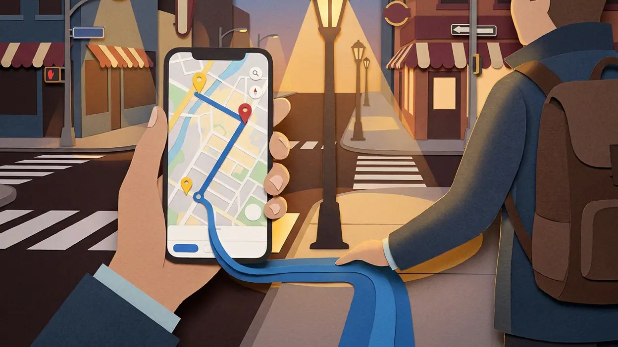
Google Maps meets much of that baseline in one familiar interface. A search can lead into place details; place details can lead into directions; directions can be recalculated as traffic or the traveler’s plan changes. That continuity is the app’s quiet strength. It reduces the small frictions between deciding where to go and actually getting there, which is why the app can become part of a routine instead of a tool opened only for unfamiliar drives.
Its strongest signal is the way it treats the map as an interface for choosing, not merely a backdrop for navigation. Search results sit in a spatial frame. Nearby businesses, roads, transit options, and saved places help users judge where something is in relation to everything else. A restaurant is not only a name and rating; it is a destination on a route, perhaps near a station or around the corner from where the user already plans to be. That spatial connection is more useful than a list that forgets the journey.
When I use the app well, the benefit is less about watching a blue line than about having fewer loose ends. I can check a destination, see how it fits into the surrounding area, and start navigating without rebuilding the plan in another service. The usefulness is concrete: fewer app switches, fewer address checks, fewer moments of wondering whether the place I found is the place I meant.
Latest News



The familiar conventions still matter. A map should respond quickly to zooming and panning, make the current location legible, and present a route that can be understood at a glance. Turn-by-turn guidance, alternative routes, traffic-aware timing, and familiar visual distinctions between roads and places are now part of the category’s grammar. Google Maps follows that grammar because people need it to. Familiarity is not a failure of imagination when a wrong interpretation can send someone down the wrong street.
But the convention Google Maps challenges is the assumption that a map app should stop being useful once a route begins. Its strongest version makes planning and movement feel like one continuous activity. A user can explore an area before departure, compare destinations, begin a trip, and adjust along the way. That challenges the old split between a directory for deciding and a navigator for executing. The map can help with both, and the value comes from carrying context across the handoff.
There is a cost to that ambition. The more jobs the app takes on, the more the interface must balance competing kinds of attention. A driver needs immediate, glanceable guidance; someone planning a weekend wants detail and options; a pedestrian may need to understand a crossing or entrance. No single screen can serve all three perfectly. The app’s breadth is useful, but its dense surface can make the next action less obvious than it should be.
What neighboring apps reveal
Related mobile services show that users have already learned to expect a clear action path. In maxim, a user moves from requesting a ride toward a pickup and a completed trip; the service makes the practical transaction its organizing idea. Google Maps takes a less transactional role, but the comparison raises a fair expectation: once someone has decided where to go, the next step should be easy to understand. A map that locates the destination but leaves the user to work out the rest has not finished the job.
Other apps underline how different kinds of stickiness are built. Word Search Quest - Puzzles and UNO!™ invite users into a compact loop with a clear next move. My Talking Tom builds continuity around a character that responds to repeated visits. PayPal - Pay, Send, Save earns trust by making consequential actions explicit. Google Maps cannot borrow those loops wholesale, and it should not turn every trip into a game or a transaction. But these products demonstrate that a useful service must communicate what is happening and what the user can do next, especially when attention is limited.
For maps, that clarity has to survive real conditions: glare, noise, poor signal, a crowded sidewalk, or a driver who cannot spare a long look. A map can contain remarkable amounts of information and still be difficult to use if the important instruction is buried in it. The category is moving from “show me everything nearby” toward “surface the detail that matters for this decision.” That is a harder design problem than adding another layer of data.
Google Maps also follows a convention that is becoming less convincing: the idea that adding more information automatically improves discovery. Ratings, photos, business details, traffic, and nearby results can each help, but they can also compete. Search results are only as good as their freshness and relevance. A crowd-sourced detail that is incomplete, an old photo, or an uncertain listing can weaken confidence precisely when a user is trying to make a quick choice.
This is where the category still lags. Maps are excellent at representing roads and points of interest, but they do not always explain the lived experience of arriving. Which entrance is open? Is a building accessible from the side street? Is a station exit close to the destination or inconveniently far away? Can a walking route avoid stairs? These questions sit between mapping and local knowledge, and the answers can matter more than a few seconds shaved off an estimated arrival time.
There is also the problem of confidence. A crisp route line looks authoritative, even when the underlying details may be incomplete or conditions have changed. Users need systems that signal uncertainty in a way they can understand, not just a confident instruction that forces them to discover the exception themselves. Better context should make a trip more legible, not create the illusion that the app knows every doorway, closure, and local rule.
The consequence for users is a change in what counts as a good map. We no longer judge it only by whether we arrive. We judge whether it helped us choose wisely, adapt without stress, and understand the place we reached. That raises expectations for Google Maps, but it also makes the service more valuable when it gets the sequence right. It can reduce the mental bookkeeping around an outing: remembering an address, checking a second app for nearby options, and then trying to reconcile a route with what is actually on the street.
That value has limits. A map cannot replace local judgment, and a polished interface should not persuade users that every recommendation is neutral or every listing is current. Nor should convenience become a reason to accept unnecessary data collection or to treat a single service as the final authority on a city. The best map supports a decision; it does not make the decision invisible.
The category’s emerging standard, then, is not a bigger map or a busier screen. It is continuity with restraint: preserve context from search through arrival, tailor guidance to the mode of travel, make uncertainty visible, and put the next useful detail ahead of the merely available one. Google Maps is already a strong example of the first part of that standard. Its breadth lets people move from curiosity to navigation without starting over, but its crowded interface and uneven arrival details show how much work remains.
That is why the app is best understood as a sign of where mobile mapping is headed, not proof that the category has solved the journey. The next leap will come from making the last stretch as dependable as the route itself: clearer entrances, more meaningful accessibility information, fresher local details, and instructions that respect the user’s attention. Google Maps has made the map a place to search, plan, and move. Now the category has to make that larger promise feel trustworthy on the ground.