Color Widgets, Theme: iWidgets
- 2.36K
- 4.7
- Installs
- 10.00M
- Price
- Free
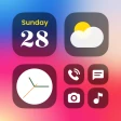
Screenshots
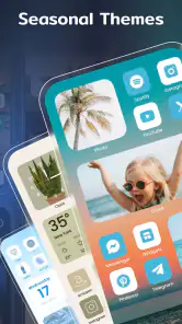
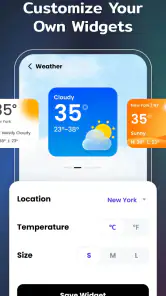
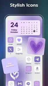
Analysis by Reviewed
I enjoy changing my home screen when its usual layout starts to feel stale, but the tricky part is often getting the look I want without making the phone harder to use. That’s the appeal of this lifestyle app: it gives me a way to make the screen feel more personal through widgets, icons, themes, and wallpapers. I’d treat it as a visual customization tool rather than a deep phone-settings manager, and that distinction helps set expectations.
Choosing a look without making setup a chore
When I try a new home-screen style, I prefer to begin with one small decision: what do I want to see at a glance? A date, a clock, or a favorite image gives the screen a purpose and makes it easier to choose a design. Starting with a whole collection of matching elements can be tempting, but it also makes it harder to identify which part is useful and which is just decoration.
I’d also take a quick look at how much open space the home screen has before choosing a widget. A design that looks balanced on its own may feel cramped beside a row of frequently used apps. Leaving some breathing room around the widget can make the overall arrangement feel intentional, even if the rest of the screen stays simple.
One useful test is to compare the design against the wallpaper and app icons already in place. If several visual elements compete for attention, I’d change one thing at a time rather than replacing everything. That helps preserve the parts of the layout that already work and keeps experimentation from becoming an all-or-nothing project.
Getting Started with Colorful Customization
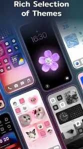
From the moment I launched Color Widgets, I was greeted with a vibrant array of options. The app is designed to let you add a personal touch to your device with ease. Whether you’re into minimalistic designs or bold, eye-catching themes, this app has you covered. It’s like having a designer right in your pocket!
Where setup can feel less obvious
The first point of friction with any home-screen styling app is that choosing a design and placing it on the screen are separate steps. I’d browse a few options first, settle on one visual direction, and then add only the pieces I actually plan to use. That avoids spending time styling several widgets before discovering that the finished screen feels crowded.
It also helps to think about readability before appearance. A decorative clock or photo can look great in a preview but compete with app names or make important information harder to scan. I’d try one widget at a time, check it on the actual home screen, and adjust the surrounding layout before committing to a full theme.
You May Like

Clash of Clans Is Won Between the Battles

Android Auto Makes the Case for Quieter Car Software

MobiOffice: Transforming Mobile Productivity with Seamless Integration

EA SPORTS FC™ Mobile Soccer: Redefining Mobile Sports Gaming

How Microsoft OneDrive Became a Mobile Productivity Giant

How Google Translate Breaks Language Barriers Effortlessly
Exploring the Features
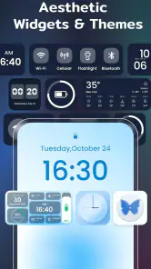
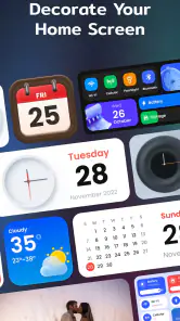
One of the standout features of this app is its wide variety of widgets. You can choose from an array of clock styles, calendar formats, and even motivational quotes. The customization options are practically endless, allowing you to tweak colors, fonts, and backgrounds until everything is just right. It’s a playground for anyone who loves getting creative with their device.
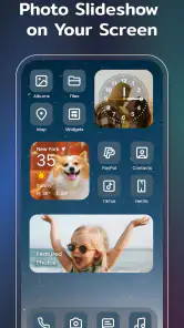
Another feature I absolutely loved is the ability to create personalized widgets. I mean, who doesn’t want to see their favorite photos or quotes every time they unlock their phone? Plus, the app is incredibly user-friendly, making it a breeze to navigate even for those who aren’t tech-savvy.
Making a design work day to day
A useful way to approach the customization is to give the screen a job. For example, I might use a calendar style where I can glance at the day before leaving home, while keeping decorative choices away from the spots I tap most often. If I’m choosing a photo-based look, I’d favor an image with enough clear space that the widget’s text remains easy to read.
That kind of small test is more practical than rebuilding the whole screen at once. If the result feels busy, remove one element rather than changing every color and font; it makes it easier to tell what improved the layout. I’d also keep a note of the design choices I like, so a future refresh doesn’t turn into starting from scratch.
A realistic refresh for a busy day
Imagine checking your phone before heading out and realizing that the first screen is cluttered with shortcuts you rarely use. I’d use that moment to make a restrained change: choose a clock or calendar look that suits the day, put it where I naturally glance, and leave the apps I need within easy reach. The point isn’t to make every part of the screen match; it’s to make the first glance more useful without adding another thing to manage.
For a workday, I’d keep the most practical information prominent and use color or a photo as a quieter accent. At home, I might care more about the overall mood and try a bolder combination. This is where the app’s visual flexibility can be useful: the same person may want a calm layout most of the time and a more expressive one when they feel like changing things up.
One trade-off is that a more decorative screen can make familiar icons harder to spot, especially if the arrangement changes at the same time as the appearance. I’d keep app placement stable during the first redesign, then decide separately whether moving icons actually helps. Separating those choices makes it easier to keep the phone comfortable to use.
When another approach may suit you better
Compared with manually arranging icons and using a plain wallpaper, a themed widget app offers a more coordinated look and more room for visual expression. The trade-off is that it takes some time to choose and place elements, and a highly styled screen may be less convenient than a simple layout. If you care more about quick access than appearance, the phone’s standard home-screen options may be enough.
I’d especially recommend trying it if you enjoy seasonal refreshes, want a favorite photo visible, or like matching your screen to a color palette. If you rarely change your layout and prefer a clean, untouched home screen, you may not get enough value from exploring lots of designs. The app is free to download, though it offers in-app purchases, so I’d check what is included before deciding to pay for anything.
It also helps to set a limit before browsing. I might choose one practical widget and one decorative detail, then stop and see how the screen feels for a few days. That approach is less demanding than chasing a perfectly coordinated layout, and it makes it easier to tell whether the app has improved my routine or simply given me a new project.
Who will get the most from it
I think the best fit is someone who notices the look of their phone and enjoys making small visual choices, but still wants the screen to serve everyday needs. A photo lover might enjoy giving a favorite image a regular place; someone who likes a coordinated palette may appreciate being able to adjust colors and backgrounds. It can also suit people who enjoy occasional changes rather than rebuilding everything every week.
On the other hand, I’d skip it if the default home screen already feels perfect, or if any extra setup sounds like a nuisance. It is also not my first recommendation for someone whose main goal is changing deep system behavior rather than the screen’s appearance. A launcher or the phone’s built-in customization controls may be a better route when the desired changes go beyond decorative widgets and themes.
Why You’ll Love It
Now, let’s talk about why this app is a must-have. Aside from its user-friendly interface and extensive customization options, Color Widgets offers a seamless experience without any hiccups. It’s perfect for anyone looking to spruce up their home screen or make their device feel more personal and unique.
In everyday use, I’d judge the result by whether the screen stays both attractive and useful after the novelty wears off. A calendar or clock is most helpful when its placement fits how I already check my phone; a decorative widget is less successful if I have to work around it. That’s why I’d make a modest first layout, live with it for a day, and only then decide whether to add more.
The app also integrates well with both iOS and Android, ensuring that everyone can join in on the fun. I found the themes to be beautifully crafted, and the developers are constantly updating the app with fresh designs to keep things exciting. It’s clear they’re committed to providing an excellent user experience.
What to check before changing everything
If you are deciding whether to keep using it, I’d first ask whether the widget is serving a purpose beyond looking attractive. A useful calendar or clock should be easy to read at the size and position you chose. If it is not, adjusting the placement or simplifying the surrounding screen is a better first move than replacing the entire design.
There is also a practical difference between enjoying a preview and enjoying the result in daily use. A carefully styled screen can look appealing while browsing options, yet become distracting when you are trying to open an app quickly. I’d give the layout time in ordinary situations—checking the time, finding a frequently used app, or glancing at the date—before deciding that a theme is a keeper.
Before paying for any optional extras, I’d make sure the free setup already gives me the kind of result I want. The available purchase range runs from $1.49 to $29.99 per item, so I’d treat spending as a separate decision rather than assuming it is needed to test the basic idea. If all I want is one simple change, there is little reason to browse paid options until I know what is missing from my setup.
Checks when something looks wrong
If a widget doesn’t appear as expected, I’d first check that it has been added to the home screen and that the chosen size and placement suit the available space. Then I’d reopen the app and review the design rather than immediately rebuilding everything. A small adjustment can solve a visual mismatch without losing the rest of the layout.
It’s also worth separating an app issue from a device-layout issue. Home-screen behavior can differ across devices and operating-system versions, so I’d check the phone’s own widget controls and make sure the system is up to date before assuming the design itself is broken. If the app’s controls feel confusing, a simpler theme is a sensible way to narrow down what is causing the trouble.
When the phone, rather than the design, is responsible
Sometimes the problem is not the chosen style at all. A home screen may have limited room, a layout may have changed, or the operating system may handle widget placement differently from what I expected. In that situation, I would check the device’s standard widget settings and available space first, then try a less crowded arrangement. That is a calmer way to troubleshoot than repeatedly rebuilding the design inside the app.
If the appearance changes after an operating-system update or a move to a different device, I’d treat that as a fresh compatibility check: confirm the current system supports the setup I’m trying to use, then test one widget before restoring a more elaborate look. Android users should also note that the stated minimum is Android 8.0, so an older system will not meet the listed requirement. Keeping the test simple helps isolate whether the issue is placement, the device environment, or the design itself.
For people comparing alternatives, the main choice is between a dedicated styling app and the tools already built into the phone. Built-in controls usually make sense if the goal is a quick wallpaper or a straightforward widget arrangement. Color Widgets is more appealing when I want a more coordinated visual treatment and enjoy spending time refining it. Neither route is automatically better: the right one depends on whether a distinctive look is worth the extra decisions.
Color Widgets is developed by AI Photo Team and has a 4.7 average from around 422,000 ratings, with more than 10 million installs. It is free, rated for everyone, and its current version is 1.7.8.90; it requires Android 8.0 or later. Those details make it an accessible option for many Android users, while the in-app purchase range means the free experience and any paid extras are worth distinguishing before you settle on a design.
So, if you’re ready to transform your device into a personalized masterpiece, give Color Widgets a try. Whether you’re going for a sleek, modern look or something more eclectic, this app will help you achieve it with style. Happy customizing!
My practical verdict is that I’d try it when I want my home screen to feel considered without building a theme entirely by hand. Start with one useful widget, check that it stays legible and fits your routine, then add decorative touches only if they improve the screen. If you prefer the default layout or want customization with no setup at all, sticking with the built-in options is likely the better choice.
Color Widgets, Theme: iWidgets Frequently Asked Questions
What is the release date and current version of Color Widgets, Theme: iWidgets?
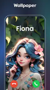
Color Widgets, Theme: iWidgets was released on March 31, 2023, and its current version is 1.7.8.90. If you are deciding whether to install it, these details help identify the app and version you are considering. The app is intended for home-screen personalization, with custom icons, color widgets, themes, and wallpapers among its decorating options.
What does the Everyone age rating mean for Color Widgets, Theme: iWidgets?
Color Widgets, Theme: iWidgets has an Everyone content rating, making it suitable for a broad audience. It is a lifestyle app focused on decorating a device’s home screen with custom icons, colorful widgets, themes, and wallpapers. As with any app, it is sensible to review the available customization and purchase choices before downloading, especially if a child will be using the device.
What is Color Widgets, Theme: iWidgets and what does it offer?
Color Widgets, Theme: iWidgets is an app designed to personalize your iOS home screen with a variety of widget options. It offers an extensive selection of customizable widgets, including clock, calendar, battery, and more. These widgets come in different styles and themes, allowing users to tailor their device’s appearance to match their personal taste and aesthetic preferences.
Is Color Widgets, Theme: iWidgets free to use or does it require a subscription?
Color Widgets, Theme: iWidgets is free to download, and users can try its basic functionality without paying. The app also offers in-app purchases, with options ranging from $1.49 to $29.99 per item. This means some content or features may require payment, so it is worth checking the purchase options shown in the app before choosing a theme or customization.
How user-friendly is Color Widgets, Theme: iWidgets for customization?
Color Widgets, Theme: iWidgets is designed with user-friendliness in mind, making it accessible to both beginners and advanced users. The app features an intuitive interface that guides users through the customization process. With simple drag-and-drop functionality and clear instructions, users can easily modify widget sizes, colors, and fonts to create a personalized home screen.
Pros
- Highly customizable interface.
- Intuitive user experience.
- Wide variety of widget designs.
- Frequent updates with new features.
- Seamless integration with iOS themes.
Cons
- May drain battery quickly.
- Some features require premium.
- Occasional bugs in widget display.
- Limited support for older iOS.
- Ads in free version can be intrusive.

- Category
- Lifestyle
- Version
- 1.7.8.90