Sherwin-Williams Color Expert™
- 430.00
- 3.8
- Installs
- 500.00K
- Price
- Free

Screenshots
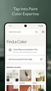
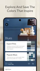
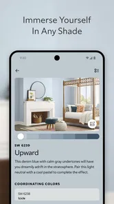
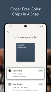
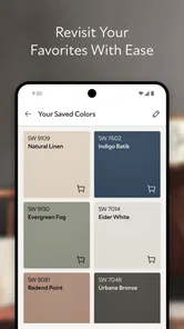
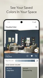
Analysis by Reviewed
When I’m choosing paint, the hardest part is often not finding a color I like; it’s deciding whether that color will make sense in the room I actually live in. Sherwin-Williams Color Expert™ is a free House & Home app from Sherwin-Williams that gives me a place to explore paint colors and visualize ideas before I make a shortlist. I see its strongest role as an early planning companion: useful for turning a vague feeling into a few options worth checking, rather than a substitute for samples on the wall.
What free access means for a painting project
The app is free to download, so I can try its color-planning approach without paying for access. That makes it easy to use while I’m still deciding whether to repaint a room or what direction to take. It does not make the paint, supplies, or work involved in a project free, though. I’d think of the app as a no-cost way to explore ideas, not as a promise that choosing a color will cost nothing beyond the download.
That distinction matters because paint is affected by the room itself. Daylight, warm bulbs, nearby furniture, and the wall’s existing color can all change how a shade feels. I’d use the app to build a shortlist, then look at actual paint samples in the room before making a final decision. If you’re wondering whether the app itself is free, yes; if you’re asking whether a painting project is free, the app cannot answer that for you.
Getting Started with Sherwin-Williams Color Expert™
First things first, downloading and setting up the Sherwin-Williams Color Expert™ app is a breeze. Available on both iOS and Android, it’s just a quick download away on your smartphone. Once you’re in, the app greets you with an intuitive interface that even the least tech-savvy among us can navigate without breaking a sweat.
Sherwin-Williams developed this House & Home app, which is rated for Everyone. It has an average rating of 3.8 from around 1,100 ratings, with 314 written reviews, and has been installed over 100,000 times. It was released on April 11, 2024, and version 1.26.0-release-1.26.0-6507 requires Android 8.0 or later. Those details give me a sense of its reach and compatibility, but they don’t tell me whether its visual suggestions will suit every room or phone.
A Kaleidoscope of Features
Now, let’s dive into the features because this app is packed with them. One of my favorite features is the color matching tool. You can snap a picture of, let’s say, your favorite scarf, and the app will find a paint color that matches it exactly. How cool is that? It’s like magic, and it saves you the headache of trying to guess which paint chip is closest to that perfect shade.
For a more reliable comparison, I’d take pictures of an object in more than one lighting condition and use the results as inspiration rather than a precise specification. A camera can shift color with exposure and surrounding light; a blue-gray fabric photographed beside a sunny window may not read the same way as it does under evening lamps. This is a useful workflow when you love a color in a cushion, artwork, or piece of clothing, but it’s still worth checking the paint in person before settling on it.
More From Our News Desk

 Block Blast!
 Makes Every Clear Feel Like One More Turn
A clean little block puzzle becomes a study in space, risk, and self-control. Its best moments come from one satisfying clear; its toughest test is knowing when to stop.

 Super Stylist Fashion Makeover
Super Stylist Turns Dress-Up into a Runway Career
Its makeover-to-client loop turns quick outfit decisions into shareable style theater. The question is whether the closet keeps giving players a reason to return.

 Block Craft 3D:Building Game
Block Craft 3D Under Pressure: How Well Does It Recover When Building Goes Wrong?
A failure-focused look at Block Craft 3D’s forgiving building loop, its uncertain recovery edges, and the moments that demand more than a cheerful village.

 Woodturning
 Trades Creative Freedom for a Satisfying Carving Loop
If your usual creative game is about building, decorating, or styling, Woodturning trades open-ended projects for a tactile, tightly guided carving loop. Here is what that switch really costs.

 PUBG MOBILE
 Shows What Battle Royale Must Get Right
PUBG MOBILE shows how battle royale has matured: bigger systems matter less than meaningful choices, readable fights, and a reason to return after every loss.

 Braindom: Brain Games Test
Braindom’s Social Life Happens Between Puzzles
Braindom turns quick logic traps into a personal ritual, but its community value is more about comparing answers than building together.
Latest News



Another fantastic feature is the virtual room painter. You can upload a photo of your room and try out different colors on the walls. It’s incredibly satisfying to see how a bold red or a calming blue would look in your space without ever lifting a paintbrush. Plus, it’s a great way to experiment with colors you might not have considered before.
I’d take the room photo from a position that shows as much of the wall as possible, with the room reasonably well lit and furniture not blocking the areas you want to judge. Then compare a small shortlist against the same image instead of constantly changing the lighting or camera angle. That makes the comparison more useful, though a photo preview is best for checking the general mood and contrast, not tiny differences between near-identical shades.
Making a useful shortlist instead of chasing a perfect preview
One practical way I’d use the visualizer is to compare colors by role, rather than testing a long string of nearly identical shades. For example, I might put one light neutral, one warmer option, and one more saturated color beside the room’s existing furnishings. That gives me a clearer sense of whether I want the room to feel brighter, softer, or more dramatic. It also makes it easier to explain my preference to someone else without pretending that the screen has settled the final choice.
There is a useful trade-off here: the more colors I test, the more possibilities I can consider, but a very long session can make every option blur together. I’d save or note only the few that solve a real design problem, such as working with a dark floor or keeping a small room from feeling too heavy. The app is more helpful when I bring a question to it than when I browse without any decision in mind.
Expert Advice at Your Fingertips
The app isn’t just about colors; it’s also packed with advice from the pros. From tips on how to choose the right finish for your paint to tutorials on color theory, the app is a treasure trove of information. It even offers suggestions on complementary color palettes, which is a lifesaver when you’re trying to coordinate multiple rooms or accents.
That kind of guidance is most valuable when you already have a practical constraint: a dark hallway, a favorite sofa that will stay, or adjoining rooms that need to feel connected. I’d start with the fixed elements I’m not changing, then use palette suggestions to explore colors that work around them. It’s a better way to make the app serve a real project than choosing a shade in isolation and hoping the rest of the room falls into place.
And for those of us who are indecisive (guilty as charged), the app’s curated color collections provide a great starting point. Whether you’re into modern minimalism or cozy cottages, there’s a palette for every style.
Where it fits among paint-planning options
Compared with browsing physical paint chips alone, a visualizer gives me a faster way to imagine a whole room and test ideas before visiting a store. Compared with a general-purpose color tool, Sherwin-Williams Color Expert™ is most useful when the goal is choosing paint in the Sherwin-Williams context, rather than building a broad digital palette for unrelated design work. If you need exact color confirmation, a physical sample viewed on the actual wall is still the better final check.
The main difference from a simple online color chart is that I can connect an idea to a picture of my own space rather than judging a patch of color by itself. That can expose a mismatch early: a shade that seems appealing on its own may feel too strong beside a particular floor or too cool next to warm-toned furniture. A chart or paint chip is still better for straightforward browsing and in-person comparison, while a general design app may be a better fit if the goal is planning furniture layouts or decorating beyond paint.
A realistic use would be repainting a bedroom while keeping the bedspread and curtains. I’d photograph the room, try a few options, and use the palette guidance to avoid picking a wall color that clashes with those fixed pieces. Then I’d check the leading choices under both daylight and the room’s usual evening lighting. That sequence can help prevent an impulsive choice, while keeping expectations sensible about what a screen can show.
A small project where the app can save a trip back to the drawing board
Imagine that I’m refreshing a bedroom over a weekend, but I’m not replacing the curtains or bedspread. I can begin by looking at those fixed colors and taking a room photo that shows the wall area I want to change. Instead of arriving at a store with a dozen unrelated ideas, I can use the app to narrow the mood I’m after and arrive with a short set of colors to investigate. The helpful outcome is not a final answer on the screen; it’s a more focused next step.
I would still bring the candidate colors into the room before buying paint. I’d place samples where the light changes during the day and look at them alongside the furniture that will remain. That last comparison matters because a color that looks calm against an empty wall in a phone image can feel different beside patterned bedding or a wood headboard. The app can help me make the first decision less random, but the room has the final say.
Who will get the most from it
I think it suits renters planning a future refresh, homeowners comparing ideas, and DIY painters who want a more considered shortlist before they shop. It can also help someone who has a color reference—a favorite object or an existing decor palette—but struggles to translate it into a wall-color direction. For a professional designer, it may be a handy brainstorming companion, but I wouldn’t treat a phone preview as a substitute for project-specific sampling and client approval.
I’d skip it if you already know the exact paint you want, need a formal color specification, or expect a digital image to predict the finished wall perfectly. It’s also not the right tool for someone who wants a general interior-design planner rather than a paint-focused way to explore color. The most useful question to ask before opening it is not “Which shade is objectively best?” but “Which few shades are worth checking in my room?”
What to expect before relying on a digital preview
A common question is whether the room preview can tell me exactly how a finished wall will look. I wouldn’t rely on it for that. It is a way to imagine a color in context, and it can help me compare broad effects, but the camera and screen are part of that picture too. If two options are close in tone, I’d be especially careful about treating the image as decisive and would move to physical samples sooner.
Another reasonable question is whether this is useful if I’m not ready to paint right away. I think it can be, provided I use it to collect a few promising directions rather than make a final commitment months in advance. Lighting, furniture, and even the condition of the wall are part of the eventual decision, so a saved idea is a starting point to revisit, not a binding plan. If I want an all-purpose room planner, though, I’d choose a tool built around broader decorating tasks instead.
Wrapping Up
All in all, the Sherwin-Williams Color Expert™ app is a must-have for anyone looking to refresh their home with a new coat of paint. It’s user-friendly, packed with features, and offers expert advice that takes the guesswork out of picking the perfect color. Whether you’re planning a major renovation or just thinking about sprucing up a single room, give this app a try. Trust me, you won’t regret it.
My more measured recommendation is to try it if you want a free starting point for exploring paint colors, especially when you’re stuck between a few directions. Its value is in helping you think and compare, not in removing the need to see a real sample. If you’re after exact results with no follow-up checking, a store visit and physical swatches are a better fit.
So, next time you’re feeling adventurous with color, remember, you’ve got a trusty sidekick in your pocket ready to help bring your vision to life.
Sherwin-Williams Color Expert™ Frequently Asked Questions
Is Sherwin-Williams Color Expert™ free to download, and who is it designed for?
Sherwin-Williams Color Expert™ is free to download and is intended for people planning paint projects at home, as well as professionals who want help exploring color choices. Its focus is finding and visualizing paint colors, so it can be useful before you start a project or while comparing options. The app is rated for Everyone, making it suitable for a broad audience.
What is Sherwin-Williams Color Expert™ app and what does it offer?
Sherwin-Williams Color Expert™ is a comprehensive mobile application designed to assist users in selecting the perfect paint colors for their projects. It offers features like color matching, color palettes, and visualization tools to help users see how different colors appear in a space. The app also provides expert advice, tips, and trends to guide users in making informed painting decisions, making it a valuable tool for both DIY enthusiasts and professionals.
How accurate is the color matching feature in Sherwin-Williams Color Expert™?
The color matching feature in Sherwin-Williams Color Expert™ is highly accurate, utilizing advanced technology to match real-world colors to Sherwin-Williams paint options. Users can take photos or use existing images to find matching paint colors, ensuring that the final result aligns closely with their vision. However, lighting conditions and screen settings can affect the perceived accuracy, so it's recommended to test colors in person before making a final decision.
Can I visualize how a color will look in my room using Sherwin-Williams Color Expert™?
Yes, Sherwin-Williams Color Expert™ offers a visualization tool that allows users to see how different colors will look in their space. By uploading photos of their rooms, users can apply various colors to walls and other surfaces, providing a realistic preview of the final outcome. This feature helps in making more confident color choices and reduces the uncertainty often associated with selecting paint colors.
What should I know about device compatibility before downloading Sherwin-Williams Color Expert™?
The Sherwin-Williams Color Expert™ app is available for Android and iOS devices. On Android, check that your device meets the app’s minimum operating-system requirement before installing. As with any visual tool, the experience can vary from screen to screen, so the colors shown in an app preview are best treated as a guide when comparing paint choices.
Pros
- Wide range of color options.
- Easy to navigate user interface.
- In-depth color matching tools.
- Access to expert color advice.
- Regular updates with new features.
Cons
- Requires internet for full features.
- Occasional app lagging issues.
- Limited offline functionality.
- Some features need account setup.
- Ads can be intrusive at times.