Inbox Homescreen
- 1.57K
- 4.4
- Installs
- 1.00M
- Price
- Free

Screenshots
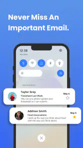
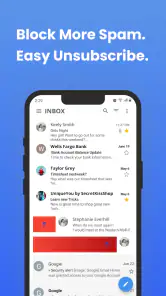
Analysis by Reviewed
Inbox Homescreen is easiest to judge after its novelty has had time to fade. A freshly organized phone can feel satisfying on day one, but the real test is whether I still find the apps I need without thinking about the layout weeks later. This communication app from Homescreen Apps takes an app-focused approach to the home screen, and its value depends less on how tidy it looks than on whether its categories fit the way you actually use your phone.
When a cleaner screen feels useful
In the first few days, the appeal is immediate: instead of treating the home screen as a collection of icons to arrange by hand, I can look for apps by category or use search. That can be a relief if your phone has gathered tools for work, errands, messages, and downtime, and you no longer remember exactly where everything sits. The change is most noticeable when you open your phone with a specific task in mind and want to get there without scanning several screens.
That benefit is not the same as having fewer apps or fewer distractions. Inbox Homescreen helps organize access; it does not decide which app deserves your attention. If social apps are the ones that pull you off task, putting them in an easy-to-reach spot may make that habit faster rather than better. I’d treat the initial setup as a chance to make deliberate choices about what should be immediately accessible, not just as an exercise in making every category look neat.
First Impressions and the Everyday Routine
Ever wished for a neater and tidier smartphone experience? Well, let me introduce you to the app that's taken my phone organization game to the next level: Inbox Homescreen. This app has been a game changer for me, and I can't wait to share why it might just be the perfect fit for you too.
First Impressions: A Clean Slate
From the moment I downloaded the app, I was immediately impressed by its sleek and user-friendly interface. It's like a breath of fresh air compared to the cluttered mess my homescreen used to be. The app essentially transforms your phone's homescreen into an organized, accessible workspace where everything is neatly categorized. No more endless scrolling just to find that one app you need!
That change is most helpful when your phone has accumulated apps for work, errands, entertainment, and occasional tasks. Instead of deciding which icons deserve permanent space on a conventional home screen, you can approach the phone by category or search. It is a small shift, but it can reduce the little interruptions that happen when you open your phone for one specific reason and get distracted hunting for the right icon.
Features That Stand Out
One of the standout features for me is the smart categorization. The app automatically sorts your apps into different categories like social, productivity, games, and more. It's like having a personal assistant who knows exactly where to put everything. And if you're anything like me—a little picky about customization—you'll appreciate the ability to tweak these categories to your liking.
You May Like

Clash of Clans Is Won Between the Battles

Android Auto Makes the Case for Quieter Car Software

MobiOffice: Transforming Mobile Productivity with Seamless Integration

EA SPORTS FC™ Mobile Soccer: Redefining Mobile Sports Gaming

How Microsoft OneDrive Became a Mobile Productivity Giant

How Google Translate Breaks Language Barriers Effortlessly
That ability to adjust categories matters more than it first sounds. Automatic sorting is convenient, but an app can feel misplaced if its label does not match the way you think about it. I’d review the categories after the initial setup and correct the few placements that matter most, rather than trying to perfect every corner at once. This keeps the system useful without turning organization into another project to maintain.
Another feature I absolutely love is the quick access bar. This nifty little addition lets you pin your favorite apps for instant access. It's perfect for those of us who have a few apps we constantly use throughout the day. Plus, the search function is intuitive and efficient, making it super easy to locate any app or function on your phone.
A practical routine is to reserve those pinned spots for apps you open repeatedly, while letting categories handle the less frequent ones. For example, if you check a calendar before leaving home, then switch between messaging and navigation during the day, keeping your personal essentials easy to reach can save more effort than rearranging every app. Search is a useful fallback for the occasional tool, not necessarily a replacement for a home screen shaped around your most common actions.
Where It Fits Compared With Familiar Home Screens
Compared with a standard launcher or the phone’s usual app grid, this approach puts more emphasis on finding apps through categories and search than on manually placing icons across multiple screens. That can suit someone with a crowded phone who wants a clearer starting point. It may feel less natural if you already have a carefully arranged layout, rely on muscle memory, or prefer opening apps from a compact set of folders. I would not switch just for the sake of tidiness if your existing setup already gets you where you need to go quickly.
It is also worth thinking about the phone as a communication tool, not only as a collection of apps. If your day involves moving between personal messages, work tools, and social apps, categories can help separate those purposes when you are choosing what to open. They do not decide what deserves your attention, though. I would still keep distracting apps out of the quick access bar if the goal is to make the home screen calmer rather than simply faster.
User Experience: Smooth Sailing
Using the app feels incredibly intuitive. The app runs smoothly without any hitches, and I haven't experienced any lag or crashes. It works on Android devices running version 9 or later. Homescreen Apps is the developer, and the app is free, so trying it does not require a purchase. Its Everyone content rating also makes its intended audience broad.
There is a simple maintenance trade-off: the more your app collection changes, the more useful it is to check that categories and pinned choices still reflect your habits. If you install new apps often, do a quick tidy when you notice something out of place instead of waiting until the screen feels crowded again. If your app collection is stable, you may barely need to revisit the setup. That difference is a good way to judge whether the organizational benefit will last for you.
Moreover, there's something incredibly satisfying about seeing your homescreen so organized. It makes the whole phone experience feel more streamlined and efficient, which is something I didn't realize I needed until now. It’s like having a Marie Kondo for your phone!
Who Will Keep Using It—and Who May Not
I can see this working best for people who install plenty of apps, forget where less-used ones are, or want a clear route from the home screen to different parts of their day. Someone who uses a phone for a mix of communication, practical tasks, and downtime may especially appreciate separating those groups. On the other hand, if you prefer a minimal screen with only a few hand-placed icons, or you seldom struggle to find apps, another setup may be simpler and just as effective.
There is also a personal preference question: do you enjoy having the phone organize things for you, or do you want complete control over every icon’s exact position? Automatic categories are a good starting point, but customization takes a little attention. If you find yourself repeatedly correcting the same placements or searching more than before, that is a sign the system is not matching your mental map. It is reasonable to return to your usual layout rather than maintain a method that creates extra work.
Month-to-Month Value and Lasting Appeal
The first-week appeal is the visible cleanup; the recurring value is whether you can get to the right app with less hunting a month later. The app has a 4.4 average from around 16,000 ratings and over 1 million installs, which suggests that many people have tried it, but those figures cannot tell you whether its organization style fits your own routine. Version 1.1.88 is the current version, and I’d judge it by a straightforward test: after the initial setup, are you still reaching for categories, the quick access bar, and search naturally?
For a realistic day, imagine opening your phone before a commute to check a practical app, then later looking for a less frequently used service. A few familiar pinned choices can cover the repeated tasks, while categories help with the one-off search. If you still need to scan several places to find something, the advantage fades. I would make small adjustments based on actual use rather than reorganizing the whole screen whenever a new app appears.
Making the routine stick
A useful way to assess the layout is to notice the moments when you reach for your phone without a plan. When you already know what you want, a pinned shortcut may be quickest. When you remember the purpose but not the app’s name, categories can offer a better route. When neither description comes to mind, search is the practical escape hatch. Thinking in those three situations helps you decide which part of the setup is earning its space instead of judging it only by appearance.
For someone balancing family messages, work communication, and occasional services, the distinction can be particularly helpful. I’d put only the apps used several times a day in the quick access bar, then use categories for tools that matter but are not part of every routine. That keeps the most visible area from becoming a second crowded app grid. It also gives you a simple check-in: if a pinned app stops being a regular choice, replace it rather than letting old habits dictate the layout indefinitely.
The app is less compelling for people who already rely on a well-practiced home-screen arrangement. A person who knows an icon’s exact position may reach it faster than they can interpret a category, and someone who keeps only a handful of apps may have little clutter to solve. In those cases, the benefit needs to be more than a fresh look. If the new route adds a step to a task you perform constantly, the familiar launcher may remain the better everyday option.
The small costs of organization
There is no need to treat every miscategorized app as a problem that must be fixed immediately. I’d correct the items that interrupt a real task and leave low-priority placements alone. This is a useful trade-off because the value comes from making common actions easier, not from achieving a perfectly sorted catalogue. Trying to curate every app can turn a practical home screen into a maintenance hobby, especially for people who install and remove apps often.
Another source of fatigue is the gap between a category’s label and your personal way of grouping things. A tool may serve several purposes, while a category can suggest just one. If that mismatch makes you pause every time, using search or pinning that specific app may be more sensible than repeatedly reshaping the whole category system. The best setup is not necessarily the most comprehensive one; it is the one that helps you act without adding a decision at the moment you are trying to get something done.
Inbox Homescreen is free to try, which makes a short real-world test more useful than guessing from screenshots or expectations. I’d use it through ordinary days rather than spending an afternoon arranging it, then ask whether I actually opened categories and search when needed. The install should earn its place through recurring convenience, not just the pleasure of seeing a newly organized screen. If that convenience is absent, going back to a standard grid is a sensible outcome, not a failed experiment.
Final Thoughts: A Must-Try for the Organized Enthusiast
If you're someone who values organization and efficiency, the app is definitely worth a try. It's transformed the way I interact with my phone, making it easier to find what I need, when I need it. And honestly, once you start using it, you'll wonder how you ever managed without it.
In conclusion, this app offers a distinct approach to managing your apps and homescreen layout. With its smart categorization, customizable features, and user-friendly interface, it's a must-try app for anyone looking to declutter their digital life. Give it a shot and see the difference it makes!
My lasting verdict is positive, with one qualification: it earns its place when categories genuinely match how you think and the pinned apps reflect what you reach for repeatedly. It is less compelling if your current launcher already feels effortless or if maintaining a tidy system becomes a chore. I’d try it as a practical change to the daily routine, then keep it only if finding apps stays easier after the initial satisfaction of a cleaner screen has passed.
Inbox Homescreen Frequently Asked Questions
What kind of app is Inbox Homescreen?
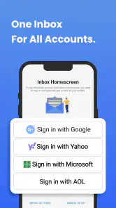
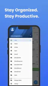
Inbox Homescreen is a communication app focused on email, with a homescreen-oriented approach intended to make email communication easier to access. Its store description presents it as a productivity solution for email needs. If you prefer keeping your email experience close to your phone’s homescreen, that focus may suit your routine; consider whether it matches how you already manage messages before installing.
Which devices and operating systems can run Inbox Homescreen?
Inbox Homescreen is listed for Android, and its minimum operating system requirement is Android 9. Check your phone’s system version before downloading to make sure it meets that requirement. If you use an iPhone or iPad, confirm that an official version is available for your device in your regional app store before proceeding, rather than assuming Android compatibility also means iOS availability.
Do I need an email account to use Inbox Homescreen?
Inbox Homescreen is intended to support email communication, so having an email account to connect or use with the app is central to its purpose. Think about which account you want to use and whether you are comfortable managing that communication through a homescreen-focused app. The app’s actual setup options and supported account types can be checked during installation and account setup.
Can Inbox Homescreen replace my current email app?
Inbox Homescreen may offer a different way to access email, but whether it can replace your existing email app depends on the features and account support you need. If your current setup handles important work or personal messages reliably, you may want to compare the two experiences before changing your routine. You can assess Inbox Homescreen first and decide whether it fits your everyday communication needs.
Is Inbox Homescreen free to download?
Inbox Homescreen is free, so you can try its email-focused communication experience without paying to download the app. Before installing, consider whether its approach to keeping email communication accessible from your homescreen fits the way you use your phone. As with any app, check the current app-store page for the latest installation details and make sure you are choosing the official listing from Homescreen Apps.
Pros
- Customizable widget sizes.
- Seamless integration with calendar.
- Minimalistic design enhances focus.
- Quick access to frequently used apps.
- Supports multiple email accounts.
Cons
- Limited theme options.
- Occasional sync issues.
- No offline mode available.
- Limited third-party app support.
- Requires frequent updates.

- Category
- Communication
- Version
- 1.1.88