Guardian
- 670.00
- 3.5
- Installs
- 500.00K
- Price
- Free

Screenshots
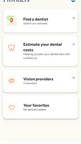
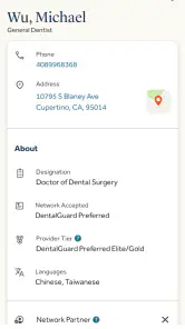
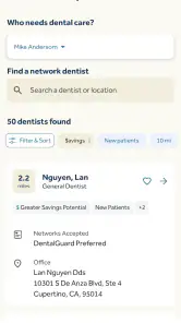
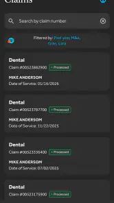
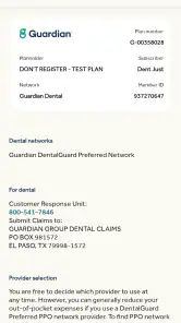
Analysis by Reviewed
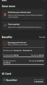
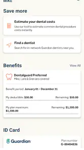
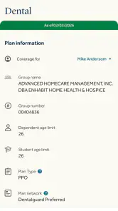
Guardian is a free medical and insurance app from The Guardian Life Insurance Company of America, built around a simple idea: keep insurance, benefits, and wealth-related information closer at hand instead of making you search through paperwork every time you need it. I found it most useful as a companion for people who already have Guardian coverage or benefits, rather than as a general health app for everyone.
The first thing to understand is that this is not primarily a symptom checker, fitness tracker, or replacement for a doctor. Its role is more practical and administrative. You use it to stay connected with your Guardian-related information, understand what is available to you, and handle routine benefit tasks from a phone. That distinction matters because it sets the right expectations from the start.
What to expect before you begin
The app sits in the medical category, but its experience feels closer to a personal insurance and benefits portal than to a clinical tool. The store summary describes insurance, wealth, and benefits, and that combination tells you where its strengths are likely to be: organizing coverage-related information and giving eligible users a mobile route into services connected with Guardian.
It is available at no cost and is rated for Everyone, which makes the download approachable for a wide range of users. The app has been available since July 18, 2012, and its current version is 26.6. It requires iOS or Android version 12 or later, so checking your phone’s operating system before installing can save a frustrating start.
Guardian has reached over 500 thousand installs and holds an average rating of 3.5 from around 2 thousand ratings, alongside roughly 670 written reviews. I read that overall picture as mixed but useful: many people clearly find a purpose for it, while the middle-of-the-road score suggests that the experience can depend heavily on your plan, employer setup, and the task you are trying to complete.
The most important expectation is this: the app becomes meaningful only when it matches your Guardian relationship. If your employer, insurer, or benefits arrangement does not connect to the functions you need, installing it alone will not turn it into a complete health-management service.
That also explains why two users can have very different impressions. One person may open it to check benefit information during a dental appointment, while another may expect a broad healthcare marketplace or a full financial-planning dashboard. Those are not the same job, and Guardian is better judged as a focused access point than as an all-purpose wellness application.
Who will get the most from it
I would recommend trying Guardian if you receive Guardian benefits through work, hold an individual policy, or need a more convenient way to keep track of coverage-related details. It can be particularly useful for people who dislike carrying benefit cards, forget where policy documents are stored, or need to check information while away from a computer.
It may also suit households where one person handles insurance administration for several family members. A mobile account can make those small moments less awkward: sitting in a waiting room, speaking with a provider’s office, or reviewing a benefits question after work. The value is not excitement; it is reducing the number of separate places you need to search.
I would skip it if you are looking for medical advice, emergency guidance, medication reminders, exercise coaching, or a way to book every type of appointment. A general health platform, your provider’s own app, or a dedicated finance service may be a better fit for those jobs. Guardian should not be treated as a substitute for urgent care or professional medical advice.
Setting up the account without getting stuck
After installation, start with the relationship that gives you access: your Guardian coverage, employer benefits, or another eligible account. Have the information associated with that relationship nearby before you begin. This is a small but important preparation step, because account setup is much easier when you are not switching between the app, old emails, and paper documents.
Use the same personal details you normally use for Guardian services. If your coverage comes through an employer, make sure you know whether the account is tied to your own information or to a workplace enrollment process. That distinction can explain why a login succeeds but shows fewer details than you expected.
Once you are inside, resist the temptation to explore every area immediately. First look for the section connected to your most urgent reason for installing the app. If you need benefit information, begin there. If your purpose is related to insurance or wealth services, start with that area instead. A focused first visit is less confusing than trying to understand the entire menu at once.
A useful setup habit is to confirm that the profile reflects the correct person and coverage context before relying on what you see. If you manage information for a spouse or dependent, check whose details are currently displayed before discussing them with a provider. This is one of those ordinary safeguards that can prevent an avoidable phone call later.
The app’s free price removes one common barrier, but free does not mean every function is available to every account. Access is shaped by the Guardian products and benefits connected to you. If a section looks irrelevant or unavailable, that may be a sign of account eligibility rather than a problem with your phone.
For privacy and security, I would use a personal device when possible and avoid completing sensitive account work on a shared phone. I would also avoid saving screenshots of benefit details unless there is a clear reason to keep them. An insurance screen can contain information that is useful in the moment but unnecessary to leave in a photo gallery.
Your first meaningful success
The best first task is something small and verifiable. Open the area that relates to your coverage and locate one piece of information you expect to need soon. For example, before a routine appointment, you might check the relevant benefit details or confirm that you are viewing the correct member information. The goal is not to master the app; it is to prove that it can answer one real question.
After finding that information, pause and note where it lives. Mobile benefit apps are most helpful when you remember the path, not just the result. If you need the same detail later, knowing which section to open is more valuable than browsing randomly through the home screen.
A realistic example is a dental visit scheduled during a busy workday. Instead of searching a desk drawer for paperwork, I would open Guardian before leaving, sign in, check the coverage-related area, and keep the relevant information available while speaking with the office. If the office still needs clarification, the app has not replaced the provider or Guardian support, but it has made the first conversation more informed.
Another useful workflow is to review your information before a benefits deadline or a change in employment coverage. Do not wait until you are standing at a reception desk to discover that you have forgotten which account or plan details apply. A short review at home gives you time to contact the appropriate support channel if something looks wrong.
For wealth-related information, take a slower approach. Financial screens can be easy to misread when you are rushing, especially if you are expecting them to behave like a banking app. Read the labels carefully and treat the app as a place to review information connected with Guardian, not as a complete substitute for personal financial advice.
A good first session ends with one answered question, not a perfectly organized account. That mindset makes the app feel much less demanding and gives you a practical reason to return.
Where first-time users may feel confused
The word “Guardian” can cover several different relationships, and the app’s broad scope can make the opening experience feel less personal than expected. Insurance, benefits, and wealth services do not necessarily follow the same workflow. If you enter expecting one unified dashboard, you may wonder why some areas are more useful than others.
Another possible point of friction is the difference between seeing information and completing an action. A mobile app can place coverage details in front of you, but a provider, employer benefits team, or Guardian representative may still be needed for changes, disputes, eligibility questions, or decisions with financial consequences. Knowing that boundary prevents you from treating a display screen as proof that every administrative task can be completed inside the app.
Login trouble can also be misleading. Before assuming the application is broken, check whether you are using the account associated with the correct Guardian service. Employer-sponsored benefits and individually held products can create different expectations, especially if you have more than one connection with the company.
If information appears incomplete, compare the screen with the document or communication that led you to install the app. Look for differences in the person covered, the type of benefit, or the timing of the information. Do not make a medical or financial decision based on a screen you do not understand. Contact the appropriate Guardian or plan support channel when the issue affects care, payment, eligibility, or a deadline.
The average rating also suggests that convenience is not the whole story. An app can be useful but still feel slow, limited, or difficult when a user needs an unusual task. My advice is to judge it by your recurring workflow rather than by a single frustrating screen. If it reliably handles the one or two things you need, it may earn a place on your phone; if every visit sends you back to paper or a phone call, another route may be better.
How it compares with the usual alternatives
The traditional alternative is a browser portal, printed benefit material, or a call to customer support. Guardian’s mobile format is more convenient when you already know what you are looking for and want to check it away from a desk. A website may still be preferable for long forms, detailed document review, or tasks that require careful comparison across several pages.
Your employer’s benefits portal may be better for enrollment choices and workplace-wide information, while a provider’s app may be stronger for appointments, test results, messages, or prescriptions. A banking or investment application may offer deeper day-to-day money tools than the wealth-related area here. I would not force Guardian to replace those services; I would use it where its connection to Guardian coverage gives it an advantage.
Compared with a general medical app, Guardian is narrower but potentially more relevant to people whose insurance and benefits are already tied to the developer. A general app may offer broader health education, while Guardian can be the more sensible choice for checking information attached to your own plan. The trade-off is that its usefulness is personal and account-dependent rather than universal.
This makes the app a good secondary tool for many users. Keep your provider’s app for clinical communication, your employer portal for workplace administration, and Guardian for Guardian-related coverage and financial information. That division may sound less tidy than one app for everything, but it is usually more realistic and less confusing.
Small habits that make it more useful
First, open the app before you need it urgently. A quiet setup visit lets you discover whether your account connects properly and whether the information you expect is visible. Doing this before an appointment is a much better test than waiting until you are already checking in.
Second, write down the navigation path for your most-used task in a secure place. This is especially helpful if you only use the app occasionally. You do not need to memorize every section; remembering the route to your benefit information is enough to turn a rare task into a quick one.
Third, separate “information gathering” from “decision making.” Use Guardian to understand what your account shows, then verify important medical, coverage, or financial decisions through the relevant professional or support channel. This two-step approach is safer than assuming a mobile summary contains every condition or exception that might apply.
Fourth, review the account after a change in employment, coverage, or household circumstances. These transitions are exactly when old assumptions become unreliable. Checking whose information is displayed and whether the relevant service is still connected can save time when you next need care or benefits support.
Finally, keep the app updated through your normal device process and make sure your phone meets the minimum operating-system requirement. Since the current version is 26.6 and the minimum OS is 12, an older device may need attention before installation or updating works smoothly.
When I would keep it installed
I would keep Guardian installed if I had active Guardian coverage and used the app even occasionally to answer questions that would otherwise require paperwork or a browser. The benefit is strongest for people who value quick access during real-world moments rather than people who want a rich, always-on health experience.
I would remove it, or simply use the web and support alternatives, if my account offered little relevant information or if my main needs were clinical. There is no advantage in keeping a specialized insurance app just because it is free. The right test is whether it shortens a task you genuinely perform.
For a first-time user, my recommended path is straightforward: install it on a compatible device, identify the Guardian relationship connected to your account, complete setup with your coverage details nearby, and use one upcoming insurance or benefits question as your first test. If that question is answered clearly, return later to explore the other areas that apply to you.
Overall, Guardian is a practical, focused app rather than a complete healthcare universe. Its strongest quality is bringing Guardian-related insurance, benefits, and wealth information into a place you can reach during ordinary life. Its main limitation is the same focus: people without a relevant Guardian account, or users expecting medical care tools, will likely find better results elsewhere.
My final recommendation is cautious but positive. If Guardian is already part of your coverage or financial arrangements, the free download is worth trying because the first useful result can be as simple as finding the right benefit detail before you need it. Just approach it as an account companion, verify important decisions through the proper professionals, and keep other specialized apps for the jobs Guardian was not designed to handle.
Pros
- Clear
- well-researched reporting from trusted journalists.
- Live updates help you follow developing stories quickly.
- Wide range of sections
- including culture
- sports
- and opinion.
- Independent journalism supported by reader contributions.
- Easy sharing options for articles and investigations.
Cons
- Some premium articles require a subscription or contribution.
- The large content volume can make navigation feel overwhelming.
- Frequent news alerts may become distracting for some readers.
- Opinion pieces may not appeal to users seeking only neutral news.
- Certain features depend on a stable internet connection.

- Category
- Medical
- Version
- 26.6