Desygner: Graphic Design Maker
- 1.78K
- 4.7
- Installs
- 5.00M
- Price
- Free

Screenshots
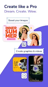
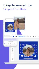


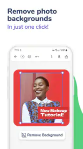
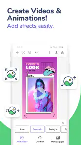
Analysis by Reviewed
I think Desygner: Graphic Design Maker works best as a practical shortcut from a blank page to a presentable visual. It gives beginners room to make polished-looking graphics without first learning a desktop design program, while still leaving enough choices to tailor a layout. I would reach for it when I need a flyer, social post, logo concept, or business card quickly—not when I need the precision and control of a full professional suite.
A useful tool for everyday visual communication
The main question I would ask before installing Desygner is not whether it can make a graphic, but whether its guided approach matches the job. If I already have a clear message and need to arrange it into a readable post, flyer, or card, a template-based app can be a sensible middle ground between improvising in a photo editor and learning a more demanding design program.
That distinction matters because speed alone does not guarantee a good result. Desygner can help me get past the intimidating empty canvas, but I still need to decide what the design should say, which details deserve attention, and what can be removed. I find it most rewarding when I treat the app as a practical workbench rather than a button that automatically makes every choice for me.
Why Choose Desygner?
First off, Desygner is all about simplicity and power in the palm of your hand. Whether you're looking to craft a quick social media post, a beautiful flyer, or even a full-blown marketing campaign, this app has got your back. I was pleasantly surprised by how intuitive the interface is. You don’t need to be a design wizard to create something that looks like it just came out of a professional studio.
That accessible approach suits the app’s place in the Art & Design category. Desygner is made by Desygner Pty Ltd, and its Android version is free to install, rated for Everyone, and currently at version 5.4.8, with Android 5.0 or later required. The app has a 4.7 average from around 100,000 ratings and more than 5 million installs. Those figures suggest a well-established tool, but what matters more in daily use is that the template-first workflow can save time when the goal is a clear, usable design rather than a custom illustration.
Templates are a starting point, not a finished design
One of the coolest things about Desygner is its massive library of templates. Seriously, there’s a template for almost anything you can think of—social media posts, business cards, posters, you name it! And if you’re like me, sometimes you just need a starting point to get those creative juices flowing.
My most useful tip is to choose a template for its structure, not just its colors or imagery. A layout with the right balance of headline, supporting text, and open space is easier to adapt than one that looks attractive but is crowded. Replace the sample wording early, then check whether your real message still fits. That small step helps avoid shrinking text until it becomes hard to read on a phone.
More From Our News Desk

Clash of Clans Is Won Between the Battles

Android Auto Makes the Case for Quieter Car Software

MobiOffice: Transforming Mobile Productivity with Seamless Integration

EA SPORTS FC™ Mobile Soccer: Redefining Mobile Sports Gaming

How Microsoft OneDrive Became a Mobile Productivity Giant

How Google Translate Breaks Language Barriers Effortlessly
Make one design serve several related needs
A less obvious advantage of starting from a template is that it can help me plan a small family of graphics, not just one isolated image. For example, a community group could make an event announcement, a reminder, and a last-call post using a similar visual structure. I would change the wording and image for each, while keeping a consistent headline style and general arrangement. The payoff is a more connected set of materials without having to invent a new layout every time.
I would be careful not to assume that one composition suits every destination. A square post, a narrow story-style graphic, and a printed flyer have different proportions and viewing conditions. When adapting a design, I would revisit the hierarchy instead of merely stretching or squeezing elements. If the headline loses prominence or the supporting details become cramped, it is better to simplify the content than to force every sentence into the same layout.
Small adjustments make a bigger difference than extra decoration
Let’s talk customization. Desygner offers a vast array of fonts, images, and icons, allowing you to tweak every detail until it’s just right. Plus, the drag-and-drop functionality is a lifesaver. It’s so easy to move elements around and get them exactly where you want.
In practice, I’d keep a design restrained: one clear headline, a supporting detail, and only a few visual elements. On a small screen, it is easy to add icons or decorative touches simply because they are available. I find it more useful to zoom out and judge the overall balance before polishing individual details. If the message is still obvious at a glance, the design is doing its job.
Check the message before polishing the layout
For a practical workflow, I would write the final wording before spending much time choosing decorative elements. A promotion may need a product or service, a date, and a clear next step; if those essentials do not fit naturally, adjusting the wording is often better than squeezing the type smaller. This approach is especially helpful on a phone, where fine spacing can be harder to judge than the overall composition.
I also like to make one deliberate pass for consistency: are the headings treated similarly, do the colors support the message, and does any image compete with the text? These checks do not require advanced design knowledge, but they can make a template feel more considered. The trade-off is that mobile editing rewards patience; tapping and repositioning individual objects can take longer than making broad changes on a computer.
Collaboration is useful when the feedback is specific
If you work in a team, Desygner makes collaboration a breeze. You can share your designs with others and even edit together in real-time. This feature is a game-changer for remote teams or anyone working on a group project. No more back-and-forth emails trying to describe what changes need to be made!
For a small business, that can make routine work less fragmented: I could prepare a promotion, share it for a check, and make a requested wording or layout adjustment without rebuilding the graphic elsewhere. It works best when collaborators agree on a simple brief and one person keeps the final design coherent. If several people make competing visual changes, easy access can turn into unnecessary back-and-forth rather than a faster decision.
A simple handoff between phone and computer
Another highlight is the seamless integration between the mobile app and the web version. You can start a project on your phone while commuting and finish it on your computer at home. The sync is flawless, ensuring you never miss a beat in your design workflow.
A realistic use for that flexibility is drafting a quick event announcement on a phone, then reviewing the text and spacing on a larger screen before sharing or printing it. I would still check the final output at the size it will actually be seen: a design that looks balanced on a laptop can feel crowded as a small social post. The ability to move between devices helps with convenience, but it does not replace that last readability check.
Plan a quick project from brief to finished graphic
Imagine I am helping a local club announce a weekend gathering. I would first settle on the essential details—what is happening, when, and where—then select a layout that gives those details room to breathe. I would replace the sample copy before fine-tuning the colors, check that the event information is easy to spot, and share the draft for a focused review. Once the wording is settled, I could adjust the spacing and prepare a related reminder using the same visual direction.
That sequence shows where the app can save effort: it gives a non-designer a structure, lets the message be revised without starting over, and makes a quick review easier to organize. It also shows what the app cannot do on my behalf. I still have to verify the event details, decide which information matters most, and judge whether the finished design is legible in the place people will see it.
Where the free option fits—and where it may not
Now, I have to mention that while Desygner offers a free version, there are some premium features that are locked behind a subscription. However, the free version is quite robust and might be all you need if you’re just starting out or working on occasional projects.
The app is free, with in-app purchases ranging from $4.49 to $149.99 per item. I would begin with the free tools and only consider a purchase after identifying a specific feature you genuinely need; regular access to paid options can change the value calculation. This is especially relevant if you are making occasional graphics, since a paid plan may be more than your workload calls for.
What to expect from a mobile-first workflow
For someone wondering whether a phone is enough, I would say it depends on the size and importance of the job. A short announcement or a simple promotional image is a reasonable mobile task, particularly if the layout is already close to what I need. Longer copy, many separate elements, or repeated fine adjustments make a larger screen more comfortable, so I would use the web version for a careful final review when that option suits my workflow.
I would also separate “ready to share” from “ready for every use.” A graphic meant for a quick online post may need a different check from a flyer intended to be printed. Before relying on a finished design, I would review the text, the order of information, and how it looks at its intended size. That final check is a small investment compared with having to correct a confusing or crowded graphic after people have seen it.
Compared with a basic photo editor, Desygner is the better fit when you need typography, layout, and several elements arranged into a finished graphic. Compared with a professional desktop design application, it is easier to approach but less suited to intricate, highly controlled artwork. If your work depends on precise illustration or complex production requirements, I would choose a specialist tool instead. Desygner’s strength is getting common communication pieces made without turning each one into a technical project.
Who will get the most from it?
I’d recommend it to a shop owner making a weekly offer, a student preparing a club announcement, or anyone who needs consistent-looking posts without hiring a designer for every small task. A helpful habit is to keep repeated pieces visually related: reuse a similar layout and change the message and imagery, rather than starting from scratch each time. That creates a recognizable style and saves effort. It is also a sensible way to test a design idea before investing time in a more elaborate version.
On the other hand, I would skip it if you want a drawing-first workspace, need fine-grained control over every technical detail, or strongly dislike working from templates. It is also not ideal to judge a design solely by how quickly it can be assembled; a ready-made layout still needs thoughtful editing to avoid looking generic. For a one-off graphic with a short deadline, that trade-off is often worthwhile. For a distinctive identity that must be exact across many materials, I would treat the app as a drafting aid rather than the whole design process.
My recommendation depends on the job
I would put Desygner on my shortlist if I regularly need everyday communication graphics and value an approachable way to arrange text and visual elements. It makes particular sense for small teams, clubs, students, and independent sellers who have a practical message to share but do not need custom illustration for every piece. The ability to start with a template and then reshape it gives those users a manageable path from idea to a shareable design.
I would not choose it as my main tool for detailed drawing, a tightly controlled brand system, or work where tiny production choices matter as much as the image itself. In those cases, a specialist editor or a professional designer is a better fit, even if it takes longer. The sensible choice is to match the tool to the stakes: use Desygner for routine, editable graphics, and move to a more exacting workflow when the project calls for it.
In conclusion, Desygner: Graphic Design Maker is a fantastic tool for anyone looking to dip their toes into the world of graphic design without the steep learning curve. It’s user-friendly, packed with features, and designed with collaboration in mind. Whether you’re a small business owner, a marketing professional, or just someone who loves creating beautiful visuals, Desygner has something for you.
My verdict is positive, with a clear boundary: this is a convenient, approachable way to produce everyday graphics, not a replacement for specialist design software. If you want to make a clean post, flyer, or card and are willing to refine a template instead of accepting it unchanged, it is worth trying. Start with one real project, keep the message simple, and see whether its workflow suits the way you create.
Desygner: Graphic Design Maker Frequently Asked Questions
Can I make designs on my phone or tablet with Desygner?
Yes. Desygner is a graphic design app for creating visuals on mobile devices, including logos, social media posts, business cards, and flyers. Its templates and editing tools let you work on designs without starting from a blank page. It is intended to make common design tasks accessible on smartphones and tablets, whether you are preparing something personal or promotional.
What should I know about Desygner’s age rating before downloading it?
Desygner has an Everyone content rating, so it is presented as suitable for a broad audience. The app focuses on creating visual content, which can include designs for personal projects, school, or business. Parents and users can still consider the app’s design features and intended use to decide whether it is a good fit for their needs.
Can Desygner help me create a logo, business card, or flyer?
Yes. Desygner is an all-in-one design app for making a variety of visuals, including logos, social media posts, business cards, and flyers. Its templates and editing tools can help you shape a design for personal, promotional, or business use. You can start with a template and customize it, rather than needing to build every design from a blank page.
Who develops Desygner, and is it suitable for all ages?
Desygner is developed by Desygner Pty Ltd and is rated for Everyone, so it is presented as suitable for a broad audience. It belongs to the art and design category and is intended for creating visual content. Whether you are designing for school, personal projects, or a business, the app’s purpose is to make common design tasks approachable.
What is Desygner and what can I use it for?
Desygner is a versatile graphic design application that allows users to create stunning visuals without the need for advanced design skills. It is perfect for creating social media graphics, marketing materials, presentations, and more. With a user-friendly interface and a wide range of templates, Desygner is ideal for both beginners and professionals looking to design quickly and efficiently on their smartphones or tablets.
Pros
- User-friendly interface for beginners.
- Wide range of design templates available.
- Seamless integration with cloud storage.
- Affordable premium features.
- Supports multiple file formats.
Cons
- Limited offline functionality.
- Occasional app crashes reported.
- In-app purchases can be frequent.
- Limited advanced editing features.
- Some templates require premium access.

- Category
- Art & Design
- Version
- 5.4.8