SherMatch+ by Sherwin-Williams
- 568.00
- 3.6
- Installs
- 500.00K
- Price
- Free

Screenshots
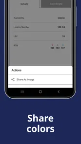
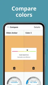
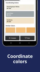
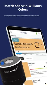
Analysis by Reviewed
When I’m choosing paint, the hardest part is often translating a color I like into a shade I can actually compare and consider for a room. ColorSnap® Match is useful for that first step: it connects visual inspiration with paint options, rather than trying to replace the decisions that come after. If you’re deciding whether this House & Home app belongs in your project toolkit, the key question is whether you want inspiration and a route to a paint shade, or a more complete planning process.
What to decide before you download
I’d start by asking what kind of uncertainty you’re trying to solve. If you have a color in front of you and want a paint direction to explore, this app is aimed at that moment. If you already have a precise paint shade in mind and only need to buy it, or if you need a detailed room plan, the app may be an unnecessary stop. Its value depends on whether identifying and saving ideas will make your next decision easier.
It also helps to separate inspiration from specification. A photo-based match can point you toward a plausible paint color, but your walls, lighting, and furnishings affect how a color feels in the finished space. I’d use the app to narrow the field, then make the final call with physical samples. That small change in expectations makes the results more useful and avoids treating a screen as a guarantee.
Discovering Colors in a Whole New Way
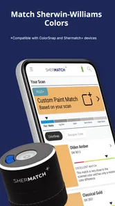
When I first downloaded the ColorSnap® Match, I was intrigued by the concept. Imagine being able to match any color you see to a Sherwin-Williams paint color. Sounds like a dream, right? The app is designed to help you pick colors from your surroundings and instantly get their equivalent Sherwin-Williams paint match. And it’s not just limited to paint; it extends to other materials as well, making it a versatile tool for designers and DIY enthusiasts alike.
How It Works
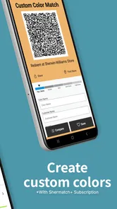
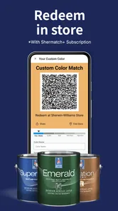
Using the app is a breeze. You simply snap a picture of the color you want to match, and voila, the app does its magic. It analyzes the color and provides you with the closest Sherwin-Williams paint options. It’s almost like having a personal color consultant in your pocket. What’s even cooler is that it offers additional suggestions for coordinating colors, so you can easily plan a whole palette.
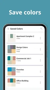
One of the standout features is the ability to save your favorite color matches for later. This is super handy when you’re comparing different shades or planning a project over time. Plus, the app’s interface is intuitive and user-friendly, so you don’t need to be a tech wizard to navigate through it.
Getting more from a color match
A useful way to avoid chasing the wrong result is to photograph a reference that is close to the kind of surface you want to paint. A bright flower, glossy packaging, and a matte wall can all produce different visual impressions even when they seem to share a hue. I’d also take more than one reference if the color matters: a second view can reveal whether the appeal came from the color itself or from the light and surroundings in the first image.
More From Our News Desk
 Block Blast!
 Makes Every Clear Feel Like One More Turn
A clean little block puzzle becomes a study in space, risk, and self-control. Its best moments come from one satisfying clear; its toughest test is knowing when to stop.

 Super Stylist Fashion Makeover
Super Stylist Turns Dress-Up into a Runway Career
Its makeover-to-client loop turns quick outfit decisions into shareable style theater. The question is whether the closet keeps giving players a reason to return.

 Block Craft 3D:Building Game
Block Craft 3D Under Pressure: How Well Does It Recover When Building Goes Wrong?
A failure-focused look at Block Craft 3D’s forgiving building loop, its uncertain recovery edges, and the moments that demand more than a cheerful village.

 Woodturning
 Trades Creative Freedom for a Satisfying Carving Loop
If your usual creative game is about building, decorating, or styling, Woodturning trades open-ended projects for a tactile, tightly guided carving loop. Here is what that switch really costs.

 PUBG MOBILE
 Shows What Battle Royale Must Get Right
PUBG MOBILE shows how battle royale has matured: bigger systems matter less than meaningful choices, readable fights, and a reason to return after every loss.

 Braindom: Brain Games Test
Braindom’s Social Life Happens Between Puzzles
Braindom turns quick logic traps into a personal ritual, but its community value is more about comparing answers than building together.
Latest News



When I’m collecting options, I’d save a small, deliberate set rather than every match that looks interesting. Too many near-identical choices can make a simple room decision harder, not easier. I’d keep one or two leading possibilities and a contrasting option, then compare them against permanent features such as flooring, counters, or wood trim. This turns saved matches into a useful decision record instead of a pile of unranked inspiration.
Perfect for Professionals and Hobbyists
Whether you’re a professional designer or just someone who loves dabbling in home décor, this app is a game-changer. For professionals, it offers a seamless way to ensure color accuracy and consistency in projects. For hobbyists, it opens up a world of inspiration and possibilities. You can finally find that perfect shade for your living room wall without second-guessing yourself.
Moreover, the app is perfect for those spontaneous moments of inspiration. Ever been on a walk and spotted a unique color in nature? Just whip out your phone, capture it, and let the app do the rest. It’s a fun and interactive way to engage with the world around you.
“Color is a power which directly influences the soul.” — Wassily Kandinsky
The app embodies this idea beautifully, making color exploration accessible and exciting.
A realistic home-project test
Picture a weekend refresh where you’re considering a calmer color for a small entryway. You notice a soft blue in a ceramic bowl, take a picture, and use the closest paint suggestions as a starting shortlist. At home, you compare those candidates with the floor and the trim, then look at physical samples in morning and evening light. The app has helped you turn a fleeting reference into a manageable set of choices; it hasn’t made the room decision on your behalf.
This approach is especially handy when a project is still at the “what if?” stage. You can gather ideas while shopping, visiting someone’s home, or simply walking around, without needing to remember the exact shade later. It is less useful when you have already chosen a color from a physical swatch and need to reproduce it exactly. In that case, keeping the swatch and checking the paint information directly is a more dependable route.
Where a Different Tool May Be Better
For a realistic room decision, I’d treat a phone match as a shortlist, not a final verdict. Camera images can be affected by daylight, indoor bulbs, shadows, and nearby colors; a cream wall beside a blue sofa may appear different from the same wall in a clear photograph. I’d capture a surface in even light, avoid reflections, and compare a few candidate shades rather than committing to the first close result. Then I’d check physical samples in the room at different times of day. That extra step is especially worthwhile for large walls, where a small undertone difference can change the whole feel.
The usual alternatives solve different parts of the job. A general color-picker app can help identify a hue but may not translate it into a paint choice you can pursue. A paint brand’s own resources are more useful when you already know which collection or brand you want to browse. And a fan deck or in-store sample gives you a physical reference, though it is less convenient when inspiration strikes away from home. I see ColorSnap® Match as the bridge between an observed color and a paint shortlist, not a replacement for those checks.
Choosing between convenience and certainty
If you’re working on a rental, a small accent project, or an early mood board, convenience may matter more than exact matching. Here, using the app to explore several directions can save time and help you communicate what you like. If the choice will cover a large area, sit beside fixed cabinetry, or need to match existing paint, I’d give the physical reference more weight. The consequence of a close-but-not-quite match is greater when it becomes a major feature of the room.
There is also a practical difference between discovering a color and coordinating a whole space. Suggestions for coordinating colors can help you think beyond one isolated swatch, but I’d still check each proposed shade against the materials already in the room. A palette that looks harmonious on a screen may not suit a warm wood floor or a cool stone surface. Treat the suggestions as prompts for comparison, not as a ready-made decorating decision.
A Useful Workflow for Real Projects
Imagine choosing a color for a hallway after noticing a muted green in a café. I’d capture it as a reference, save the promising match, and repeat the process with the floor, nearby trim, and any fixed furniture in mind. Later, I could compare the saved options together instead of relying on memory or returning to the original scene. The non-obvious benefit is not simply finding one shade; it is building a small record of decisions while the project is still taking shape.
For a shared project, I’d also use saved matches as conversation starters: show a partner or decorator the color inspiration and discuss whether the proposed paint feels too cool, too dark, or too vivid for the room. The app can help make a vague reaction more specific, but it cannot settle how a finish will look across a whole wall. That is where samples and a real-room comparison earn their place.
If you need exact, repeatable color control for a professional specification, I would not rely on a phone photograph alone. Keep the original reference, note the chosen paint name, and verify the final selection through the appropriate physical sample or professional process. The trade-off is convenience versus certainty: the app makes exploration faster, while careful sampling takes more effort but reduces the risk of an expensive repaint.
Who should choose it, and who may skip it
This is a good fit if you enjoy home decorating, collect visual references, or want help moving from “I like that color” to a paint shade worth investigating. It is less suitable if you want a complete renovation planner, need guaranteed color accuracy from a photo, or prefer to browse only physical swatches. The app is free to install and is developed by Variable, Inc; optional in-app purchases are listed from $9.99 to $99.99 per item, so I’d check the purchase details before choosing anything paid. It is rated for Everyone and has a 3.6 average from around 1,400 ratings, with over 500,000 installs.
It was released on February 2, 2017, and requires Android 7.0 or later. Those details make it worth checking your device compatibility before downloading, particularly if you use an older phone. A rating of 3.6 suggests a mixed experience among users, so I’d approach it as a useful helper rather than assume every match will be spot-on. The best way to judge it is to test one color you already know and see whether its suggestions are helpful for your own decisions.
What to expect before committing
You can begin with a simple test rather than building an entire project around the app. Choose a familiar object with a fairly even color, photograph it in steady light, and see whether the suggested paints feel relevant to what you see. If the first result seems off, try another angle or a less reflective reference before deciding that the tool is not for you. This is a low-effort way to learn whether its matching approach suits your phone, habits, and expectations.
The app is free to install, but the listed range for optional in-app purchases is broad. I’d look carefully at what a paid item includes before buying, and I wouldn’t assume that paying will remove the need to test paint in the actual room. For someone who only wants occasional inspiration, the key question is whether the free experience does enough to make the purchase unnecessary. For a frequent user, the decision should depend on the specific paid option rather than the appeal of color matching in general.
Final Thoughts
All in all, the ColorSnap® Match app is a must-have for anyone with a penchant for color. It’s innovative, easy to use, and incredibly practical for both personal and professional use. Whether you’re redecorating your home, working on a design project, or simply love exploring colors, this app will become an indispensable tool in your arsenal.
So, next time you come across a color that captures your heart, you know exactly what to do. Happy color hunting!
SherMatch+ by Sherwin-Williams Frequently Asked Questions
Who is ColorSnap® Match intended for?
ColorSnap® Match is aimed at people choosing paint for home projects, as well as designers and other users who want to compare a real-world color with paint options. Its focus on matching colors makes it useful during planning, whether you are considering a shade for a room or looking for a closer match to an object. The app is free to download, with in-app purchases available.
What is ColorSnap® Match and how does it work?
ColorSnap® Match is a mobile application designed to help users find the exact paint color they desire. By using your smartphone's camera, the app scans real-world objects and matches their colors to the closest Sherwin-Williams paint colors. It’s an essential tool for DIY enthusiasts, designers, and professionals looking to achieve color accuracy in their projects.
Is ColorSnap® Match compatible with both Android and iOS devices?
Yes, ColorSnap® Match is available for both Android and iOS devices. Users can download the app from Google Play Store for Android devices and the Apple App Store for iOS devices. Ensure your device meets the minimum operating system requirements to install and run the app smoothly.
Do I need a Color Muse device to use ColorSnap® Match?
ColorSnap® Match is presented as an app for finding paint colors using a Color Muse and ColorSnap® Match. Its camera-based color scanning can help you compare colors from real-world objects, while a Color Muse is another tool associated with the paint-matching experience. This makes the app relevant whether you are exploring color options or using the Color Muse as part of your project.
Does ColorSnap® Match require an internet connection to function?
While ColorSnap® Match can work offline to some extent, an internet connection is required for certain features, such as accessing the full Sherwin-Williams color database and receiving app updates. For optimal performance and to utilize all features, it's recommended to have a stable internet connection.
Pros
- Accurate color matching technology.
- User-friendly interface design.
- Large database of colors available.
- Integration with smart devices.
- Real-time color capture feature.
Cons
- Requires stable internet connection.
- Limited free features available.
- May lag on older devices.
- Some colors may appear differently.
- Subscription model for premium features.