Color Portfolio
- 374.00
- 3.9
- Installs
- 500.00K
- Price
- Free

Screenshots
Analysis by Reviewed
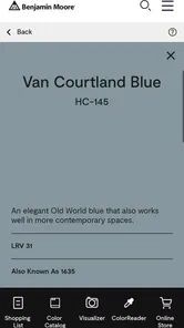
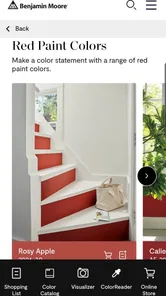
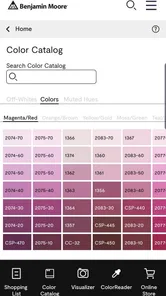
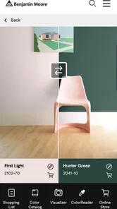
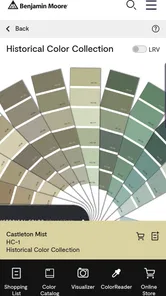
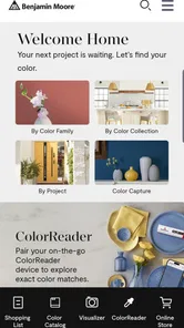
When I’m choosing paint for a room, the hardest part is often narrowing down colors before I buy anything. Color Portfolio is a House & Home app from Benjamin Moore & Co. that gives me a way to explore paint colors on my phone. It is free and rated for Everyone, so it is easy to try without making a purchase commitment. I see its main value as a planning aid: it can help me compare ideas, but I would not treat a phone screen as a reliable substitute for checking a real paint sample in the room.
Who gets the most from a brand-focused palette
I’d recommend starting here if you are already considering Benjamin Moore paint and want to get a sense of its color range before visiting a store or picking up samples. The app is less useful if your first question is which brand offers the best match, since its focus is not a neutral comparison across paint makers. In that situation, I’d use a broader inspiration tool to collect ideas, then bring a few specific color candidates into Color Portfolio for brand-focused exploration.
It also suits people who are still shaping a room’s mood rather than choosing a final wall color. For example, someone furnishing a new apartment could use it to compare a few directions—soft and understated, warm and earthy, or more vivid—before coordinating paint with furniture and flooring. If you already know the exact shade you want, opening an app may add little; a physical sample and a careful look at the room may be the more direct next step.
A practical shortlist beats endless browsing
I would keep a note outside the app as I browse: record each color name alongside the room, surface, and reason it made the cut. That small habit makes it easier to return to a candidate later without relying on memory or a collection of nearly identical screenshots. It also gives me a useful list to take into a paint-shopping conversation, where I can ask about the specific shades I am considering.
There is another advantage to limiting the shortlist: it makes comparisons more meaningful. Rather than jumping between unrelated colors, I’d look at a handful of candidates that solve the same problem, such as finding a neutral that works with a particular wood floor. If none feels right in the actual room, I can widen the search; if one remains appealing, I have a clearer reason to test it physically.
Trust, controls, and what to check
Because a paint-color app can involve room photos or images from a home, I would pause before importing anything personal and look at the permissions and choices shown on my own device. I would not assume that a particular privacy setting, account control, or data-handling practice exists unless it is clearly presented in the app. This is a sensible habit with any home-planning tool: use a non-sensitive image when testing, and share only what you actually intend to share.
The app has an average rating of 3.0 from around 4,600 ratings, with about 340 written reviews, and it has over 100,000 installs. Those figures suggest that people have tried it, but they do not tell me whether it will work smoothly on every device or suit every decorating workflow. Its current version is 2.7.5, and the listed minimum operating system is 7.1; before relying on it for a project, I would check that it runs properly on my phone and that the controls feel comfortable to use.
More From Our News Desk

 Block Blast!
 Makes Every Clear Feel Like One More Turn
A clean little block puzzle becomes a study in space, risk, and self-control. Its best moments come from one satisfying clear; its toughest test is knowing when to stop.

 Super Stylist Fashion Makeover
Super Stylist Turns Dress-Up into a Runway Career
Its makeover-to-client loop turns quick outfit decisions into shareable style theater. The question is whether the closet keeps giving players a reason to return.

 Block Craft 3D:Building Game
Block Craft 3D Under Pressure: How Well Does It Recover When Building Goes Wrong?
A failure-focused look at Block Craft 3D’s forgiving building loop, its uncertain recovery edges, and the moments that demand more than a cheerful village.

 Woodturning
 Trades Creative Freedom for a Satisfying Carving Loop
If your usual creative game is about building, decorating, or styling, Woodturning trades open-ended projects for a tactile, tightly guided carving loop. Here is what that switch really costs.

 PUBG MOBILE
 Shows What Battle Royale Must Get Right
PUBG MOBILE shows how battle royale has matured: bigger systems matter less than meaningful choices, readable fights, and a reason to return after every loss.

 Braindom: Brain Games Test
Braindom’s Social Life Happens Between Puzzles
Braindom turns quick logic traps into a personal ritual, but its community value is more about comparing answers than building together.
Latest News



What to consider before bringing in a room image
When an app offers a way to work with home imagery, the image itself deserves a moment of thought. A close crop of a blank wall can be a sensible test subject if you want to avoid showing family photos, mail, personal belongings, or other details in the room. I’d also check what choices are visible at the point where an image is selected or shared, rather than assuming that an image stays private or is handled in a particular way.
That caution need not make the app difficult to try. It simply means I would start with an image I’m comfortable using and pay attention to any permission request before granting access. If a requested permission does not make sense for the task I’m attempting, I would pause and decide whether to continue. A paint-planning decision rarely needs to be rushed, and I would rather understand the choices on my device than tap through them automatically.
Making screen color useful
The key limitation with any digital paint preview is that the screen is only a guide. Lighting, display settings, nearby furnishings, and the existing wall color can all affect how a shade appears. I would narrow my choices in the app, then view physical samples in the actual room at different times of day before deciding. A color that looks balanced in a bright kitchen may feel quite different in a shaded hallway, so testing in context matters more than finding a convincing-looking preview.
To get a more useful comparison, I would avoid judging a potential wall color against a white phone screen alone. I’d consider the room’s fixed elements—flooring, counters, tile, and large furniture—and ask whether the candidate supports them or competes with them. I’d also check it under the light the room actually gets: daylight and evening lamps can change the impression considerably. The app can help me focus the search, but those real-world checks are what make a decision dependable.
How it compares with familiar alternatives
A general mood-board app is better when I want to gather inspiration from many sources, mix paint ideas with fabrics, or compare products from different brands. A photo editor is better for creative image effects, but those effects do not tell me whether a paint shade will work on a real wall. Color Portfolio’s strongest case is narrower: it gives me a place to explore Benjamin Moore colors while I am thinking about a home project.
That distinction helps set expectations. I would not use it as a substitute for a measuring tool, a renovation budget, or a full room-design planner. If I need to coordinate several materials or organize a large remodel, I’d use tools built for those tasks and treat this as one part of the decision. If I only need a starting point for a paint shortlist, a focused color app may be more convenient than a general design workspace.
A weekend decision, without the rushed purchase
For a realistic weekend project, I might use the app while planning a living-room refresh: browse a few warm neutrals, keep a short list, and compare those candidates against the floor and sofa rather than judging each color in isolation. If I am choosing paint across several brands or need precise room measurements and renovation budgeting, I would pair this with other tools instead of expecting one color app to handle the whole job. It is most useful for exploration, not as a complete interior-design system.
I’d make the first pass from the sofa, where I can see the floor, upholstery, and daylight together, then revisit the shortlist in the room itself. Before buying paint, I would take the color names to a physical sample and see how they behave on the wall. This workflow prevents a common mistake: choosing a shade because it looks attractive by itself, only to discover that it clashes with a fixed feature that is expensive or impractical to change.
Unleashing Your Creative Potential
One of the first things I noticed when using Color Portfolio was its user-friendly interface. You don't have to be a professional artist to navigate through its features. The app is designed for everyone, from beginners to seasoned photographers, to explore their creative instincts without any hassle. I found myself easily lost in the multitude of options available, each more exciting than the last.
The Magic of Color
Color Portfolio offers a vast palette of colors, allowing you to choose from a variety of hues to enhance your photos. Whether you're looking to make a subtle change or a dramatic transformation, the app’s comprehensive color wheel has got you covered. I was particularly impressed by how intuitive the color selection process was, making it easy to experiment with different shades until I found the perfect match.
Filters and Effects Galore
What’s an editing app without a plethora of filters and effects? This app doesn’t disappoint. It includes an extensive range of filters that you can apply to give your photos that extra oomph. From vintage vibes to modern aesthetics, there’s a filter for every mood. I spent hours playing around with different effects, each time discovering a new way to bring my photos to life.
Sharing Your Masterpieces
Once you've perfected your photo, sharing it with the world is just a tap away. The app integrates seamlessly with various social media platforms, allowing you to showcase your creativity with friends and followers instantly. I found this feature particularly handy, as it saved me the hassle of manually uploading photos one by one.
In conclusion, Color Portfolio is more than just an app; it's a gateway to a world brimming with color and creativity. Whether you're a casual user looking to enhance your social media presence or a budding photographer wanting to experiment with new techniques, this app provides the tools you need to express yourself in vibrant detail. So why not give it a try? You might just find your new favorite way to add a little color to your day.
My cautious take
There is a mismatch between the paint-planning role I would expect from a House & Home app and the photo-editing and social-sharing experience described above. I would keep that distinction in mind rather than assuming that every feature suits a paint-selection task. The best reason to try it is to explore colors in a Benjamin Moore-focused setting; for dependable final decisions, I would still rely on physical samples and the room’s real lighting.
Who should pause before choosing it
If you expect a dedicated interior-design workspace, I would look elsewhere first. A focused paint palette does not replace planning room dimensions, tracking renovation expenses, or coordinating every finish in a home. Likewise, anyone who needs to compare paint brands side by side may find a broader research process more useful. This app makes the most sense when the question is specifically about exploring Benjamin Moore colors, not when the whole project needs to be managed in one place.
I would also be cautious about treating any edited or simulated image as proof that a color will look the same on a finished wall. The display can make a shade seem more decisive than it really is, especially when the image has been adjusted or viewed under different lighting. Use the preview to eliminate directions that clearly do not suit the room, then move to real samples for the close call between similar options.
Before settling on a shade
A useful final check is to ask whether a candidate still works when the room is viewed from its usual angles, not just in a close-up or carefully framed image. I’d look at how the color relates to trim and adjacent rooms, too; an appealing isolated wall can feel abrupt when seen from a hallway. Those comparisons are particularly helpful when choosing a strong color, since a bold shade can dominate the view more than it does on a phone.
For a smaller decision, such as refreshing a single accent wall, I’d still keep the same discipline: shortlist, compare against what stays in the room, then test physically. If I’m choosing across multiple connected spaces, I would take more time and consider how the colors transition from one room to the next. The app is a starting point for that thinking, not a guarantee that a whole-home palette will feel coherent.
My cautious take
There is a mismatch between the paint-planning role I would expect from a House & Home app and the photo-editing and social-sharing experience described above. I would keep that distinction in mind rather than assuming that every feature suits a paint-selection task. The best reason to try it is to explore colors in a Benjamin Moore-focused setting; for dependable final decisions, I would still rely on physical samples and the room’s real lighting.
Color Portfolio Frequently Asked Questions
Is Color Portfolio meant for choosing paint colors for a home?
Yes. Color Portfolio is a House & Home app from Benjamin Moore & Co. for exploring paint colors before committing to a project. Its store summary describes sampling thousands of Benjamin Moore colors without picking up a paintbrush, making it useful when you want to browse possibilities and consider color choices for a home.
Is Color Portfolio free, and is it appropriate for all ages?
Color Portfolio is free to download and has an Everyone content rating, so it is presented as suitable for a general audience. It focuses on browsing Benjamin Moore colors, which can be helpful whether you are starting a home project or simply looking for inspiration. As with any app, check the details on your device’s app store before installing.
What is Color Portfolio and what does it offer?
Color Portfolio is a comprehensive app designed to help artists, designers, and color enthusiasts manage and explore color palettes with ease. The app offers tools to create, customize, and store diverse color schemes, making it an essential resource for projects that require precise color coordination and inspiration. It is centered on sampling Benjamin Moore colors, so it can also support people comparing paint ideas for home projects.
How user-friendly is the interface of Color Portfolio?
Color Portfolio boasts a user-friendly interface that is intuitive and easy to navigate, even for beginners. The design is clean and organized, allowing users to seamlessly explore features like color palette creation, adjustment tools, and the ability to save favorite palettes for future reference. Its focus on browsing colors makes it approachable for anyone who wants to explore options without beginning with a physical paint sample.
Is Color Portfolio suitable for professional use?
Yes, Color Portfolio is highly suitable for professional use. It offers advanced features such as detailed color analytics, export options for various design software, and compatibility with industry-standard color models. This makes it an ideal tool for designers, artists, and professionals who require precision in their color work. It can also be useful when a professional wants to browse Benjamin Moore paint colors as part of a home or design project.
Pros
- User-friendly interface for easy navigation.
- Wide range of color palettes available.
- High quality image exports.
- Offline mode for uninterrupted use.
- Customizable palette options.
Cons
- Limited free features.
- Occasional app crashes reported.
- In-app purchases can be pricey.
- No support for animated palettes.
- Requires frequent updates.