Add Text on Photo - Text Art
- 1.60K
- 4.4
- Installs
- 10.00M
- Price
- Free
Screenshots
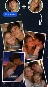
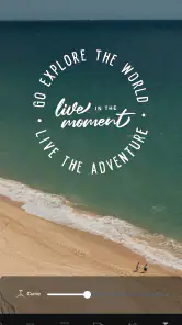
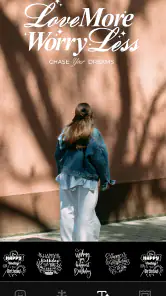
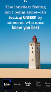
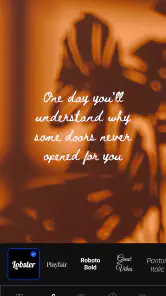
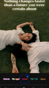
Analysis by Reviewed
Adding a short message to a photo sounds simple, but the result often depends on small choices: where the words sit, how much contrast they have, and whether the style supports the image instead of fighting it. I spent time using Add Text on Photo - Text Art as a practical photography editor, and I found that its main appeal is focus. It is built for putting text over an image quickly, rather than making you work through a full desktop-style editing suite.
The app comes from Eco Mobile Editor and is free to install, with optional in-app purchases ranging from $1.39 to $65.60 per item. It is rated for Everyone, runs on Android 8.0 and later, and the current version is 1.4.98. Those details make it fairly approachable for casual users, although the purchase range is worth keeping in mind if you plan to explore paid extras rather than staying with the basic workflow.
How I use it for a clean first result
My usual starting point is not to choose a decorative style immediately. I first pick the photo, add the wording, and place it where the image has enough visual breathing room. This matters because a fancy font cannot rescue text that sits across a busy face, a bright sky, or a detailed background. The app works best when I treat it as a tool for composition, not just a button that turns a picture into a poster.
For a quick social post, I keep the message short and test its position against the main subject. A title near the top can work well when the lower part of the image contains the action, while a caption near the bottom is easier to read when the upper half is visually crowded. I also avoid placing important words too close to the edges. Even if the editor shows the whole canvas, different social platforms may crop images later.
The basic workflow is comfortable for everyday jobs: choose a photo, enter text, adjust its appearance, and save the finished image. That simplicity is the strongest reason to use it. I do not have to learn layers, masks, or a complicated timeline just to make a birthday card, a sale announcement, a quote image, or a labeled snapshot.
One useful habit is to write the final wording before styling it. When I experiment with fonts first, I tend to accept a design that looks attractive but leaves too little room for the actual message. Writing the text first also makes it easier to judge whether the image needs one line, two lines, or a shorter phrase. This is a small change, but it makes the editor feel much faster.
Choosing a readable look instead of the loudest one
The app is clearly aimed at stylish text, so it is tempting to keep trying decorative treatments. I get better results when I start with a readable option and only add personality afterward. A script-like appearance can suit a personal greeting, but it is a poor choice for a small announcement that people need to understand at a glance. Likewise, very thin lettering may disappear when the image is compressed.
More From Our News Desk
Weather by Xiaomi Review: Clear at a Glance, Less Clear Up Close

X Under Pressure: Can It Recover When Posting Goes Wrong?

Clash of Clans Is Won Between the Battles

Android Auto Makes the Case for Quieter Car Software

MobiOffice: Transforming Mobile Productivity with Seamless Integration

EA SPORTS FC™ Mobile Soccer: Redefining Mobile Sports Gaming
I judge the text at the size where people will actually see it. A design that looks excellent while editing on a phone can become difficult to read in a small feed preview. I also check the image without zooming in, because that gives a better sense of its real balance. If the wording is the first thing I notice, the style is probably too strong; if I have to search for it, the contrast or placement needs work.
The most reliable workflow is to solve readability first and decoration second. That principle is more valuable here than collecting as many visual effects as possible. It helps the app produce usable images instead of merely busy ones.
Settings I check before saving
I pay particular attention to text size, alignment, color, and placement before exporting. These are the controls that change whether a finished image feels intentional. A centered message is not automatically the best choice: left alignment can look more natural over a landscape, while centered text can suit a symmetrical portrait or a simple background.
Color selection deserves more care than it usually receives. White text is popular because it is quick, but it can disappear over clouds, pale walls, or light clothing. Dark text has the opposite problem on shadows and night scenes. I compare the lettering with the area directly behind it, not with the photo as a whole. A color that looks attractive in the palette may still be weak in the exact place where the words sit.
When an outline, shadow, or other separation option is available in the editing controls, I use it lightly. Strong separation can make text readable, but too much creates a sticker-like effect that distracts from the photograph. I prefer a modest adjustment and a simpler font over piling several effects on top of each other. This is especially important for portraits, where aggressive styling can compete with facial details.
I also check whether the text box is balanced relative to the image. If the message has two lines, I look at the gap between them and the distance from the subject. A line break can change the entire composition. Breaking after a short word may leave one line looking awkwardly isolated, while a more deliberate break can create a visual block that feels stable.
Another practical question is whether the final image needs to be edited again elsewhere. If I intend to continue working in another photography app, I keep the design restrained and avoid making every decision here. If this is the final stop, I spend more time checking the edges, spelling, and overall contrast. Knowing the next step prevents me from treating every edit as if it has to do everything.
Repeatable patterns that make editing quicker
Experienced use of this app is less about rushing through individual taps and more about repeating a dependable order. I choose the image, type the exact message, set a readable size, place it away from important details, check contrast, and only then explore a more expressive style. Following that sequence reduces backtracking because each decision has a clear purpose.
For a series of related images, I keep the visual language consistent. I use a similar text position and avoid changing the style just because a different option happens to look interesting on one photo. Consistency is particularly useful for event pictures, product snapshots, or a set of travel images. The app is not a full brand-design system, so I create that consistency through my own habits rather than expecting the editor to manage it for me.
A good everyday example is preparing a last-minute invitation. I might take a photo of a cake, a decorated room, or a simple background, then add the event wording in a clear area. Instead of covering the central subject, I place the details in open space and use a style that remains readable on a small screen. The result can be ready quickly, but it still looks considered because the text follows the image rather than hiding it.
For marketplace or community posts, I use the editor differently. The text needs to identify the item or message immediately, so I avoid elaborate lettering and keep the wording compact. A short label over a well-lit area is more useful than a large decorative sentence that obscures the product. This is one situation where a general-purpose design app may offer more control, but this editor is convenient when the job is simply to label a photo.
For motivational images and greetings, I allow more personality. Even then, I keep the number of visual decisions limited. One expressive font, one strong color, and a carefully chosen position are usually enough. Combining several dramatic treatments can make a personal message feel like a template, which is not always the mood I want.
Where it sits beside other photo editors
Compared with a standard photo editor, this app feels more direct when the main goal is text. A traditional editor may give me better control over exposure, cropping, retouching, and color correction, but those extra tools can slow down a simple caption job. If I already like the photograph and only need wording on top, Add Text on Photo - Text Art gets closer to the task I actually want to complete.
Compared with a full graphic-design app, it is less suitable for complex layouts. I would choose a broader design tool for several text blocks, carefully measured margins, reusable brand elements, or a project that needs many pages and formats. Those apps are better when text is the main structure of the design. This one makes more sense when the photograph remains the star and the words provide context, mood, or a clear callout.
It also differs from social media editors, which often combine text with stickers, templates, music, and platform-specific publishing tools. Those editors can be faster for content that is going straight into a story or short video. I prefer this app when I want a standalone image that I can save, reuse, or send through another channel without building the entire post inside a social platform.
Limits that become clearer with regular use
The focused approach is helpful until a project becomes demanding. If I need precise graphic design control, a large multi-part composition, or detailed image correction before adding text, I quickly reach the point where another app is more appropriate. This editor is convenient, but convenience should not be confused with the flexibility of a professional layout tool.
Decorative choices can also create friction. Having stylish options encourages experimentation, yet not every option is equally practical for long sentences, small screens, or busy photographs. I sometimes have to simplify my original idea because a look that works for a short title does not work for a paragraph. The app is strongest with concise wording, and users who want to place substantial text should set realistic expectations.
There is also a difference between making an image attractive and making it communicative. A visual effect may add energy, but it can reduce legibility or make the message feel less personal. I recommend previewing the result at normal viewing size and asking someone else to read it without explanation. If they need to zoom in or ask what the words say, the design needs another pass.
The free entry point is useful, but anyone considering optional purchases should decide first whether the basic tools already cover their needs. I would not pay simply to collect more styles without a specific project in mind. A paid option makes more sense when it solves a repeated limitation in the kind of images you create, rather than when it only adds variety.
Who will enjoy it most
I think this photography app suits people who regularly add short captions, greetings, labels, announcements, or quotes to existing pictures. It is also a sensible choice for someone who finds full design suites intimidating and wants a narrower tool with a quick learning curve. Families, casual creators, small community sellers, and anyone preparing a simple image on a phone can get useful results without turning the task into a design project.
It is less convincing for users who need advanced typography, exact alignment across many assets, extensive photo correction, or a carefully managed visual identity. Those users will probably be happier with a more complete design or photo-editing package, even if it takes longer to learn. I would also skip it for text-heavy posters where the wording needs to dominate the layout.
The app has established a substantial audience, with a 4.4 average from around 157 thousand ratings, roughly 1.6 thousand written reviews, and over 10 million installs. That level of use makes it easier to see why the straightforward concept has appeal, but popularity does not remove the need to judge whether its focused feature set matches your own workflow.
My verdict after building a practical habit around it
Add Text on Photo - Text Art is a useful specialist rather than an all-purpose editor. I like it when I already have a good photo and need to turn it into a message quickly. Its best results come from restraint: short wording, strong contrast, sensible spacing, and one clear visual idea. The app makes those jobs approachable, while still leaving enough room for personal choices in style and arrangement.
My recommendation is strongest for casual photography projects and quick social graphics, not for professional layout work. Before saving, I would always check spelling, view the design without zooming, and consider how the image may be cropped after export. Those habits compensate for the app’s narrower control set and make the finished result more dependable.
As a free app for Android users on version 8.0 or later, it is easy to try without committing to a complicated workflow. The Everyone age rating also makes its basic purpose broadly accessible. I would keep the optional purchase range in mind, but I would begin with the free experience and judge it by one real task: whether it lets me create the kind of text-over-photo image I need without unnecessary effort.
In my experience, that is where it succeeds. It does not replace a complete photo studio or design workspace, and it should not try to. When the job is to add a readable, attractive message to a photograph and move on, the focused approach is exactly what makes it worthwhile.
Add Text on Photo - Text Art Frequently Asked Questions
Will the app work on an iPhone or iPad?
Add Text on Photo - Text Art is a photography app for Android, with Android 8.0 as its minimum operating-system requirement. If you are considering it for an iPhone or iPad, check the app’s availability in the relevant store before downloading, since the Android version is intended for compatible Android devices. On Android, also make sure you have enough free storage for the app and the photos you plan to edit.
Who developed Add Text on Photo - Text Art, and is it widely used?
The app is developed by Eco Mobile Editor and focuses on adding styled text to photos. It has an average rating of 4.4 from around 157,000 ratings, with over 10 million installs. Those figures suggest it has attracted a sizeable audience, although individual experiences can differ depending on the device, the editing tools someone needs, and whether they prefer free or paid options.
What devices and operating systems can run Add Text on Photo - Text Art?
Compatibility is worth checking before you install, especially if your phone is older. Add Text on Photo - Text Art is a photography app for Android, and its listed minimum requirement is Android 8.0. Make sure your device meets that requirement and has enough free storage for the app and the images you plan to edit. The app is free to download.
What is Add Text on Photo - Text Art used for?
Add Text on Photo - Text Art is designed for creating customized images with written messages, captions, quotes, invitations, social media posts, and promotional graphics. After testing its editing workflow, I found that it focuses mainly on adding and styling text over photos rather than offering advanced photo retouching. It can be useful for beginners who want a quick way to produce attractive text-based designs on a mobile device.
What text editing and design features does the app offer?
The app provides tools for changing font styles, text size, color, alignment, spacing, and positioning. Depending on the available version, users may also find effects such as shadows, outlines, opacity adjustments, backgrounds, stickers, and decorative elements. These controls make it possible to create anything from a simple caption to a more elaborate text-art composition, although the exact feature selection may vary by device and app update.
Pros
- Offers many fonts and text styles for creative photo designs.
- Text can be resized
- rotated
- and positioned with simple gestures.
- Includes decorative stickers and effects for extra customization.
- Useful for creating social media posts
- quotes
- and promotional graphics.
- Supports quick editing without requiring advanced design skills.
Cons
- Some fonts
- effects
- or design tools may require in-app purchases.
- Free exports may include ads or other interruptions during editing.
- Complex designs can feel difficult to manage on smaller phone screens.
- Image quality may depend on the resolution of the original photo.
- Limited advanced controls compared with professional design applications.
- Category
- Photography
- Version
- 1.4.98