 About Weather - By Xiaomi
Weather by Xiaomi Review: Clear at a Glance, Less Clear Up Close
A weather app earns trust in the seconds between waking up and deciding what to wear. Weather - By Xiaomi understands that glance-first job: its home screen puts current conditions and the day’s outlook in view without asking you to learn a complicated system. The trade-off is that the interface’s quiet simplicity sometimes hides how to move deeper, correct a mistake, or tell which details deserve attention. Its design is strongest when you want a quick answer, and less sure-footed when you want to interrogate the forecast.
A calm forecast, with a few quiet ambiguities
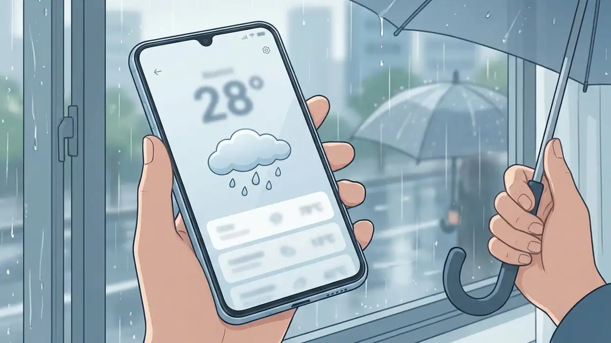
The central design idea is straightforward: make the weather feel like a readable scene rather than a data dashboard. The current temperature and conditions carry the opening view, while supporting information sits around them in a scrolling page. This is a sensible hierarchy for an app most people open briefly, often outdoors or while getting ready. It also gives the experience a recognizable softness: weather is presented as something to understand at a glance, not a set of measurements to decode.
That restraint matters. A crowded forecast can make a simple decision feel like work, while an overdecorated one can blur the difference between atmosphere and information. Xiaomi’s interface generally keeps the main answer prominent. Yet calmness has a cost: some secondary elements do not announce their importance clearly, so a user can mistake a useful forecast detail for mere decoration or overlook a control tucked into an otherwise passive-looking screen.
First use: orientation before exploration
On first opening the app, the key question is immediate: what is it like here, and what should I expect next? The current conditions answer the first part quickly. The location context helps establish whose weather is being shown, while the forecast beneath gives the screen a natural forward direction. That order is well judged. It does not make a new user start with menus or settings before delivering the app’s basic value.

Location permission is the first meaningful interruption, and it is also the point where the design must explain itself. A weather app has a clear reason to ask for location, but people may prefer to enter a city manually or limit access. The best version of this flow makes those options feel like legitimate choices, not obstacles to the forecast. Xiaomi’s overall presentation is direct enough to keep the purpose understandable, though the experience is less reassuring if a user is unsure whether the displayed place came from device location or a saved selection. A small, persistent location label is more than housekeeping here; it anchors the forecast.
After that initial orientation, the screen invites scrolling rather than presenting a row of obvious destinations. This keeps the first view uncluttered, but it also means discovery depends on noticing that the page continues. For a casual user, that is usually fine. For someone checking rain timing before a walk or comparing the next few days, the app should make the depth of its forecast legible without requiring a hunt.
Navigation and hierarchy: a page, not a control panel
The app’s navigation feels built around one primary surface. You arrive at a location and move through its forecast vertically, with related information arranged as sections rather than scattered across a maze of tabs. That is a good fit for the task. It preserves a clear mental model: the place stays constant while the time horizon expands as you move down the page.
The hierarchy is less convincing when the user wants to change the subject of the screen. Switching locations, adjusting preferences, or finding a less obvious view involves shifting attention away from the forecast itself. These actions are secondary, but they are not rare. People travel, commute, and check the weather where a friend or family member lives. The design should distinguish the active location from the content around it and make changing that location feel like a deliberate, reversible action.
There is a useful contrast with apps such as Google Wallet, where the interface is organized around explicit items and actions: choose a pass, then use it. Weather is more fluid; the same page serves as both answer and browsing surface. Xiaomi sensibly avoids forcing every forecast detail into a separate destination, but its reliance on a continuous page can make navigation feel implicit. A stronger visual cue between the location controls and forecast content would help without turning the app into a tab-heavy dashboard.
Feedback after actions: the forecast should confirm the change
Weather screens are mostly read, not operated, so interaction feedback can seem unimportant. It is not. Pulling to refresh, selecting another city, or changing a setting alters information people may act on immediately. The interface should acknowledge those actions clearly: a refresh should look in progress and then settle; a location change should make the new place unmistakable; a preference change should show that it took effect.
In ordinary use, the app’s visual calm makes its status easy to read when the forecast is already loaded. The weaker moments are transitions, when the screen can feel more static than the action deserves. A clear loading cue and a brief confirmation would reduce the temptation to repeat a tap or wonder whether the app registered it. The most valuable feedback is not a flourish. It is a quiet confirmation that the number on screen belongs to the place and update the user intended.
That principle is especially important for forecasts that change across time. A temperature or rain indicator needs a clear temporal frame: now, later today, or a particular day. When those labels are visually subordinate to the data, users must infer more than they should. The app benefits from putting context close to the forecast value instead of asking people to remember which section they are reading.
Friction and recovery: make the wrong turn cheap
The most consequential design problem is not that the app asks users to make choices; it is whether they can recover when their choices produce an unexpected screen. A wrong city, a denied permission, or a refresh that appears to do nothing should all have an obvious way back. Weather is local by nature, so location errors are particularly costly: an otherwise polished forecast is useless if it quietly belongs to somewhere else.
Recovery works best when the app keeps the current location visible and provides a direct route to change it. If a user has denied location access, manual city selection should remain easy to find. If the forecast has not updated, the interface should distinguish stale information from a current reading rather than leaving the user to guess. Xiaomi’s compact approach avoids a barrage of prompts, which is welcome, but it could do more to make these edge cases feel like supported paths instead of exceptions.
There is also a small but real friction in discovering what can be tapped. A section that looks like a card may invite a tap even if it is only informational; a control that resembles a label may fail to signal that it opens another view. Consistency in affordances would reduce this uncertainty. The user should not need to test the interface by tapping every interesting-looking element.
Consistency and the small screen
The visual language is coherent across the main experience: information remains grouped, the page stays focused on the selected place, and the weather itself does not compete with a dense layer of controls. That consistency makes the app approachable. It also gives the interface room to work on a phone without shrinking a complex dashboard into an unreadable one.
On a small screen, however, vertical order becomes a design decision with practical consequences. The first viewport should answer the most urgent questions, while deeper sections should reward scrolling with meaningful detail. Xiaomi generally gets the opening balance right, but users who want a specific item farther down may have to pass through material that feels less important to them. A little more emphasis on section boundaries and a clearer sense of how much remains would make long-page browsing feel intentional.
Spacing and restraint are useful only when they preserve meaning. If supporting details are too visually quiet, they become easy to miss; if every item receives equal emphasis, the screen loses its calm. The design’s task is to create contrast through hierarchy, not simply through size. Xiaomi comes close, but occasional ambiguity between the forecast’s headline and its supporting context keeps the page from feeling fully resolved.
What an expert user notices
Frequent users develop their own scan pattern. They may go straight to the near-term outlook, check a particular hour, then compare the next few days. For them, consistency is not merely aesthetic; it is speed. Keeping familiar information in stable positions makes repeated checks nearly automatic. Weather - By Xiaomi earns points for centering the experience on one forecast page instead of forcing a fresh navigation decision each time.
That same expert eye spots gaps in control and precision. People who plan around changing conditions want to distinguish a broad summary from a detailed timeline, understand when information was updated, and switch locations without losing their place in the app’s mental model. The interface serves the quick-check user more confidently than the planner. It communicates the broad picture well, but the route from broad picture to precise answer could be more explicit.
Here, comparison with a task-heavy app such as AliExpress is useful only in one respect: different jobs demand different levels of visible structure. A shopping app can expose filters and categories because browsing is the task. Weather should not imitate that density. But it should borrow the underlying clarity: controls need names and locations that users can predict. Restraint does not mean hiding the route to detail.
The strongest design choice
The best decision is the app’s commitment to a single, readable forecast surface. It gives the experience a steady center and respects the way people actually use weather information: a quick check, followed by deeper reading only when plans depend on it. There is no need to decode a feature maze before seeing the conditions, and the page’s structure gives casual users a reliable starting point.
This choice also makes the app feel less demanding than services that turn every visit into a prompt to explore. Weather is often a utility, not a destination. A design that lets people get an answer and leave is doing something right. The improvement Xiaomi needs is not more content on the first screen; it is better signposting between the quick answer and the decisions that follow.
A useful everyday tool, not yet a perfect instrument
Weather - By Xiaomi is most successful when it behaves like a well-arranged glance: current conditions first, a clear sense of what comes next, and no unnecessary ceremony. Its visual restraint and page-centered navigation suit a utility people open for seconds at a time. The design has a coherent point of view, and that matters more than a longer feature list.
Its weaknesses are equally specific. Location and refresh states could be more unmistakable, tappable elements could communicate their behavior more consistently, and the path from summary to precise forecast detail could be easier to read. These are not reasons to dismiss the app; they are the difference between a screen that looks calm and an interaction that feels dependable under pressure.
My verdict is favorable but measured: Xiaomi has designed a weather app that is easy to approach and pleasant to scan, yet it sometimes asks users to infer too much about navigation and state. As an everyday forecast for quick decisions, it gets the fundamentals right. To become a more trustworthy planning tool, it needs to make every change visible and every route back obvious.