Prisma Art Effect Photo Editor
- 19.92K
- 4.5
- Installs
- 50.00M
- Price
- Free

Screenshots
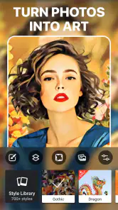
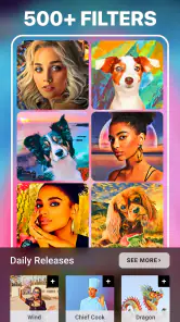
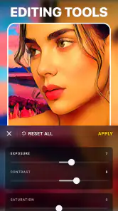
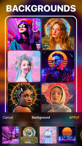
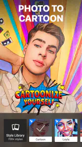
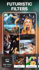
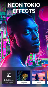
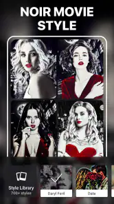
Analysis by Reviewed
When I first opened Prisma Art Effect Photo Editor, I understood its appeal quickly: it is built to turn an ordinary photo into something that feels deliberately styled, rather than merely brighter or sharper. This is a photography app from Prisma Labs, Inc., and its focus is artistic editing, portrait changes, creative selfies, and playful transformations. I would not approach it as a complete replacement for a traditional camera editor. I see it more as a fast way to give a familiar image a strong visual identity.
That distinction matters for a first-time user. If you want careful exposure correction, detailed color grading, or precise object removal, a conventional photo editor may suit you better. If you want to experiment with a portrait, make a social image stand out, or find a fresh look without spending a long time adjusting sliders, this app is much more inviting. It is free to install, rated for Everyone, and available for devices running Android 9 or later. Optional purchases range from $0.99 to $49.99 per item, so the free starting point is useful, but it is sensible to pay attention to which creative options are available without an upgrade.
What to expect before editing your first photo
The main experience is intentionally visual. Instead of asking you to understand editing terminology before you begin, the app encourages you to choose an image and explore artistic treatments. That makes the first session less intimidating than opening an editor filled with technical controls. I found the strongest results came from photos with a clear subject, good separation between the person and the background, and enough light to show facial features or important shapes.
A busy photograph can still be interesting, but a dramatic effect may make its details compete with one another. For a first attempt, I would choose a well-lit portrait, a pet looking toward the camera, or a simple street scene with one obvious focal point. This is one of the easiest ways to get a meaningful result quickly: start with an image that already has a readable composition instead of expecting an effect to rescue a weak photo.
The app’s appeal comes from the difference between a normal snapshot and a finished-looking image. That does not mean every treatment will work equally well. Some styles can make skin look too smooth, flatten small facial details, or push the colors farther than you intended. I recommend judging an effect at the size where you plan to share the image. A result that looks exciting when enlarged may become muddy or overly intense when viewed as a small profile picture.
There is also a useful creative trade-off here. Strong effects are memorable, but subtle effects are usually easier to live with. I often prefer to begin with the most distinctive option, then compare it with a calmer alternative before saving anything. This prevents the first impressive preview from automatically becoming the final choice.
The app has attracted a large audience, with over 50 million installs and an average rating of 4.5 from around 1 million ratings. Those figures suggest that its basic idea is easy for many people to understand, but popularity does not remove the need to choose images carefully. Its store short description is “Prisma Art,” while the broader experience is best understood as a quick, effect-led photography workshop for portraits, selfies, and expressive everyday pictures.
How the first setup feels
After installing it, I would keep the first session simple. Open the editor, choose one photo that you already know well, and resist the temptation to import a whole collection immediately. Working with one image lets you learn how the preview changes, how you compare styles, and where the save or sharing action appears without turning the process into a search exercise.
The current version is 4.6.6.637, and the app is free to begin using. Because in-app purchases are part of the experience, I would treat the first launch as a trial rather than assuming every visible style is included. If a treatment is marked as paid, move on and learn the editing flow with an available option first. That way you can decide whether the app’s particular look is worth spending money on before committing to anything.
One practical habit makes the setup less frustrating: keep the original image untouched. If you are editing a photo from your phone’s gallery, do not rely on memory to recreate it later. Save the finished version as a separate result whenever the app gives you that choice, and compare it with the original outside the editor. Artistic processing can make an image feel better while you are looking at the dramatic preview, but the side-by-side comparison reveals whether the face, background, and important details still look natural enough for your purpose.
I also recommend beginning with a photo that is not emotionally irreplaceable. A casual selfie or a spare landscape is ideal for learning. This removes the pressure of getting the first edit perfect and gives you freedom to test a bold treatment, back out, and try something else. Once you understand the rhythm, you can bring in family photos, travel images, or pictures intended for a profile without feeling unsure about the controls.
For a first-time user, the most important setup question is not technical. It is deciding what the image is supposed to do. A profile picture benefits from a clear face and moderate styling. A birthday post can handle something more playful. A printed image may need a calmer treatment than a temporary social post. Choosing the destination first helps you avoid selecting an effect simply because it looks dramatic in isolation.
The quickest route to a first successful edit
My recommended first workflow is short. Pick a single portrait, preview several artistic looks, identify the one that preserves the eyes and general shape of the face, and then compare it with a less intense option. Do not judge only by novelty. Ask whether the result still looks like the person in the photo. When the answer is yes, you have found a useful starting point.
For selfies, I would avoid beginning with the most aggressive treatment. Facial effects can be especially sensitive to lighting, hair, glasses, and background contrast. A style that looks polished on one face may produce strange emphasis on another. Try the same treatment on a second image before deciding that it is your favorite. This small test is a non-obvious but valuable step because it separates a genuinely flexible style from one that only works with a particular pose or lighting setup.
For a travel photo, look for a treatment that strengthens the main shape rather than covering every detail. Buildings, bridges, and landscapes often benefit when the effect supports their lines and silhouettes. If the preview turns distant textures into a flat pattern, choose a softer result. The point is not to preserve every pixel; it is to keep the scene recognizable while giving it a different mood.
A useful everyday example would be a quick birthday message. I might take a normal group selfie, choose an expressive artistic treatment, and use the result as the image accompanying the message. The process is faster than building a composite design, and the final picture feels more personal than a plain snapshot. I would still check the faces at normal viewing size, because an effect that makes the background attractive can sometimes make people less recognizable.
Another good use is refreshing an old photo for a private creative project. Rather than posting the original again, you can make an alternate interpretation and compare the two. This is where the app feels more rewarding than a basic brightness-and-contrast editor: it encourages a change in mood, not just a correction of technical flaws.
Once you have a result you like, save it and look at it outside the editing screen. This is the point where I make the final decision. The editor’s preview is designed to keep you engaged, while the gallery or message window shows whether the image actually works in context. If the result still catches my eye without overwhelming the subject, I consider the edit successful.
Confusion points that can affect the result
The first common misunderstanding is expecting every effect to improve every photo. Artistic processing is selective. A close-up portrait, a full-body image, and a dark indoor selfie can react very differently to the same treatment. When a preview looks awkward, I would not immediately blame the app or the photo. Try a different image with clearer lighting and a simpler background first.
The second is confusing a finished effect with a complete retouching workflow. The app can help create a distinctive picture, but it is not the best choice when your goal is a series of small, controlled corrections. If you need to remove a tiny distraction, balance several colors precisely, or make a large batch of images look consistent, a conventional editor with detailed adjustment tools may be more efficient. Prisma is strongest when the creative transformation itself is the point.
Selfies deserve extra caution. A stylized result can be fun, but repeated smoothing or exaggerated facial treatment may remove the features that make the picture feel like you. I prefer using the app to explore a visual character rather than to chase an idea of perfection. If the eyes, smile, or face shape stop feeling familiar, reduce the intensity or choose another style.
Another source of friction is the difference between free access and optional purchases. Since the app is free but includes individual in-app purchases from $0.99 to $49.99, a first-time user should not assume that a preview automatically means unrestricted use. I would explore the accessible choices first, decide whether the overall editing approach fits my taste, and only then consider paid options. This is especially important for occasional users who may only need one creative image.
The age rating of Everyone makes the app approachable for a broad audience, but that does not mean every result will be appropriate for every setting. A playful selfie effect may be perfect for friends and feel out of place on a professional profile. Think about the audience before saving or sharing. The app gives you creative freedom; it does not choose the social context for you.
Performance can also feel different depending on the image and device. Large photos, complex edits, or repeated experimentation may take more patience than a simple preview. I avoid opening several demanding tasks at once and give the app time to finish before tapping repeatedly. This is basic advice, but it prevents accidental duplicate actions and makes the first session feel more controlled.
How it compares with familiar photography apps
Compared with a standard photo editor, Prisma is less about fixing and more about interpreting. Traditional tools usually win when you want a natural image with corrected lighting, accurate colors, and carefully adjusted detail. They are also better for repeatable workflows where a group of photos needs to share the same treatment. I would choose one of those alternatives for product photos, documents, or a polished professional portfolio.
Compared with a typical selfie editor, this app feels more artistic than cosmetic. A selfie-focused tool may concentrate on skin, facial proportions, makeup-like changes, and quick beautification. Prisma’s appeal is broader: it can make a selfie look illustrated or dramatically reimagined, but it can also give a landscape, pet photo, or city image a new visual direction. That makes it more interesting for users who want their pictures to feel expressive rather than simply perfected.
It also differs from a collage or template app. Those apps help you arrange several images, add text, and build a designed post. This one is more useful when a single photograph is the raw material and the style of that photograph needs to change. If your project depends on captions, borders, layouts, or multiple panels, another category of app will probably save time.
My practical rule is simple: use Prisma when the question is “What creative version of this photo could I make?” Use a conventional editor when the question is “How can I make this photo technically cleaner?” There is some overlap, but the distinction keeps expectations realistic and helps you choose the right tool before editing.
Ways to get more from the app without overworking it
One advanced habit is to build a small personal test set. Keep three different kinds of images available: a face, a scene with strong geometry, and a photo with a busy background. Preview the same few styles across all three. You will quickly learn which looks are versatile and which depend on a particular subject. This is more useful than choosing favorites from a single portrait because it reveals how consistent your results will be.
Another is to use the app for variations rather than one supposedly perfect answer. Save a restrained version and a bold version, then wait until you see them in your gallery. The restrained edit may work better as a profile image, while the bold one may be ideal for a creative post. Creating both versions takes little extra effort and avoids forcing one treatment to serve every purpose.
I also find it helpful to crop with the final destination in mind before becoming attached to an effect. A face that looks balanced in a full portrait may be cut off in a square profile image. A beautiful landscape may lose its focal point in a narrow story format. If the app’s editing view lets you work with the full image first, remember to check the eventual crop afterward. The artistic treatment should support the composition you will actually publish.
Finally, keep a clean original and name exported variations clearly if you are experimenting with several looks. This is particularly useful for older photos or shared family images. It prevents the common mistake of losing track of which version is natural, which is stylized, and which one you intended to send. The app is enjoyable partly because experimentation is quick, so a little organization lets you experiment without creating confusion later.
Who should install it, and who should skip it
I would recommend this app to someone who wants a fast creative result, enjoys trying different visual moods, or feels that ordinary phone photos have become repetitive. It is especially approachable for a first experiment because you can begin with one familiar image instead of learning a full technical editing system. Portraits, casual selfies, pets, travel scenes, and social posts are all sensible starting points.
I would be more cautious about recommending it to photographers who need precise control, consistent color, or professional retouching. It may also disappoint anyone who expects every effect to look natural. The best results are intentionally stylized, and that means some previews will be too strong, too flat, or simply unsuitable for the particular photo. Users who edit large batches may prefer a tool designed around repeatable adjustments rather than individual artistic choices.
People who only need occasional edits should begin with the free experience and see whether the available options are enough. Frequent users may find value in exploring more of the creative selection, but the purchase range makes it worth deciding what kind of editing habit you actually have. I would not pay simply because an effect is visible; I would pay only after finding a style I would realistically use more than once.
For a first meaningful success, choose one well-lit image, test a few treatments, compare a strong look with a restrained one, and save the version that still works outside the preview screen. That process answers the most important beginner questions: what the app is for, whether its style suits you, whether the free starting point is sufficient, and whether your device and photos produce results you like.
Overall, I see Prisma Art Effect Photo Editor as a focused and enjoyable photography app rather than an all-purpose editing toolbox. Prisma Labs, Inc. has made the central idea easy to approach: take an ordinary image and explore a more artistic interpretation. Its limitations become clear when you need detailed corrections, predictable batch work, or subtle professional finishing, but those are not the situations where I would reach for it anyway.
My recommendation is to try it when you want a photo to feel different, not merely improved. Start with a spare image, keep the original, and judge the result in the place where you plan to use it. If you enjoy expressive portraits and quick visual experiments, the free installation is an easy invitation to explore. If your priority is accuracy and control, keep a traditional editor nearby and treat this app as the creative companion rather than the complete solution.
Pros
- Transforms photos with distinctive painting and artistic effects.
- Offers many styles for portraits
- landscapes
- and everyday snapshots.
- Simple interface makes applying and comparing filters quick.
- Regularly adds new creative effects and seasonal style options.
- Processed images are easy to share on social media and messaging apps.
Cons
- Many of the best filters require a premium subscription.
- Some effects need an internet connection to process properly.
- High-resolution exports may take longer on older devices.
- Intensive editing can drain battery during extended sessions.
- Results may vary significantly depending on the original photo quality.

- Category
- Photography
- Version
- 4.6.6.637