Fonts Keyboard
- 16.53K
- 3.9
- Installs
- 100.00M
- Price
- Free
Screenshots

Analysis by Reviewed
I judge a keyboard by how it feels during ordinary tasks, not just by how many decorative styles it offers. Fonts Keyboard is a free personalization app from Fonts Keyboard, and its appeal is straightforward: it gives people who enjoy expressive messages another way to make short text feel more like their own. It is best understood as a style-focused alternative to the keyboard already on your phone, rather than a tool for improving every part of typing.
Readability beyond the novelty
Decorative lettering can be charming in a greeting, profile caption, or playful message, but it is not automatically easier to read. I’d keep a clear, familiar style for directions, longer notes, work conversations, and anything someone may need to scan quickly. A useful habit is to draft in an expressive style, then reread the message in context before sending. If a letter shape makes you pause, your recipient may have the same problem.
The app has a 3.9 average from around 1.3 million ratings, and it has been installed over 100 million times. Those figures suggest broad interest, but they don’t tell me whether every font will suit a particular reader or display consistently in every app. The practical test is your own usual mix of chats and social posts: try a style in the place you plan to use it, and check that it stays legible on the screen and to the people receiving it.
Articles Related to Fonts Keyboard
Making expressive typing work in daily life
Fonts Keyboard works best when I treat its styles as accents rather than a permanent replacement for plain text. In a birthday message, for instance, I might use a decorative look for a name or a brief opening, then switch back for the details. That keeps the personal touch without making the whole message harder to follow. It is also a sensible way to decide whether the keyboard’s visual options add enough value to justify changing your everyday typing routine.
Navigation and a low-friction setup
The published app version is 5.0.81.51948, and Android support starts at version 6.0. The setup is presented as a guided keyboard integration, which should feel familiar if you have enabled a third-party keyboard before. Still, changing keyboards involves leaving the app and following device settings, so it may take a little patience if you rarely adjust your phone. I’d complete setup when I have a few quiet minutes, then test the keyboard in a low-stakes chat before relying on it for an important message.
For someone who types quickly, one useful approach is to choose a small handful of styles rather than browse every option whenever inspiration strikes. A consistent favorite reduces interruptions and makes it easier to return to ordinary text. If you mainly want standard autocorrect, predictive typing, or a minimalist layout, your phone’s built-in keyboard may be the better fit; Fonts Keyboard’s distinctive value is visual expression, not a reason by itself to replace a keyboard that already works well.
Motor and sensory considerations
People who find small keys difficult to target should pay attention to the keyboard’s feel on their own device. Font variety changes the appearance of text, but it does not necessarily make keys larger or easier to reach. I would try a short message first and notice whether switching styles adds extra taps or slows down a familiar rhythm. Anyone who depends on a particular key layout or established accessibility setting should check that those needs remain comfortable before making this their default.
You May Like

MobiOffice: Transforming Mobile Productivity with Seamless Integration

How Microsoft OneDrive Became a Mobile Productivity Giant

How Google Translate Breaks Language Barriers Effortlessly

Why Google Sheets Is the Ultimate Mobile Productivity Tool

Unveiling the Dynamic World of My Talking Tom Friends

Free Fire MAX: Dominating the Battle Royale Arena
Visual choice can cut both ways. A distinctive style may help a short message feel noticeable, yet unusual letterforms can create extra visual effort, especially in a long paragraph or on a busy screen. I’d reserve expressive text for brief phrases and use ordinary lettering when clarity matters most. That small distinction makes the app more practical without asking every recipient to interpret highly stylized writing.
When the keyboard earns a place
A realistic use case is composing a social caption while waiting for a friend: add a short flourish to the opening, switch back for the useful information, and read the result once before posting. It suits people who enjoy personalizing messages and are happy to trade a little speed for visual variety. It is less suited to someone who wants an unchanged, highly predictable typing experience, or who regularly sends long, information-heavy text where decorative lettering gets in the way.
Compared with staying on a phone’s default keyboard, this app puts more emphasis on typographic personality. Compared with simply copying styled text from another tool, having styles available while typing can make quick experiments feel more convenient. The trade-off is that special-looking characters may not behave like ordinary text everywhere; if a style looks odd in a particular app, switching to a plain style is the sensible fallback rather than forcing it.
Free to try, with practical boundaries
The app is rated for Everyone and is free to download, with in-app purchases ranging from about fifty cents to thirty dollars per item. I’d start with the free experience and decide whether any paid extras matter to my own habits before spending. Its 17,000 reviews offer another place to look for recent user experiences, but I would focus on comments about the specific device and use case I care about rather than assume everyone’s keyboard behaves identically.
As with any third-party keyboard, I’d take a moment during setup to read the system’s keyboard notices and make an informed choice about enabling it. That is a sensible step for anyone, especially people who type sensitive information often. If the setup, visual styling, or keyboard behavior does not feel right, switching back to the built-in keyboard is a reasonable choice; personalization should not come at the cost of comfort or confidence.
A measured recommendation
After trying its central idea, I see Fonts Keyboard as a playful option for short, expressive writing rather than an all-purpose accessibility or productivity solution. The developer is Fonts Keyboard, and the app’s large audience shows that this kind of customization has clear appeal, but popularity cannot decide whether its lettering works for your eyes, hands, or recipients. I’d recommend giving it a test if you like styling captions and casual messages, while keeping a plain-text option ready for anything important or lengthy.
Let's dive into this nifty app called Fonts Keyboard. You know how sometimes you want to spice up your messages with some cool fonts? Well, this app is like a treasure trove for typography enthusiasts. I recently gave it a whirl, and here's the lowdown.
Unleashing Creativity with Typographic Flair
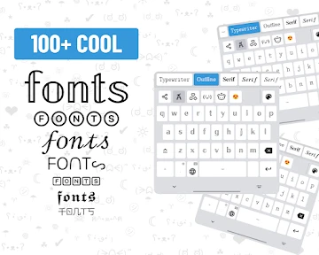
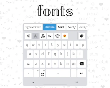
First off, the moment you open the app, it's like stepping into a world of endless font possibilities. The app offers a pretty vast collection of fonts, and the best part is, it's super easy to switch between them while typing. I was thrilled to find everything from elegant cursive to quirky and bold styles. Whether you're messaging friends or posting on social media, this app lets you express yourself in a whole new way.
User-Friendly Experience
Now, let's talk about usability. The app is designed with the user in mind. Setting it up was a breeze, even for someone like me who tends to get tangled in tech setups. Once installed, you can seamlessly integrate it with your device's keyboard. I found the interface to be intuitive, with clear instructions guiding you to customize your keyboard just the way you like it.
Compatibility and Performance
One thing I was curious about was how well it would run on different devices. I'm happy to report that Fonts Keyboard performed like a charm on both Android and iOS. No crashes, no glitches, just smooth sailing. The fonts loaded quickly, and I didn’t experience any lag while switching between them, which is a huge plus. It’s like having a personal font artist at your fingertips!
Personalization and Fun
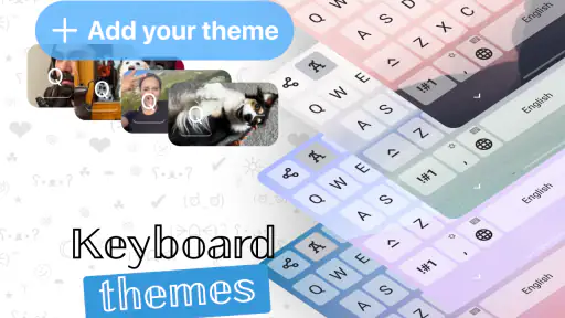
Another thing that caught my attention was the level of personalization it offers. You can not only change the font style but also adjust the size and color to match your mood or the theme of your message. I had a blast experimenting with different combinations, and it really adds a personal touch to your communications. Plus, it’s a fun way to stand out and make your texts memorable.
In conclusion, if you're looking to add a dash of creativity to your everyday typing, Fonts Keyboard is definitely worth checking out. It's easy to use, works like a dream across devices, and offers a delightful array of typographic options. Give it a try, and watch your messages come alive with personality and flair!
Choosing styles that suit the moment
One way I’d make this keyboard useful without letting it take over is to give each style a job. A playful look can mark the first line of an invitation, while ordinary lettering carries the time, place, and any practical details. For a profile caption, I’d keep the stylized part short enough to scan at a glance. This gives the visual treatment a purpose, rather than turning every message into a test of how much decoration it can hold.
It also helps to consider the person reading the message. A close friend who enjoys playful typography may welcome a distinctive greeting; a group chat coordinating a pickup or appointment benefits more from text everyone can read quickly. I would not assume that a font that looks clear to me will be equally comfortable for someone with different vision or display settings. When in doubt, keep the decorative flourish optional and put essential information in plain text.
A small workflow for everyday use
For a quick social post, I’d write the complete thought first, then add styling only to the words that benefit from emphasis. That order makes it easier to catch missing details and avoid spending time polishing a phrase that later needs rewriting. Before posting, I’d check line breaks and punctuation as well as letter shapes; a style can look attractive in the keyboard and still feel crowded once the full caption is visible in its destination.
For recurring messages, such as a familiar sign-off or a short greeting, settling on one readable style can save repeated browsing. I’d keep a plain-text version of any important wording available too, especially when sending a message that needs to be copied, searched, or reused. This is a practical compromise: the keyboard can add personality, while the useful content remains easy to reproduce without reconstructing its styling.
When another keyboard is the better tool
If my priority were faster everyday typing, a keyboard built around familiar layout, predictive assistance, or a particular input method would be a more sensible starting point. Fonts Keyboard is appealing when appearance matters, but its special lettering is not a substitute for the established tools someone may rely on for efficient writing. Likewise, people who need a highly consistent visual presentation should test how the text appears in the specific messaging or social app they use most before adopting it as their default.
Copy-and-paste font tools can be a better choice for someone who styles only an occasional bio or headline and does not want to change their keyboard. The advantage of a keyboard-based approach is that experimentation happens while composing; the disadvantage is making a system-level keyboard change for a task that may be rare. I’d choose based on frequency: regular styling can justify the convenience, while a once-in-a-while flourish may not.
Checking comfort before committing
For people with motor or sensory needs, I’d treat a short trial as a comfort check rather than a promise that the app will solve an access problem. Try ordinary typing, a style switch, and a brief edit in the same kind of conversation you usually use. Notice whether the keyboard remains predictable and whether the finished text is easy to review. If any step creates strain, confusion, or extra effort, returning to a familiar keyboard is a perfectly reasonable outcome.
The same cautious approach applies when typing in a hurry or while attention is divided. A decorative style can make a message more personal, but browsing options is an unnecessary distraction when I’m navigating, taking care of a task, or trying to send a time-sensitive detail. I’d save experimentation for a calm moment, then use the clearest option when the situation calls for speed and accuracy.
Who is likely to enjoy it
I can see Fonts Keyboard suiting people who write short captions, casual greetings, or playful messages often enough to appreciate having visual choices close at hand. It may also appeal to someone who likes experimenting with presentation and does not mind occasionally checking how a chosen style appears after sending. The strongest fit is not simply “anyone who likes fonts”; it is someone whose everyday communication includes brief, low-stakes text where personality matters as much as speed.
I’d advise skipping it as a primary keyboard if your routine depends on plain, highly legible text, a specific keyboard arrangement, or minimal interruption. It is also a poor match if you rarely style messages and would rather keep your current setup untouched. Those are not failures of the app; they are signs that its central trade-off—more visual choice in exchange for a change to typing habits—does not suit the way you use your phone.
Inclusive verdict
My recommendation is a measured one: Fonts Keyboard can make short writing feel more personal, but accessibility depends on the person, device, setting, and recipient. I would test a few styles alongside plain text, keep important information easy to read, and avoid treating decorative lettering as a readability aid. If the keyboard feels comfortable and its appearance works in the apps you use, it can earn a place for expressive moments; if not, the built-in keyboard remains a sound choice.
Fonts Keyboard Frequently Asked Questions
What should I know about Fonts Keyboard before downloading it?
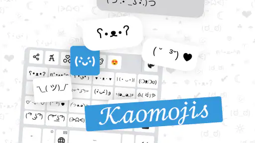
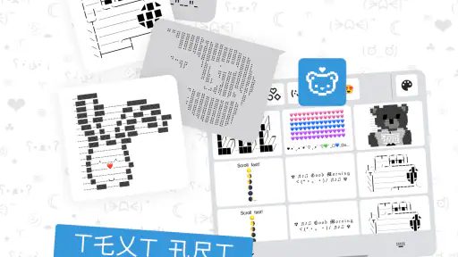
Fonts Keyboard is a personalization app for adding style to everyday typing. Its store summary describes Kika Keyboard with cool symbols, emoji, and stylish font stickers for cute text. If you want decorative text for messages or social posts, that gives you a quick sense of its purpose. The keyboard is optional to use, so consider whether its styles and customization approach suit your preferences.
Can Fonts Keyboard create decorative text for social media and messages?
Fonts Keyboard is intended to make typing more expressive with font styles, symbols, emoji, and stickers. You can use it when writing in apps that accept text input, which may be useful for messages, captions, or profile text. Keep in mind that decorative characters may display differently across apps and devices, so it is sensible to check how a finished message appears before sharing it.
Is Fonts Keyboard suitable for people who prefer a standard keyboard?
Fonts Keyboard is aimed at people who want to customize the look of their typing rather than keep every message plain. You can choose whether to use its keyboard for a particular text field, so downloading it does not mean every message must be decorative. If you mainly want a familiar standard layout, consider whether the extra font and symbol choices are worth adding to your keyboard options.
What devices and operating systems can run Fonts Keyboard?
Fonts Keyboard is available for devices running Android 6.0 or later. Before downloading, check your device’s operating system version in its settings to make sure it meets this requirement. The app is a personalization tool for changing the style of your typing, so compatibility with the operating system is separate from whether a particular app accepts its font effects.
What is Fonts Keyboard and how does it work?
Fonts Keyboard is a mobile application designed to enhance your typing experience by providing a variety of unique fonts. Once installed, it integrates with your existing keyboard, allowing you to easily switch between different font styles while typing in any app. This adds a creative touch to your messages, social media posts, and more, without needing to switch apps.
Pros
- Wide variety of fonts available.
- Easy-to-use interface design.
- Compatible with most apps.
- Regular updates with new fonts.
- Customizable keyboard settings.
Cons
- May slow down typing speed.
- Ads can be intrusive.
- Limited free font options.
- Can drain battery quickly.
- Requires full access to function.
- Category
- Personalization
- Version
- 5.0.81.51948