Benefits OnLine
- 1.05K
- 3.5
- Installs
- 1.00M
- Price
- Free

Screenshots
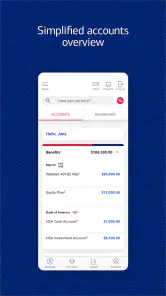


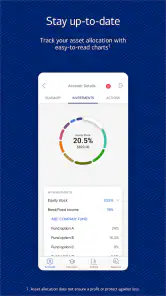
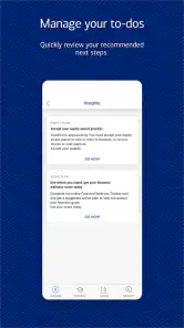

Analysis by Reviewed
Managing retirement and workplace benefits is rarely difficult because of one complicated task. The real challenge is keeping track of several small decisions: checking a balance, reviewing a contribution, finding a document, or confirming whether an update actually went through. Benefits OnLine is built for that kind of routine. I found it most useful as a focused finance app for people whose retirement and benefit information is handled through Merrill Lynch, Pierce, Fenner, and Smith Inc.
The app is free and available to an Everyone-rated audience, with a minimum operating system requirement of 11. Its current version is 26.08.02, and its purpose is clear from the first screen: it provides access to retirement and benefit services rather than trying to become a complete personal-finance hub. That narrow focus is both its strongest quality and its biggest limitation.
After spending time with it, my view is straightforward: Benefits OnLine works best when you treat it as a regular check-in tool, not as a replacement for a full budgeting or investment app. It can make benefit administration less dependent on a desktop browser, but the value depends heavily on what your employer plan supports and how often you need to use those details.
How I would use Benefits OnLine in an ordinary week
A practical starting routine
My preferred workflow begins with a simple purpose before opening the app. I decide whether I am checking a current retirement balance, reviewing contributions, looking for plan information, or handling a benefits-related task. That small habit matters because a workplace benefits portal can contain several kinds of information, and aimless browsing quickly becomes less efficient than a short, deliberate visit.
For a first-time user, I would sign in and spend a few minutes identifying the main areas that are relevant to the employer plan. I would not immediately change a contribution rate or make a retirement decision just because a menu makes the option visible. Instead, I would first understand where the app places balances, activity, documents, and plan guidance. Knowing the route to each item makes later visits much faster.
A realistic example is checking the account after payday. I might open the app, confirm that a contribution appears, review the displayed balance, and leave. That is a better use of the mobile experience than trying to conduct a long planning session while standing in a checkout line. The app is most comfortable for quick verification and access to information already connected to the workplace plan.
I also recommend separating “checking” from “deciding.” A balance screen can tell me what is currently displayed, but it does not automatically tell me whether my savings rate suits my goals. Likewise, seeing a contribution does not mean that every payroll or tax question has been answered. Benefits OnLine can support the information-gathering part of the process, while more involved decisions may require plan documents, an adviser, or the employer’s benefits team.
What makes the mobile format useful
The main advantage over relying only on a computer is convenience. Retirement information is often ignored when access requires remembering a website, finding a laptop, and navigating a browser session. A dedicated app lowers that friction for people who only want to perform a quick review. I found that especially useful for building a repeatable habit: open the app at a planned time, check the relevant information, and close it without turning the visit into an unplanned financial deep dive.
That convenience should not be confused with completeness. The app is not designed to replace every financial service on a phone. It is not the natural choice for tracking bank accounts, building a household budget, comparing credit cards, or monitoring investments held outside the workplace relationship. If those are your main goals, a broader personal-finance application will usually be more suitable.
Settings and account details worth checking
Experienced use starts with checking the practical setup rather than assuming the default experience is ideal. I would review the sign-in process, device access, and any available security choices before relying on the app for regular account checks. I would also make sure the contact and plan information shown inside the account looks familiar. A small mismatch is easier to investigate before an urgent transaction or enrollment deadline.
Notifications deserve a thoughtful approach as well. If the app offers alerts connected to account activity or plan communication, I would enable only the ones that help me act. Too many low-value notifications train me to dismiss everything, while a useful reminder can prevent an important document or task from being overlooked. The right balance is personal: someone who checks weekly may need fewer prompts than someone who rarely opens the app.
I would also inspect how documents and messages are organized. Benefits information can be easy to lose among unrelated email, particularly when a notice concerns a plan rule rather than an immediate transaction. If the app provides access to relevant documents, I would use it as a central place to review them and make a note of the document title or subject for later reference. That is a simple but effective habit when speaking with human support.
Another worthwhile check is the app’s behavior after an update. The current version is 26.08.02, so users should keep their device environment compatible with the minimum requirement of 11. I would not update immediately before an important benefits deadline without allowing time to sign in again and confirm that the account opens normally. This is not a criticism unique to Benefits OnLine; it is sensible preparation for any app that handles financial information.
Shortcuts that make repeat visits less tiring
The fastest pattern I found is to use the same order every time. I start with the item that prompted the visit, review the current information, look for any related message or document, and then stop. Repeating that sequence prevents me from wandering through every menu and makes it easier to notice something unusual.
For contribution checks, I would compare the displayed activity with the expected payroll timing rather than judging the account from the balance alone. A balance can change for several reasons, while a contribution entry is more directly connected to the question I am asking. If something looks delayed or unfamiliar, I would record the date and description before contacting support. That creates a clearer conversation than saying only that “the number looks wrong.”
For document-heavy tasks, I would read the relevant material before changing a setting. A plan document may explain eligibility, timing, or consequences that a short screen cannot summarize. The app can make the document easier to reach, but it does not remove the need to read it. My rule is simple: use the app for access and organization, then slow down for decisions with lasting effects.
Another useful pattern is to avoid making changes on a poor connection or while distracted. A mobile interface encourages quick taps, but retirement and benefits choices deserve a final review. I would check the selected value, read the confirmation screen, and save any confirmation details that the app presents. If the screen does not clearly show that a change was accepted, I would not assume success merely because the button responded.
Where the app is strong for experienced users
The app’s focused nature helps people who already know what they need. Someone who has used a workplace plan for years may not want a long educational journey each time they check a contribution or retrieve plan information. A direct mobile route can be more practical than a general financial dashboard filled with accounts that have nothing to do with employment benefits.
It is also useful for people who want a regular review habit without carrying a paper file or waiting until they are at a desktop. A monthly or payday check can help users notice changes early, especially when they already understand their plan and only need access to current information. The app becomes a convenient front door to an existing relationship rather than a complete financial coach.
The audience size suggests that this is not an obscure utility: Benefits OnLine has more than one million installs, with an average rating of 3.5 from roughly 3.4 thousand ratings and about 1.1 thousand written reviews. I read that combination as evidence of a mixed but established experience. It is widely used, yet the rating does not suggest that every user finds the interface effortless. That matches my own balanced impression: the purpose is useful, but the experience can feel functional rather than polished.
Important limits before you depend on it
The first limitation is eligibility. This is not a general retirement tracker that anyone can use simply because they want to compare savings. Its usefulness depends on having an applicable workplace or benefit relationship. If your employer does not use the relevant service, installing it will not turn it into a universal account aggregator.
The second limitation is scope. I would not choose Benefits OnLine as my main tool for household financial planning. It does not replace a spending tracker, a broad investment portfolio app, or a tax organizer. Those alternatives are better when the goal is to combine information from several institutions or understand total net worth. Benefits OnLine is the better choice when the question is specifically tied to workplace retirement or benefits access.
The third limitation is the difference between information and advice. A mobile account view can make figures easier to see, but it cannot know every detail of a person’s income, emergency savings, debt, tax position, or retirement plans. I would be cautious about making a major change based on a single screen. The app should support a decision, not pretend to make the decision for me.
There can also be friction when a user expects a desktop-level experience on a phone. Mobile access is convenient, but some tasks are naturally easier when reading longer documents, comparing choices side by side, or keeping several references open. For those situations, I would use the app to locate the information and then move to a larger screen if the available service supports that route. Convenience is not the same as the best workspace for every task.
Who should use it and who should skip it
I would recommend it to employees and plan participants who need a practical mobile way to review retirement or benefit information connected with Merrill Lynch, Pierce, Fenner, and Smith Inc. It is particularly suitable for people who already know the basics of their plan and want a repeatable check-in routine. It can also help users who tend to postpone account reviews because desktop access feels inconvenient.
I would suggest skipping it if you are looking for one app to manage every part of your financial life. A broader alternative will be more useful for budgets, spending categories, outside investment accounts, and household-level reporting. I would also avoid treating it as a substitute for professional guidance when a decision involves complicated tax, beneficiary, or retirement-planning consequences.
Families may need to set expectations carefully. One person’s workplace account does not automatically make the app a shared household dashboard. If partners manage finances together, they may still need separate planning tools or a clear process for discussing what each person sees. The app can provide access to the relevant account, but it is not necessarily the complete collaboration space a household wants.
My verdict after building a repeatable habit
Benefits OnLine earns its place on my phone when I use it for a defined job: checking workplace retirement and benefit information without waiting for a computer. The best experience comes from a disciplined routine, sensible notification choices, careful review of documents, and a pause before confirming important changes. Those habits make the focused design feel more useful than it may seem during a casual first visit.
At the same time, I would not oversell it. The average rating of 3.5 shows that the experience is not universally smooth, and the app’s narrow purpose means many people will need another financial tool alongside it. Its free price removes the cost barrier, and its Everyone age rating makes it broadly approachable, but neither point changes the need for an applicable workplace plan.
My final recommendation is conditional but positive: if your retirement or benefits account is supported, install it and use it as a regular verification tool. Start with short visits, learn where your key information lives, and keep major decisions separate from quick balance checks. If you want budgeting, complete portfolio analysis, or a unified view of several financial institutions, choose a broader app instead. For the right user, Benefits OnLine is a practical access point that rewards consistent habits more than constant exploration.
Pros
- Centralizes employee benefits
- discounts
- and rewards in one app.
- Personalized offers make relevant savings easier to discover.
- Useful search and category filters help find benefits quickly.
- Mobile access lets users check perks while shopping or traveling.
- Regular updates can introduce new offers and participating providers.
Cons
- Access may require an eligible employer or membership account.
- Available benefits vary significantly by company and location.
- Some offers have restrictions
- exclusions
- or limited validity periods.
- Certain discounts may redirect users to external websites or apps.
- The interface and offer quality can depend on employer configuration.

- Category
- Finance
- Version
- 26.08.02