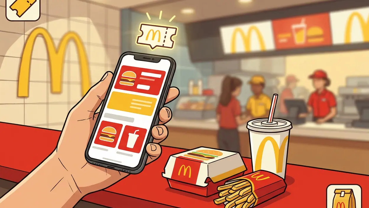
 About McDonald’s: Cupons e Delivery
McDonald’s Coupons Work Best When They Fit the Meal You Planned
A McDonald’s order can be decided before you reach the counter, but the app’s most useful trick is not delivery tracking or a slick menu. It is the coupon: a small, time-sensitive offer that can change what you order and what you pay. McDonald’s: Cupons e Delivery is at its best when those deals fit naturally into a meal you were already planning. Its value is less about dramatic savings than about making the quick, familiar choice a little smarter.
The coupon is the feature worth opening the app for
The name points to two jobs, coupons and delivery, but the coupon experience deserves its own close look. It turns the app from a digital menu into a practical prompt: check what is available, compare it with your usual order, and decide whether an offer is worth changing course for. That sequence sounds ordinary. In practice, it is the difference between a discount you actually use and a promotion you notice only after paying full price.
Coupons are most convincing when they attach to things people already buy: a familiar sandwich, a side, a drink, or a combination that makes a meal feel complete. Rather than asking users to learn a new service, the app puts a possible saving beside a well-known menu. The mental effort is low. You do not need to research a restaurant, decode a points scheme, or plan a special trip; you just check whether a deal suits the appetite and budget you have today.
What the offer actually does
At a basic level, a coupon gives a user access to a promotional price or bundled offer, subject to the terms shown in the app and availability at the relevant restaurant or ordering channel. The practical routine is simple: browse the offers, choose one that matches your order, and follow the app’s instructions to redeem it. Depending on the offer and local setup, that may mean presenting it in person or applying it during an eligible order.


That qualification matters. A coupon is not a universal price promise, and the app should not be treated as proof that every restaurant, menu item, or delivery option will accept the same deal. The useful habit is to check the conditions before building an order around an offer. When the restrictions are clear, the feature feels straightforward. When they are easy to miss, the discount can become a small source of friction instead of a welcome surprise.
Why a modest discount matters
Food promotions are often judged by the size of the number on the screen. That misses the more important question: does the offer reduce the price of something you would have bought anyway? A discount on a familiar meal can help someone keep a routine affordable, especially when ordering for more than one person. A large-looking deal on an unwanted item, by contrast, is not much of a saving at all.
There is also a timing advantage. The app can put current offers in front of you before you commit at the counter or in the delivery flow. That extra moment changes the decision from “What should I order?” to “Is there a better-priced version of what I already want?” It is a small shift, but a useful one: the coupon works as a shopping aid rather than a push to spend more just because a promotion exists.
Latest News



That is where the feature earns its place on a phone. A printed voucher can be forgotten; a web search can turn up expired promotions or unclear terms. An in-app offer is closer to the ordering decision and easier to inspect in context. It does not remove the need to read the conditions, but it reduces the distance between seeing a deal and acting on it.
The best real-world moment
The clearest use case is a rushed lunch break. You are already heading to a nearby McDonald’s, you know roughly what you want, and you have a few minutes before ordering. A quick check of the coupon section may reveal a cheaper way to get that meal or a combination that suits the group. If the offer fits, you redeem it and move on. If it does not, you have spent only a short moment checking.
That scenario is deliberately unglamorous, and that is why it works. The app does not need to persuade you to build a new habit around coupons. It only needs to make the existing habit—choosing lunch—slightly more informed. For a family ordering several meals, the same check can be worthwhile because small differences add up across an order. But the value still depends on matching the deal to real preferences rather than treating every promotion as a reason to add something.
How coupons change behavior
The feature creates a brief pause before purchase. Instead of moving straight from craving to checkout, you scan the available offers and reconsider the order. This can encourage a switch to a better-value bundle, or simply confirm that your usual choice is still the right one. Either outcome is useful. A good coupon interface should help you decide, not make you feel that you have failed by ignoring a deal.
There is a trade-off: promotions can nudge people toward larger orders or items they did not plan to buy. The app’s usefulness therefore depends on a little discipline from the user. I would treat the coupon as a comparison tool, not a shopping list. Ask whether the offer lowers the cost of a meal you wanted; if it instead makes you spend more for food you do not need, the discount has done its job for the seller, not for you.
Used selectively, the feature may also make a restaurant visit feel more deliberate. You arrive knowing which offer you intend to use rather than discovering a deal after you have chosen. That can make the counter interaction smoother, provided the redemption method is clear and the offer is valid where you are ordering.
Where the design feels smart
The strongest design choice is keeping promotions close to the menu and ordering context. Coupons have little practical value if they are buried in a separate loyalty portal or scattered across external pages. By placing them within the brand’s own app, McDonald’s gives the user one place to browse offers and consider food choices. The design serves a focused purpose: reduce the work required to find a deal before ordering.
Its familiar setting helps, too. McDonald’s menu is recognizable to many customers, so the app does not have to explain what every product is before a coupon makes sense. That familiarity makes offer comparison quick. The best version of this experience is not a fireworks display of savings; it is an offer that is easy to understand, easy to redeem, and relevant to the order already in mind.
The feature also pairs naturally with delivery without making coupons dependent on delivery. That distinction is useful. A user can think about an offer while deciding whether to collect food, order at a restaurant, or have a meal brought to them. The app’s broader role is to connect those choices, while the coupon supplies a concrete reason to check it before committing.
Where it still falls short
Promotions have boundaries, and those boundaries can blunt the feature. Offers may vary by location, channel, time, or item, and an attractive deal is less helpful if its conditions appear only after a user has started assembling an order. A coupon should make the final price easier to understand. If the customer has to backtrack to discover an exclusion or a redemption requirement, the app has added a task rather than removing one.
There is also the question of consistency. A coupon section is only worth checking if users believe it is current and relevant. A sparse selection, repeated offers, or deals that do not match local availability can turn a quick habit into a ritual with little payoff. The app cannot guarantee that every visit brings a worthwhile discount, so the experience is strongest when checking takes seconds and expectations stay modest.
Finally, a discounted menu price does not automatically make the entire order cheaper. Delivery fees and other charges can alter the total, while minimums or channel-specific rules may affect whether an offer applies. The sensible comparison is the amount payable at checkout, not the headline price of one item. That is a basic point, but it is exactly where promotion design can either earn trust or create confusion.
How rivals solve the same problem
Other popular apps show how different the coupon challenge is from simply keeping someone entertained or moving them through a city. Google Maps is built around a concrete task: get from here to there. Its guidance earns attention by making the next turn obvious. McDonald’s coupons have a similar need for clarity, but their task is financial: tell users what qualifies, what it costs, and what action redeems it.
Games such as Trivia Crack: Brain Quiz Games, 8 Ball Pool, and Subway Surfers keep people returning through repeated play, competition, or progress. That is a different kind of stickiness. A food app should not need to occupy spare hours. Its success is measured by whether it helps at the moment of choice and then gets out of the way. Against those rivals, coupon utility is less about daily engagement than about being reliably useful in a short window.
That comparison also sets a fair standard. The app does not need the richest feature set in a phone’s library; it needs a clear offer, a fair redemption path, and a checkout total that matches what the user expects. In that narrow job, simple design beats constant novelty.
Who gets the most value
Regular McDonald’s customers are the natural audience, especially people who already know their go-to orders and are willing to check for a better price before buying. Families and groups may also benefit when an offer covers a combination or helps make a larger order more manageable. For these users, the coupon section can become a quick pre-order check rather than another app to explore for its own sake.
Occasional visitors can still benefit, but they may need to spend more time comparing offers with the menu and checking the conditions. Someone who rarely eats at McDonald’s should not install the app expecting a steady stream of meaningful savings. The value depends on frequency, location, available promotions, and whether the deals fit personal preferences. It is a practical extra, not a reason to order food you did not want.
The best coupon is the one that makes your planned meal cheaper, not bigger. That principle keeps the feature honest from the user’s side and makes it easier to judge whether an offer is genuinely useful.
The final assessment
The coupon feature in McDonald’s: Cupons e Delivery succeeds by addressing a small, recognizable problem at exactly the right time: customers want to know whether their usual order can cost less. Its value comes from proximity to the menu and the convenience of checking promotions before paying, not from any grand reinvention of fast-food ordering.
There are caveats. Local availability and redemption rules matter, and the headline discount is not the same as a lower final bill. The app works best when offers are clear enough to compare quickly and users resist spending extra simply to claim a deal. With those limits understood, this is a useful feature for regular customers: modest, practical, and worth a brief look before an order. It will not transform lunch, but it can make a familiar choice feel a little better judged.