MD339 Digital watch face
- 52.00
- 4.4
- Installs
- 10.00K
- Price
- $2.99
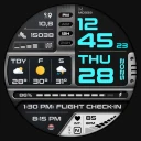
Screenshots
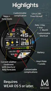
Analysis by Reviewed
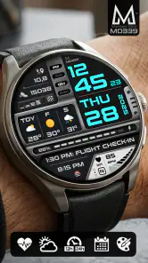
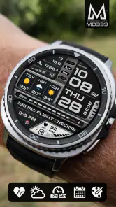
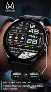
MD339 Digital watch face is the kind of personalization app I would choose when I want my smartwatch to feel more like a useful daily instrument than a decorative screen. It is made by Matteo Dini MD ® Watch Faces and costs $2.99, placing it in the paid-watch-face category rather than the crowded field of free designs. The main idea is straightforward: put time, weather updates, health information, and complications together so I can check more at a glance.
That sounds simple, but the quality of a watch face depends on how well those elements work during real routines. A design can look impressive in a store preview and become tiring when I am checking it in bright daylight, walking between appointments, or trying to read a small data field without stopping. My experience with MD339 Digital watch face is that its strongest appeal is practical customization. It is aimed at people who want information close at hand, while still caring about the overall appearance of the watch.
The app belongs to the personalization category and has an Everyone content rating, so it is easy to approach as a general-purpose accessory rather than a specialist health tool. It has a 4.4 average from around 430 ratings, with roughly 52 written reviews and over 10K installs. Those figures suggest a modest but established audience, not the scale of a default platform feature. The face was released on Aug 20, 2025, and its short store label is MD339.
What to expect from the design
Before installing, I would set the right expectation: this is a watch-face experience, not a replacement for a full weather app, fitness dashboard, or health platform. Its value comes from bringing selected information into the place I already look at repeatedly. That distinction matters because a watch face has limited room. The more complications I add, the greater the chance that the display feels busy or that I start reading labels instead of information.
MD339 Digital watch face is most attractive to someone who likes a data-forward layout. I can imagine using it on a workday when I want the current time, an idea of the weather, a health-related glance, and access to familiar complications without opening separate screens. It also makes sense for a user who changes watch faces according to context: a simpler face for evenings, and MD339 when the day involves commuting, errands, or outdoor plans.
The first useful decision is not which decoration to choose. It is deciding which information deserves space. I recommend beginning with only the items I genuinely check. Weather is useful before leaving home, while a health field may matter more during a walk or a busy day. Adding every available complication immediately can make the face harder to understand, especially when the watch is viewed quickly rather than studied.
Compared with the usual alternatives, MD339 sits between a minimalist built-in face and a highly specialized fitness display. A default minimalist face may be easier to read, but it often gives up the glanceable detail that makes a smartwatch valuable. A fitness-focused screen may offer more activity emphasis, but it is not always the best choice for appointments, messages, weather checks, and ordinary timekeeping. MD339 is a compromise: more informative than a plain clock, but still intended to remain part of the watch rather than become a complete dashboard.
More From Our News Desk

Clash of Clans Is Won Between the Battles

Android Auto Makes the Case for Quieter Car Software

MobiOffice: Transforming Mobile Productivity with Seamless Integration

EA SPORTS FC™ Mobile Soccer: Redefining Mobile Sports Gaming

How Microsoft OneDrive Became a Mobile Productivity Giant

How Google Translate Breaks Language Barriers Effortlessly
How I would approach the first setup
After installation, I would avoid trying to perfect the face in one pass. The most reassuring path is to apply MD339, look at it in the situation where I normally check my watch, and then adjust the information that feels least useful. This approach is better than making choices while staring at a static preview because a watch face is read in motion, at different angles, and under changing light.
The first setup should focus on three questions. Can I identify the time immediately? Can I tell which small area contains weather or health information? Can I reach the complication I care about without having to remember an unfamiliar arrangement? If the answer to any of these is no, I would simplify before changing the entire design.
One practical tip is to treat the complication areas as a limited budget. A field that looks attractive but rarely helps me is taking attention away from something I use every day. For a first-time user, I would keep the most important data in the easiest-to-recognize positions and leave secondary areas alone until the basic layout feels natural. This is a small change, but it prevents the common mistake of turning an informative watch face into visual noise.
Weather information also deserves a realistic expectation. I would use it for a quick decision, such as whether to take a jacket or plan a walk, rather than treating the watch face as a detailed forecast. The same principle applies to health data: a glance can help me notice a trend or remember a routine, but it should not replace a deeper look when accuracy or context matters.
The first successful action
For me, the first meaningful success would be leaving home, raising my wrist, and getting a useful answer without opening another screen. Imagine a weekday morning: I check the time, glance at the weather, and see the health-related detail I chose during setup. If that takes one quick look, MD339 has already justified its place on the watch. The success is not merely installing the face; it is reducing a small amount of friction in a routine I repeat.
I would test that moment in more than one setting. First, I would check it indoors while getting ready. Then I would look again outside, where brightness and movement can expose whether the arrangement is genuinely readable. Finally, I would use it during a short walk or commute. This three-part check helps separate a design that looks good in a calm setup screen from one that works during ordinary use.
Another useful workflow is to assign each visible area a job. One area can answer “what time is it?”, another can answer “what should I expect outside?”, and another can answer “how is my day progressing?” The exact choices depend on the complications available through the watch, but the principle is specific to MD339’s data-oriented appeal: every visible element should earn its place.
I also like the idea of using the face as a prompt rather than a report. Seeing a health-related field can remind me to move, pause, or check a longer-term record later. Seeing weather can remind me to change plans before I am already outside. This makes the face more useful than a collection of numbers, but only if I keep the information limited enough to notice quickly.
Where first-time users may hesitate
The most likely confusion is understanding the difference between the watch face and the information supplied by the watch ecosystem. MD339 presents weather, health data, and complications, but those details still depend on the connected watch and its available sources. If a field appears empty, outdated, or unfamiliar, I would first check whether the underlying watch feature is configured correctly before assuming the face itself is broken.
Another point of friction is the temptation to judge the face from a single glance after installation. Data-rich designs often need a short adjustment period. My eyes have to learn where the important information lives, especially if I have been using a very simple face. I would give the layout a normal day before deciding whether it is too dense, then remove fields that I repeatedly ignore.
There is also a trade-off between information and calm. MD339 is not the right choice for someone who wants the watch to disappear into the background. If I prefer a large, isolated time display with almost nothing else competing for attention, a simpler alternative will probably feel better. Paying for MD339 makes sense when I will actually use its glanceable data, not merely because a more detailed face appears more advanced.
Small complications can create their own reading habits. I would avoid checking them while walking near traffic, crossing a road, or doing anything that requires attention. The convenience of a watch face should not encourage distracted behavior. For deeper health interpretation or a detailed forecast, I would still use the relevant app when I have time to read the context properly.
Making the layout work for everyday routines
One of MD339’s practical strengths is that it can support different kinds of days without requiring me to open a separate information screen for every small question. On a workday, I might prioritize the time, calendar-related access, and weather. On a walking day, I might give more attention to health information. The useful insight is that I do not need one permanent arrangement simply because the watch face is installed; I can think of the layout as a daily tool and adjust it when my priorities change.
A good test is the “three-second glance.” I would raise my wrist briefly and ask whether I can understand the primary information before the screen goes dark or my attention moves elsewhere. If I need to stare at the display, the face is carrying too much detail for my routine. This test is especially helpful for first-time users because it turns a vague feeling of clutter into a clear setup decision.
I would also avoid placing similar types of information next to one another unless that grouping genuinely helps. Weather and health data may both be useful, but they answer different questions. Separating their roles mentally makes the face easier to scan. Likewise, if a complication is only useful once or twice a week, I would consider giving that space to something I check every day.
The weather function is particularly useful as a planning shortcut. Before leaving for lunch, I can use the glance to decide whether outdoor seating is sensible or whether I should bring another layer. That is not a substitute for a full forecast, but it is exactly the kind of small decision a watch face can improve. The health information works similarly: it can provide a quick cue during a busy day, while a longer review belongs elsewhere.
Because the app is paid, I would be more demanding about long-term usefulness than I would be with a free face. The price is modest, but the face should become part of my routine rather than remain an experiment. I would keep it installed if I repeatedly use its weather, health, or complication areas. If I only admire the appearance and continue opening separate screens for everything, a free built-in alternative may be the more sensible choice.
Who will appreciate it most
I think MD339 Digital watch face is best for smartwatch owners who enjoy a compact information panel and are willing to spend a few minutes arranging their priorities. It suits people who want weather close at hand, like seeing health-related information during the day, and use complications as shortcuts rather than decoration. It is also a reasonable fit for someone who wants one face to cover ordinary routines without switching constantly between several designs.
It may be especially useful for a person who checks the watch frequently but dislikes digging through menus. A commuter can glance at the weather before leaving a station. Someone building a walking habit can keep a health-related cue visible. A busy worker can use complications to reduce the number of times the phone needs to come out. None of these examples requires the face to do everything; they work because MD339 puts selected answers in a familiar place.
I would skip it if my top priority is maximum simplicity, a very large time display, or a completely distraction-free appearance. I would also choose a different option if I need a dedicated training interface with extensive activity detail rather than a balanced everyday face. MD339’s strength is its middle ground, and that same balance means it will not satisfy users looking for either extreme.
What I would do after the first day
After using the face through one normal day, I would make only one or two changes at a time. If I change everything together, I will not know which adjustment improved the experience. I would start by removing the least-used complication, then test the display again during the morning and outdoors. If readability improves, I would keep the simpler arrangement even if the preview looked less impressive.
I would then decide whether the weather and health areas are helping me act or merely giving me more numbers to notice. The best configuration is not the one with the most information; it is the one that answers recurring questions quickly. That is a useful rule for MD339 because its appeal comes from combining several kinds of data in a small space.
For anyone concerned about paying before knowing whether the style fits, the most sensible approach is to treat the first session as a practical trial of the workflow: install it, apply it, select only familiar information, and test it during a real routine. The $2.99 price is easier to justify when the face replaces repeated trips into menus. If it does not, the issue is probably not a missing feature but a mismatch between the design and the way that person uses a smartwatch.
My final view
MD339 Digital watch face is a focused personalization app with a clear purpose: make the watch face more informative without turning the watch into a separate phone screen. I like it most when I think of it as a glanceable starting point for weather, health data, and complications, not as a complete source of detail. Its paid status makes sense for users who will build it into a routine, while people who only want the time may be happier with a simpler option.
The first-time experience becomes much easier when I resist the urge to fill every available area. Start with the time and the one or two pieces of information that genuinely influence the day. Test the face indoors and outside, use the three-second glance, and adjust based on repeated behavior rather than the initial preview. The real success of MD339 is not how much it can display, but how quickly it helps me make a small everyday decision.
With that expectation, I can recommend it to anyone seeking a data-oriented watch face from Matteo Dini MD ® Watch Faces and willing to pay for a more deliberate layout. It is polished as a concept, useful in the right routine, and honest about its trade-off: more awareness at a glance, in exchange for a little more visual complexity. For my own use, that balance is worthwhile when the watch is meant to be an active companion rather than just a clock.
MD339 Digital watch face Frequently Asked Questions
What does MD339 Digital watch face cost, and is it a one-time purchase?
MD339 Digital watch face is a paid personalization app priced at $2.99. The purchase gives you access to the watch face through the relevant app store, where you can check the current purchase terms before confirming. Make sure you select the correct account and compatible watch when installing, particularly if you use more than one device. A clear digital display with weather, health data, and complications is its main appeal.
What is MD339 Digital watch face?
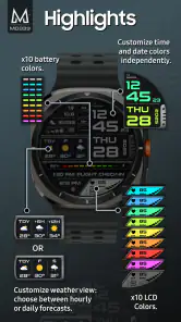
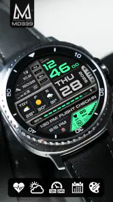
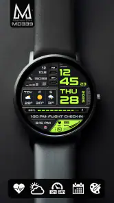
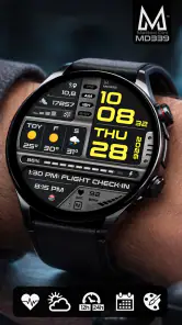
MD339 Digital watch face is a customizable digital-style watch face designed for compatible Wear OS smartwatches. It focuses on presenting the time clearly while also displaying useful information such as the date, battery level, and other configurable indicators. Its exact appearance and available functions may vary depending on the watch model, screen shape, and the companion customization options supported by your device.
Which smartwatches are compatible with MD339 Digital watch face?
Compatibility depends mainly on your smartwatch operating system and the version listed on the app’s Google Play page. MD339 Digital watch face is intended for supported Wear OS watches, but not every Android-based wearable will work with it. Before downloading, check the compatibility section, supported Wear OS version, and whether your particular watch model is included. Older devices may have limited features or may not be supported.
Can I customize the MD339 Digital watch face?
The watch face is designed to offer personalization, although the available options can depend on the installed version and your smartwatch. Typical settings may include changing colors, selecting display styles, adjusting complications, and choosing which information appears on the screen. After installation, customization is usually handled through the watch face settings or the Wear OS companion interface. Some options may not be available on every device.
What information and complications can MD339 Digital display?
MD339 is described as an advanced watch face with weather updates, health data, and complications, so it can bring more than the time to your smartwatch screen. The exact information shown depends on the options supported by your watch and the settings you choose. Complications can provide quick access to selected details or app functions, making the face useful at a glance without needing to open each app.
Pros
- Clean digital layout makes the time easy to read at a glance.
- Multiple color options help match the watch face to different styles.
- Useful complications provide quick access to key smartwatch information.
- Designed for efficient operation without overwhelming the display.
- Works well for users who prefer a modern
- minimalist watch appearance.
Cons
- Some features may require a compatible Wear OS smartwatch.
- The digital design may feel too simple for users wanting an analog look.
- Customization options can vary depending on the watch model.
- Small complication text may be difficult to read on compact screens.
- Battery impact may differ based on brightness and active complications.
- Category
- Personalization
- Version
- Varies with device













