Letter Fonts - Stylish Text
- 517.00
- 4.2
- Installs
- 10.00M
- Price
- Free

Screenshots
Analysis by Reviewed
I judge a personalization app by what happens after the first burst of curiosity: does it become a useful part of my routine, or does it sit untouched once I’ve tried every flashy option? Letter Fonts - Stylish Text makes a strong first impression because it gives ordinary messages a quick visual lift. Its real test, though, is whether those decorated letters remain readable and convenient in the places I actually use them.
A quick creative lift in the first week
For a birthday message, a social profile line, or a short caption, a different typeface can make a familiar phrase feel more personal. I’d use the app when I have a specific reason to make a few words stand out, rather than treating every message as a design project. That distinction keeps the novelty enjoyable: a little flourish can feel thoughtful, while styling every sentence can make a conversation harder to scan.
A practical tip is to draft the wording first, then try a few styles against the same short phrase. That makes it easier to compare how the letters read instead of choosing the first option that catches my eye. I’d also keep a plain-text version ready for anything important, since decorative characters may not look identical everywhere they’re pasted or sent.
That balance is especially helpful for people who post occasional updates or like adding a playful touch to chats, but it may not suit anyone who needs consistent typography for work, accessibility, or a polished brand identity. For those jobs, a design tool with more control over layout and export is a better fit than a text-styling app.
How it fits into everyday use
As a personalization app from TarrySoft, Letter Fonts - Stylish Text focuses on making text look different without asking me to learn a full design workflow. It’s free to download, rated for Everyone, and has a 4.2 average from around 90,000 ratings, with over 10 million installs. The current version is 1.4.6, and it runs on Android 8.0 or later. Optional in-app purchases range from $0.99 to $279.99 per item, so I’d check any purchase screen carefully rather than assuming every option is included at no cost.
Month-to-month value, not just a novelty
The app earns a lasting place most easily when I give it a narrow, repeatable role: perhaps styling a profile update, making a short greeting feel festive, or preparing a small set of distinctive labels for a personal project. It doesn’t need to become part of every conversation. Used occasionally, it can offer variety without turning routine communication into extra work.
Compared with changing a phone’s system font, this kind of app is more focused on individual snippets than on reshaping the whole interface. A keyboard with built-in text styles may feel faster if I want to decorate messages constantly; a graphics editor is more capable when I need precise spacing, colors, or an image-ready layout. I’d choose Letter Fonts when speed and a quick stylistic choice matter more than detailed control.
More From Our News Desk
Weather by Xiaomi Review: Clear at a Glance, Less Clear Up Close

X Under Pressure: Can It Recover When Posting Goes Wrong?

Clash of Clans Is Won Between the Battles

Android Auto Makes the Case for Quieter Car Software

MobiOffice: Transforming Mobile Productivity with Seamless Integration

EA SPORTS FC™ Mobile Soccer: Redefining Mobile Sports Gaming
Small checks that prevent frustration
Before sending a styled line, I’d paste it into the destination app and read it once at normal size. Some decorative lettering is less legible in long passages, and unusual characters can behave differently across apps or devices. For a public bio, I’d keep the most important words plain enough to recognize quickly; for a playful one-off greeting, I’d feel freer to experiment.
There’s also a maintenance trade-off: a distinctive style can make a profile feel recognizable, but changing it too often can make that identity feel inconsistent. I’d save a simple rule for myself—one or two styles for recurring uses, with more adventurous choices reserved for special occasions. That reduces decision fatigue and makes the app easier to return to after the initial browsing session.
Making it useful in a real routine
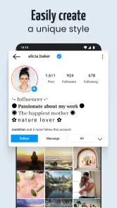
A realistic use case is preparing a social profile refresh during a spare moment, rather than stopping midway through a conversation to test styles. I’d write the bio in plain text, identify only the name or short phrase I want to emphasize, and then try a few treatments. After pasting it into the profile editor, I’d check that the line still reads clearly beside the surrounding text. This small workflow keeps the app’s contribution focused and makes it easier to undo if the result feels too busy.
For a group message about a birthday or other celebration, I’d use a decorative treatment on the greeting, not on the practical details. Names, dates, and instructions are the parts people need to find quickly, so keeping those plain is a useful compromise. The app can supply a bit of personality without making the message harder to use.
It also helps to decide where a style will appear before choosing it. A look that feels charming in a short caption may seem overdone in a profile line that people see repeatedly. I’d treat the destination as part of the design: a fleeting greeting can be more playful, while something attached to my public identity should be readable and consistent over time.
Who benefits most, and who can skip it
I see the strongest fit for people who like to personalize short pieces of writing but don’t want to build a graphic from scratch. Casual social posters, people who enjoy festive messages, and anyone who likes experimenting with the visual feel of a few words can get value from that focused approach. Its large audience—over 10 million installs—also suggests that this kind of quick text customization has broad appeal, though popularity alone doesn’t determine whether it belongs in your routine.
I’d skip it if I mainly need professional layout control, reliable typography across a team, or a way to redesign the appearance of every app on my phone. It is also a poor match for someone who prioritizes maximum readability in every message, especially when the audience may use different devices or assistive settings. Plain text is often the safer choice for instructions, work communication, and anything where nobody should have to decode the lettering.
There’s a useful middle ground for accessibility-conscious users: keep the sentence itself ordinary and make only a small, nonessential accent decorative. That way the meaning does not depend on recognizing unusual letterforms. If the distinction between fonts is the whole point of a design, I’d use a tool that lets me control the finished visual composition instead.
First Impressions
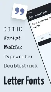
The first time I opened Letter Fonts - Stylish Text, I was greeted with a sleek, user-friendly interface. It’s not cluttered, which is a big win in my book. The app immediately offers a wide variety of font styles that are just a tap away. I found the navigation intuitive, making it easy for even the most tech-challenged among us to pick up and start customizing their texts.
Features That Stand Out
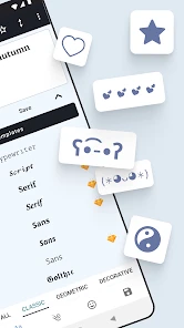
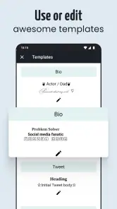
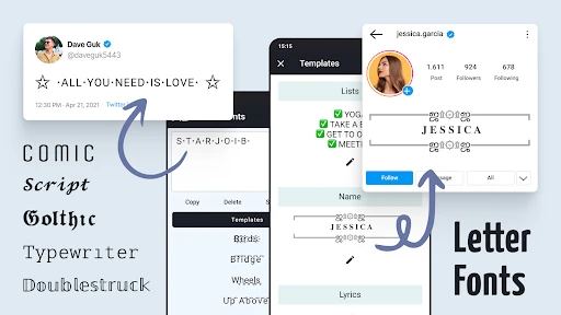
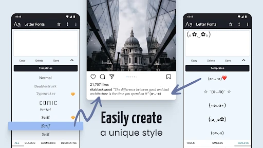
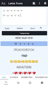
This app isn’t just about changing fonts; it’s about creating a unique identity with your words. Among its many features, the ability to create stylish text is the highlight. You can choose from a plethora of fonts, ranging from elegant and cursive to bold and quirky. There's even a feature for creating your own unique font style! How cool is that?
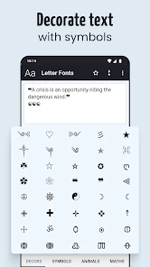
Another neat feature is the text decorator. With a tap, you can add symbols and emojis to your text, making each message a mini masterpiece. I personally enjoyed adding little stars and hearts to my messages, giving them a playful touch.
Performance and Usability
In terms of performance, the app runs smoothly without any noticeable lag. It integrates seamlessly with other messaging apps, allowing you to send your stylish texts directly through your preferred platform. Whether you’re on Android or iOS, Letter Fonts - Stylish Text adapts well, providing a consistent experience across devices.
One thing I would have liked to see is a tutorial or a help section for first-time users. Although the app is straightforward, a little guidance at the beginning could make a world of difference for some users.
Keeping the upkeep light
The most sustainable way to use a text-styling app is to avoid turning each visit into a long search for the perfect effect. I’d choose a dependable style for recurring occasions, then keep a short mental note of what works for a bio, a greeting, or a lighthearted caption. This makes repeat use quicker and prevents a small task from growing into an unnecessary editing session.
If I change a profile or a recurring message, I’d review the whole result rather than just the decorated words. A style can look appealing on its own but clash with the rest of the text or become tiring when seen every day. Rechecking it in context is a better maintenance habit than changing it whenever a new option catches my attention.
The main burden is not technical upkeep so much as attention: styles need occasional judgment, and the user has to decide when decoration helps rather than distracts. Anyone who prefers to set a design once and never think about it may find even this lightweight customization unnecessary. If that sounds like you, sticking with the default text is a perfectly sensible choice.
Using it without getting tired of it
The easiest way to keep the app useful is to treat its decorative options as accents, not replacements for ordinary writing. A short opening line, a name, or a few words on a social post can benefit from a change in style; a long explanation usually benefits more from plain text. That’s a simple way to keep the visual effect while avoiding the fatigue that comes from making every message compete for attention.
In a typical day, I might write a quick thank-you in a messaging app, then use a more noticeable style for a celebratory caption later. I’d check both in the actual destination before sending, because the final appearance matters more than the preview in a font picker. If a style makes a name or key detail difficult to read, I’d switch back rather than forcing the decoration.
People often wonder whether they need to change their phone’s whole appearance to use a font app like this. The appeal here is the ability to style selected text, so it makes more sense for messages and short snippets than for someone seeking a system-wide redesign. And if you’re deciding whether to pay, the app is free to download, but optional purchases are available; I’d try the free experience first and only consider an upgrade if a particular paid choice clearly fits a recurring need.
When the novelty starts to wear off
Decorative text has a limited supply of occasions where it genuinely improves communication. If I apply it to every status, message, and greeting, the effect stops feeling special and can make my writing look less direct. The practical test I use is simple: does the style help the reader notice tone or a key phrase, or am I adding it only because I opened the app? If it’s the latter, I leave the text alone.
Another source of fatigue is inconsistency. A profile that changes its visual treatment every few days can feel less intentional, and a recurring message may lose its usefulness if the decoration makes the words harder to recognize. I’d rather keep a small, familiar set of choices than browse endlessly. That restraint is what gives the app a chance to remain useful beyond its first burst of experimentation.
There’s no need to use it daily for it to earn its place. For me, an occasional tool can be worthwhile if it reliably handles a specific small task when the occasion comes up. If you rarely write social captions or personalized greetings, though, the novelty may pass quickly, and a regular keyboard or the formatting options already available in your favorite apps may be enough.
Final Thoughts
All in all, Letter Fonts - Stylish Text is a delightful app for those who love to express themselves creatively. It's simple, effective, and adds a fun twist to ordinary texts. If you’re someone who enjoys standing out from the crowd, this app is definitely worth a try. With its array of features and ease of use, it’s a small tool that can make a big difference in how you communicate. So go ahead, give it a whirl, and let your texts do the talking!
My long-term verdict is more measured: I’d keep it around if I regularly have short text worth dressing up, and I’d open it for specific moments rather than make it part of every chat. Its convenience is the point, but that convenience doesn’t replace careful reading, a consistent visual style, or a proper design editor when those matter more. Try the free experience, keep important text plain, and judge it by whether it saves effort on occasions you actually have—not by how many styles you can browse in one sitting.
Letter Fonts - Stylish Text Frequently Asked Questions
Can I preview a font before using it in a message or post?
The app is built around choosing from stylish text options, so you can try a look and decide whether it suits your message or post before using the finished text elsewhere. This is useful when you want a profile line, caption, or chat message to feel more distinctive without committing to a font that does not match the tone. The available choices are intended for personalizing text.
Will stylized text remain readable when I share it with other people?
Stylized text can make a message or profile stand out, but very decorative lettering may be less convenient to read than ordinary text, particularly in longer passages. For captions, short messages, and profile details, a distinctive style can add personality; for important information, simpler text is often easier to scan. It is sensible to check how your chosen style looks in the destination app before sharing.
Is Letter Fonts - Stylish Text free to download, and who is it for?
Letter Fonts - Stylish Text is a free personalization app from TarrySoft for people who want to give everyday text a more distinctive look. It is rated for Everyone and can be installed on Android devices running version 8.0 or later. Some optional features involve in-app purchases, so it is worth checking those choices before buying anything.
What is Letter Fonts - Stylish Text and what can I use it for?
Letter Fonts - Stylish Text is an app designed to enhance your text with a variety of stylish fonts and unique symbols. Whether you're looking to personalize your messages on social media, create visually appealing posts, or add creative flair to your digital communications, this app provides a wide selection of fonts and text styles to suit your needs. It's ideal for users who want to stand out with their text-based content.
Is Letter Fonts - Stylish Text compatible with all social media platforms?
Yes, Letter Fonts - Stylish Text is compatible with most popular social media platforms including Instagram, Facebook, Twitter, and WhatsApp. You can easily copy and paste your stylized text into any platform, allowing you to enhance your posts, comments, and messages with ease. The app is designed to ensure that the fonts and symbols are displayed correctly across different platforms.
Pros
- Wide variety of fonts to choose from.
- User-friendly interface for easy navigation.
- Supports multiple languages.
- Allows font customization.
- Integrates well with social media apps.
Cons
- Contains ads that may be intrusive.
- Some fonts require in-app purchases.
- Occasional app crashes reported.
- Limited free options available.
- Requires internet for full features.
- Category
- Personalization
- Version
- 1.4.6













