Outlined Watch Face
- 17.00
- 4.2
- Installs
- 10.00K
- Price
- $0.99
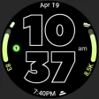
Screenshots
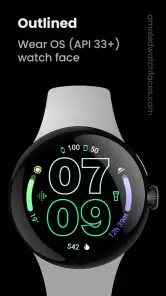
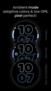
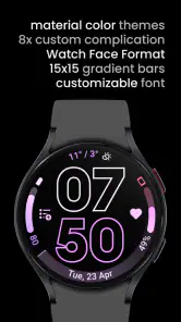
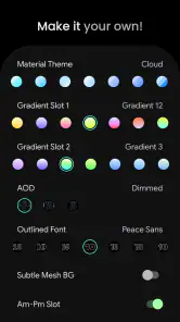
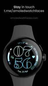
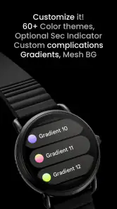
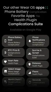
Analysis by Reviewed
I approach Outlined Watch Face as a focused choice for someone who wants a digital clock to look distinctive without turning a watch into a busy dashboard. It is an Art & Design app from amoledwatchfaces™, built for the Watch Face Format, and its outlined lettering gives the time a clear visual identity. If your starting point is a standard face that feels dull, this is appealing; if you mainly want a broad catalog of complications or constant access to lots of information, a more configurable general-purpose face may suit you better.
From choosing a look to wearing it
The practical workflow is simple in concept: decide whether the outlined numerals suit your watch and your usual setting, adjust the available design choices, then apply the face and check it on your wrist. I would make those choices with readability in mind rather than chasing the most striking combination. A bright outline can stand out in a quick glance, while a subtler treatment may feel calmer at a desk or during an evening out. The key trade-off is that a graphic style this specific will not blend into every wardrobe or taste.
For an everyday test, imagine checking the time while carrying groceries or heading out for a walk. A distinctive digital display can be easier to recognize at a glance than a face crowded with tiny details. I would set it up at home, look at it in the lighting where I normally use my watch, and make one adjustment at a time. That small check helps avoid settling on a design that looks appealing on a phone preview but feels too loud or hard to read on the wrist.
Getting Started with Outlined Watch Face
The first time I launched the Outlined Watch Face, I was instantly impressed by its user-friendly interface. No rocket science here, just straightforward navigation that lets you explore various customization options. It’s like having a mini design studio on your wrist. From the moment you start, the app guides you through setting up the essential watch face features, which is especially handy for first-timers in the smartwatch arena.
Customization Galore
This app is a playground for anyone who loves to customize. You can tweak everything from the watch face color to the widget styles. I spent a good chunk of my afternoon playing around with different color schemes, and let me tell you, the possibilities seem endless. The app offers a palette of vibrant colors and design elements that you can mix and match to suit your personal style. Plus, the real-time preview feature is a lifesaver. You see exactly how each tweak will look before you even hit apply.
Latest News
My useful tip is to treat customization as a two-pass process: first settle on a color and overall contrast, then decide which information deserves space. A face that looks great in a still preview can feel cluttered once widgets compete with the time. I would begin with only the details I check repeatedly, then add anything else only if it stays legible at a glance. That keeps the outlined numerals doing their main job instead of making the watch face feel like a miniature phone screen.
Functionality Meets Style
But it’s not just about looks; the Outlined Watch Face packs a punch in terms of functionality too. You can integrate various widgets like weather updates, fitness tracking, or calendar alerts, right on the face of your watch. I found this particularly useful during my morning jogs, as I could easily keep track of my pace and the weather without having to pull out my phone. It’s like having a personal assistant on your wrist!
There is also a handoff to consider: setting up the face is one task, while relying on its widgets during a busy day is another. I would use weather or calendar information as a quick prompt, not assume the watch face replaces opening the relevant app when I need detail. For a run, the convenience is fewer phone checks; for planning a meeting, a glance at an alert is useful, but it is not a substitute for reviewing the full calendar. That distinction makes the face more practical and keeps expectations realistic.
What really sets this app apart is how it seamlessly blends style with practicality. Whether you’re dressing up for a formal occasion or just hanging out in casuals, there's a design that fits every scenario. It's like the app reads your mind and knows exactly what you need at any given moment.
Making it work across the day
I would judge the setup by how it performs in the moments when I do not want to stop and study my wrist. At a checkout, on a commute, or while carrying something, the time should be the first thing my eye finds. That makes contrast and restraint more useful than filling every available area. If I find myself pausing to decode a widget, I would remove it rather than assume I need to get used to a busier face.
A sensible routine is to make the first version deliberately plain, wear it for a day, and then change only the element that caused a real problem. This avoids chasing color combinations in the preview without knowing how they feel in ordinary use. It also makes the trade-off clearer: the face is strongest when its outlined digits remain the visual anchor, not when every design option is treated as something that must be switched on.
For someone choosing a watch face for work, the important question is whether the style suits the setting as well as the wrist. A bright, graphic clock can be a welcome break from a default dial, but a more understated face may be a better fit for a conservative workplace or formal event. I would not expect one design to cover every mood. Keeping a familiar built-in face available as an alternative is a practical way to enjoy this one without forcing it into situations where it feels out of place.
Where the fit can break down
The outlined look is the main reason to choose this face, but also the clearest reason to skip it: if you prefer analog hands, a restrained plain dial, or a dense information layout, this visual approach may not feel right. The advertised emphasis on battery-friendly digital timekeeping is attractive for someone who wants a simple daily face, though any watch-face choice still involves balancing appearance, readability, and the information shown. I would compare it with the watch’s built-in faces before paying, especially if a built-in option already gives you the layout and glanceable details you need.
There are a few practical questions worth resolving before settling in. The app costs $0.99, is rated for Everyone, and has a 4.2 average from around 265 ratings; it has passed 10,000 installs. It was released on April 22, 2024. Those figures give a sense of its place among watch-face downloads, but they do not tell me whether its particular look will suit your wrist. I would also check that my watch supports the Watch Face Format before choosing it, since that compatibility is central to the experience. The developer is amoledwatchfaces™, and the app’s focused design makes the most sense when you want this specific outlined style rather than a collection of unrelated faces.
Compatibility is the first thing I would check before spending anything: this is made for the Watch Face Format, so support on the watch matters more than whether the phone itself can display the customization screen. I would confirm that point in the watch’s face-selection workflow before getting attached to a preview. That small step prevents a frustrating mismatch between an appealing design and a device that cannot use it as intended.
The purchase decision is also fairly specific. At $0.99, I would treat it as paying for one defined visual direction, not for a large library or a general customization toolkit. If I already know I like outlined digital numerals, that is a reasonable low-cost experiment. If I am unsure, the built-in faces are the better comparison because they let me test whether I actually want a cleaner digital display before adding another face to my routine.
Battery expectations deserve the same practical approach. The face is presented as battery friendly, which is a useful priority for an always-visible accessory, but I would not make a battery decision based on the label alone. I would wear it through a normal day and compare my own experience with my usual face, keeping the display style and the information shown consistent where possible. That is more useful than assuming a visual design alone will settle how long a particular watch lasts.
The app is a stronger fit for people who enjoy making a watch feel personal but do not need it to function as a packed control panel. It may appeal to someone who has grown tired of standard digital faces, wants the time to remain prominent, and likes adjusting color or widget presentation. It is less compelling for anyone whose first requirement is maximum data density, analog styling, or a face that disappears into the background. In those cases, a simpler built-in dial or a broader complication-focused option is likely the more comfortable daily choice.
I also see a useful distinction between a glance and a task. A watch face can surface a reminder or a small piece of context, but when I need to respond to a calendar change or understand a workout in detail, I still expect to move into the relevant watch or phone app. The face’s value is reducing how often I reach for that deeper view, not eliminating it. Thinking of it this way helps keep the layout useful without asking a clock face to do the work of several apps.
Another small but worthwhile setup habit is to judge the face at the distance and angle I naturally use, rather than holding the watch close and inspecting every detail. The latter makes tiny elements seem more useful than they are in practice. I would check the time while walking, glance down at a desk, and see whether the outline stays readable without deliberate effort. If it does not, changing the overall contrast or removing competing information is a better response than adding more decoration.
Final Thoughts
In conclusion, if you’re someone who values both style and functionality when it comes to your gadgets, the Outlined Watch Face app is a must-have. It’s not just an app; it’s an experience that transforms your smartwatch into a true extension of your personal style. So, go ahead, give it a whirl, and let your wrist do the talking!
My recommendation is to choose it for the look first and treat the extra information as a supporting detail. The face earns its place when the time remains quick to read and the customization makes you enjoy checking your wrist. If you want a broad menu of layouts, a subdued dial, or the most information possible at once, I would choose another option instead. For a watch owner who likes an expressive outlined clock and is willing to check compatibility before buying, this is a focused, approachable way to make a familiar screen feel more individual.
Outlined Watch Face Frequently Asked Questions
What kind of app is Outlined Watch Face?
Outlined Watch Face is an Art & Design app by amoledwatchfaces™ focused on a digital watch-face look with customizable outlined fonts. Its style is intended to make the time stand out while keeping the display clean and modern. The app has an Everyone content rating, so it is presented for a general audience.
What should I know about its design before downloading?
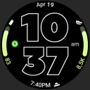
The central idea is a digital clock built around outlined typography, giving the watch display a distinct, graphic appearance. The store description also presents it as battery friendly and based on Watch Face Format. If you prefer a clearly styled clock rather than a more traditional watch face, this design approach is the main reason to consider it.
What features does the Outlined Watch Face offer?
The Outlined Watch Face offers a sleek and modern design that enhances the appearance of your smartwatch. It includes customizable elements such as color schemes, time formats, and widget displays. Users can choose from a variety of complications, including step counters, weather updates, and battery status, ensuring a personalized watch face experience.
Is the Outlined Watch Face compatible with all smartwatches?
The Outlined Watch Face is designed to be compatible with most smartwatches that support custom watch faces, including popular brands like Samsung Galaxy Watch, Fossil, and Wear OS devices. However, it is always recommended to check the compatibility with your specific model before downloading to ensure a seamless experience.
How can I customize my Outlined Watch Face?
Customization of the Outlined Watch Face is straightforward and user-friendly. Users can access the customization settings directly through the watch or accompanying smartphone app. You can modify color themes, adjust the display of complications, and select from different time formats. This flexibility allows you to tailor the watch face to your personal style and needs.
Pros
- Customizable color themes for personalization
- Supports multiple time zones
- Minimalistic design enhances readability
- Battery efficient with optimized performance
- Compatible with always-on display
Cons
- Limited widget options available
- No weather integration feature
- Font size not adjustable
- Lacks fitness tracking integration
- Requires premium for full features
- Category
- Art & Design
- Version
- Varies with device