نزدیکا
- 76.00
- 3.8
- Installs
- 500.00K
- Price
- Free

Screenshots
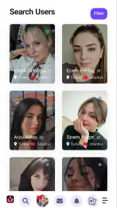


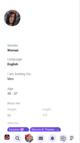
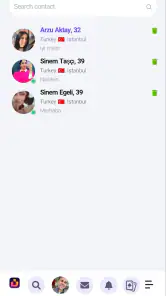
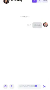
Analysis by Reviewed
نزدیکا is a social app built around a simple promise: getting into the service and starting from there. I approached it less like a polished entertainment platform and more like a lightweight entry point for people who want to explore a local social space without paying first. That distinction matters, because the experience depends heavily on how smoothly registration and login work for you.
The app is free, carries a Mature 17+ age rating, and is published by Menchu Castañeto Siring. Its store summary focuses on registering and signing in to the new version of نزدیکا, so the first moments deserve more attention than they might in a typical social network review. If you are deciding whether to try it, the real question is not simply whether it is free. It is whether the sign-in journey and the social experience fit the way you want to connect.
Where people are most likely to get stuck
The clearest friction point is the beginning. An app whose central store message emphasizes registration and login asks the user to complete an account step before the service becomes useful. That is normal for a social product, but it can feel less welcoming than opening a platform where you can browse immediately. I would set aside a few uninterrupted minutes rather than trying to register while rushing between other tasks.
Language can also affect the first impression. The app’s store-facing text is in Persian, and the name itself is written in Persian script. If you are comfortable reading Persian, that should feel natural. If you are not, the sign-in process may require more patience than a familiar English-language social app. I would avoid guessing at buttons simply because they appear in the expected position; on an account screen, one mistaken tap can send you back to an earlier step or submit incomplete information.
Another practical issue is separating an account problem from a connection problem. When a login attempt fails, users often repeat the same action several times. That rarely helps if the underlying cause is an unstable mobile connection, a temporary service response, or an incorrectly entered detail. My preferred approach is to pause after one failed attempt, check the connection, reread the fields, and then try again once. Repeated rapid attempts make troubleshooting harder because you no longer know which change, if any, made a difference.
The most useful mindset is to treat registration as a short setup task, not as proof that the app is broken. That does not excuse confusing design, but it prevents a common mistake: abandoning the app before checking the simple causes of a failed sign-in.
What the first session is really testing
Your first session should answer three practical questions. Can you complete the account entry without confusion? Can you reach the main social area after signing in? And does the available activity feel relevant enough to justify returning? Those questions are more useful than judging the app by its name or by the number of people who have installed it.
You May Like

Clash of Clans Is Won Between the Battles

Android Auto Makes the Case for Quieter Car Software

MobiOffice: Transforming Mobile Productivity with Seamless Integration

EA SPORTS FC™ Mobile Soccer: Redefining Mobile Sports Gaming

How Microsoft OneDrive Became a Mobile Productivity Giant

How Google Translate Breaks Language Barriers Effortlessly
At the time of review, the app is at version 1.0.0 and supports Android 7.0 or later. That gives it a broad compatibility range for Android users, including people who keep an older phone for everyday use. Still, compatibility is not the same as a guaranteed smooth experience. Older devices can make any registration form feel slower, especially when switching between the keyboard and the app. I would keep the keyboard visible while checking each field and avoid switching repeatedly between apps during setup.
The app has attracted more than 500 thousand installs and holds an average rating of 3.8 from around 2.3 thousand ratings. I read that as interest with some room for improvement, not as a reason to assume either excellence or failure. A social app can receive mixed reactions because people judge both the software and the community they encounter. A useful login screen will not compensate for an audience that does not match your needs, and an active community will not make a frustrating sign-in flow pleasant.
Setup checks that save time
Before registering, I would make a short checklist. First, confirm that the phone has a stable connection. Wi-Fi is not automatically better, but a reliable network is preferable to a weak signal that drops while the account screen is loading. Second, make sure the device has enough free space for normal app operation. I would not assume that every delay is caused by the service itself; an overloaded phone can make forms, keyboards, and screen changes respond slowly.
Third, read the age guidance carefully. نزدیکا is marked Mature 17+, so it is intended for an adult audience. That is relevant not only for deciding whether you should install it, but also for deciding whether it belongs on a shared family device. I would not hand the phone to a younger user and assume that a social app with this rating is suitable simply because the download itself is free.
Fourth, check that your device is running a supported Android release. The minimum is Android 7.0, which covers many older phones, but the practical question is whether the phone is still stable and responsive. If the operating system is supported but the device is struggling with other apps, registration may appear worse than it really is. Closing unnecessary apps before starting is a sensible first step.
Finally, prepare to enter account details carefully. I would check spelling, spacing, and the keyboard language before submitting anything. This is especially important when moving between Persian and English input. A keyboard can silently change the characters you intended to type, and a failed login caused by one character can look like a server issue. Slow, deliberate entry is less frustrating than correcting an account problem later.
How I would handle a confusing registration screen
If a screen is unfamiliar, I would identify its purpose before tapping. Is it asking me to create an account, enter an existing account, or continue from a previous step? The store summary specifically highlights both registration and entry, so confusing those paths is an easy mistake. I would look for the visual difference between creating new access and returning to an existing account rather than choosing the first prominent button.
I would also avoid creating several accounts just to get past a stalled attempt. That can leave you unsure which details belong to which account and makes later recovery more complicated. One carefully completed registration is easier to manage than multiple rushed attempts. If the screen seems to reset, I would first confirm whether the information was actually accepted before starting again.
There is a useful trade-off here. A sign-in-first social app can feel more private than a service that exposes everything before you join, but it also asks for more commitment up front. If you prefer to inspect a community before creating an account, نزدیکا may feel restrictive compared with social platforms that offer extensive public browsing. If you are comfortable joining first and evaluating the service from inside, the same design may feel straightforward.
Recovering when the normal workflow breaks
When the app does not move forward, I would use a simple recovery sequence rather than changing several things at once. Stop the current attempt, return to the beginning of the login or registration flow, and check the connection. If the problem repeats, close the app fully and reopen it. The point is not to perform complicated maintenance; it is to clear a temporary stalled state and create a clean second attempt.
If the keyboard is covering a required field or button, I would dismiss it before deciding that the control is missing. On a smaller screen, the form may simply be compressed. Rotating the phone is not always helpful, because it can reset the screen or change the layout, so I would first scroll gently and close the keyboard. This small adjustment is one of the easiest ways to distinguish a hidden control from a broken one.
For login trouble, I would verify whether I am using the same method and details chosen during registration. It is surprisingly easy to enter a different spelling, use another keyboard layout, or mistake a registration field for a login field. If the service offers a recovery route on the screen, follow that route rather than repeatedly guessing. If no recovery option is visible, the safest general step is to stop guessing and preserve the details you used, so you do not create a second problem.
I would also pay attention to timing. If the app was just installed and the first screen takes longer than expected, give it a moment before tapping repeatedly. Multiple taps can create duplicate actions or make the interface appear frozen. A single deliberate tap, followed by a short wait, is usually a better test of responsiveness than pressing the same control several times.
What to do after you finally get inside
Once access works, I would spend the first session learning the shape of the app rather than immediately treating it as a permanent social home. Look for the basic route back to the account area, the way you return to the main social screen, and the controls used to leave a page. Knowing those paths early makes later troubleshooting much easier because you can tell whether you are lost in the interface or genuinely blocked.
I would also test the service in a low-risk, ordinary way. Read the available content, notice whether conversations feel relevant, and avoid sharing personal information simply to make the account look active. A social app should earn trust through repeated use. The fact that it is free removes a payment barrier, but it does not remove the need for sensible judgment about what you post or reveal.
A practical everyday scenario would be checking نزدیکا during a quiet evening when you want a local-feeling social space rather than a global feed. I would register at home on a stable connection, explore without rushing, and then return another day to see whether the experience still feels useful. That second visit matters. Many social apps seem promising during the novelty of installation but become less appealing when you try to fit them into a normal routine.
When the app is not the cause
It is easy to blame the application whenever a screen loads slowly, but the phone and network deserve a fair check. If other apps are also struggling, the problem may be the device, connection, or operating system rather than نزدیکا specifically. I would compare the behavior with another ordinary app, close background tasks, and retry later. This is basic troubleshooting, but it prevents an unfair verdict based on one bad moment.
The same applies to the social experience. If the first people or posts you encounter do not interest you, that does not necessarily mean the app is technically poor. Social platforms are shaped by timing, location, language, and the size of the audience available to you. نزدیکا may suit someone looking for a Persian-oriented social environment more than someone who needs a broad international network. If your priority is a huge established audience, a larger mainstream alternative will probably be the better choice.
On the other hand, if your main need is private messaging with people you already know, a dedicated messenger may be more efficient. If you want public discovery without registering first, a content platform with open browsing may fit better. And if you need mature moderation tools, detailed privacy controls, or a highly developed profile system, I would compare those requirements directly before making نزدیکا your main social app. The right choice depends on whether its focused entry experience matches your purpose.
There is also a difference between an app being usable and being ready for every kind of user. Someone comfortable with Persian interfaces and willing to complete registration can probably evaluate it fairly. Someone who needs an English-first experience, instant anonymous browsing, or a mature ecosystem may encounter unnecessary friction. I would not recommend installing it solely because it is free; I would recommend it when the language, audience, and sign-in model make sense for you.
Three habits that make the experience easier
Complete registration when you have a stable connection and enough time to read each step, rather than doing it during a rushed commute.
Keep a private note of the exact account details you chose, especially if you switch keyboard languages or use more than one social account.
Judge the community after a return visit, not only after the first login, because a social service is valuable only when it fits your regular routine.
These habits are modest, but they address the parts of the experience most likely to create confusion: account entry, language switching, and premature judgment. They also reduce the temptation to create duplicate accounts or blame the app for a phone-level issue.
My practical verdict
After looking at نزدیکا as a real social tool rather than just a download, I see it as a focused option for adults who are comfortable with its Persian presentation and willing to begin with registration. The free price makes trying it easy, and the broad Android support means many older devices can at least attempt the experience. Its current version is still an early-looking starting point, so I would approach it with realistic expectations rather than comparing it immediately with the most established social networks.
The rating of 3.8 across around 2.3 thousand ratings suggests a mixed but meaningful reception. I would interpret that as a reason to test the app personally, not as a final verdict. Your experience will depend on whether the sign-in flow works cleanly, whether the available social activity matches your interests, and whether you are comfortable with the language and age positioning.
My recommendation is conditional but positive: try it if you want a free Persian-oriented social app and do not mind completing an account setup before exploring. Start on a stable connection, take the registration screens slowly, and give the community more than one visit before deciding. I would skip it if you need instant public browsing, a very large international audience, or a social tool designed mainly for private conversations with existing contacts.
For the right user, نزدیکا is worth a careful trial, not a blind commitment. Its strongest advantage is the low barrier of a free download combined with a clear focus on entering a social service. Its main weakness is that the first step carries much of the burden: if registration feels confusing or the available community does not match you, there is little reason to continue. I would install it with that trade-off in mind and keep another familiar social option available while deciding whether it deserves a regular place on my phone.
نزدیکا Frequently Asked Questions
Is نزدیکا available for my phone?
نزدیکا is an app for Android, and its listed minimum operating-system requirement is Android 7.0. Before downloading, check your phone’s Android version and make sure you have enough space for an installation. The app is in the Social category, so it is intended for social discovery and interaction rather than general device utilities or offline entertainment.
Who is نزدیکا intended for, and is there an age restriction?
نزدیکا is marked Mature 17+, so it is intended for adults rather than younger users. Parents and guardians should take that rating into account before allowing a teenager to install or use it. As with any social app, it is sensible to discuss privacy and safe communication, particularly if a user may interact with people they do not already know.
What is نزدیکا and what can I use it for?
نزدیکا is a location-based social and discovery application designed to help users find people, places, services, and nearby activities. Depending on the available features in your region, you may use it to explore local content, connect with other users, share information, or discover useful destinations. The experience is centered on proximity, so location access is an important part of the app’s functionality.
Does نزدیکا require access to my location and personal information?
Yes, نزدیکا may request access to your device location so it can display nearby users, places, recommendations, or services. It may also ask for permissions such as notifications, camera, photos, or contacts, depending on which features you use. Before accepting, review each permission carefully and disable anything unnecessary through your phone’s privacy settings.
Is نزدیکا free to download and use?
نزدیکا is free to download, so you can install it without an upfront charge. However, the cost of downloading does not necessarily explain every possible in-app feature or transaction. Read any payment prompt carefully before confirming a purchase, and check the official app store page for the current terms. If children use your device, consider enabling purchase controls as an extra safeguard.
Pros
- Helps discover nearby places and services quickly.
- Useful for finding local deals and community updates.
- Simple interface makes browsing nearby content convenient.
- Location-based results can save time during daily errands.
- Supports local businesses by improving their visibility.
Cons
- Some listings may be outdated or missing important details.
- Location access is required for the best experience.
- Results can vary greatly depending on your area.
- Notifications may become distracting if left enabled.
- Privacy-conscious users may dislike its location-based features.

- Category
- Social
- Version
- 1.0.0