Fonts Art: Cute Keyboard Font
- 7.19K
- 4.5
- Installs
- 10.00M
- Price
- Free
Screenshots
Analysis by Reviewed
I like a keyboard that lets me add a little personality to everyday messages, and Fonts Art: Cute Keyboard Font is built around that simple idea. It combines decorative text styles with keyboard themes, so I can change both how my typing looks and how the keyboard itself appears. That makes it more playful than leaving the standard keyboard untouched, though its appeal depends on how often you actually want to use stylized text.
A useful way to think about a custom keyboard
Before changing my default keyboard, I’d ask what I want to personalize: the keys I see while typing, the text other people see, or both. Fonts Art aims at both, but they solve different problems. A theme changes the look of the typing screen; a decorative font changes the character of a message. Trying those separately makes it easier to tell which part you’ll actually keep using.
For example, someone who wants a calmer-looking phone may enjoy a theme every day but use ornate lettering only now and then. Someone who posts frequently may care more about distinctive text and regard the theme as a bonus. I’d begin with the option that matches your routine instead of changing everything at once and then struggling to work out which choice made typing feel less comfortable.
Making a keyboard feel more personal
Fonts Art is a free personalization app from AIBY Inc. Its appeal is easy to understand: the keyboard is something I use throughout the day, and changing its look can make familiar chats feel less plain. The app has a 4.5 average from around 380,000 ratings, and it has passed 10 million installs. Those figures suggest broad interest, but the important question is whether the extra style suits your own routine.
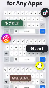
Ever felt your standard keyboard just doesn’t cut it anymore? I totally get it! Fonts Art: Cute Keyboard Font is like a breath of fresh air. Once you install it, you’re greeted with an array of fonts that range from the quirky to the elegant. Seriously, it’s like having your very own font factory right at your fingertips.
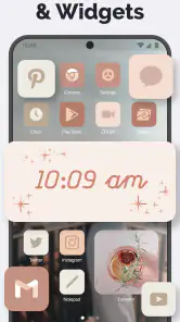
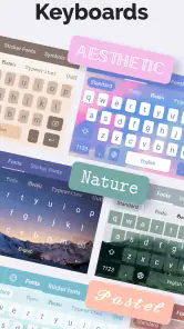
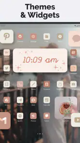
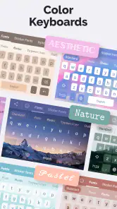
But it’s not just fonts; you’ve got themes too! There’s something exhilarating about jazzing up your keyboard with vibrant themes that reflect your personality. From pastel palettes to bold designs, the customization options are endless. It’s like dressing up your phone for a party every day!
Where the styling is most useful
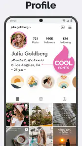
I find decorative fonts most useful when the message itself is casual: a short social post, a profile line, or a playful note to a friend. For anything that needs to be read quickly, I’d stick with ordinary characters. Unusual letter shapes can be harder to scan, and some services or devices may display them differently. A good practical habit is to draft in the fancy style, then switch back to standard text for addresses, instructions, or work messages.
You May Like

Clash of Clans Is Won Between the Battles

Android Auto Makes the Case for Quieter Car Software

MobiOffice: Transforming Mobile Productivity with Seamless Integration

EA SPORTS FC™ Mobile Soccer: Redefining Mobile Sports Gaming

How Microsoft OneDrive Became a Mobile Productivity Giant

How Google Translate Breaks Language Barriers Effortlessly
The keyboard themes are a separate kind of customization. They change the feel of the typing screen even when I’m not using a special font, which is handy if I want a more personal look without making every message decorative. I’d choose a theme that keeps the keys easy to distinguish rather than picking one only for its colors; visual flair is less useful if it slows down routine typing.
Keeping posts readable after you share them
A small but worthwhile workflow is to test a font in the destination app before committing to a whole profile or caption. I’d paste a short sample, look at it on the actual screen, and check whether the letters remain clear at the size people will see them. This catches the practical issue that a style can look charming in a keyboard preview yet feel crowded in a compact bio or beside other text.
I’d also keep a plain-text version of anything I may need to reuse. Decorative characters can be awkward to edit later, especially if I want to change only one word or move the text into a different context. For a social caption, I might style a brief opening phrase and leave the rest ordinary. That gives the post a point of personality without making the entire block tiring to read.
Easiest Setup Ever
Now, I know what you’re thinking – setting up a new keyboard app must be a hassle, right? Wrong! The setup process is as smooth as silk. Once downloaded, you’ll breeze through the installation with guided instructions that even the least tech-savvy person could follow. It’s literally a matter of a few taps, and voilà, you’re ready to roll with your new keyboard look!
Installing a keyboard is still a more meaningful choice than changing a wallpaper, because a keyboard handles what you type. I recommend reading the system prompts carefully and checking that the selected keyboard is the one you intend to use. If you prefer not to replace your usual keyboard, you can treat Fonts Art as a styling tool for occasional posts instead of making it your everyday default. That distinction matters for anyone who values familiar typing habits over customization.
Choosing a setup without disrupting your routine
When trying a new keyboard, I’d start with low-stakes typing: a casual message or a search, rather than a long note that I need to finish quickly. That gives me a chance to see whether the layout and theme feel comfortable in ordinary use. If the visual treatment makes keys harder to distinguish, or I keep reaching for controls by habit, that’s a useful sign to switch back rather than forcing myself to adapt for the sake of appearance.
People often wonder whether a themed keyboard means every message must use a decorative font. I wouldn’t approach it that way. The styling is most valuable when it’s optional: use a familiar, readable style for routine communication and reserve expressive lettering for places where it adds something. Likewise, if you decide the custom keyboard is not for you, returning to your usual typing setup is a sensible choice, not a failure to get the point of the app.
Useful extras, with a trade-off
Aside from its charming looks, the app is packed with functionality. It includes emoji suggestions and GIF support to make your conversations livelier. Plus, there’s a handy text translator feature that’s a godsend for multilingual chats. It’s like having a personal assistant in your keyboard!
One of the features I absolutely adore is the clipboard manager. Ever copied something important only to lose it moments later? This app’s got your back by keeping track of your copied texts. Trust me, once you get used to this, there’s no going back!
Those extras can save a few steps when I’m chatting, but I wouldn’t choose a keyboard primarily as a translator or clipboard archive. For a sensitive password or private note, I’d use the appropriate secure app rather than rely on a keyboard clipboard. The same goes for translations where nuance matters: the built-in option can help with a quick exchange, but I’d review the wording before sending anything important.
Where convenience has its limits
There’s a trade-off in putting more chat tools beside the keys: a keyboard can become visually busier than the plain input panel many people are used to. If I’m writing something long, I care more about predictable typing and clean editing than having extra shortcuts within reach. I’d treat the GIF, emoji, translation, and clipboard options as conveniences to try when they fit, not as features that need to become part of every conversation.
That distinction also helps answer whether the app is a good replacement for a standard keyboard. For someone who likes to personalize the phone and sends plenty of short, expressive messages, it may be a fun everyday choice. For someone who prioritizes a familiar layout, quick long-form typing, or a minimal interface, the phone’s usual keyboard is likely the more comfortable tool. Fonts Art’s strongest case is creative customization, not universal superiority at typing.
Who should choose it—and who might not
Compared with a standard phone keyboard, Fonts Art gives more emphasis to decorative lettering and visual themes; the usual keyboard is often the better fit if consistency and familiar input matter most. I’d recommend trying Fonts Art if you enjoy personalizing your phone, share expressive social posts, or like switching the look of your keyboard for fun. If your priority is fast, predictable typing for long work messages, the standard keyboard may be a better daily choice.
A realistic use for me would be choosing a bright theme for casual chats, then using a distinctive font for a short caption before posting. I’d keep longer captions plain so they stay easy to read, and I’d check the finished text in the app where it will appear. That small preview step helps avoid a polished-looking draft turning into awkward or hard-to-read text after it’s pasted elsewhere.
A practical trial before deciding
If I were recommending a first try to a friend, I’d suggest making one small change at a time. Pick a theme and use it for a day of ordinary messages; then decide whether the keyboard still feels comfortable when the novelty wears off. After that, try a decorative style in a short social caption. This separates the daily keyboard experience from the occasional creative use and gives a fairer sense of which part earns a place in your routine.
It’s particularly suited to people who enjoy small visual details and don’t mind choosing a style for the context. It’s less compelling for someone who rarely posts, never changes phone appearance, or wants a keyboard mainly for efficient long-form writing. If you’re unsure, starting with free use is a low-commitment way to judge whether its particular mix of themes and text styling is more enjoyable than the familiar alternative.
Fonts Art is free to start, with in-app purchases ranging from $0.99 to $49.99 per item. I’d explore the free experience first and only consider paying if I found a style or option I genuinely wanted; there’s no need to spend just to test whether decorative typing fits my habits. It’s rated for Everyone, and version 2.78.8 supports devices running OS 10 or later.
My verdict
All in all, Fonts Art: Cute Keyboard Font has turned out to be a delightful surprise. It’s not just about aesthetics; it’s about enhancing your overall typing experience. Whether you’re a font fanatic or just someone looking to spice up your digital life, this app is definitely worth checking out. It’s fun, functional, and fabulously easy to use. Give it a try, and you might just find yourself wondering how you ever typed without it!
So go ahead, unleash your inner artist and let your keyboard do the talking. Who knew typing could be this much fun?
My recommendation comes with one qualification: I’d treat the decorative options as a creative extra, not a reason to abandon every familiar typing tool. If you enjoy making short messages look distinctive, the visual payoff is immediate; if you rarely customize your phone, the novelty may fade. For me, it works best when I choose the right style for the moment and keep readability in mind.
The final decision comes down to your habits
I’d sum it up this way: Fonts Art is worth considering when visual self-expression is part of how you use your phone, especially for short social writing and casual chats. Its themes can make the keyboard feel more personal, while the font choices give you another way to shape a post. The useful approach is selective rather than constant—let the styling add character where it helps, and keep everyday text plain when clarity matters more.
If you want a practical customization app rather than a new standard for fast typing, I think it makes a good case for a trial. If your ideal keyboard is quiet, familiar, and focused on getting long messages written with minimal fuss, I’d stay with the default option. That’s the distinction that makes my recommendation honest: the app is enjoyable for the right kind of user, but its extra personality is a preference, not a necessity.
Fonts Art: Cute Keyboard Font Frequently Asked Questions
What does Fonts Art: Cute Keyboard Font let me personalize?
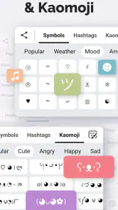
Fonts Art: Cute Keyboard Font is for people who want to give everyday typing and social posts a more personal look. Its options include custom fonts, keyboard themes, symbols, and font-changing features for Instagram. You can browse the available styles and choose designs that suit your taste, while remembering that font display can vary between apps.
Can I change the look of the keyboard without changing my device’s entire theme?
Yes. Fonts Art focuses on keyboard themes and font styling, so you can personalize the appearance of your typing without treating it as a full device-theme app. Explore the available designs and select a keyboard look that suits you. The changes are visual, and how they appear may depend on the app you are typing in.
What devices and operating systems can run Fonts Art: Cute Keyboard Font?
Fonts Art: Cute Keyboard Font is a personalization app from AIBY Inc. It supports devices running Android 10 or later, so check your operating system before downloading. The app is also available for iOS. Once installed, you can explore its fonts and keyboard themes and see how they fit your device and typing preferences.
What are the main features of Fonts Art: Cute Keyboard Font?
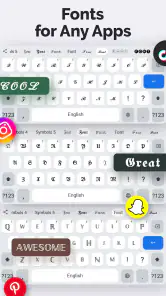
Fonts Art: Cute Keyboard Font offers a wide variety of stylish fonts that can be used across various apps on your device. It provides personalized keyboard themes, emoji collections, and even allows for font customization. The app is designed to enhance your typing experience by making it more fun and visually appealing. Its store summary also highlights custom fonts, keyboard themes, symbols, and font-changing options for Instagram.
Is Fonts Art: Cute Keyboard Font free to use?
Fonts Art: Cute Keyboard Font offers both free and premium features. While you can access a good range of fonts and themes for free, some exclusive designs and features may require a subscription or in-app purchases. Individual in-app purchases range from $0.99 to $49.99, so review the available options in the app before making a purchase and check what is included in the free version.
Pros
- Customizable keyboards
- Variety of fonts
- Easy to use interface
- Supports multiple languages
- Frequent updates
Cons
- Ads can be intrusive
- Some features require payment
- Limited free options
- May slow down device
- Requires internet connection
- Category
- Personalization
- Version
- 2.78.8