Clock, Date and Weather Widget
- 44.00
- 3.7
- Installs
- 100.00K
- Price
- Free
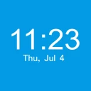
Screenshots
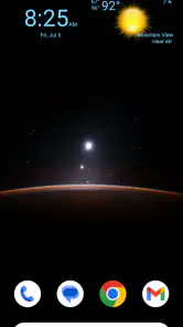
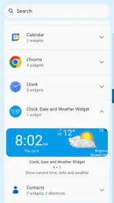
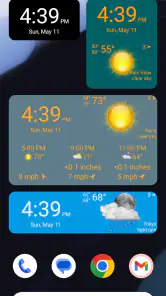
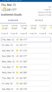
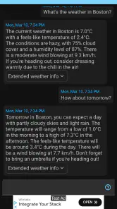
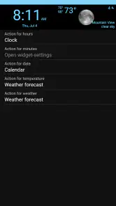
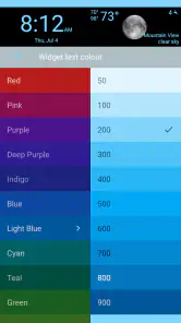
Analysis by Reviewed
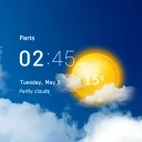
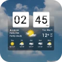
When I first tried Clock, Date and Weather Widget, I approached it as a small home-screen utility rather than a full weather service. That distinction matters. Its purpose is to keep three everyday details visible in one place: the time, the date, and the current weather. I did not need to open a separate forecast app just to check whether I should take a jacket, and I could see the date without pulling down the notification shade.
The app is developed by aac and belongs to the weather category, although its most useful role is really as a glanceable home-screen tool. It is free to install, suitable for Everyone, and has reached over one hundred thousand installs. Its average rating sits at 3.7 from more than five hundred ratings, which suggests a fairly mixed but usable experience rather than something universally polished. After spending time with it, I understand that reaction: the idea is simple and convenient, but the value depends heavily on how well the widget fits your home screen and how much detail you expect from weather information.
What the widget is really for
The central appeal is reducing small interruptions. Instead of opening a clock, calendar, and weather application separately, I can glance at the home screen and get a compact snapshot. That works especially well for people who check their phone repeatedly during the day: before leaving home, while planning an errand, or when writing the date on a form.
I would not treat it as a replacement for a detailed forecast service. A dedicated weather app is normally better when I need hourly changes, several-day planning, alerts, radar, or a deeper explanation of conditions. This widget is more suitable for the quick question, “What time is it, what day is it, and what is the weather like right now?” Its strength is convenience, not depth.
That narrow focus is also what makes it approachable for a first-time user. There is no need to learn a complex dashboard before getting value from it. Once the widget is placed where I can see it, the app becomes part of the phone’s visual routine. The best result comes when I choose a home-screen page I already visit often, rather than hiding it on a secondary page that I rarely open.
Who will appreciate it most
I think it is a good match for someone who wants a cleaner home screen and prefers information that is visible without opening an app. It can also suit users who find separate weather and clock widgets too large or distracting. People who regularly forget the date may find the date display just as useful as the weather element, especially on a work or study phone.
It is less convincing for anyone who wants weather analysis. If your daily decisions depend on precipitation timing, wind, temperature changes, or longer-range planning, you will probably still need a conventional forecast app. Installing this one does not remove that need; it simply makes the current snapshot easier to reach.
More From Our News Desk

Clash of Clans Is Won Between the Battles

Android Auto Makes the Case for Quieter Car Software

MobiOffice: Transforming Mobile Productivity with Seamless Integration

EA SPORTS FC™ Mobile Soccer: Redefining Mobile Sports Gaming

How Microsoft OneDrive Became a Mobile Productivity Giant

How Google Translate Breaks Language Barriers Effortlessly
Getting started without overthinking the setup
The first meaningful step is to install the app and look for its widget through the normal home-screen customization process. On Android, that generally means pressing and holding an empty area of the home screen, opening the widget picker, and locating the clock, date, and weather option. The exact wording can vary by phone, but the important point is that the useful part appears on the home screen rather than as a screen I must repeatedly launch.
I recommend choosing a page with enough empty space before adding it. A crowded page makes a compact widget feel awkward, while a carefully chosen position lets the information work as a quick visual anchor. I would place it near the top or on the first page if I check the weather before leaving home. If I mainly use it for the date, placing it beside my calendar or task icons may make more sense.
The app supports Android devices running version 6.0 or later, so it is aimed at a broad range of phones rather than only recent hardware. The current version is 1.1.3. That makes it worth checking the device’s software version before installation if you are using an older phone, but most users with a relatively modern Android device should find the compatibility requirement straightforward.
Because the widget is designed around current weather, the first setup should include checking whether the displayed location makes sense. If the weather seems wrong, I would not immediately assume the forecast itself is inaccurate. A location setting, phone setting, or update delay can affect what appears. The practical habit is to compare the widget with the location where I actually spend time, especially after traveling or changing the phone’s location configuration.
Another useful setup decision is visual priority. The clock is something I may read dozens of times, while the weather is usually checked less often. I therefore prefer a position where the time remains easy to read without making the weather look like the main event. If the widget competes with large icons, moving it to a less crowded page can improve the experience more than repeatedly adjusting the rest of the phone.
The first successful action
For a new user, success should be simple: add the widget, return to the home screen, and confirm that the time, date, and current weather are visible at a glance. That is the moment the app proves its usefulness. I do not need to build a forecast routine or explore a complicated menu. I only need to make the information appear in a place I already use.
A realistic example is a morning departure. I unlock my phone to check a message, notice the date, read the time, and look at the weather before leaving. If the weather suggests different clothing, I can make that decision without opening another application. Later, when I am filling in a document or scheduling an appointment, the date is still available from the same spot. These are small savings, but they happen often enough to make a simple widget worthwhile.
I also found that the first successful action is a good time to decide whether the widget is earning its space. Home-screen space has a cost: every widget can push useful shortcuts onto another page. If I rarely look at the weather and already have a clock built into my phone’s layout, the combined display may not justify that space. If I repeatedly check all three pieces of information, the trade-off becomes much more favorable.
Where first-time users may get confused
The most common misunderstanding is expecting a complete weather application from a widget whose main job is quick visibility. Seeing current weather on the home screen is not the same as receiving a full planning tool. I would keep a more detailed weather service available if I need forecasts beyond a quick glance, then use this app as the convenient front layer.
Another point of confusion is the difference between installing the app and placing the widget. A successful installation does not necessarily mean the information is already visible on the home screen. The widget normally needs to be added separately through the device’s home-screen controls. If a new user opens the app and sees little happening, the next practical step is to check the widget list rather than repeatedly reinstalling it.
Home-screen behavior can also vary by Android manufacturer. Some phones organize widgets in a dedicated picker, while others place them under the app’s name or a broader widget category. That is not a flaw unique to this application, but it can make the first attempt feel less obvious. I would search the widget picker patiently and check the app’s entry instead of assuming the installation failed.
Weather information is another area where expectations need to stay realistic. A current condition can change, and a widget may not refresh at exactly the moment I look at it. If the display seems stale, opening the app or checking the phone’s relevant settings may help identify the cause. I would avoid treating one glance as a guarantee of what the weather will be later in the day.
There is also a practical difference between a widget that looks good in the preview and one that works on a real home screen. Icons, wallpapers, screen density, and launcher spacing all affect readability. I would test it against the wallpaper I actually use, not only judge the appearance during installation. A display that is technically present but difficult to read defeats the purpose of a glanceable tool.
Free installation and optional spending
The app is free, which makes it easy to test without committing money first. There are in-app purchases priced at $5.99 per item, so I would pay attention to any optional purchase screen and decide whether the basic experience already meets my needs. For a simple clock, date, and current-weather display, trying the free version first is the sensible approach.
This pricing detail is important for people who want a completely no-cost utility. The installation itself does not require payment, but optional purchases mean the app is not necessarily limited to a single free experience. I would not buy anything merely because the widget is attractive; I would first use it through a normal day and decide whether the extra value is clear.
Since the content rating is Everyone, the app is positioned as a general-purpose utility rather than something aimed at a narrow age group. That makes it suitable for a shared household phone or for users who want a straightforward display without entertainment features. Still, suitability does not guarantee that every device layout will look identical, so I would judge it on the phone where I plan to use it.
Small habits that make it more useful
One non-obvious advantage is that the widget can act as a visual checkpoint for routines. I can use the date to confirm that I am looking at today’s task list, the clock to estimate whether I have time to leave, and the weather to decide whether an outdoor plan needs adjustment. The benefit is not any single reading; it is the combination appearing before I start searching through apps.
A second useful approach is to place it near apps connected to time-sensitive decisions. For example, I might keep it close to transit, calendar, or navigation shortcuts. Then the widget becomes the first step in a workflow: check the time and weather, open the relevant app, and act. This is more efficient than placing it on a decorative page that I only visit accidentally.
A third trade-off involves visual simplicity versus information density. Adding more widgets may provide more detail, but it can make the home screen harder to scan. I would use this app when I want one restrained block of information, not when I want every weather measurement visible. Users who enjoy highly detailed dashboards may find the compact approach too limited, while users who dislike clutter may see that limitation as the main benefit.
A fourth practical tip is to reassess the placement after a few days rather than deciding immediately. At first, I may think the widget is unnecessary because I am used to opening another app. After several days, I may notice that I check the date and weather more naturally from the home screen. The reverse can also happen: if I never look at it, removing it restores valuable space. Its usefulness is easy to test because the commitment is small.
Travel is another situation where I would pay attention to location behavior. When moving between places, I would verify that the displayed weather corresponds to the location I care about, especially before relying on it for clothing or outdoor plans. For a quick local glance, that may be enough. For a trip involving changing conditions, I would still open a fuller forecast service.
How it compares with the usual alternatives
Compared with the clock already built into most phones, this app adds the date and weather in the same visual area. That makes it more useful for people who want a combined glance, but it also uses more home-screen space than a simple clock. If the phone’s existing layout already shows the date and weather clearly, installing another widget may offer little improvement.
Compared with a dedicated weather app, it is faster for basic checking but less suitable for investigation. A full weather application usually wins when I need to compare times, inspect changing conditions, or plan several days ahead. This widget wins when I want to avoid an extra tap and do not need a detailed explanation.
Compared with a calendar widget, it provides a different kind of date awareness. A calendar is better for appointments and schedules, while this app is better for confirming the current date alongside the time and weather. I would not choose it instead of a calendar if my main problem is missed events. I would choose it beside a calendar if I want a simple daily orientation point.
Its strongest comparison point is convenience rather than feature count. The app does not need to compete with large weather platforms on depth. It only needs to make a few frequently checked details easy to see. That focused purpose is valuable, but only when the user genuinely prefers a home-screen glance over opening separate tools.
My recommendation after using it
I would recommend Clock, Date and Weather Widget to someone who wants a modest, practical addition to an Android home screen and is comfortable with a current-weather snapshot instead of a complete forecast dashboard. The free installation makes it easy to try, and the setup becomes reassuring once I understand that adding the widget is a separate home-screen step.
I would skip it if I need detailed forecasts, weather alerts, or a highly configurable information panel. I would also skip it if my phone already presents the time, date, and weather exactly where I want them. In that situation, the extra widget may create clutter rather than solve a problem.
For everyone else, the best test is concrete: install it, add it to the page you open most, and use it during a normal morning. Check whether the date, time, and weather help you make a decision without opening another app. If they do, the widget has earned its place. If not, removing it costs very little.
The app is not ambitious, and that is both its appeal and its boundary. It turns a home screen into a small daily reference point, but it does not replace deeper weather tools. With version 1.1.3 and support for Android 6.0 or later, it remains an accessible option for users who value quick information over extensive controls. My honest view is that its success depends less on advanced features and more on whether those three details are genuinely part of your everyday routine.
Clock, Date and Weather Widget Frequently Asked Questions
Is Clock, Date and Weather Widget free to download?
Clock, Date and Weather Widget is free to download, so you can try its home-screen display without paying upfront. The app also offers in-app purchases priced at $5.99 per item, so check the purchase details before choosing any paid option. It is rated for Everyone, making its stated content rating suitable for a general audience.
Will Clock, Date and Weather Widget work on my phone?
The app requires Android 6.0 or later, so check your phone’s Android version before downloading. It is listed as an Android app, and the widget’s appearance and available functions can vary with the device and operating system. If your phone meets the minimum requirement, you can try adding the clock, date, and weather display to its home screen.
What is Clock, Date and Weather Widget?
Clock, Date and Weather Widget is a customizable home-screen widget that combines the current time, date, and weather information in one convenient display. After adding it to your Android or iOS home screen, you can usually check essential information at a glance without opening separate clock or weather applications. Its appearance and available functions may vary depending on the device and operating system.
Does Clock, Date and Weather Widget require an internet connection?
An internet connection is generally needed to update weather forecasts, temperatures, locations, and other live meteorological information. The clock and date can normally continue working offline because they use your device’s system settings. If the connection is unavailable, the widget may show the last successfully updated weather data until it can synchronize again.
Can I customize the widget’s design and information?
The application is designed to provide customization options, although the exact choices depend on the version and device. Users may be able to change widget size, layout, colors, clock format, date presentation, weather units, and location settings. Before downloading, check whether your phone supports the desired widget style and whether all customization features are included for free.
Pros
- Combines time
- date
- and weather details in one compact widget.
- Offers quick access to essential information without opening an app.
- Useful for checking forecasts directly from the home screen.
- Supports a more personalized and informative home-screen layout.
- Can help monitor upcoming weather before leaving home.
Cons
- Weather accuracy depends on the quality of the selected data source.
- Some widget styles may consume noticeable home-screen space.
- Frequent weather updates can increase battery or data usage.
- Advanced customization options may be limited in the free version.
- A cluttered layout can reduce readability on smaller displays.
- Category
- Weather
- Version
- 1.1.3