ULTRA Digital Retro watch face
- 129.00
- 4.6
- Installs
- 10.00K
- Price
- $1.89
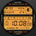
Screenshots
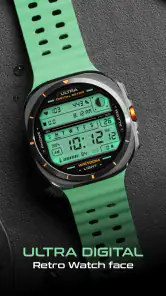
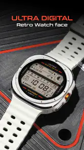
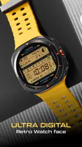
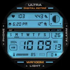
Analysis by Reviewed
I tend to judge a watch face by how quickly it tells me what I need, not just by how it looks in a screenshot. ULTRA Digital Retro puts a vintage digital style on your wrist, and its color options give that familiar look some room to feel personal. It is a paid personalization app from Facer Studios, priced at $1.89, and it is aimed at anyone who wants a retro display rather than a conventional smartwatch dial. My main question is whether the design remains practical in the small, quick glances that make a watch useful.
Quick glances, not a speed test
A watch face is not an app I expect to launch and browse like a feed; its job is to show the time promptly when I raise my wrist. ULTRA Digital Retro’s restrained, digital-display concept suits that use: familiar numerals are easy to scan, and the visual effect gives the face character without requiring me to stop and study it. I would choose it for short checks during a commute, between meetings, or while carrying groceries, rather than for an information-heavy dashboard.
There is a useful trade-off in that focus. A cleaner face can make the time the obvious priority, while a busier layout may answer more questions without reaching for a phone. If you rely on a watch face to surface lots of changing details, check how its available options fit your routine before settling on it. I would start with the time and only keep extra information that I genuinely check; a display that is crowded with things I rarely use is less useful, however appealing it looks.
Personalization that earns its place
The color choices are more than a cosmetic bonus when they help the display suit its surroundings. A restrained palette can feel at home with work clothes, while a brighter choice makes the retro character more noticeable in casual settings. I would pick a combination for readability first, then style: a color that looks striking in a preview is not necessarily the one I want to glance at in bright daylight or a dim room.
One practical approach is to settle on a dependable everyday color before experimenting. That gives you a familiar baseline, so a later change feels deliberate rather than like an attempt to fix a setup you never liked. If you switch styles often, consider whether you enjoy that small bit of upkeep; if you would rather set a face once and forget it, choose a palette you can live with across work and leisure.
How it fits daily routines
Picture checking the time while walking to a bus stop: you want a quick, legible answer, not a miniature screen that invites a long interaction. That is where a retro digital face can make sense. It also has a clear personal angle for people who like classic digital watches but want their current smartwatch to feel less generic. The look is distinctive without asking you to change how you use the watch.
Compared with the usual choices in watch-face personalization, the appeal here is its specific retro identity and adjustable color, not an assumption that every user needs the most information possible. If your priority is dense data or a face that blends into a formal setting, another style may fit better. If your priority is a recognizable digital look that feels intentional, this is a more characterful alternative to a plain default face.
More From Our News Desk

Clash of Clans Is Won Between the Battles

Android Auto Makes the Case for Quieter Car Software

MobiOffice: Transforming Mobile Productivity with Seamless Integration

EA SPORTS FC™ Mobile Soccer: Redefining Mobile Sports Gaming

How Microsoft OneDrive Became a Mobile Productivity Giant

How Google Translate Breaks Language Barriers Effortlessly
A sensible way to test the face
I would give the design a fair trial across different parts of an ordinary day rather than deciding from a preview alone. Check it indoors, outdoors, and while moving, then notice whether you can read the time without changing your wrist position or pausing. That simple check is more useful than repeatedly adjusting colors in the first few minutes: it separates a genuine readability issue from the novelty of trying a new look.
If you use your watch mainly for time checks, a single familiar palette may be the best setup. If you also glance at other information, think about what you actually consult during a normal week before deciding how much to place on the display. The practical test is whether those details help you make a quick decision or merely make the face busier. I would keep only information that saves me from reaching for my phone often enough to matter.
The face is also a better fit for someone who enjoys visual character than for someone who wants the watch to disappear into the background. Its retro styling is meant to be noticed, so it may feel out of place if you prefer a conventional business look or switch between formal settings and casual ones without wanting to adjust your watch. In that case, a neutral default face is likely the easier everyday choice.
Nostalgia Meets Modern Technology
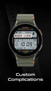
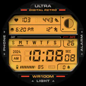
Right off the bat, the first thing you’ll notice about this watch face is its nostalgic design. It’s like having a slice of the 80s right on your wrist! The digital display mimics old-school LCD screens, complete with those chunky numbers and a slightly pixelated look. If you’re someone who grew up in the era of classic digital watches, this is sure to hit you right in the feels.
Customizable Features Galore
One of the things I love most about this app is its customization options. You can tweak the colors to match your personal style or mood, whether you’re feeling bold with bright neon or prefer a subtle monotone. The app also allows you to add different widgets, so you have all the information you need at a glance. You can include the date, weather updates, or even your daily step count. It’s not just about looking cool; it’s about staying informed and on top of things.
Another cool feature is the ability to set multiple time zones. For those of us who have friends or family overseas, or if you’re a frequent traveler, this feature is a lifesaver. No more mental math trying to figure out what time it is for your loved ones; just a simple glance at your wrist, and you’ve got your answer.
Simplicity and Ease of Use
Despite its plethora of features, the app remains incredibly user-friendly. Installing the watch face is a breeze, and navigating through its settings is just as simple. The interface is intuitive, so even if you’re not tech-savvy, you’ll find it easy to use. I appreciate how the developers have kept the user experience straightforward without compromising on the wealth of options available.
Battery life is always a concern with smartwatches, but I found that the ULTRA Digital Retro is well-optimized. The design doesn’t drain your battery as much as you might expect, given its rich features. You can enjoy all its benefits without constantly worrying about your watch dying on you halfway through the day.
Everyday friction and fit
That said, it is worth treating the face as a visual choice, not a promise that every smartwatch will behave identically. Screen shape, size, and the way a device presents its watch faces can affect how the design feels on your wrist. If you have a smaller display or prefer large, high-contrast text, take a moment to check the preview on your own watch before committing to a favorite color. A style that looks balanced on one screen may feel cramped on another.
For a heavy-use day, I would keep the setup conservative and avoid changing several things at once. Try the color you expect to use most, wear it through ordinary routines, and then decide whether you want a more decorative look. This makes it easier to tell whether any awkwardness comes from the palette, the watch’s display, or simply the retro layout. If you switch between work, exercise, and travel, a consistent design can also make quick glances feel more familiar.
My expectations for speed and stability are modest in the right way: a watch face should appear as part of the watch experience, without demanding repeated attention. I would not judge it by how many settings it offers, but by whether the time remains easy to read and whether the chosen look stays comfortable over a full day. Should a setting change not look right, returning to a simpler color choice is a sensible first step before deciding the whole face is unsuitable.
Keeping expectations grounded
There is a difference between a face that looks responsive and one that changes how quickly a watch wakes or refreshes. I would treat ULTRA Digital Retro primarily as a design choice, not a performance upgrade. For everyday use, the useful question is whether the time is visible when you need it and whether the display remains clear enough for a quick glance. If your watch already feels slow to wake, changing its appearance is unlikely to be the first thing I would investigate.
Likewise, I would not assume that a colorful look automatically means a heavy drain on the watch. Battery use can depend on the device and the way it is used, so I would judge it in the context of your own routine rather than promise a particular result. If battery life is already tight, keep the face simple and compare a normal day with your usual setup. That is a more sensible decision than making a change based only on how lively a preview appears.
For someone who wears a watch through a long workday, a good routine is to settle the color before leaving home and avoid unnecessary tinkering later. This makes the display predictable when you are busy, and it also gives you a fair sense of whether the face suits your screen. Travelers may value the vintage look, but anyone who depends on multiple time zones or other information should check that those elements are genuinely available and convenient in the chosen setup before relying on them for scheduling.
Who should choose this face
This is strongest for someone who enjoys retro digital design and wants a personal touch without turning the watch into a complicated project. It can also be a good fit for people who want their smartwatch to feel more like a familiar everyday digital watch than a tiny phone screen. On the other hand, I would skip it if you want a minimal analog dial, a very formal appearance, or a screen devoted to dense information. Those priorities point toward a different kind of face, not a flaw that color adjustment can solve.
The app is rated for Everyone, and its 4.6 average across around 580 ratings suggests that many users have found something to like in its distinctive style. It has passed 10,000 installs, which gives a prospective buyer a useful sense that it is not an obscure one-off. Those figures are context, not a guarantee that the design will suit your device or taste; the best test is whether the display stays legible and appealing in your own everyday settings.
Price, expectations, and the choice to keep it
At $1.89, this is a small paid purchase rather than a commitment to a larger app service. I would decide whether it is worthwhile by asking how often I will actually enjoy seeing this particular retro treatment. If I change watch faces constantly, its appeal may be brief; if I want one distinctive look to use day after day, the specific style and color adjustment make a clearer case for the cost. The price is easiest to justify when the design is something you would choose repeatedly, not merely admire once.
That also helps answer whether it is the right alternative to a built-in face. The default option is the sensible pick if you want a neutral design with no extra purchase, while a data-packed face is better if you use your watch as a glanceable dashboard. This one sits between those choices: more expressive than a plain default, but best approached as a visual preference rather than a solution for every smartwatch need.
Final Thoughts
In summary, if you’re looking to spice up your smartwatch with a touch of retro flair, the ULTRA Digital Retro watch face is an excellent choice. It not only brings a unique aesthetic to your wrist but also packs a punch with its customizable features and ease of use. Whether you’re a fan of the old-school digital era or just someone looking for a stylish and functional watch face, this app is worth checking out. So go ahead, give your smartwatch a blast from the past!
ULTRA Digital Retro watch face Frequently Asked Questions
What does the ULTRA Digital Retro watch face look like, and is it suitable for everyday use?
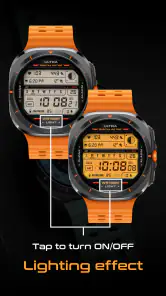
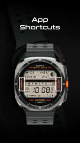
ULTRA Digital Retro is a personalization app for a retro digital watch face. Its defining style is a vintage-inspired digital display paired with a distinctive lighting effect, giving the screen a more expressive look than a plain clock. It can suit everyday wear if you enjoy that aesthetic, while its customizable colors let you adjust the appearance to better match your taste.
How much does ULTRA Digital Retro cost, and what should I know before downloading it?
ULTRA Digital Retro costs $1.89. Before downloading, consider whether you want a retro digital style and whether your smartwatch supports the watch face. The app is rated for Everyone, and it has an average rating of 4.6 from 578 ratings, giving you a sense of how other users have responded. Check the app’s store page for the purchase and installation options available to your device.
What are the key features of the ULTRA Digital Retro watch face?
The ULTRA Digital Retro watch face offers a unique blend of vintage digital aesthetics with modern functionality. Key features include customizable display options, various color themes, and compatibility with multiple smartwatch brands. Users can also enjoy features like battery level indicators, steps counter, and weather updates, making it both stylish and practical.
Is the ULTRA Digital Retro watch face compatible with all smartwatches?
The ULTRA Digital Retro watch face is designed to be compatible with a wide range of smartwatches, including popular brands like Samsung, Garmin, and Wear OS devices. However, it is always advisable to check the specific compatibility with your device model to ensure smooth installation and operation.
How can I customize the ULTRA Digital Retro watch face to suit my preferences?
Users can easily customize the ULTRA Digital Retro watch face through the settings on their smartwatch. Options include changing the color theme, adjusting the brightness, and selecting which information to display prominently, such as time, date, or health metrics. This personalization ensures your watch face meets your style and functional needs.
Pros
- Eye-catching retro design
- Highly customizable features
- Battery efficient
- Real-time weather updates
- Compatible with various devices
Cons
- Limited free features
- Occasional sync issues
- Requires Wear OS
- Ads in the free version
- Some features need premium
- Category
- Personalization
- Version
- Varies with device













