Simple Floral Watch Face
- 46.00
- 4.7
- Installs
- 10.00K
- Price
- $1.49
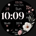
Screenshots
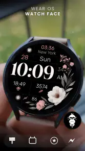
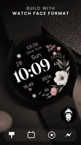
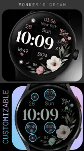
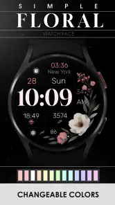
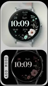
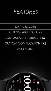
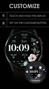
Analysis by Reviewed
I like watch faces that improve the glance without turning the watch into another noisy screen, and Simple Floral Watch Face takes that restrained approach. Developed by Monkey's Dream, this personalization app is made for Wear OS and centers on a floral design that feels decorative without becoming overly busy. I spent time looking at it as an everyday watch face rather than treating it like a static illustration, because the real question is whether it remains useful when I am checking the time quickly, walking outside, or wearing it alongside different outfits.
The app costs $1.49, carries an Everyone age rating, and was released on January 24, 2024. Its audience is fairly clear: people who want an elegant floral style on a compatible Wear OS watch and still expect some control over the way the face looks. It is not trying to replace a fitness dashboard or become a miniature productivity tool. That focus is one of its strengths, although it also defines the situations where I would choose something else.
A closer look at the design, controls, and everyday trust
A floral face that works best when the watch stays in the background
The first thing I noticed is the balance between decoration and readability. Floral watch faces can easily become crowded, especially when petals, stems, color changes, and complications compete for the same small space. This one is more successful when I treat the floral artwork as the visual character and let the time remain the primary information. I can glance down, understand the hour, and move on without feeling that I am reading a poster compressed onto my wrist.
That makes it a good fit for someone who wants a watch to look personal at a dinner, in an office, or during a relaxed weekend without using a loud novelty theme. The style also suits people who find the default digital faces too plain but do not want a highly animated or technical appearance. I would describe the mood as polished and calm rather than playful, sporty, or futuristic.
The design choice has a practical trade-off. A floral background may be more attractive than a plain color field, but any decorative detail can affect instant legibility depending on the selected arrangement, brightness, and the lighting around you. I would spend a few minutes checking the face indoors and outdoors before deciding on a permanent setup. A configuration that looks excellent on the watch while sitting at home may need a small adjustment when viewed in strong daylight.
Customization matters more than the first preview
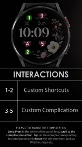
The store summary presents this as a customizable watch face, and that is important because the appeal is not only the floral artwork itself. I would not judge it from the initial preview alone. The useful workflow is to install it, open the Wear OS face-selection and customization controls, and test the available choices against the way I actually use my watch. The best result is usually the one that keeps the visual center clean while placing only the information I check regularly around it.
For me, that means resisting the temptation to fill every available area. If I add too much information, the face loses the quiet quality that makes the floral design attractive in the first place. A weather detail may be useful before leaving home, while a calendar item may matter more during a workday. I would choose one practical glance point, then keep the rest of the layout open. This is a small but meaningful insight: customization is not automatically better when it adds more; with this design, restraint protects both style and readability.
More From Our News Desk

Clash of Clans Is Won Between the Battles

Android Auto Makes the Case for Quieter Car Software

MobiOffice: Transforming Mobile Productivity with Seamless Integration

EA SPORTS FC™ Mobile Soccer: Redefining Mobile Sports Gaming

How Microsoft OneDrive Became a Mobile Productivity Giant

How Google Translate Breaks Language Barriers Effortlessly
I would also compare the face with the watch's existing options before installing it. Many Wear OS watches include free faces with extensive complication support, and some users may already have a simple analog or digital layout that is faster to read. The reason to choose this app is the combination of its floral identity and the ability to adapt it to personal preferences, not because every possible information panel will outperform a dedicated utility face.
How it fits into a normal day
Imagine leaving home for work with a watch that already shows the time and one or two details you care about. At the train platform, I want a quick glance rather than a screen that demands attention. During a meeting, I may prefer a softer appearance that does not look like a sports computer. Later, when I am walking home, I might want the same face to remain readable without changing to a completely different theme. This is the kind of continuous, low-effort use where the app makes sense.
It also works well for someone who treats the watch as part of an outfit. A floral face can make a plain smartwatch feel less generic, particularly when the usual alternatives are dark technical designs or very basic digital clocks. I would be comfortable recommending it to a friend who says, “I want my watch to look nicer, but I do not want a complicated setup.” The setup still deserves attention, but the visual goal is easy to understand.
On the other hand, I would not recommend it as the first choice for someone who spends most of the day tracking workouts, monitoring several health indicators, or checking multiple calendar and communication details from the wrist. A purpose-built fitness face or information-dense dashboard will usually be more suitable for that routine. This app is strongest when the watch is primarily a timepiece with a personal visual touch.
What I look for before trusting a personalization app
A watch face has a more intimate position than an ordinary wallpaper because it stays visible throughout the day and may sit alongside personal notifications or health information. That is why I pay attention to the installation flow, the choices shown by the system, and whether the app asks me to create an account before I can use a basic visual product. With Simple Floral Watch Face, I would keep the decision focused on the permissions and controls actually displayed on my device rather than assuming that every watch face behaves the same way.
The safest habit is simple: read each Android or Wear OS permission prompt before accepting it, and do not grant access that does not make sense for changing a watch face. I would also check the app's system page after installation so I know what access is active. This is not a criticism of Monkey's Dream; it is a sensible routine for any personalization download, especially when the app's main purpose is visual rather than social or communication-based.
I also prefer products that let me make a choice without pushing me toward an account, a community profile, or unnecessary sharing. For this app, my practical advice is to use the most direct setup available, review the visible settings, and keep the watch face limited to information I am comfortable displaying on my wrist. If the watch is used around colleagues, family, or strangers, remember that complications can expose more than the decorative design does. A calendar title or notification preview may be more sensitive than the face itself.
Small decisions that improve the experience
My first tip is to test contrast before settling on a favorite look. I would view the face with the watch at arm's length, not only close to my eyes, and check it while moving between an indoor room and a bright outdoor area. This catches a common problem with decorative faces: a beautiful composition can become slower to read when the background and digits have similar visual weight.
My second tip is to build one “daily” configuration and one “quiet” configuration if the available controls allow it. The daily version can include the information I check on a commute, while the quiet version can remove distractions for evenings or formal occasions. Keeping the two purposes separate is more useful than constantly changing every setting. It also lets me decide whether the face's customization is genuinely helpful or merely attractive in a preview.
My third tip is to consider battery behavior without making assumptions about exact results. A static-looking face is generally a more sensible starting point for a battery-conscious user than a theme that depends on constant motion, but the watch model, display technology, brightness, and complications still matter. I would monitor normal use after installation and compare it with the previous face over several ordinary days. If battery life becomes a priority, reducing unnecessary complications and avoiding frequent screen interaction is a better first adjustment than immediately uninstalling the app.
There is another practical detail that is easy to overlook: make sure the face is selected on the watch after installation, rather than assuming the phone-side installation has completed the whole process. Wear OS management can vary by device, so I would check the watch's face picker and then open the customization panel from there. That quick verification prevents the frustrating situation where an app is installed but the face is not actually being used.
Where the usual alternatives are better
The most obvious alternative is the collection of faces already included with a Wear OS watch. Those faces have a convenience advantage: they are already integrated into the device, familiar, and often designed around the manufacturer's own display and complication system. If I only need a clean clock and do not care about floral styling, the built-in option may be enough.
Another alternative is a highly informative face designed around exercise, weather, appointments, or health data. That type of face can win for a user who checks the watch repeatedly during a busy day and wants several answers at once. Simple Floral Watch Face makes more sense when appearance and calm readability matter more than maximum data density.
There are also animated, themed, and photo-based faces. Those can offer more visual novelty, but they may feel less timeless and can make the watch look busier. I see the floral design as a middle ground: more distinctive than a default clock, but less demanding than a constantly changing theme. The trade-off is that someone seeking a dramatic transformation may find it too understated, while someone seeking pure efficiency may see the artwork as unnecessary.
Who should install it, and who should pass?
I would point this app toward Wear OS owners who want an elegant floral appearance, prefer a watch face that can be adjusted to personal taste, and value a softer alternative to technical-looking layouts. It is especially appealing if the watch is part of everyday clothing rather than only a fitness accessory. The one-time price is modest, so the decision mainly comes down to whether the design earns a permanent place on the watch.
I would suggest passing if your top requirement is a large amount of live information, specialized workout data, or the fastest possible access to many complications. I would also skip it if you dislike decorative backgrounds altogether. Customization can improve the fit, but it cannot turn a floral concept into a completely different kind of watch face.
The app has an average rating of 4.7 from over 400 ratings, with more than 40 written reviews and over 10 thousand installs. Those figures suggest that it has found a receptive audience, but I would still treat them as context rather than a substitute for checking compatibility and personal preferences. A well-liked face can remain wrong for a user who needs a dense sports layout or a very large digital display.
My cautious verdict
After looking at it as both a design choice and a daily tool, I see Simple Floral Watch Face as a focused personalization purchase rather than an all-purpose smartwatch upgrade. Its value comes from giving a Wear OS watch a more graceful identity while leaving room for the user to decide how much information belongs on the screen. That balance is more convincing than a face that tries to do everything.
I appreciate that the app's purpose is easy to understand: install it, choose the face, adjust the visible choices, and decide whether the result remains comfortable during real use. My recommendation is to approach the setup deliberately, keep personal complications under control, and test readability in the places where you normally check the time. Those steps matter more than choosing the most decorative preview.
My final take: choose it for floral style with practical customization, not for a data-heavy smartwatch dashboard. At $1.49, it is a reasonable option for someone who wants a more personal and polished look on a compatible Wear OS watch. I would recommend it to a friend who values appearance, simplicity, and control over the final layout, while steering a fitness-focused or information-hungry user toward a more specialized alternative.
Simple Floral Watch Face Frequently Asked Questions
Who makes Simple Floral Watch Face, and what is its age rating?
Simple Floral Watch Face is made by Monkey's Dream and is categorized as a personalization app for Wear OS. Its content rating is Everyone, so it is presented as suitable for general audiences. If you are choosing a watch face for a family member, the rating is one helpful point to consider alongside whether their smartwatch supports the app and whether its look suits their preferences.
What is Simple Floral Watch Face?
Simple Floral Watch Face is a decorative watch-face app designed to give a compatible smartwatch a clean, nature-inspired appearance. It generally combines a simple time display with floral artwork, creating a softer and more personal alternative to standard digital or fitness-focused designs. Before downloading, check the store listing carefully because compatibility, supported watch models, and available customization options may vary by device and operating system.
Which smartwatches are compatible with Simple Floral Watch Face?
Compatibility depends on the platform for which the watch face was published. It may be intended for a specific smartwatch ecosystem rather than every Android or iOS wearable, so users should confirm support for their exact model before installing. Check the app description, required operating system, and companion-app requirements. Some watches may also need a separate installation or synchronization step through the manufacturer’s official application.
Can I customize the Simple Floral Watch Face?
Customization can differ depending on the version and the smartwatch platform. A floral watch face may allow users to select from several designs, adjust colors, change information shown on the screen, or choose between digital and analog layouts. However, not every version includes these controls. Review the screenshots and feature list before downloading, especially if you need complications such as steps, battery level, date, weather, or heart-rate information.
Does Simple Floral Watch Face affect battery life?
Like any active watch face, Simple Floral Watch Face can have some effect on battery consumption, although the impact is usually influenced more by the display technology, brightness, animation, complications, and screen-on behavior of the smartwatch. A static floral design will generally be less demanding than an animated face. If battery life becomes noticeably shorter, reduce brightness, disable unnecessary data fields, or switch to a simpler built-in face.
Pros
- Clean floral design is easy to read at a quick glance.
- Lightweight watch face should have minimal impact on battery life.
- Works well with both casual and nature-inspired watch styles.
- Simple layout avoids distracting animations and visual clutter.
- Floral artwork gives the watch a softer
- more personalized appearance.
Cons
- Limited customization may disappoint users seeking detailed controls.
- A decorative design may not suit professional or sporty outfits.
- Small text can be harder to read on compact smartwatch screens.
- Some features may depend on the watch platform or companion app.
- The floral theme may feel repetitive for users who change faces often.
- Category
- Personalization
- Version
- Varies with device













