Big HomeScreen - Easy & Smooth
- 20.00
- 4.5
- Installs
- 10.00K
- Price
- Free

Screenshots
Analysis by Reviewed
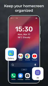
I approached Big HomeScreen - Easy & Smooth as a practical personalization app rather than just another way to change icons. Its store summary suggests something broader than a basic launcher, while the short description points directly to its main idea: making the home screen feel bigger and easier to use. After spending time with that concept, my impression is that this app is aimed at people who want their phone’s first screen to feel less cramped and less demanding.
That focus matters. Many launchers try to impress with endless visual controls, gesture systems, theme engines, and dense settings menus. Big HomeScreen takes a more approachable direction. The appeal is not necessarily having the most elaborate desktop possible; it is having a home screen that is easier to read, easier to reach, and less tiring during ordinary use. I can see the value for someone who checks a phone repeatedly throughout the day and wants the essential apps to be obvious immediately.
What using a larger home screen feels like
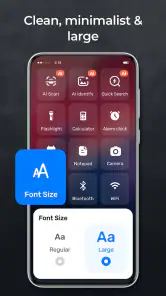
The first thing I noticed is that a larger layout changes the rhythm of using a phone. Instead of treating the home screen as a decorative space, I began to think of it as a simple control panel. The apps I use most often become easier to identify, and there is less temptation to fill every available area with shortcuts. That makes the experience feel calmer, especially when I am in a hurry.
This is where the app’s “easy and smooth” positioning makes sense to me. The benefit is not just visual size. A home screen with clearer targets can reduce the small moments of hesitation that happen when several icons look similar or when a compact layout makes you aim carefully. It is a modest change, but one that can become noticeable over a full day of unlocking, checking messages, opening maps, and returning to the same few tools.
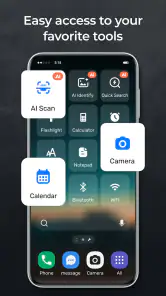
I would especially consider it for an older family member, someone with less comfortable eyesight, or anyone who finds modern phone interfaces too crowded. It can also suit a work phone where only a handful of apps matter. A simple first page with communication, calendar, camera, and navigation tools is often more useful than a carefully arranged collection of every installed app.
There is a trade-off, though. Bigger elements can make the home screen feel less information-dense. If you like seeing many shortcuts at once, a conventional launcher with a compact grid may be more efficient. Big HomeScreen is better understood as a choice for clarity and reachability, not as a productivity dashboard packed with tiny controls.
Speed expectations in everyday use
When I judge a launcher, I pay attention to the moments between intention and action: unlocking the phone, returning home, opening the app drawer, and finding the next app. Big HomeScreen’s strongest performance argument is its straightforward purpose. A launcher that does not ask the user to manage a complicated visual system can feel quicker simply because there is less mental sorting involved.
More From Our News Desk

Clash of Clans Is Won Between the Battles

Android Auto Makes the Case for Quieter Car Software

MobiOffice: Transforming Mobile Productivity with Seamless Integration

EA SPORTS FC™ Mobile Soccer: Redefining Mobile Sports Gaming

How Microsoft OneDrive Became a Mobile Productivity Giant

How Google Translate Breaks Language Barriers Effortlessly
That perceived speed is important. Even when two home screens open in a similar amount of time, the one with clearer placement can feel faster because I spend less time searching. The larger presentation helps with that kind of speed. It is especially useful when I am walking, carrying something, or trying to make a quick call without carefully inspecting the screen.
I would not choose it expecting a dramatic transformation of the phone’s overall performance. A launcher controls the starting point of the device, but it cannot make a demanding game render faster or repair a slow storage system. Its contribution is narrower: it can make common navigation feel more direct. That distinction keeps expectations realistic.
The current version is 1.1.2, and the app supports devices running Android 8.0 or later. That broad compatibility makes the idea relevant to older phones as well as newer ones, but it also means the experience may depend heavily on the device itself. A modern phone with plenty of available storage and memory will naturally feel more responsive than an aging handset already struggling with background work.
What happens during heavy-use moments
The most revealing test for a home-screen replacement is not the first launch. It is what happens after a busy stretch: several apps opened, a call answered, a notification checked, and the user returning home repeatedly. In that situation, I value predictable access more than decoration. Big HomeScreen’s large, uncomplicated approach is well suited to returning to a known starting point without having to remember a complicated gesture or hunt through layers of customization.
A realistic example is a morning commute. I might open a transit app, switch to messages, check a calendar reminder, and then return to the home screen to open music or navigation. A larger arrangement gives those frequent destinations a clear place. The useful insight is to organize the screen around transitions rather than categories: put the apps I reach for immediately after another task near each other, instead of grouping them only by type.
Another practical workflow is to keep the first screen intentionally sparse and use the rest of the phone for less frequent apps. This prevents the larger design from becoming another crowded collection. If I were setting it up for a relative, I would place only the apps they actually use on the main screen, then spend time practicing the route to everything else. The value comes from reducing decisions, not from enlarging every possible shortcut.
Heavy use also exposes the limits of any simple launcher. If a phone is already under pressure from demanding applications, the home screen cannot eliminate delays caused elsewhere. Returning to the launcher may still depend on the operating system reclaiming memory or rebuilding an app after it has been closed. I would therefore judge the app by whether it keeps the everyday entry point understandable, not by expecting it to solve wider device slowdowns.
Stability and recovery after interruptions
Reliability is more than opening correctly once. I want a launcher to remain usable after interruptions, screen rotations, calls, notifications, and long periods away from the phone. Big HomeScreen’s appeal is its focused role: it is there to present the home screen and help me reach the next task. That narrow purpose should make it easier to live with than a launcher that constantly asks me to maintain a complex system.
Recovery is particularly important for people who are not comfortable troubleshooting Android settings. If the phone returns to a familiar, readable arrangement after an interruption, the experience feels dependable. If the layout becomes confusing or the user cannot remember where a function went, even a visually attractive launcher becomes a burden. My advice is to keep the setup conservative at first. Make the essential apps easy to find before experimenting with any optional arrangement or personalization controls the app offers.
I also recommend giving the new layout a proper trial rather than switching back after five minutes. The first reaction can be misleading because muscle memory expects the old grid. The real question is whether the larger presentation reduces mistakes after several days. For a shared household device or a phone used by someone who values consistency, that long-term familiarity matters more than the novelty of the first setup.
There is a practical recovery habit worth adopting with any launcher: remember where the standard Android launcher selection lives before changing the default. That is not a special feature of this app; it is simply good preparation. If the new arrangement does not suit you, knowing how to return to the previous launcher prevents a small experiment from becoming a frustrating support call.
Device constraints and who should think twice
The Android requirement begins at version 8.0, so Big HomeScreen is not restricted to recent phones. That is useful for people keeping an older handset in service, but compatibility alone does not guarantee identical comfort on every device. Screen size, display sharpness, touch responsiveness, and the phone’s general condition will affect how convincing a larger home screen feels.
On a small display, larger items may improve readability while also leaving less room for secondary shortcuts. On a very large display, the same layout may feel comfortable, but users who prefer compact information could find it wasteful. I would make the decision based on the kind of friction I experience now. If I regularly tap the wrong icon or struggle to distinguish shortcuts, the space trade-off is probably worthwhile. If I already find my phone easy to navigate and want maximum density, it may not be.
Resource demands are another sensible consideration. A personalization app becomes part of the phone’s basic navigation, so I would avoid judging it only by visual appeal. On a device with limited free space or noticeable memory pressure, every additional layer can matter. I cannot promise that a different home screen will reduce battery use or make an old phone feel new. The safer expectation is that this app changes the interface and the way I reach apps; it is not a general performance optimizer.
People who rely on highly specialized launcher features should also compare carefully before switching. Users who want extensive automation, intricate gesture chains, elaborate icon packs, or a very dense productivity layout may prefer a mature power-user launcher. Big HomeScreen’s strength is approachability. That same simplicity can feel restrictive to someone who enjoys tuning every visual and behavioral detail.
How it compares with the usual alternatives
The default launcher supplied with a phone is the obvious alternative. It usually offers the least disruption and tends to match the device’s system behavior closely. If I am satisfied with the existing grid and only want a few cosmetic changes, staying with the default is sensible. Big HomeScreen earns consideration when the standard arrangement feels too small, busy, or awkward for the way I use the device.
Traditional third-party launchers generally compete through customization. They may appeal to users who want to control icons, folders, gestures, transitions, and page structure in detail. That flexibility is valuable, but it can also create setup work. Big HomeScreen takes the opposite route: the main reason to install it is to make the starting screen more accessible and less crowded, not to turn the phone into a design project.
Accessibility settings built into Android are another comparison point. System-level adjustments can help with text size, display scaling, and other visibility needs across the phone. Those controls may be the better answer when the problem affects every screen, not just the home screen. I see Big HomeScreen as more targeted: it can improve the first point of contact with the device, while system settings address broader readability and interaction concerns.
This distinction helps avoid choosing the wrong tool. If the main frustration is finding a few important apps quickly, a dedicated large home screen makes sense. If menus, notifications, web pages, and in-app controls are also difficult to read, I would combine interface changes with Android’s own accessibility options rather than expecting a launcher alone to solve everything.
Who will get the most from it?
The clearest audience is someone who wants a phone to feel less visually demanding. That includes users with eyesight or dexterity concerns, people who use a phone mainly for a small set of everyday tasks, and families setting up a device for someone who does not enjoy learning a complicated interface. The free price also makes it easy to try without turning the decision into a financial commitment.
I can imagine it working well on a spare phone used for calls, emergency contact, navigation, or household tasks. In that role, a focused home screen is more useful than a highly customized one. It can also suit a person who keeps accidentally burying important apps in folders and wants a visible starting point instead.
I would be more cautious if my phone is an intense productivity tool. Someone who needs many shortcuts visible at once, relies on elaborate gestures, or wants a carefully optimized multi-page system may find the larger layout too limiting. The same applies to users who enjoy constantly changing themes and fine-tuning animations. This app’s appeal comes from reducing complexity, so it is not the best match for someone who sees complexity as part of the fun.
My performance verdict after living with the idea
Big HomeScreen - Easy & Smooth is a focused personalization app from ICC Tech that makes the home screen the center of its experience. Its store rating averages 4.5 from around 164 ratings, and it has passed 10K installs, which suggests that the concept has found an audience without needing to be treated as a mainstream replacement for every launcher. It is free, rated for Everyone, and released on Apr 3, 2026.
Those details fit my overall impression: this is an approachable utility rather than a feature-heavy playground. I like it most when I think about real friction—mis-taps, crowded pages, forgotten app locations, and the effort of explaining a phone to another person. The larger presentation can make the device feel more deliberate and less cluttered, particularly when the user’s routine revolves around a few trusted apps.
My main caution is to keep the promise in perspective. It may make navigation feel clearer and more comfortable, but it should not be treated as a guaranteed speed booster, battery saver, or cure for an aging phone’s wider performance problems. The best results will come from pairing the app with a restrained layout and realistic expectations about the device underneath.
My recommendation is simple: try it if clarity matters more to you than density. I would install it for a family member who wants larger, easier-to-reach choices, or for a personal phone that has become visually tiring. I would skip it in favor of a conventional power-user launcher if I needed deep customization and maximum information on every page. For the right user, though, Big HomeScreen turns the first screen into something more useful: a calm, readable starting point that gets out of the way and lets the rest of the phone do its job.
Big HomeScreen - Easy & Smooth Frequently Asked Questions
Is Big HomeScreen - Easy & Smooth suitable for seniors or anyone who finds standard phone interfaces difficult to use?
It may be a good fit for people who want a simpler, easier-to-read Android home screen. Big HomeScreen - Easy & Smooth focuses on larger icons and accessible controls, which can help reduce the effort of finding everyday apps. It can also suit anyone who prefers a less crowded layout, though comfort and readability are personal, so consider trying the interface and adjusting its options to your needs.
What is Big HomeScreen - Easy & Smooth, and who is it designed for?
Big HomeScreen - Easy & Smooth is an Android launcher designed to make everyday phone use simpler and more comfortable. It replaces the standard home screen with a cleaner layout, larger icons, and easier-to-read controls. It may be especially useful for seniors, people with limited vision, users who prefer a less crowded interface, or anyone who wants quick access to essential apps without navigating complicated menus.
Does Big HomeScreen - Easy & Smooth work on every Android device?
The launcher should work on many Android smartphones and tablets, and it requires Android 8.0 or later. Compatibility can still depend on your device model, screen size, and manufacturer software. Some system features may also behave differently on Samsung, Xiaomi, Motorola, or other customized Android interfaces. Before downloading, check the app’s current Google Play requirements and confirm that your device supports changing the default home screen application.
Can I customize the appearance and apps shown on the home screen?
Big HomeScreen - Easy & Smooth is focused on simplicity, but it generally allows users to personalize important parts of the interface, such as the apps displayed, shortcuts, layout, or visual settings. The exact options may vary according to the installed version and device. It is a good idea to review the settings after installation so you can place frequently used apps, contacts, and functions where they are easiest to reach.
Will installing this launcher delete my apps, files, or current home-screen setup?
Installing Big HomeScreen - Easy & Smooth should not delete your applications, photos, messages, contacts, or other personal files. However, changing the launcher changes the way you access those items from the home screen. Your previous launcher and its arrangement may not automatically appear in the same form if you switch back, so consider noting your preferred setup and make sure you know how to restore the original launcher through Android settings.
Pros
- Clean layout makes essential apps easy to find.
- Large icons improve visibility for users with poor eyesight.
- Simple navigation reduces confusion for first-time smartphone users.
- Runs smoothly without demanding advanced phone hardware.
- Useful option for seniors or users wanting fewer distractions.
Cons
- Limited customization may frustrate users who prefer detailed layouts.
- Large elements can reduce the number of apps shown at once.
- Some features may require accessibility permissions to work properly.
- The simplified design may feel too basic for experienced users.
- Compatibility and performance may vary across Android devices.
- Category
- Personalization
- Version
- 1.1.2













