2025 ColorCal
- 1.00
- 4.8
- Installs
- 500.00
- Price
- $1.49
Screenshots
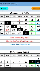
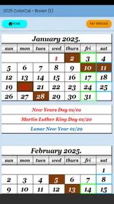
Analysis by Reviewed
I would approach 2025 ColorCal as a focused planning aid rather than a replacement for every calendar in my life. It is aimed at USPS letter carriers and clerks, including NALC and APWU members, so its appeal is most obvious when a color-coded view helps make a work schedule easier to scan. That focus can be useful, but it also means I would first ask whether its calendar conventions match the way I actually plan.
When a connection becomes part of the workflow
Calendar apps can behave differently when a phone moves between Wi-Fi and mobile data, or when a user switches devices. I wouldn’t assume that a schedule entered on one screen appears everywhere immediately: if I rely on multiple devices, I’d check the app’s actual sync behavior before making it my only record. That small test matters more than a polished first impression, especially for plans that affect a shift or appointment.
The app is developed by FourCatsApp, and its current release is version 1.02. I’d treat the relatively focused purpose as a reason to test the basic routine first: open the calendar, find the relevant date, and confirm that the colors make sense at a glance. That tells me more about day-to-day fit than trying to migrate every commitment at once.
Useful in the moments between tasks
For a carrier or clerk checking a schedule during a busy day, a quick visual scan can be more practical than opening a general-purpose planner full of unrelated projects. A realistic use would be checking the next day’s commitments before leaving home, then reviewing the week when planning errands around work. I’d keep the first few entries simple and use color consistently; changing the meaning of colors from week to week makes a visual system less useful.
That same focus will not suit everyone. If you want a broad task manager, shared household planning, or a calendar already tied to a larger suite of work tools, a standard calendar may be the better starting point. I would also avoid depending on any calendar as the sole place for urgent information until I have tested how it behaves when connectivity is unreliable and after reopening the app.
A Splash of Color in Your Daily Routine
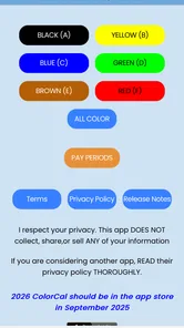
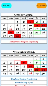
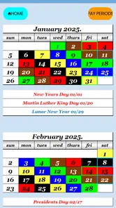
One of the first things you'll notice about 2025 ColorCal is its visually appealing interface. The app embraces a colorful design, which isn’t just for show. The color-coding feature is brilliant for those who, like me, need visual cues to keep track of various tasks. Whether you’re dealing with work commitments, personal errands, or social events, each can be assigned a different color, allowing you to see what’s on your plate at a glance.
Features That Stand Out
Beyond the aesthetics, the app packs a punch with its features. The app offers seamless integration with other calendar tools, which means you won’t miss a beat if you’re transitioning from another platform. I particularly love the task prioritization feature, which lets you mark tasks as high, medium, or low priority. It's a lifesaver when you're juggling multiple deadlines and need to focus on the most pressing tasks first.
More From Our News Desk

 Gmail
Gmail in a Busy Inbox: Who Benefits Most?
From first account to crowded workday, Gmail earns its place through dependable search and flexible sorting—but its best fit depends on how much inbox maintenance you can tolerate.

 Prime Video
Switching to Prime Video: What Changes in Your Viewing Routine
Prime Video can make a compelling second home for streaming, but switching means learning a different catalog, rental layer, and route from browsing to playback.

 Universal TV Remote Control
 Works Best as a Reliable Backup
A phone remote earns its place through quick setup and reliable habits. Here is how to get more from Universal TV Remote Control—and where its limits show.
 Weather - By Xiaomi
Weather by Xiaomi Review: Clear at a Glance, Less Clear Up Close
Xiaomi’s weather app makes everyday forecasts quick to scan, but its calm surface can leave useful details and recovery paths harder to find than they should be.

 X
X Under Pressure: Can It Recover When Posting Goes Wrong?
A resilience-focused review of X, examining setup, mistaken posts, interruptions, weak connections, and the gaps that matter when recovery needs to be dependable.

 Clash of Clans
 Is Won Between the Battles
Its raids are quick; its community is a long-term project of coordination, teaching, rivalry, and shared responsibility—with all the friction that entails.
Latest News



Another feature worth highlighting is the notification system. It’s customizable, which means you can set reminders that best fit your lifestyle. Whether you need a gentle nudge an hour before or a loud alarm five minutes prior, the app has got you covered. Plus, the app allows you to set recurring events effortlessly, making it perfect for both personal and professional schedules.
User Experience and Accessibility
Using the app feels intuitive. The developers have clearly prioritized user experience, ensuring that even those who aren’t tech-savvy can navigate the app with ease. The layout is clean, and the instructions are straightforward, which I appreciate as someone who doesn’t have time to fumble around with complicated settings.
The app is also accessible across devices, which means you can check your schedule on your phone, tablet, or computer without any hassle. This cross-platform compatibility is essential in today’s fast-paced world where we’re constantly switching between different devices.
Price, fit, and a sensible first test
It costs $1.49, so I’d weigh that against how often I need a calendar centered on postal work rather than assuming a free general calendar will do the same job. The app is rated for Everyone, has a 4.8 average from 9 ratings, and has 500+ installs. Those figures suggest a small audience with a positive response, not enough on their own to tell me whether the workflow suits my particular route or office.
Before moving important plans over, I’d try a low-stakes week: add a recurring commitment, set a reminder, and check the calendar in the places I normally use it. I’d also make one deliberate connectivity check—open it where reception is weak, then revisit the same schedule later on a reliable connection. This is a practical way to learn whether the app fits my routine without risking a missed appointment or assuming a particular offline or sync behavior.
For anyone watching mobile data use, ordinary calendar checks are a different habit from repeatedly refreshing or switching between services. I’d avoid unnecessary back-and-forth during a shift and verify key plans before heading out. That advice is less about saving a precise amount of data and more about keeping schedule checks quick and dependable when attention is already divided.
Final Thoughts
In a nutshell, the app is a game-changer for anyone looking to streamline their scheduling process. It’s not just about keeping track of dates; it’s about enhancing productivity and adding a bit of fun to your planning. If you’re in the market for a reliable and easy-to-use calendar app, give it a try. It might just be the colorful boost your routine needs!
My recommendation is narrower than that closing enthusiasm might suggest: it makes most sense for postal workers who want a dedicated, color-led view and are comfortable checking how it behaves on their own devices. If you need a full team planner or depend on guaranteed real-time updates across several screens, I’d compare those needs against a broader calendar before paying. For a straightforward personal schedule, however, the low one-time price and specialized focus make it a reasonable option to test.
Making the color system useful beyond a quick glance
I’d give each color a stable job before filling the calendar. For example, one could represent work-related commitments and another personal obligations, while keeping the distinction simple enough to recognize quickly. The useful test is whether I can tell what kind of day I’m looking at without opening each entry. If colors become decorative rather than consistent cues, they add visual noise instead of helping me make decisions.
A second practical habit is to review the coming week at a calm moment, rather than relying on quick checks alone. A postal worker might look ahead before arranging an appointment or family errand, then use a short daily glance to confirm the immediate plan. This separates planning from checking: the weekly review catches conflicts, while the glance is only for orientation. It also helps reveal whether the calendar’s display suits a route or office routine over several days.
Recurring commitments are worth testing carefully before I trust them. I’d create one ordinary repeat schedule, inspect a later occurrence, and confirm that the reminder is attached as intended. This is not because I expect a problem; it is simply the safest way to understand how a repeated entry behaves before using it for something important. A small trial also shows whether the calendar is comfortable for a schedule that changes often or works better for predictable patterns.
Where a specialized calendar beats a general planner
The strongest reason to choose this app over a standard calendar is the fit between its postal-work audience and a color-led way of scanning dates. A general calendar may be excellent for appointments and personal events, but it can become cluttered when work obligations, errands, and reminders all compete for attention. A focused view can reduce that clutter if its organization matches the way I think about the week.
The trade-off is that specialization is not automatically an advantage for every person. Someone coordinating a household, sharing events with colleagues, or managing projects with task lists may be better served by a broader platform built around those needs. I would not pay for a second calendar just because its audience sounds relevant; I’d first decide whether I want a dedicated view for postal scheduling or one place to manage every part of life.
It may also make sense to keep a general calendar as the main record while trying this one with non-critical plans. That approach is less tidy, but it limits risk while I learn whether the visual layout and day-to-day routine feel right. If I find myself entering the same event in two places for too long, that is a sign to choose one system rather than letting duplication become another chore.
A realistic day and the value of a quick check
Imagine finishing a shift and needing to plan an appointment, pick up groceries, and remember a personal commitment the next morning. I would check the calendar before leaving work, compare the next day’s obligations at a glance, and decide whether the errand fits without crowding the morning. The benefit is not that the app makes the decision for me; it is that a visual schedule can make the competing commitments easier to notice before I make plans.
For someone who checks a phone in short intervals, the most useful workflow is to keep entries readable and avoid turning each one into a long note. Put the essential detail where it can be recognized quickly, and use a reminder only when a prompt will genuinely help. Too many alerts can make a calendar easier to ignore, so I’d reserve notifications for events where timing matters rather than enabling them for every routine item.
On a busy day, I would also avoid changing the color scheme on the fly. A stable convention means a quick glance stays meaningful even when I have little time to study the screen. If a new type of commitment does not fit an existing color, I’d decide where it belongs during a weekly review instead of improvising while rushing between tasks.
What to check when something does not look right
If an event seems missing or a reminder does not behave as expected, I’d start with the simple checks: confirm the date, reopen the calendar, and review the entry itself before making a duplicate. Duplicate events can create more confusion than the original problem, especially when the schedule is already busy. If I use more than one device, I’d compare them only after checking the app’s behavior in my own setup, rather than assuming that a change should appear instantly.
Connectivity deserves a practical test, not a guess. I’d check the schedule once in a reliable connection, then repeat the check in the places where I commonly have weaker reception. If something looks different, I would avoid making consequential changes until I can verify which version of the plan is current. For appointments or shift-related details, keeping a separate dependable reminder during the trial period is a sensible precaution.
That cautious approach is especially useful for people who move between buildings or spend much of the day away from stable Wi-Fi. A calendar can still be handy in those settings, but confidence comes from seeing how it behaves in the actual routine. I would judge it on the dates and reminders I can verify, not on assumptions about synchronization or access when the network changes.
Who will get the most from it
I can see this being a good fit for USPS carriers and clerks who want a compact, visually clear way to think about work dates alongside personal plans. It is also suited to someone who prefers a dedicated tool over a general planner and is willing to spend a little time establishing consistent colors. The app’s $1.49 price makes a low-risk trial possible for people who have already decided that a postal-work-oriented calendar is worth exploring.
I’d skip it if my main need were collaborative scheduling, a comprehensive task-management system, or assured coordination across multiple devices without first testing the setup. I’d also think twice if I rarely use color cues or already have a calendar that handles work and personal plans cleanly. The app is rated for Everyone, but that broad age label does not determine whether its specialized workflow is the right fit for an individual user.
Its average rating is 4.8 from 9 ratings, with 500+ installs, so I’d treat the positive response as encouraging but modest in scope. A small pool of feedback cannot answer every practical question about a particular workplace schedule, phone, or connectivity pattern. My own short trial would matter more than treating the rating as a guarantee.
My connectivity verdict
For me, the central question is not whether a calendar can show a colorful month; it is whether I can trust the routine I build around it. I’d try a normal week, test a recurring commitment and reminder, and check how the calendar behaves as I move between network conditions. That process keeps the decision grounded in real use without assuming capabilities that I have not personally established.
2025 ColorCal is most appealing when its postal-work focus and visual organization solve a specific everyday problem. I would choose it over a broad planner only if that focused view makes my schedule easier to scan, and I would keep a wider calendar in the running if collaboration or all-in-one planning matters more. Used with a consistent color habit and a sensible first test, it is a reasonable option to consider; whether it becomes my main calendar depends on how reliably it fits the places and moments where I need it.
2025 ColorCal Frequently Asked Questions
What devices and operating systems can I use with 2025 ColorCal?
Before downloading, check that your device is running a compatible operating system. 2025 ColorCal is a productivity app for Android, with a minimum requirement of Android 10. It is intended for USPS letter carriers and clerks, including NALC and APWU users, so its color-coded calendar focus may be most useful if that matches your work and scheduling needs.
What is 2025 ColorCal and what does it do?
2025 ColorCal is an innovative calendar app designed to enhance your scheduling experience with vibrant color-coded features. It offers a user-friendly interface, allowing you to organize your appointments, meetings, and events efficiently. With its advanced color customization options, users can easily categorize tasks, set reminders, and synchronize with other calendars for seamless management. It's the perfect tool for boosting productivity and maintaining an organized lifestyle.
Who is 2025 ColorCal designed for, and is it useful outside postal work?
2025 ColorCal is a color-coded calendar app aimed at USPS letter carriers and clerks, including people associated with NALC and APWU. That focus is worth considering before you download: its calendar approach may suit postal-work scheduling particularly well, while people looking for a general-purpose planner may find that its intended audience is narrower. It is listed in the productivity category.
Is 2025 ColorCal available on both Android and iOS platforms?
Yes, 2025 ColorCal is available for download on both Android and iOS platforms. The app is designed to provide a consistent user experience across different devices, ensuring that users can manage their schedules whether they're using a smartphone or a tablet. You can find it on the Google Play Store for Android devices and the Apple App Store for iOS devices.
Does 2025 ColorCal offer data synchronization across devices?
Absolutely, 2025 ColorCal supports data synchronization across multiple devices. This feature ensures that your calendar data is always up-to-date, no matter which device you're using. By logging into your account on different devices, you can access and manage your schedules seamlessly. This is particularly useful for users who operate across various platforms and need to keep their calendar information consistent.
Pros
- User-friendly interface design.
- Accurate color selection tool.
- Integrates with calendars.
- Customizable reminders.
- Supports multiple languages.
Cons
- Limited free features.
- Occasional ad pop-ups.
- Requires internet for full access.
- No dark mode available.
- Some features are subscription-based.