WFP 339 Ultra watch face
- 21.00
- 4.7
- Installs
- 5.00K
- Price
- $1.99
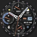
Screenshots
Analysis by Reviewed
I judge a watch face by more than its first glance: it has to be readable when I’m moving, work with the way I use my watch, and avoid making routine checks feel fussy. The WFP 339 Ultra is a paid personalization app from WFProduction by Alexandr Kovalev, made for Wear OS 4.0 and 5.0 devices. Its modern analog look gives it a clear style, but the practical question is whether that look fits your daily habits as well as your screen.
Quick checks and the feel of speed
A watch face should make the time easy to find without asking me to stop and study the display. The analog layout here puts the time and date in a prominent position, while the additional information described for the face can make a glance more useful. That matters when I’m crossing a street, carrying shopping, or checking the time between tasks: I want the essentials to register quickly, not compete for attention.
The face is aimed at a particular kind of wearer: someone who likes an analog presentation but still wants a smartwatch to show more than the time. If you mainly want a quiet, minimal dial, a simpler built-in option may suit you better. If you enjoy a more expressive look and like arranging visible information around your routine, this design has more appeal.
First Impressions
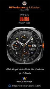
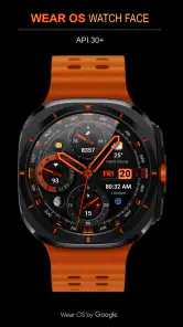
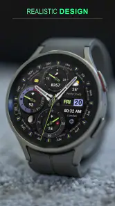
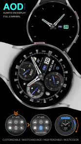
So, first things first, the WFP 339 Ultra really knows how to make an entrance. It boasts a sleek and modern design that immediately caught my eye. The vibrant colors and sharp graphics make it stand out from the typical watch faces you’d find pre-installed. It’s like giving your smartwatch a fresh coat of paint.
Design and Usability
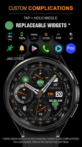
Let’s talk design. This watch face doesn’t just look good; it’s functional too. The layout is intuitive and user-friendly. I found it super easy to navigate through the different features. The time and date are prominently displayed, which is great for a quick glance. Plus, the additional widgets for weather updates and fitness tracking are a nice touch. You can customize the settings to prioritize what’s important to you. Whether it’s steps, heart rate, or even your next meeting, it’s all there at a glance.
Those options are most useful when they reflect what I actually check. For a workday, I’d put the information I need most often where I can read it quickly; for a walk, activity details may matter more than calendar information. There’s a small trade-off with any information-rich face: adding more to the display can make it feel busier. I’d start with only the details I rely on, then adjust after a day or two rather than trying to show everything at once.
Customization Options
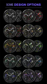
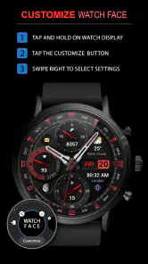
Customization is where the WFP 339 Ultra truly shines. You can tweak the color scheme to match your mood or outfit, which is a feature I absolutely love. It’s like having a little wardrobe for your wrist. The app also offers various styles for the clock hands and numerals, giving you plenty of options to personalize your watch face.
More From Our News Desk

Weather by Xiaomi Review: Clear at a Glance, Less Clear Up Close

X Under Pressure: Can It Recover When Posting Goes Wrong?

Clash of Clans Is Won Between the Battles

Android Auto Makes the Case for Quieter Car Software

MobiOffice: Transforming Mobile Productivity with Seamless Integration

EA SPORTS FC™ Mobile Soccer: Redefining Mobile Sports Gaming
That flexibility is a good reason to spend a minute testing the face in the places you actually use your watch. A color combination that looks striking indoors may be less comfortable to read outdoors, so I’d prioritize contrast over matching an outfit perfectly. It’s also worth choosing a hand and numeral style that stays distinct at a quick glance. Those small choices can make a decorative analog dial more practical without changing its overall character.
Performance
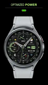
In terms of performance, I have to say, I’m impressed. The watch face runs smoothly without any noticeable lag, which is crucial when you’re dealing with digital displays. It’s also pretty easy on the battery life. I didn’t notice any significant drain, even after using it for a few days straight. That’s always a win in my book!
For heavier days, I’d pay attention to how the face behaves during the checks that happen most often: waking the watch, glancing at it while walking, and returning to it after using other watch functions. A smooth first impression is reassuring, but real-world comfort also depends on whether the information remains legible without extra taps. If you are particularly careful about battery use, compare your normal routine with this face before deciding it is the right long-term choice; a watch face is only one part of the overall experience.
There is a useful distinction between a face feeling quick and the watch itself feeling quick. A watch face mainly shapes what appears when you check the time; it does not replace the device’s broader performance. When I’m deciding whether a design is convenient, I focus on how quickly my eyes find the time and the information I care about, rather than expecting the face to make every watch task faster. If you use your watch mostly for quick glances, that visual ease matters more than a busy layout that promises to show everything at once.
A practical way to judge the setup is to give it a normal day rather than repeatedly opening customization controls. In the morning, choose a readable color and the details you expect to check; during the day, notice whether you can read them naturally in different surroundings. If you keep wanting to pause, tilt your wrist, or look closely, that is a cue to simplify the display or pick a different face. This check helps separate a design that looks attractive in a preview from one that actually fits your routine.
Compatibility is the practical first filter. This face is intended for Wear OS 4.0 and 5.0 devices, so I’d check the operating system on my watch before paying rather than assuming that every smartwatch can use it. It is rated for Everyone, and it costs $1.99. That price makes sense if you expect to keep the look and use its configurable information, but someone who changes faces constantly or prefers a free, basic dial may get less value from it.
Before buying, I’d also think about how often I use the watch face itself compared with other watch functions. Someone who checks the time and date throughout the day may appreciate a dial they have deliberately tuned. Someone who opens a particular app for nearly every task may get little practical benefit from paying for a different starting screen. The value is personal: it comes from seeing a design you enjoy and being able to make its visible details useful, not from changing what the watch can do.
In the broader personalization category, the usual alternatives are built-in faces and other downloadable designs. Built-in options are convenient and familiar, while a more specialized face can offer a stronger visual identity and a closer fit to personal taste. The useful comparison is not simply which one looks more elaborate: it is which one lets you read your chosen details quickly without making the watch feel crowded. I’d choose this face for its analog styling and adjustable appearance, not just because it has more going on.
If you are choosing between this and a very minimal analog face, think about what you want your wrist to tell you before you reach for your phone. The more restrained option is likely the better match if the time is all you need and visual calm is the priority. This design makes more sense if you want the face to carry extra context and enjoy shaping its appearance. Compared with a highly digital layout, its analog character may feel more familiar, though a digital alternative can be easier for someone who prefers information presented in a direct, text-like way.
A realistic use case is a weekday when I’m moving between errands and meetings. I can use the date and time for quick checks, then make the visible information fit the part of the day that matters most. Before heading out, I’d confirm that the details I rely on are readable in the chosen colors; later, if the dial feels cluttered, I’d simplify what I prioritize. That small setup step is more helpful than constantly changing the whole face to suit every situation.
For example, if I’m taking a walk after work, I’d favor the activity information I tend to check and keep the main time display easy to spot. On a desk-heavy day, a different selection may be more useful. The point is not to rebuild the dial for every outing; it is to make one considered setup that handles the checks I actually make. If I find myself wishing for entirely different information each hour, a face with a simpler layout—or a habit of opening the relevant watch app—may be less distracting.
WFProduction by Alexandr Kovalev’s watch face has an average rating of 4.7 from around 280 ratings, with over 5K installs and 21 written reviews. It was released on Sep 12, 2024. Those figures offer a little context, but they don’t replace checking whether the design and Wear OS compatibility suit your own watch and habits.
One point worth keeping in mind is that an analog face is not automatically the best choice for every glance. If you rely on a very sparse screen, want the most understated look, or would rather avoid a paid customization app, the standard faces on your device may be a better fit. And if the information you want is difficult to distinguish at your chosen size or color combination, a simpler design is the sensible alternative. Personalization is useful only when it improves the way you read your watch.
It is also worth considering the viewing conditions you encounter most often. A color scheme that feels clear at home may not be the one you prefer in bright daylight, and a detailed design can be harder to scan when you are moving quickly. I’d make readability the deciding factor rather than treating every customization choice as purely decorative. If a setting looks good but slows down a basic time check, it is not the right setting for me.
Another standout feature is its adaptability. Whether I’m indoors or outdoors, the display adjusts beautifully to the lighting conditions, ensuring it’s always readable. This might seem like a small detail, but trust me, it makes a huge difference in everyday use.
Reliability in everyday use
For me, reliability means the face stays understandable throughout ordinary routines, not merely that it looks polished at setup. I’d make the first adjustment when I have a moment to focus, then leave it alone for a normal day and see whether the chosen layout continues to work. If the watch is briefly out of reach or I switch between activities, the face should still make the basic time check straightforward when I return to it. I wouldn’t treat a watch face as a replacement for the watch’s other tools; its job is to make the information I want easier to see.
When assessing stability, I would keep expectations grounded: a watch face is one visible part of a Wear OS device, and the overall experience also depends on the watch and how it is being used. If something feels slow or the display does not behave as expected, I’d first check whether the issue persists after returning to the normal watch screen and whether the layout itself is simply difficult to read. That is a more useful first step than assuming the design alone is responsible for every performance change.
For a dependable everyday setup, I’d avoid making a large batch of changes right before leaving home. Adjust the face when you have time to look at the result, then use it through a few ordinary checks. That gives you a fair sense of whether the time, date, and selected information are easy to pick out without repeated tweaking. It also makes it easier to identify which choice is causing friction if the screen feels crowded: remove or change one detail at a time rather than starting over.
Who will enjoy it most
I’d recommend it to Wear OS users who like a modern analog appearance, want some control over colors and clock styling, and are willing to tune the visible details to their needs. It is less compelling for someone who never changes the default face, wants a plain dial, or is looking for a design that works on an operating system outside its stated compatibility. The best reason to choose it is a combination of visual preference and useful at-a-glance information, rather than customization for its own sake.
It is also a better fit for someone who enjoys making a watch feel personal but does not want the face to become a project. A small amount of setup can help the dial suit your day; if you prefer never to adjust anything, a built-in option may be more convenient. Likewise, if you need a very spare screen to keep your attention on a task, this more expressive style may be a distraction rather than an upgrade. I’d choose it for a clear preference for analog styling, not simply because it is available.
Final Thoughts
All in all, the WFP 339 Ultra watch face brings both style and functionality to the table. It’s perfect for those who want their smartwatch to reflect their personal style while still offering all the practical features you’d expect. Whether you’re a fitness buff or just someone who appreciates a good-looking watch, this app is worth checking out. It’s like having a little piece of tech art on your wrist.
My performance verdict is measured rather than absolute: the experience is most convincing when the dial is set up for quick reading and the watch already suits your needs. I would not buy it expecting a general speed boost or a substitute for the watch’s built-in tools. I would consider it if I want a distinctive analog face, plan to use its adjustable appearance, and am comfortable checking compatibility before paying. If those priorities match yours, the cost may feel worthwhile; if not, a simpler included face is an easy choice.
So, if you’re in the market for a new watch face that combines aesthetics with practicality, give the WFP 339 Ultra a whirl. It might just be the upgrade your smartwatch needs!
WFP 339 Ultra watch face Frequently Asked Questions
Is WFP 339 Ultra designed for a particular kind of smartwatch?
WFP 339 Ultra is a modern analog watch face for Wear OS 4.0 and 5.0 devices. Before downloading, check which Wear OS version your smartwatch runs so you can make sure it matches. It is a personalization app by WFProduction by Alexandr Kovalev, intended to change the appearance of a compatible watch rather than serve as a standalone smartwatch app.
What features does the WFP 339 Ultra watch face offer?
The WFP 339 Ultra watch face offers a variety of features designed to enhance your smartwatch experience. It includes customizable widgets, multiple color themes, and a selection of watch hands. Users can enjoy real-time weather updates, step counters, and heart rate monitoring. The design is sleek and modern, ensuring your watch face remains attractive and functional.
Is the WFP 339 Ultra watch face compatible with all smartwatches?
The WFP 339 Ultra watch face is compatible with most Android-based smartwatches. However, users need to ensure their smartwatch supports the installation of third-party watch faces. It's advisable to check the compatibility details on the app's download page or the smartwatch's user manual to avoid any issues.
How can I customize the WFP 339 Ultra watch face to suit my style?
Customizing the WFP 339 Ultra watch face is straightforward. Within the app, users can choose from a variety of color themes and widget layouts. Simply access the settings menu on the app, where you can select your preferred style, adjust the information displayed, and even change the watch hands to match your personal taste.
Does the WFP 339 Ultra watch face drain the smartwatch battery quickly?
The WFP 339 Ultra watch face is designed to be battery efficient. It employs optimized animations and refresh rates to ensure minimal battery usage. However, the impact on battery life can vary depending on the specific smartwatch model and usage patterns, such as the frequency of updates for weather and health monitoring.
Pros
- Highly customizable watch face.
- Supports multiple health tracking features.
- Compatible with various watch models.
- Battery-efficient design.
- Easy to sync with your device.
Cons
- Limited free features.
- Occasional sync issues reported.
- Premium version is costly.
- Requires frequent updates.
- May drain battery on older devices.
- Category
- Personalization
- Version
- Varies with device












