ThemeMate DIY Themes & Widgets
- 14.00
- 4.6
- Installs
- 100.00K
- Price
- Free
Screenshots
Analysis by Reviewed
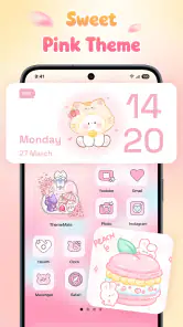
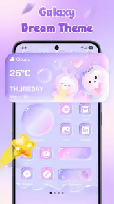
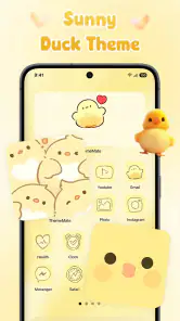
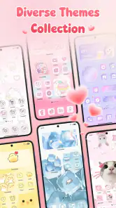
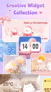
ThemeMate DIY Themes & Widgets is the kind of personalization app I would open when my phone feels visually tired but I do not want to rebuild everything from scratch. It brings themes, wallpapers, icons, and widgets into one place, so the basic idea is easy to understand: choose a look, adjust the screen around it, and keep the result consistent. After spending time with it, I found that its real value is not simply having attractive images. It is giving you a repeatable way to coordinate several parts of your home screen instead of collecting unrelated downloads.
This is a free personalization app from WestPoint Store, with optional purchases priced from $2.99 to $14.99 per item. It is suitable for Everyone, works with Android 7.0 and later, and the current version is 1.2.5. The app has reached over 100 thousand installs and holds a 4.6 average from around 1.6 thousand ratings, which suggests that its visual approach is connecting with a fairly broad audience. I would still judge it by your own setup, because a theme that looks polished in a preview can feel crowded once your real apps and notifications are on the screen.
Building a useful starting layout instead of chasing every theme
My preferred way to begin with ThemeMate DIY Themes & Widgets is to treat the first setup as a baseline rather than a final makeover. I start by deciding what the home screen needs to do during an ordinary day. If I check the calendar, weather, messages, and music regularly, those should remain easy to reach. A beautiful background is not much help if the icons disappear into it or a widget pushes the apps I use most onto another page.
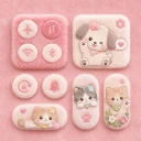
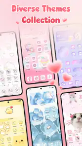
The app’s combination of aesthetic themes, 4K wallpapers, icons, and widgets makes it tempting to change everything at once. I found better results by choosing one visual direction first. A muted wallpaper, a small group of matching icons, and one restrained widget usually look more intentional than a dramatic wallpaper paired with several competing panels. This approach also makes it easier to identify which part of the design is causing trouble when the result feels wrong.
A realistic everyday example is a workday home screen. I might use a calm background, keep communication and navigation icons in the lower area, and place a compact information widget where it can be read without opening an app. In the evening, I may prefer a darker image and fewer shortcuts. ThemeMate is useful here as a design tool, but it does not replace the normal launcher decisions that determine how quickly I can reach an app. The best result comes from combining its visual material with a sensible arrangement.
One practical habit is to take a quick mental snapshot of the original layout before applying changes. If a new theme makes an important shortcut hard to find, I can reverse the decision without wondering whether the problem is the wallpaper, the icon style, or the widget placement. I also avoid changing the lock screen, home screen, and icon appearance in one rushed session. Small, deliberate changes produce a more comfortable result and reduce the feeling that the phone has become unfamiliar.
How I choose between wallpapers, icons, and widgets
Wallpapers are the easiest place to begin because they establish the color and contrast of the whole screen. The 4K options sound especially appealing on large, sharp displays, but resolution alone does not guarantee a good home-screen image. A detailed picture can compete with app labels, while a busy center can make widgets difficult to read. I look for open space where icons will sit and check whether the main subject remains visible after the launcher crops the image.
More From Our News Desk

Clash of Clans Is Won Between the Battles

Android Auto Makes the Case for Quieter Car Software

MobiOffice: Transforming Mobile Productivity with Seamless Integration

EA SPORTS FC™ Mobile Soccer: Redefining Mobile Sports Gaming

How Microsoft OneDrive Became a Mobile Productivity Giant

How Google Translate Breaks Language Barriers Effortlessly
Icons require more judgment than I expected. A matching set can make a screen feel much cleaner, but only if the apps I use most are represented in a style that remains recognizable. Highly decorative icons may look elegant in a collection but slow me down when I am trying to open a familiar app quickly. For that reason, I would rather use a coherent set for the first page and leave less-used apps in their normal appearance elsewhere than force every icon into a style I find confusing.
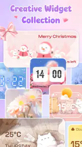
Widgets are where visual design meets daily usefulness. A widget should earn its space by saving a step or presenting information I genuinely check. I do not place one merely because it matches a theme. A small widget with clear text can support a minimalist layout, whereas several large widgets can turn a carefully chosen wallpaper into a narrow strip of visible background. This is one of the important trade-offs in the app: the more decorative elements I add, the less room remains for the shortcuts that make the phone practical.
My strongest recommendation is to test readability in ordinary conditions, not only while customizing. Look at the screen in bright daylight, with a notification present, and while holding the phone at a normal angle. A design that seems perfect in a dark room may have weak contrast outdoors. If a wallpaper makes labels difficult to read, changing the image is usually a better fix than trying to compensate with more icons or extra widgets.
Settings and small choices that deserve attention
The most useful “settings” work is often outside the visual catalog itself. Before applying a complete look, I check how my phone’s launcher handles icon placement, widget sizing, label visibility, and page layout. ThemeMate can provide the visual pieces, but the launcher remains responsible for how those pieces behave in practice. This matters because two phones can display the same theme differently depending on the available grid and the launcher’s own rules.
I also pay attention to cropping. A wallpaper may be designed as a full image, but the phone can reposition or enlarge it when it is applied. If the important part of the picture is near an edge, it may be cut off or sit behind interface elements. Choosing images with generous empty space is a simple workaround. It is less exciting than selecting the most dramatic preview, but it gives a more dependable result across different screen shapes.
Another worthwhile check is the balance between visual consistency and recognition. If every icon has the same shape and color, the screen may look organized but require more concentration. I prefer stronger consistency for secondary pages and a little more distinction on the first page. That arrangement keeps the main screen attractive without turning common actions into a visual memory test.
The optional purchases also deserve a practical look before spending. The app is free to install, but individual items can cost between $2.99 and $14.99. I would not buy a large collection immediately. First, I would confirm that the wallpaper fits my screen, that the icon style includes the apps I rely on, and that the widget actually works with my layout. A single purchase that completes a theme I will use for weeks makes more sense to me than collecting several attractive packs that never leave the preview stage.
Repeatable habits for faster customization
Experienced personalization users usually save time by repeating a process, not by browsing endlessly. My process is simple: select a color family, choose the wallpaper, test the first-page icon group, add one useful widget, and then live with it for a while. If something feels inconvenient, I change only that element. This prevents the common cycle of applying a full theme, disliking one detail, and starting over with an entirely different design.
I also separate discovery from installation. During the browsing stage, I note which visual elements belong together instead of applying every appealing item immediately. Once I have a clear combination, I make the changes in one short session. This is particularly helpful when several themes share similar colors but differ in icon shape or widget style. It keeps the final screen from becoming a mixture of pieces that were chosen at different times for unrelated reasons.
A useful shortcut in my routine is to keep the first page functional and let the second page carry more personality. The first page gets the apps I open repeatedly, with a wallpaper that supports legibility. The second page can use a stronger aesthetic, a larger widget, or a more experimental icon treatment. This gives ThemeMate’s visual tools room to shine without making the entire phone feel like a display that happens to run apps.
I would also avoid changing the design whenever I feel briefly bored. A new theme can be exciting for a few minutes, but the real test is whether it remains comfortable after repeated use. Waiting before buying another item helps reveal whether the problem is truly the theme or simply the normal urge for something new. This habit is especially useful when the app’s catalog makes several styles look equally tempting.
Where the app is strong, and where the limits become visible
ThemeMate is strongest when I want a coordinated visual refresh without searching separately for every component. The appeal is the relationship between elements: a wallpaper can establish the palette, icons can echo its shapes, and a widget can finish the layout. That is more convenient than downloading unrelated wallpaper and icon apps and trying to make them agree afterward.
It is less convincing for someone who wants deep control over every part of the phone interface. A theme app can supply visual assets, but it cannot make every launcher behave identically or guarantee that every icon will be equally recognizable. Users who enjoy manually designing icons, building highly specific launcher grids, or controlling extensive automation may prefer specialized tools. Those alternatives can offer finer control, even though they usually require more time and more separate decisions.
There is also a practical difference between a theme that looks good and one that remains efficient. Large widgets consume space. Detailed wallpapers reduce contrast. Uniform icons can hide familiar visual cues. These are not failures unique to ThemeMate, but they are important limits to understand before treating a complete theme as an automatic improvement. I see the app as a source of coordinated design, not as a substitute for organizing the phone around real habits.
Compatibility is another reason to keep expectations realistic. The app supports Android 7.0 and later, which covers a wide range of devices, but the final appearance still depends on the phone and launcher. Screen proportions, icon grids, system text, and widget behavior can all affect the result. If you have a heavily customized launcher or a device that restricts how icons and widgets are applied, you may need extra manual adjustment. That does not make the app unusable, but it does make the process less immediate than a single tap suggests.
I would skip it if my priority were purely functional simplicity, if I disliked changing familiar icons, or if I expected one theme to redesign every system surface consistently. I would also be cautious if I wanted to avoid optional spending altogether and felt frustrated by browsing items that are not part of the free experience. On the other hand, it is a good fit for someone who enjoys seasonal changes, wants a more coherent home screen, or likes experimenting with a visual style while keeping the underlying phone and apps the same.
Who will get the most from this personalization approach?
ThemeMate suits people who want visible improvement without learning a complicated design system. A student can use it to give a tablet or phone a calmer study layout. Someone working from home can create a less distracting first page with a simple background and a focused widget. A user who has kept the default wallpaper for years can make the device feel fresh in a short session, provided they are willing to adjust the layout after applying the visual elements.
It is also useful for users who think in moods or occasions. A soft, low-contrast style can make a reading-focused page feel quieter, while a brighter arrangement may suit a more energetic personal screen. I like that this kind of change does not require replacing the apps themselves. The phone’s function stays familiar while the surface becomes more personal.
However, I would not recommend it as the first choice for someone who wants a fully automated rotation system, detailed launcher engineering, or a design built entirely from personal photographs and custom graphics. ThemeMate’s strength is curated coordination. If your satisfaction comes from creating every asset yourself, a more hands-on customization workflow will probably feel more rewarding.
My verdict after using it as a daily design tool
ThemeMate DIY Themes & Widgets is a focused way to make an Android home screen feel more considered. I like it most when I use it with restraint: one wallpaper chosen for readability, a compatible group of icons, and a widget that solves a real need. The app makes that combination easier to explore than assembling each part from unrelated sources, and its free entry point lowers the risk of trying a new look before deciding whether it belongs on my phone.
The trade-off is that the app cannot remove the judgment involved in good personalization. I still have to check cropping, contrast, launcher behavior, icon recognition, and the amount of space widgets consume. Optional purchases also mean I would browse carefully rather than assume every attractive item is included at no cost. Those limits are manageable when I treat the app as a design library instead of a magic one-tap transformation.
With its Everyone rating, broad Android compatibility, and current version 1.2.5, it is accessible to a wide group of users. The strong average rating and growing install base make it easy to see why it attracts attention, but my recommendation is more specific: try it if you want a coordinated visual refresh and enjoy making small layout decisions. Skip it if you want total control, zero visual maintenance, or a purely functional home screen.
The best way to use ThemeMate is to build a repeatable screen you can live with, not merely a pretty preview you admire once. Start with the wallpaper, protect the shortcuts you actually use, add only useful widgets, and wait before buying more. Used that way, it becomes a practical personalization companion rather than another collection of designs competing for attention.
ThemeMate DIY Themes & Widgets Frequently Asked Questions
What devices and operating systems can I use ThemeMate DIY Themes & Widgets on?
ThemeMate DIY Themes & Widgets is listed as an app for Android, with a minimum operating system requirement of Android 7.0. Check that your device meets this requirement before downloading. The app is in the personalization category and is intended for people who want to customize their screen with themes, wallpapers, icons, and widgets.
What is ThemeMate DIY Themes & Widgets used for?
ThemeMate DIY Themes & Widgets is a customization app for creating a more personalized home screen on a compatible Android or iOS device. It typically combines wallpapers, icon styles, widgets, color palettes, and themed layouts in one place. Instead of changing each element separately, users can browse design collections or build a coordinated appearance that matches their preferred style.
Can I create my own themes in ThemeMate, or are there only ready-made designs?
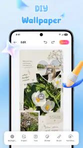
The app is designed to support both ready-made themes and do-it-yourself customization. You can usually start with a preset and adjust elements such as wallpapers, icons, widgets, colors, and decorative graphics. The exact editing tools may vary by device and app version, so some advanced options may require additional steps or may be available only through selected templates or premium features.
Does ThemeMate change app icons and widgets automatically?
ThemeMate may provide instructions, shortcuts, or downloadable assets for applying themed icons and widgets, but the process is not always completely automatic. On some devices, icon changes require adding shortcuts manually, while widgets may need to be placed and configured from the home-screen editor. Android and iOS also impose different customization limits, so the final result can vary.
Is ThemeMate DIY Themes & Widgets free to download and use?
The app is free to download, but some designs, icon packs, widgets, or advanced editing options may require in-app purchases. These purchases range from $2.99 to $14.99 per item, so check the price shown for a specific item before confirming a payment. Free access may include advertising, limited theme collections, or restrictions on certain customization tools.
Pros
- Large collection of wallpapers
- icons
- widgets
- and matching theme elements.
- DIY editor lets you create personalized home-screen designs.
- Useful previews make it easier to check a theme before applying it.
- Supports seasonal and aesthetic styles for different tastes.
- Can refresh the look of an older device without changing its launcher.
Cons
- Some designs or customization tools may require in-app purchases.
- Ads can interrupt browsing and make the interface feel less streamlined.
- Certain widgets may need extra setup or permissions to work correctly.
- Theme compatibility can vary between Android versions and device brands.
- Applying many custom elements may use additional storage and battery.
- Category
- Personalization
- Version
- 1.2.5












