TAG Mobile
- 1.18K
- 4.4
- Installs
- 1.00M
- Price
- Free

Screenshots

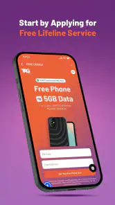

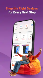
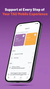

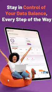
Analysis by Reviewed
I approached TAG Mobile as a practical wireless-service app rather than as something designed to keep me entertained for long sessions. Its purpose is straightforward: put the basic relationship between a customer and TAG Mobile in one place, with less dependence on phone calls, paper notices, or a desktop browser. That simplicity is its biggest appeal, but it also means the quality of the experience depends heavily on how clearly each task is presented and how well the app fits a person’s particular way of using a phone.
TAG Mobile is a free business app from HTH Communications, available to an Everyone audience. It has reached over a million installs, which makes it more than a niche utility, and its average score sits at 4.4 from around six thousand ratings. Those figures suggest that many people find the service useful, although they do not tell me whether it will suit every customer, especially someone who needs highly customized accessibility controls or prefers handling everything through a full website.
How TAG Mobile feels when everyday access matters
Readability and navigation come before extra features
My first impression is that TAG Mobile works best when I treat it as a focused account companion. I am not looking for a maze of menus or a collection of unrelated tools. I want to open it, understand where I am, and reach the action I need without translating technical wireless language into something usable. For a mobile-service app, that basic clarity is not a small detail: it affects whether a person can check something independently or has to ask another person for help.
The app’s focused identity helps here. Instead of competing with social feeds, news, shopping sections, or promotional distractions, a wireless account app can keep attention on service-related tasks. That is particularly helpful for people who find dense interfaces tiring, for users with limited concentration, and for anyone checking their account while travelling or dealing with a connection problem. In my experience, a narrow purpose is often more accessible than a feature-heavy design, provided the labels remain plain and the important actions are easy to locate.
I would still approach navigation patiently on the first visit. Wireless accounts commonly involve several kinds of information that sound similar but are not interchangeable: service status, usage, account details, support, and payment-related actions. A reader who uses a screen magnifier or enlarges text may need to scan more carefully if labels wrap or if key information is visually subordinate to secondary content. The practical tip is to learn the location of the few tasks you use most often instead of exploring every section each time. That reduces both visual effort and the chance of selecting the wrong account action.
For users with dyslexia or cognitive fatigue, the most useful habit is to pause after opening a page and identify its purpose before tapping. A compact account screen can make several options appear equally important. Reading the heading first, then moving through the page in order, creates a more predictable routine. This is not a special feature of TAG Mobile, but it is a sensible way to make a business app less demanding when the interface does not offer much personalization.
The app’s current version is 1.6.5, so I would keep it updated through the normal app-store process. Updates matter more for a service app than they might for a simple calculator because account screens and sign-in flows need to keep working as the underlying service changes. I would also avoid judging the entire experience from a single slow opening: wireless apps can feel different on a strong home connection, a congested public network, or a weak mobile signal.
More From Our News Desk

Clash of Clans Is Won Between the Battles

Android Auto Makes the Case for Quieter Car Software

MobiOffice: Transforming Mobile Productivity with Seamless Integration

EA SPORTS FC™ Mobile Soccer: Redefining Mobile Sports Gaming

How Microsoft OneDrive Became a Mobile Productivity Giant

How Google Translate Breaks Language Barriers Effortlessly
Motor and sensory considerations in real use
TAG Mobile is most comfortable for people who can use ordinary touch navigation and read standard mobile content, but that does not make it unsuitable for everyone with a disability. The phone’s own accessibility tools remain important. Larger text, display magnification, screen readers, contrast settings, switch access, voice control, and alternative input methods may reduce the effort of using the app, depending on how the operating system presents its screens.
My advice is to enable those tools before an urgent account task, not during one. If a user relies on a screen reader, the best test is practical: can the app announce the page purpose, identify buttons clearly, move through account information in a sensible order, and confirm when an action is complete? If a user depends on voice control or switch access, the question is whether each control has a distinct, recognizable name. These checks reveal more than a general claim that an app is accessible.
People with motor limitations may appreciate being able to complete a short account task on a phone instead of navigating a larger website, but small targets and closely placed controls can still create problems. A useful workaround is to increase the phone’s touch-and-hold timing or use a stylus if that gives better accuracy. I would also complete sensitive actions while seated and with the phone supported, rather than trying to manage the account one-handed while walking or carrying something.
For users with low vision, brightness and magnification can help, but there is a trade-off: enlarging text may cause more scrolling and may place related controls farther apart. That is why I would check one complete workflow, not just the home screen. An account page that looks readable at first can become awkward when a confirmation button moves below the visible area. Taking screenshots is not a good substitute for understanding the live screen, especially where personal account information is involved.
Users who are sensitive to motion, glare, or visual clutter should try the app with their preferred system settings already active. If the phone’s reduced-motion or contrast options change the presentation, that can make the experience calmer. I would not assume that every visual adjustment works identically inside every screen, so a low-pressure trial is worthwhile before relying on the app for an urgent service problem.
Situational access: where the app is genuinely useful
The strongest case for TAG Mobile is not an abstract promise of convenience; it is the ordinary moment when I need account information without being near a computer. Imagine leaving home for work and noticing that something about the wireless service needs attention. A phone-based account tool can be easier than finding a desktop, remembering a web address, or explaining the issue to another person. For someone with limited mobility, fatigue, or a need to avoid a phone call, that independence can matter more than a long feature list.
It can also be useful for people who share responsibility for a household account. One person may handle the service while another needs to understand what is happening. A focused mobile app gives the account holder a portable way to check information and make routine decisions. I would be careful, however, about passing the phone around or leaving an account open in a public place. Convenience should not turn into accidental exposure of personal details.
For users with hearing loss, a self-service app may be preferable to relying on a voice conversation, assuming the needed task can be completed in the app. That is an important situational advantage. At the same time, no app should be treated as a complete replacement for every support route. If a problem requires explanation, identity verification, or assistance beyond the available account controls, the user may still need another contact method. TAG Mobile is most valuable when the task is clear and routine.
Travellers and commuters may also find the mobile format practical, but I would not wait until a poor-signal location to discover whether a particular page loads correctly. A good preparation routine is to open the app at home, sign in if required, and identify where the support or account area is located. I would not assume that account information remains available offline or that every action can be completed without a connection. Planning around that limitation prevents a frustrating surprise when the service itself is already unreliable.
Families supporting an older adult can use the app as a teaching opportunity rather than taking over permanently. I would show the person how to recognize the app, reach the main account area, and stop before any irreversible action. Large system text, voice guidance, and a written sequence of familiar steps may help. The aim is not merely to make the app usable once, but to make the person more confident the next time they need it.
Where the experience still creates barriers
The main limitation is that a simple wireless app cannot automatically solve every accessibility problem. If a person needs a highly specialized interface, extensive keyboard navigation, unusually strong text customization, or a fully descriptive support experience, a mobile app may feel restrictive compared with a well-designed website or direct assistance. I would choose the alternative that best matches the task rather than insisting on the app for everything.
Another barrier is the difference between visual simplicity and operational clarity. A clean screen can still leave a user unsure whether a change was saved, whether a payment-related action went through, or whether the app is waiting for a network response. For users with cognitive disabilities or anxiety around account mistakes, clear confirmation is essential. My practical rule is to wait for an unmistakable completion message and, when appropriate, revisit the account area to verify the result rather than tapping repeatedly.
Sign-in friction can also affect accessibility even when the app itself is easy to read. Password managers, one-time codes, device keyboards, and security prompts each introduce another step. I would use a password manager if available, keep the phone’s text size comfortable, and avoid rushing through authentication while distracted. If a code arrives through a separate channel, a user with vision, hearing, or dexterity limitations may need extra time or a different device arrangement.
There is also a privacy trade-off. A mobile account app is convenient because it travels with me, but that means the phone becomes a gateway to sensitive service information. Screen locks, notification previews, and shared-device habits deserve attention. I would turn off lock-screen previews if other people can see the phone, and I would sign out or lock the device after helping someone else. These steps are especially important when a support person assists a user who cannot operate every control independently.
Finally, the app is not the right choice for someone who dislikes managing accounts on a phone or who needs a broad comparison of wireless plans before making a decision. TAG Mobile is designed around existing service use, not around replacing every part of the customer journey. A browser, a printed record, or human support may be better for research, complicated changes, or situations where the user wants to discuss options rather than simply access an account.
How it compares with usual wireless alternatives
Compared with calling customer service, TAG Mobile offers more control over timing. I can try a routine task without waiting for an agent or explaining the same information aloud. That is a clear advantage for people with hearing difficulties, speech-related barriers, social anxiety, or limited time. The trade-off is that self-service gives me less opportunity to ask follow-up questions when the problem is unclear.
Compared with using a mobile browser, a dedicated app can feel more direct because it is already associated with the service. It may reduce the repeated effort of finding the correct site, but a browser can be better when I need larger desktop-style layouts, multiple tabs, copying information between services, or access from a device where the app is not installed. Users who depend on browser extensions or specialized reading tools should compare both approaches instead of assuming the app will reproduce every browser advantage.
Compared with paper records, the app is more current and portable, but paper can be easier for some people to annotate, share with a caregiver, or read without a battery and network connection. I would keep a simple offline note of essential account details and support information rather than relying on the app as the only source during an emergency. That is not a criticism of TAG Mobile specifically; it is sensible preparation for any account that depends on a connected device.
Compared with a general email inbox, the app keeps service-related information in one context, which can reduce searching. Email may still be easier for preserving a written trail or using familiar text-to-speech tools. For an inclusive workflow, I would use the app for quick account access and another channel for records or complex explanations when needed.
Who should use it, and who should skip it?
I would recommend TAG Mobile to TAG Mobile customers who want a free, portable way to manage ordinary wireless-service needs and who are comfortable with touch navigation. It is especially promising for people who prefer self-service, need to avoid voice calls, or want to check their account while away from a computer. Its Everyone age rating also makes it suitable for a broad household audience, although an adult should still supervise account actions when another person is helping.
I would be more cautious if accessibility depends on a very specific interaction pattern. Someone who needs guaranteed compatibility with a particular assistive technology should test the exact workflows they care about before making the app their only route. The same applies to users who need extensive account history, detailed plan comparisons, or complicated support conversations. In those cases, the full web experience or direct support may be more effective.
One useful approach is to judge the app with three small trials: find the account information you check most often, complete one routine action, and locate help without assistance. Try those trials with your normal text size, screen reader, magnification, voice control, or switch setup. If all three feel understandable, TAG Mobile is likely to become a helpful daily tool. If one fails, that does not automatically make the app unusable, but it tells me which alternative I should keep ready.
My inclusive verdict
TAG Mobile succeeds when I need a focused wireless account companion rather than a full customer-service conversation. HTH Communications has positioned it as a free business app with a clear everyday purpose, and its broad adoption shows that it has practical value for many users. The strongest benefit is independence: routine service access can happen on my schedule, in a format that may be easier than calling or finding a computer.
My balanced view is that its accessibility depends partly on the phone’s own tools and partly on how clearly each account workflow communicates progress. That makes testing important for people with vision, hearing, motor, cognitive, or situational needs. I would keep the app updated, prepare the phone’s accessibility settings in advance, protect account information on shared devices, and maintain another support route for complicated problems.
TAG Mobile is a sensible choice when portable self-service matters, but it should be one part of an inclusive support plan rather than the only option. If your needs match short, focused account tasks, I can see myself recommending it to a friend. If you need extensive customization or detailed human guidance, I would recommend comparing it with the browser and support alternatives before committing.
TAG Mobile Frequently Asked Questions
Who develops TAG Mobile, and what kind of app is it?
TAG Mobile is a business app developed by HTH Communications. Its store summary describes it as “Free Wireless Made Simple,” making it relevant to users looking for TAG Mobile services on a phone. The app is listed for everyone, and its broad availability may make it worth considering if you want to access TAG-related features from a mobile device.
What is TAG Mobile and what can I use it for?
TAG Mobile is a mobile application designed to give users convenient access to TAG-related services and features from an Android or iOS device. Depending on your region and account type, it may let you manage profile information, review available services, receive notifications, and interact with the platform without using a desktop browser. Available tools can vary by country and app version.
Is TAG Mobile free to download and use?
The TAG Mobile app is free to download from the official app store. However, downloading the app does not necessarily mean that every service inside it is free. Some functions may require an existing subscription, account, payment, or additional charges determined by TAG. Before using paid features, check the pricing information and terms shown in the application or on the official website.
What devices and permissions does TAG Mobile require?
TAG Mobile is intended for compatible Android and iOS smartphones. The current version is 1.6.5, and Android users need version 7.0 or later. During installation or first use, the app may request permissions such as notifications, internet access, camera, location, or storage, depending on the features enabled for your account. Only grant permissions that you understand and consider necessary.
Do I need an account to use TAG Mobile?
Some basic sections of TAG Mobile may be accessible without signing in, but the main personalized features usually require a TAG account or an authorized login. Registration may involve providing an email address, phone number, or other account details. If you already use TAG services, you may be able to sign in with your existing credentials. Keep your login information private and use the official recovery process if you forget it.
Pros
- Simple interface makes core features easy to find.
- Works well for users who prefer a lightweight mobile experience.
- Useful notifications help keep important updates visible.
- Account access is convenient across supported mobile devices.
- The app’s focused design avoids unnecessary distractions.
Cons
- Some features may require a stable internet connection.
- Compatibility and availability can vary by device or region.
- Notifications may become intrusive if too many are enabled.
- The app may offer limited customization for advanced users.
- Occasional updates may change the layout or feature placement.
- Category
- Business
- Version
- 1.6.5