Somo AI: Photo to Art & Video
- 7.00
- 4.2
- Installs
- 10.00K
- Price
- Free

Screenshots
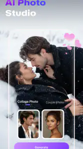
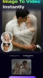
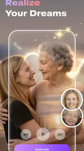
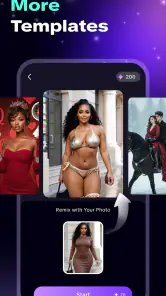
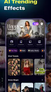
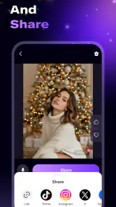
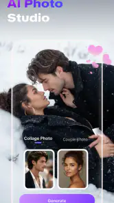
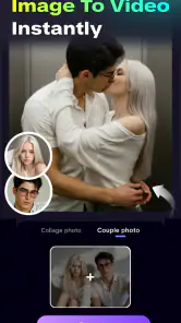
Analysis by Reviewed
I tried Somo AI: Photo to Art & Video as an art and design app, and my first impression was that it is aimed at people who want a quick visual transformation rather than a full creative workstation. The basic idea is simple: start with a photo, apply an AI-driven artistic treatment, and explore the result as an image or video. That makes it easy to understand, but the real question is whether the convenience is worth giving up some hands-on control.
My answer is cautiously positive. I can see the appeal for social posts, profile images, mood boards, invitations, and playful experiments. I would not treat it as a replacement for a serious drawing app or a detailed photo editor. Its strongest quality is the short distance between an ordinary picture and something visually unusual. Its main weakness is the same thing: the more the app does automatically, the less precise control I have over the final look.
What Somo AI feels like in everyday use
The app comes from Smart App Lab and sits in the Art & Design category. It is free to install, with optional purchases ranging from $0.99 to $49.99 per item. That pricing detail matters because an AI art app can be enjoyable to browse casually, but repeated creation may lead users toward paid choices. I would begin with a small personal project rather than uploading a large batch of important images immediately.
The first useful way to think about it is as a visual idea generator. I would use it when I have a clear source photo but want to see several possible directions: a more illustrated appearance, a dramatic portrait treatment, or a moving version that feels different from the original. I would not open it expecting layers, masks, detailed brushwork, or the kind of exact retouching I get from a conventional editor.
That distinction helps set expectations. Traditional editing is usually better when I need to remove one object, correct a specific color, preserve a person’s exact features, or prepare an image with consistent branding. Somo AI is more interesting when the goal is interpretation. It takes the original picture as a starting point and lets the style become the main event.
The app has an average rating of 4.2 from a small group of users, and it has passed the ten-thousand-install mark. I read that as early evidence of interest rather than proof that it suits everyone. The current release is version 1.2.0, and it supports devices running Android 7.0 or later. It is also rated for Everyone, which makes the presentation approachable, though parents should still remember that generated visuals can vary depending on the source image and chosen treatment.
Where the app is genuinely useful
One practical scenario is preparing a quick birthday post. I could take a normal family photo, turn it into a stylized image, and use the result as a background or greeting visual. The benefit is not professional polish; it is speed. I do not need to draw the scene or learn a complicated interface before getting something shareable.
Another good use is exploring a personal creative direction. If I am designing a small poster, a video intro, or a mood board, I can use a familiar photo as a visual seed. The transformed result may not be the final asset, but it can show me whether I prefer a softer, darker, more graphic, or more animated direction. That makes the app useful before the serious design work begins.
I also think it could help people who feel uncomfortable starting from a blank canvas. A blank page asks me to make every decision. A photo-to-art workflow gives me something concrete to react to. Even when the result is imperfect, it can reveal what I like and what I want to change.
Why the source photo matters more than expected
The quality of the starting image has a large effect on how useful the transformation feels. A clear subject with a simple composition is easier to judge than a crowded picture with several faces, tiny details, or poor lighting. I would test the app first with a photo where the main subject is easy to identify, then compare that result with a more complicated image.
This is one of the less obvious trade-offs. A dramatic source photo may produce a dramatic result, but it can also exaggerate visual mistakes. For a profile image, I would choose a front-facing or lightly angled picture with enough space around the head. For a landscape or object, I would select an image with a strong central shape. The app can change the style, but it cannot make every source equally suitable for every treatment.
I would also keep the original file untouched. The safest workflow is to treat the generated version as a new creative copy, not as a replacement for the photograph. That matters if I later decide that the effect is too strong or if I want to try a different direction without losing the starting point.
Art styles are exciting, but control is the real test
AI styling is fun partly because it produces outcomes I might not have planned. That surprise is valuable for experimentation, but it creates a control problem. If I need the same character, color balance, or visual identity across a set of images, an automatic style can become inconsistent. A result that looks excellent on one portrait may feel awkward on another because faces, backgrounds, and lighting react differently.
For that reason, I would use the app for individual highlights rather than a whole campaign unless I had time to inspect every output. A small business owner creating branded material may prefer a standard editor with repeatable settings. Someone making a one-off announcement, personal collage, or playful social image is more likely to appreciate the variation.
The same principle applies to video. Turning a still image into an animated visual can make a post feel more alive, but movement is not automatically better. I would use a video result when the motion supports the subject, such as a travel image, a fantasy portrait, or a visual loop for a story post. For a formal announcement or information-heavy graphic, a clean static image may communicate more clearly.
Trust, privacy choices, and practical control
Because this app works with photos, trust is not just about whether the artwork looks good. The important moment comes before creation: deciding which image to use and whether it contains other people, private surroundings, documents, or identifying details. I would avoid testing it with passports, medical paperwork, children’s school information, or anything I would not normally share with a creative service.
I also recommend starting with a disposable test image. A landscape, a public object, or a non-sensitive portrait lets me understand the workflow without immediately placing personal material at the center of the experiment. This is not a criticism of Smart App Lab; it is simply sensible behavior for any tool that transforms user-provided photos.
The app’s visible user choices are most important when I am selecting an image, choosing an artistic direction, and deciding whether to keep or share the result. I would slow down at each of those points instead of tapping through automatically. If the app presents an optional purchase during the creative process, I would check what the purchase unlocks before confirming it, especially because individual items can range from a low-cost option to a much more expensive one.
That range makes budgeting part of the experience. A free starting point is useful for testing whether the style suits me, but I would not assume that every creative option is included at no cost. My preferred approach would be to create only a few experiments, compare them, and decide whether the result is worth paying for before committing to more extensive use.
Account and data choices deserve the same attention as purchase choices. I would use the least personal account setup that still allows the app to work comfortably, and I would review any sign-in or sharing screen rather than accepting it reflexively. If I were using the app for client work, I would first check the app’s current privacy wording and the client’s own rules about uploading images. That is especially important when a photo belongs to someone else.
What I would and would not upload
For casual use, I would upload my own non-sensitive photos and keep the output for a personal project. I would be more careful with group pictures, because other people may not expect their faces to be processed into an AI-styled image. I would ask permission before using a friend’s portrait for something public, even if the final result is meant as a joke or a gift.
I would also avoid relying on the app for confidential professional material. A designer working with unreleased products, a teacher handling student images, or a freelancer preparing client assets should pause and inspect the current account, storage, deletion, and sharing controls before proceeding. Those users may be better served by a tool chosen specifically for documented business workflows and stronger administrative control.
This is where the app’s friendly simplicity can be misleading. A short creative process does not mean the source image is unimportant. The easiest upload is still a meaningful decision. I like that the app encourages experimentation, but I would keep my own rules around sensitive content rather than treating convenience as a substitute for judgment.
Three workflows that make the app more worthwhile
My first recommended workflow is the “reference, not final” method. I would create several versions from one suitable photo, note which visual direction feels strongest, and then use that result as a reference for a more controlled design elsewhere. This turns imperfect AI output into useful creative guidance instead of judging it only as a finished product.
The second is a subject-first workflow. I would crop or select a photo so that the main subject is unmistakable before applying a style. This is particularly helpful for portraits and product-like objects. A busy original may give the system too many competing details, while a focused composition makes it easier for me to evaluate whether the transformation actually improves the image.
The third is a separation workflow for static and moving content. I would not assume that an attractive art image should automatically become a video. I would make the static version first, decide whether the composition works on its own, and only then explore motion if it adds something. This saves time and prevents animation from hiding a weak composition.
A fourth useful habit is to compare the result at the size where it will actually be seen. An image that looks impressive when enlarged on a phone may feel too busy as a small profile picture. Conversely, a subtle transformation may disappear in a fast-moving social feed. I would judge the output in its real context before paying for more versions or sharing it publicly.
Who should choose it, and who should skip it
I would recommend Somo AI to casual creators, social media users, students working on visual concepts, and anyone who wants a low-effort way to explore AI art from personal photos. It is also a good fit for someone who enjoys surprise and does not need every detail to remain under manual control.
I would be less enthusiastic for professional illustrators who need brush-level precision, photographers who require faithful color correction, or brand teams that need identical treatment across many assets. In those cases, a conventional editor or a specialized production tool is likely the better choice. The app can contribute ideas, but it should not be mistaken for a complete professional pipeline.
I would also skip it for highly sensitive material until I had personally reviewed the current privacy and account controls. The Everyone rating describes the broad age suitability of the app, not the appropriateness of every photo a user might upload. That distinction is worth keeping in mind when younger users or shared family devices are involved.
My cautious verdict after using it
The best reason to try Somo AI is its fast path from an ordinary photo to a visual experiment. I like it as a creative playground and as a way to overcome the blank-page problem. It can help me discover a direction for a post, invitation, mood board, or short visual clip without requiring advanced art skills.
At the same time, I would use it deliberately. I would begin with a non-sensitive image, inspect each choice involving uploads or purchases, preserve the original photo, and judge the output for the actual place where it will appear. I would not rely on automatic styling when consistency, privacy, or exact editing is the priority.
For a free art and design app from Smart App Lab, it offers a straightforward reason to open it: quick visual exploration. The optional purchase range means I would keep an eye on spending, and the limited control typical of an automated workflow means I would keep a traditional editor nearby for finishing work. If you want playful transformations and can accept some unpredictability, I think it is worth trying. If you need precise, repeatable, or business-sensitive editing, I would choose a more controlled alternative instead.
Pros
- Turns ordinary photos into creative AI-styled artwork quickly.
- Offers multiple visual styles for different moods and occasions.
- Useful for creating eye-catching social media posts and profile images.
- Video effects add motion and variety beyond standard photo filters.
- Simple interface makes experimenting accessible to casual users.
Cons
- Some advanced styles or effects may require a paid subscription.
- AI results can vary and may not always match the original photo accurately.
- Processing times can increase when servers are busy.
- Export quality or resolution may be limited on certain plans.
- Uploading personal photos raises privacy concerns for some users.

- Category
- Art & Design
- Version
- 1.2.0