Raven Dark Icon Pack
- 50.00
- 4.5
- Installs
- 10.00K
- Price
- $0.69

Screenshots
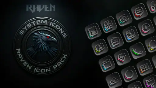
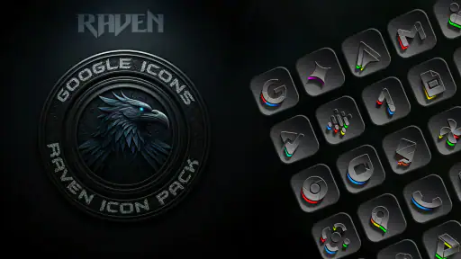
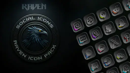
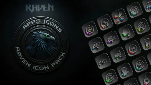
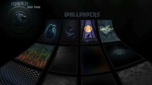
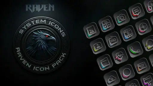
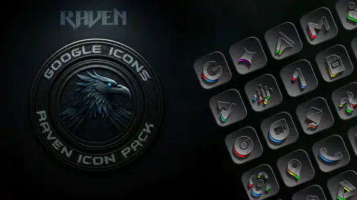
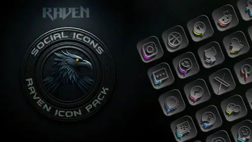
Analysis by Reviewed
My first impression of Raven Dark Icon Pack was that it is aimed at a very specific Android home-screen problem: the phone works perfectly, but the default icons make the whole setup feel bright, mixed, or visually untidy. This is a personalization app from Creativepixels, and its purpose is simple—give a compatible launcher a darker, more unified appearance without replacing the phone itself.
I approached it as I would any small customization purchase: start with an ordinary home screen, install the pack, apply it through the launcher, and then live with the result during normal use. That workflow matters because an icon pack can look excellent in a preview and still become annoying if applying it is awkward or if too many important apps remain unchanged. In my experience, the appeal here is less about adding a large collection of tools and more about making the first screen feel intentional every time I unlock the phone.
The app costs $0.69, carries an Everyone age rating, and requires Android 5.0 or later. It was released on Jan 1, 2025, and the current version is 1.3.0. Those details make it an easy, low-cost experiment for someone who already enjoys changing wallpapers, widgets, and launchers, although the final result depends heavily on the launcher being used.
From a bright default screen to a darker daily setup
Starting with the right phone and launcher
The starting condition is important. An icon pack is not a standalone replacement for the entire interface; it needs a launcher that can use icon packs. Before paying for any personalization app, I would first check the launcher settings for an option such as icon style, icon pack, or theme. If the phone uses a launcher with no support for third-party packs, Raven Dark Icon Pack cannot deliver its main benefit there.
This is the first practical distinction between this app and a wallpaper application. A wallpaper can usually be changed directly from the system interface, while an icon pack is part of a handoff between the pack and the launcher. That extra step is not difficult, but it creates the main point of friction. Someone who expects to open the app, tap once, and see every icon change may be disappointed if the launcher requires a separate selection process.
I also recommend deciding what “dark” should mean before applying it. A dark icon set works especially well with a nearly black, charcoal, or muted wallpaper. It can look less convincing against a very colorful background, where the icons compete with the image instead of settling into it. A restrained wallpaper gives the pack room to create a consistent visual rhythm.
There is another useful starting check: look at the apps that matter most on the first home-screen page. I would focus on messaging, phone, camera, maps, music, banking, and work tools. The pack is worth considering if those everyday shortcuts can be represented in the chosen launcher. If your most-used apps are obscure or highly specialized, the experience may be less uniform because the launcher may retain original icons for anything without a matching design.
More From Our News Desk

Clash of Clans Is Won Between the Battles

Android Auto Makes the Case for Quieter Car Software

MobiOffice: Transforming Mobile Productivity with Seamless Integration

EA SPORTS FC™ Mobile Soccer: Redefining Mobile Sports Gaming

How Microsoft OneDrive Became a Mobile Productivity Giant

How Google Translate Breaks Language Barriers Effortlessly
The installation step is simple, but the launcher decides the experience
Once installed, I would open the pack and look for its application or setup route rather than assuming Android will apply it automatically. The exact wording can vary by launcher, but the general flow is straightforward: install the pack, open the launcher’s appearance settings, choose the icon-pack section, and select Raven Dark Icon Pack. If the launcher offers a direct apply button inside the pack, that is the quickest path; otherwise, the launcher remains the control point.
This is where the app’s small size in the personalization category becomes both a strength and a limitation. There is no need to learn a new social feed, editor, or complicated design system. The job is focused. At the same time, users looking for extensive manual editing may find the experience narrower than a full theme engine. The value comes from the finished style, not from building every icon from scratch.
After applying the pack, I would leave the home screen for a moment instead of judging it immediately. The first visual change can feel dramatic simply because the old icons disappear. A better test is to open and close the apps I use repeatedly, check the app drawer, and look at folders. Icons that seem attractive individually need to remain recognizable at small sizes, especially when several similar shortcuts sit next to one another.
Folders deserve special attention. A dark icon style can make a crowded folder feel calmer, but it can also reduce quick recognition if the symbols are more decorative than the original system icons. My preferred workflow is to keep the first page limited to essential shortcuts and move less-used apps into folders. That lets the pack’s visual consistency show without forcing me to identify dozens of icons at a glance.
Making the home screen useful instead of merely dark
The best result comes from treating the icon pack as one part of a layout rather than a complete makeover. I would begin with a clean first page, place the most frequently used apps in predictable positions, and use a widget only if it supports the same restrained look. A dark icon pack cannot fix a cluttered arrangement, but it can make a carefully arranged screen feel more deliberate.
One practical tip is to avoid changing the wallpaper, widget arrangement, and icon positions all at once. I would apply the pack first, use the phone for a while, and then make one change at a time. This makes it easier to tell whether the icons are genuinely improving the experience or whether the novelty of a full redesign is doing all the work.
A second tip concerns recognition. Keep familiar actions in familiar places, even if the new symbols look different. For example, I would not move the camera shortcut simply because the new style makes another position look balanced. Visual consistency is useful, but muscle memory is useful too. The pack should support daily navigation, not turn routine actions into a search exercise.
Where the handoffs happen
The workflow has several handoffs, and each one can affect the final result. Creativepixels supplies the visual pack. Android handles installation. The launcher interprets the pack and applies it to the home screen or app drawer. Individual apps remain responsible for their own notifications, widgets, and internal design. Raven Dark Icon Pack can influence the shortcut appearance, but it does not turn every part of the phone into a dark interface.
That distinction helps set realistic expectations. If your goal is a dark notification shade, dark menus, or a system-wide night theme, Android’s built-in dark mode or a launcher theme may be a better starting point. If your goal is specifically to replace bright, mismatched shortcut artwork on the home screen, this pack is more focused and potentially more effective.
Widgets are another handoff. A dark icon beside a bright calendar or weather widget can make the screen feel inconsistent. I would either choose a widget with a dark or transparent treatment or place it on a secondary page. This is not a flaw unique to this app; it is a trade-off of using an icon pack instead of a complete visual theme.
The app drawer can reveal another difference between launchers. Some launchers apply packs broadly, while others handle certain shortcuts differently or leave unsupported icons untouched. That means the home screen may look more polished than the full drawer. For me, that is acceptable if the first page is the main destination, but it matters to anyone who expects every installed app to share one exact style.
A realistic everyday scenario
Imagine starting a workday with a phone whose default home screen contains bright system icons, colorful social shortcuts, and a wallpaper that already has a lot of contrast. I would install the pack, apply it through the launcher, replace the wallpaper with a subdued background, and keep only calendar, email, notes, calls, and navigation on the first page. The immediate outcome would not be a new operating system; it would be a quieter launch point for the tasks I repeat all day.
During the commute, I would test the shortcuts without looking too closely. If the phone, maps, and music controls remain easy to identify, the darker style is helping rather than getting in the way. At work, I would check whether the same icons remain readable in bright conditions. In the evening, the darker arrangement may feel more comfortable alongside Android’s night mode, but the icons themselves should not be confused with a system-wide dark theme.
This scenario also shows why I would not apply the pack blindly to every page. A focused first page gives the visual treatment a clear job. Secondary pages can hold less-used apps, and folders can be organized by task rather than by appearance. That approach reduces the chance that a missing or unfamiliar icon will interrupt a quick action.
What the result feels like after the novelty fades
The real test is not the first five minutes; it is whether the home screen still feels better after repeated use. A good icon pack should disappear into the routine in a positive way. I should notice a cleaner layout, not constantly think about the theme. Raven Dark Icon Pack is most convincing when the wallpaper, launcher spacing, and shortcut arrangement support its darker direction.
The pack also benefits users who enjoy a coherent visual identity but do not want to spend an evening designing individual icons. Compared with manually replacing shortcuts one by one, an icon pack offers a faster route to a unified look. Compared with a complete launcher replacement, it is a smaller commitment: I can keep the launcher’s existing gestures, app drawer behavior, and layout options while changing one visible layer.
That middle position is its strongest practical advantage. A wallpaper alone changes the background but leaves the default icon mix untouched. A full launcher theme may change many behaviors along with the appearance. This app sits between those choices, giving the home screen a distinct direction without asking me to rebuild the entire phone interface.
Its average rating is 4.5 from around 370 ratings, with about 50 written reviews, and it has passed 10K+ installs. I read those figures as signs of a focused app with a real audience, not as proof that it will suit every launcher or personal taste. Icon design is unusually subjective, and compatibility matters more here than popularity alone.
Where the flow breaks
The first break is launcher compatibility. If the current launcher cannot import third-party icon packs, the purchase may not solve the problem. In that situation, I would choose a compatible launcher first or look for a system theme supported directly by the phone manufacturer. Raven Dark Icon Pack is not the right choice for someone unwilling to change launchers or adjust launcher settings.
The second break is incomplete coverage. A phone with many niche apps may still show a mixture of dark custom icons and original icons. That mixture can be more distracting than the starting screen, especially if the unmatched icons are unusually bright. Before committing to a long-term layout, I would inspect the apps I use most and decide whether a few exceptions are acceptable.
The third break is visual legibility. Dark does not automatically mean clearer. On a dark wallpaper, low-contrast icons may blend into the background, and similar symbols can be harder to distinguish in a crowded drawer. I would solve this by increasing launcher icon size if the launcher allows it, adding more spacing, or choosing a slightly lighter background rather than abandoning the style immediately.
There is also a maintenance trade-off. When new apps are installed, their icons may not match the established look. That means the home screen can gradually lose consistency unless I occasionally reorganize it or accept a few original icons. People who want a completely automatic, system-managed appearance may prefer a manufacturer theme or a launcher with stronger built-in integration.
Finally, the app is not aimed at someone who wants bright, playful, highly colorful personalization. Its appeal is deliberately narrow. If your ideal phone uses vivid gradients, animated effects, or a different visual style on every page, the dark direction may feel restrictive rather than refined.
Who should install it, and who should skip it
I would recommend it to an Android user who already has a launcher with icon-pack support, prefers a darker home screen, and wants a quick visual cleanup without replacing the whole launcher. It also makes sense for someone who values a calm first page and is comfortable spending a few minutes checking folders, widgets, and unsupported shortcuts after applying the pack.
I would be more cautious for a person using a locked-down stock launcher, relying heavily on specialized apps, or expecting system menus and notifications to change along with the icons. In those cases, Android’s own dark mode, a manufacturer theme, or a more comprehensive launcher may produce a more complete result.
The price makes experimentation relatively easy, but I would still check the launcher before installing and plan the home-screen arrangement beforehand. That small preparation prevents the most common disappointment: paying for an icon style and then discovering that the launcher cannot use it in the way you expected.
My final take on the finished workflow
After following the process from a bright, inconsistent home screen to a darker arrangement, I see Raven Dark Icon Pack as a focused finishing tool rather than a full customization suite. Its success depends on the handoff between the app and the launcher, the visibility of the icons in your chosen wallpaper, and how many everyday apps receive a matching treatment.
For my preferred workflow, the best outcome comes from applying it selectively and pairing it with a simple background, sensible icon placement, and restrained widgets. The result is more polished than a wallpaper change alone and less disruptive than replacing the entire launcher. The trade-off is that compatibility and coverage remain part of the user’s responsibility.
Creativepixels has kept the idea clear: use a darker icon language to give an Android home screen more character and consistency. If that is exactly the gap you want to fill, the low price and focused purpose make it worth trying. If you need a complete dark interface or guaranteed uniformity across every app, I would choose a broader theming option instead. For the right launcher and the right taste, though, this is a compact way to turn an ordinary home screen into a calmer, more deliberate daily starting point.
Raven Dark Icon Pack Frequently Asked Questions
What does the Everyone age rating mean for Raven Dark Icon Pack?
Raven Dark Icon Pack is listed with an Everyone content rating, so it is intended for a general audience. The app is a personalization tool that changes the appearance of supported icons rather than how other apps work. If you manage a child’s device, you can still review its store page and the launcher settings together before installing or applying the pack.
What is Raven Dark Icon Pack, and what does it change on my device?
Raven Dark Icon Pack is a customization app designed to replace the standard app icons on compatible Android launchers with a darker, more uniform visual style. After applying it, supported icons adopt the pack’s carefully designed shapes, colors, and shadows, giving the home screen a more cohesive appearance. It changes the look of icons rather than the apps’ functions, settings, or performance.
Which launchers are compatible with Raven Dark Icon Pack?
Compatibility depends on the Android launcher installed on your phone. Raven Dark Icon Pack is generally intended for third-party launchers that support custom icon packs, such as popular options like Nova Launcher, Lawnchair, Smart Launcher, and similar alternatives. The system’s default launcher may not support it directly, so you should check the pack’s compatibility list or launcher settings before downloading.
Does Raven Dark Icon Pack include icons for every application?
The pack may cover many widely used applications, but no icon collection can guarantee an icon for every app available on Android. Less common, newly released, or region-specific applications may not be included. When an icon is missing, the launcher may keep the original design or allow you to choose a similar icon manually. Coverage can also improve through future updates from the developer.
How do I apply Raven Dark Icon Pack after installing it?
After installation, open Raven Dark Icon Pack and look for the application’s apply option. Select your compatible launcher from the available list, then confirm the change. You can also apply it from the launcher’s own icon or theme settings if the pack is detected there. If nothing changes, verify that the launcher supports icon packs and that it is currently set as the phone’s default launcher.
Pros
- Dark
- elegant icons give Android home screens a distinctive look.
- Large icon collection covers many popular apps and games.
- Includes alternative icons for extra customization options.
- Works with several popular Android launchers.
- Lightweight design should have minimal impact on device storage.
Cons
- Requires a compatible launcher; it does not replace every system icon.
- Some less popular apps may use generic or missing icons.
- Updates may be infrequent for newly released applications.
- Best results require manual setup and occasional icon adjustments.
- Not available as a native iOS customization option.
- Category
- Personalization
- Version
- 1.3.0












