Camo Dark Icon Pack
- 91.00
- 4.5
- Installs
- 10.00K
- Price
- $0.69

Screenshots
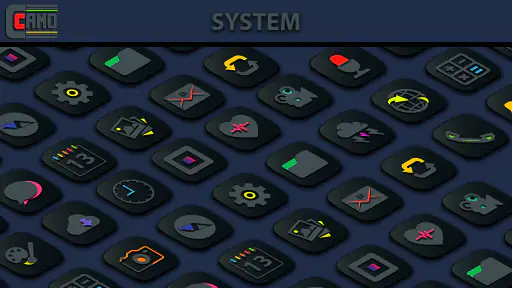
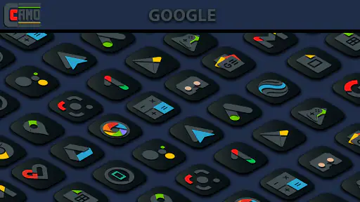
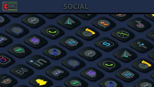
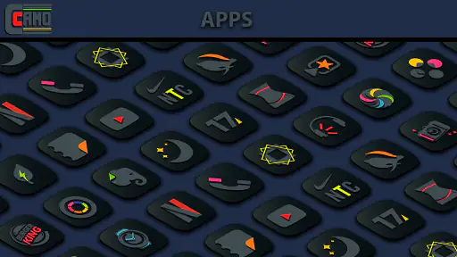
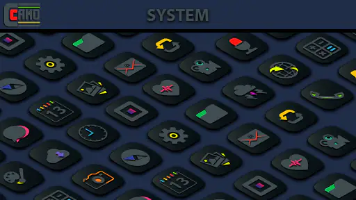
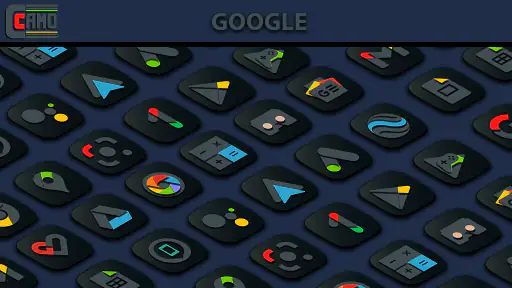
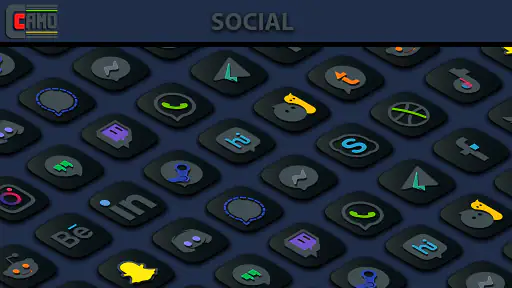
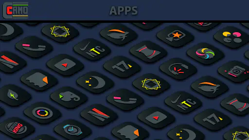
Analysis by Reviewed
I like icon packs that change the mood of a phone without forcing me to rebuild the entire home screen. Camo Dark Icon Pack takes that focused approach: it belongs to the personalization category, costs $0.69, and is built around very dark icons with brighter color accents. After spending time judging it as an everyday home-screen tool, I found its appeal is less about dramatic customization and more about creating a controlled, low-key visual style.
That distinction matters. This is not a launcher replacement, a wallpaper collection, or a complete theme system. It is an icon pack from Creativepixels, and its value depends on whether your current launcher can apply icon packs smoothly. If you already enjoy a dark setup and want app icons to look more coordinated, it is an inexpensive option to consider. If you want animated effects, elaborate widgets, or a complete redesign of every screen, this is probably too narrow for your needs.
How the dark visual style works in daily use
The central idea is easy to understand: the icons use deep black or near-black surfaces, while selected colors provide enough contrast to identify the app. That combination gives a home screen a quieter appearance than the usual bright, multicolored icon grid. I found it especially suitable for phones using a dark wallpaper, a black AMOLED-style background, or a simple monochrome layout with one or two accent colors.
The visual choice also changes how I read the screen. Bright icons normally compete for attention, even when I am only looking for one app. With this pack, the dark shapes recede, and the colored details become small recognition cues. That makes the home screen feel less busy, although it can also make certain icons less immediately obvious if they rely on subtle color differences rather than a strong symbol.
A useful way to approach the pack is to treat it as part of a composition rather than an isolated download. A dark wallpaper with too many bright widgets can weaken the effect, while a restrained layout makes the icons feel intentional. I would place the most-used apps on the first page, keep folders limited, and avoid mixing the pack with several unrelated icon styles. The pack works best when the rest of the screen gives its dark surfaces room to breathe.
Who will notice the biggest improvement
This app makes the most sense for someone who already cares about the appearance of a home screen but does not want to spend an evening editing every icon manually. It is also a good fit for people who find standard icons visually loud, especially on a dark phone theme. The color pops help preserve recognition, so the result is more practical than a completely uniform black-and-white treatment.
I would also recommend it to users who prefer a discreet setup in shared spaces. A subdued home screen does not immediately draw the eye in the same way a wall of saturated icons does. That is not a privacy feature, and I would not treat it as one, but it can make the phone feel less visually exposed when the display is visible on a desk or beside someone else.
More From Our News Desk

Clash of Clans Is Won Between the Battles

Android Auto Makes the Case for Quieter Car Software

MobiOffice: Transforming Mobile Productivity with Seamless Integration

EA SPORTS FC™ Mobile Soccer: Redefining Mobile Sports Gaming

How Microsoft OneDrive Became a Mobile Productivity Giant

How Google Translate Breaks Language Barriers Effortlessly
On the other hand, users who depend on highly distinctive official branding may need an adjustment period. Darkening an icon can remove some of the visual shortcuts you have learned over time. I occasionally found myself using the app label rather than the artwork when several icons had similarly dark silhouettes. People with large app collections should therefore test the pack with their actual daily layout before deciding whether the style remains convenient.
Launcher compatibility is the first practical question
The most important limitation is not the artwork itself but the launcher. Icon packs are applied through a compatible launcher, and the exact process varies from one Android setup to another. Some launchers expose an icon-pack option in their appearance settings; others may require a different route, and a stock home screen may offer less flexibility than a third-party alternative.
That means I would not buy this expecting a universal one-tap transformation on every device. Before installing, check whether your current launcher supports external icon packs. If it does, applying the pack should be a straightforward personalization task. If it does not, the pack may sit unused unless you are willing to change launchers, which is a much bigger decision than changing icons.
There is another small trade-off here. Switching launchers can affect your familiar gestures, folder behavior, app drawer, and home-screen arrangement. I would make a backup or note the current layout before experimenting. The icon pack itself is a small change, but the launcher decision around it can influence the whole way the phone feels.
Trust, controls, and careful everyday use
Because this is a personalization app rather than a messaging, finance, or social tool, I approach it differently from an app that handles personal content. Still, I do not install customization software blindly. I look at the permissions and privacy information shown on the installation and app-information screens, then consider whether the requested access makes sense for an icon pack. I would avoid granting unrelated access simply to make a visual change work.
The developer is Creativepixels, and the app has reached over ten thousand installs with a 4.5 average from around five hundred ratings. Those figures suggest that people have found the pack useful, but they are not a substitute for checking the controls on my own device. Ratings can tell me whether an app has an active audience; they cannot decide which permissions I should approve.
In practical terms, the safest workflow is simple: install it, open the launcher’s icon settings, apply the pack, and then review the app’s permissions from Android settings. If the pack does not need a permission for the task I am performing, I leave that permission disabled. I also check whether the launcher, rather than the icon pack, is responsible for any broader access requested during setup. Separating those two pieces helps me understand what I am actually allowing.
What I check before and after applying it
My first check is whether the icon pack appears in the launcher’s available choices. If it does, I apply it only after taking a quick screenshot of the existing home screen. That gives me an easy reference if I want to return to the old arrangement. I then inspect the first page, the app drawer, and a few folders rather than judging the result from one screen alone.
Folders are particularly useful for testing. An icon that looks clear on an uncluttered home screen may become harder to distinguish when several dark icons sit together in a small folder. I look for the apps I open most often and decide whether the color accents are enough to identify them quickly. If they are not, I keep those apps outside folders or use the launcher’s individual icon controls where available.
I also pay attention to what happens after an app update or a new installation. Icon packs can require occasional manual attention when a newly installed app is not represented in the pack. Rather than assuming every icon will match automatically, I treat the home screen as something to review after adding several apps. This is a realistic maintenance step and one reason a fully automatic theme may suit some people better.
Data-sensitive moments deserve a separate check
The app’s purpose does not require me to enter personal messages, photos, contacts, or payment details inside the icon pack itself. That lowers the amount of sensitive content I expect to handle directly in the app. However, the purchase and installation process still passes through the platform account and device settings, so I keep my attention on the system screens where those choices are displayed.
I would also avoid treating a small price as a reason to skip basic privacy checks. The one-time cost is $0.69, but price and data handling are separate questions. I look at the permission panel, any privacy information presented by the platform, and the account used for the purchase. If I later remove the pack, I check that the launcher has returned to the intended icon set and that no unwanted launcher change remains.
There is no reason to give an icon pack access to unrelated personal material merely because the home screen looks better with it. That is my general rule, and it is especially useful for customization apps because the visual benefit is easy to judge without exposing extra content. I prefer to keep the app’s role narrow: apply the icons, adjust the appearance, and leave unrelated controls untouched.
How much control does the user really have?
The strongest form of control comes from combining the pack with launcher settings. I can decide whether to use it across the whole home screen, keep certain apps visually distinct, change the wallpaper, and reorganize folders around the new artwork. The pack supplies the style, but the launcher determines much of the final experience.
That separation is helpful because I do not have to accept the entire look as a permanent decision. I can try the pack for a normal day, see whether I still find essential apps quickly, and switch back if the darker treatment slows me down. A good test is to use the phone while distracted: answer a notification, open a banking app, start navigation, and find the camera without deliberately admiring the layout. If recognition remains quick, the style is working as a practical theme rather than just a screenshot-friendly design.
Another useful tactic is to reserve the strongest color accents for the apps I need to spot immediately. If the launcher permits individual icon changes, I would leave the pack applied generally but customize only a few high-priority apps. That avoids abandoning the whole visual system because of one difficult icon. It also preserves a more coherent look than mixing many unrelated icon packs.
Version, device age, and expectations
The current version is 1.8.0, and the app supports Android 5.0 or later. That broad operating-system range makes it relevant to older Android phones as well as newer devices, but compatibility with the operating system is not the same as identical launcher behavior. The phone model, launcher, and Android skin can still affect how icon packs are selected and displayed.
The content rating is Everyone, which fits the straightforward nature of a visual customization tool. I would still set expectations correctly: an age rating describes suitability, not the quality of the theme or the privacy choices on a particular device. My own installation routine remains the same regardless of the rating—check access, test the launcher, and make sure the result is reversible.
One realistic scenario is a phone used for work and personal tasks that has gradually accumulated bright default icons. I would install the pack, pair it with a plain dark wallpaper, move communication and work apps to the first page, and keep less-used tools in a small number of folders. After a day or two, I would decide whether the darker icons reduce distraction or make urgent apps slower to find. That short trial tells me more than judging the pack only from its store images.
Where it stands beside the usual alternatives
Compared with leaving the manufacturer’s icons untouched, this pack gives the phone a more deliberate identity with very little effort. Compared with a monochrome icon pack, it keeps more color information, which can make recognition easier. Compared with a complete launcher theme, it is less invasive: I can change the icons without committing to a new set of widgets, transitions, menus, or navigation behavior.
The trade-off is flexibility. A full launcher or theme suite may offer more icon shapes, adaptive controls, widget styling, and screen-level customization. A manual icon editor may give me precise control over individual apps. Those alternatives are better if I want to design every detail. Camo Dark Icon Pack is better when I want a consistent dark direction without turning personalization into a long project.
I would also distinguish it from a purely black icon treatment. The colored details are not just decoration; they provide a compromise between visual calm and everyday recognition. That compromise will appeal to some users and disappoint others. If your goal is absolute uniformity, the remaining color may feel inconsistent. If your goal is to keep the phone usable at a glance, those accents are one of the pack’s more sensible choices.
My cautious verdict
I see Camo Dark Icon Pack as a focused, affordable personalization purchase rather than an essential utility. Its dark artwork can make a cluttered Android home screen feel calmer, and the restrained color accents stop the result from becoming completely anonymous. I especially like it for a simple dark wallpaper, a carefully arranged first page, and users who want a visual change without replacing their entire phone experience.
The main caution is compatibility and recognition. Check the launcher before paying, keep a record of your original layout, and test the icons with your real folders and most-used apps. Also review permissions and account-related choices through the platform screens instead of assuming a visual app deserves broad access. Those small checks preserve user control and make the experiment easy to undo.
For me, the $0.69 price is reasonable when the launcher supports the pack and the dark style matches the rest of the phone. I would skip it if I rely on a launcher that cannot apply external icon packs, need highly recognizable official icons, or want a complete theme with widgets and system-level changes. Everyone else can reasonably try it as a modest visual reset—provided the final decision is based on daily usability, not just how impressive the home screen looks in a screenshot.
Camo Dark Icon Pack Frequently Asked Questions
Does Camo Dark Icon Pack change my wallpaper or other phone settings automatically?
Camo Dark Icon Pack is a personalization app focused on the look of app icons, so applying it is intended to change the appearance of supported icons rather than alter unrelated phone settings. You can choose whether to use a matching wallpaper if one is offered, and your launcher remains in control of the home-screen layout. Applying an icon pack is a visual change, not a replacement for your device’s operating system.
What is Camo Dark Icon Pack?
Camo Dark Icon Pack is a visual customization app for Android devices that replaces standard app icons with a dark, camouflage-inspired design. It is intended for users who want a more consistent and military-style home-screen appearance. The pack generally includes themed icons for popular applications, along with wallpapers or dashboard tools, depending on the launcher and version installed. Its style pairs deep black tones with vibrant color accents, making it a natural fit for a sleek dark setup.
Which Android launchers are compatible with Camo Dark Icon Pack?
Compatibility depends on the launcher rather than the phone model alone. Camo Dark Icon Pack is typically designed to work with popular third-party launchers that support icon packs, such as Nova Launcher, Lawnchair, Smart Launcher, Apex, and similar alternatives. Some default launchers may not accept external icon packs, so users should check their launcher settings or the app’s compatibility list before downloading. The app is for Android, requires version 5.0 or later, and is listed for $0.69.
How do I apply Camo Dark Icon Pack after installing it?
After installation, open the icon pack and use its built-in apply option if your launcher is supported. You can also open your launcher’s customization settings, find the icon or theme section, and select Camo Dark Icon Pack from the available choices. If some icons remain unchanged, the launcher may not support them automatically, and individual icons may need to be replaced manually. The icon pack itself does not take the place of a compatible launcher; the launcher is what applies the visual changes to your home screen.
Does Camo Dark Icon Pack include icons for every application?
No icon pack can guarantee coverage for every application, especially newly released or less popular apps. Camo Dark Icon Pack usually focuses on widely used services and may provide alternative icons, an icon request feature, or a masking effect for unsupported apps. Coverage can vary between versions, so it is worth reviewing the included icon catalog before expecting a completely uniform home screen. If an app is not themed, you may still be able to assign an available icon manually through your launcher.
Pros
- Includes a large collection of stylish dark-themed icons.
- Works with many popular Android launchers.
- Consistent designs give home screens a polished appearance.
- Icon masking helps unsupported apps blend in better.
- Frequent updates may add icons for newer applications.
Cons
- Requires a compatible launcher; it may not work with default launchers.
- Some app icons may remain unthemed or use generic alternatives.
- The full icon collection may require an in-app purchase.
- Dark designs can reduce visibility on already dark wallpapers.
- Icon requests may take time before unsupported apps are added.
- Category
- Personalization
- Version
- 1.8.0












