PER9 Sport Watch Face Mesa
- 108.00
- 4.3
- Installs
- 100.00K
- Price
- Free
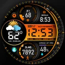
Screenshots
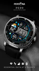
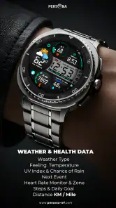
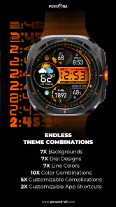
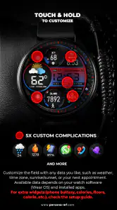
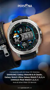
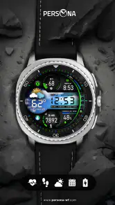
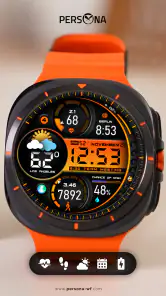
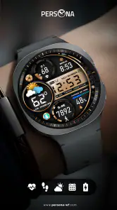
Analysis by Reviewed
I usually judge a watch face by what happens after the first few days. A striking design can feel exciting when it is new, but the real test is whether I still want to look at it during an ordinary commute, a workout, a busy workday, and a quiet weekend. PER9 Sport Watch Face Mesa, created by PERSONA Watch Face, makes a confident first impression as a digital Wear OS watch face with a sporty visual identity. It is free, rated for Everyone, and belongs to the personalization category, so the main question is not whether it can replace a fitness app or a smartwatch operating system. The question is whether it gives the watch a more useful and enjoyable everyday appearance.
After spending time with it, my view is positive but practical. This is the kind of watch face I would recommend to someone who wants a clear digital look with a more active character than a traditional analog design. I would not recommend choosing it simply because the preview looks energetic. Its lasting value depends on how well its information layout fits your routine and whether you enjoy keeping the same visual style on your wrist for weeks at a time.
From first-week appeal to everyday usefulness
A sporty look that feels purposeful
The strongest part of Mesa is its immediate identity. It does not try to look like a miniature formal watch. The design points toward movement, training, and quick glances, which makes sense for the short description “PER9 Sport Watch Face.” When I check a watch face while walking between tasks, I want the essential information to be recognizable without turning the moment into a reading exercise. Mesa is built around that kind of glance-first experience.
That distinction matters because many Wear OS faces fall into two familiar groups. Some imitate classic watches and prioritize decoration, while others compress as much information as possible into a crowded screen. Mesa sits closer to the sporty digital side. Its appeal comes from the feeling that the watch is an active tool rather than a piece of jewelry with a screen attached.
During the first week, this style is easy to appreciate. It gives a smartwatch a fresh personality without requiring a complete change in how the device is used. I could look down for the time and move on, rather than stopping to interpret an elaborate dial. That simplicity is especially welcome when the watch is used outdoors or during exercise, where a familiar digital arrangement can be more comfortable than small decorative details.
What I would check before settling on it
A first impression can hide an important issue: a watch face may be attractive while still being wrong for your normal information needs. Before keeping Mesa installed, I would spend a full day checking it in the situations that matter most to me. I would look at it indoors, outside, while the wrist is moving, and when the watch is partly covered by a sleeve. I would also check whether the visual hierarchy makes the time obvious or whether the surrounding design competes with it.
This is a useful test for any digital watch face, but it is particularly relevant here because the sporty character is part of the attraction. If you prefer a very quiet, minimal screen, the same energy that makes Mesa interesting may eventually feel excessive. If you like a watch face that looks ready for a run even when you are only buying groceries, the design is more likely to remain satisfying.
More From Our News Desk

Clash of Clans Is Won Between the Battles

Android Auto Makes the Case for Quieter Car Software

MobiOffice: Transforming Mobile Productivity with Seamless Integration

EA SPORTS FC™ Mobile Soccer: Redefining Mobile Sports Gaming

How Microsoft OneDrive Became a Mobile Productivity Giant

How Google Translate Breaks Language Barriers Effortlessly
Another practical test is to wear it through a normal workday rather than only during exercise. A face that looks appropriate with sports clothing can feel less comfortable with formal clothing or in a meeting. Mesa is best suited to people who want one consistent active style, not to users who expect a single face to blend perfectly into every setting.
Why the free price changes the decision
Because the app is free, the trial is low-risk. I do not need to justify a purchase before finding out whether the layout suits my wrist, my watch model, and my habits. That makes it easier to compare Mesa directly with the usual alternatives: the default face supplied with the watch, a minimalist digital face, or a more decorative analog option.
The free price also changes what I expect from it. I am willing to overlook a design preference that does not work for me because I can move back to another face without having paid for a permanent choice. At the same time, free does not automatically mean useful. A face still has to earn its place by being readable and comfortable over time. Mesa succeeds when its sporty presentation helps me interact with the watch more quickly; it becomes less convincing when the style is doing more work than the information.
Who will enjoy the first week most
I think Mesa is a strong starting point for someone who has just grown tired of the stock Wear OS appearance and wants a more athletic mood without installing a complicated companion system. It also suits people who prefer digital time displays and want their watch to look active during walks, gym sessions, or casual daily use.
I would be more cautious if you normally use the watch as a quiet office accessory, if you want a classic analog presentation, or if your priority is a highly customized data dashboard. In those cases, a different face may be a better match even if Mesa looks attractive in screenshots. The first-week appeal is real, but it is not universal.
What remains after the novelty fades
Month-to-month value comes from habit
A watch face has recurring value only when it reduces friction. I do not expect Mesa to transform the watch into a new device. Its long-term contribution is smaller and more personal: it can make routine checks feel clearer and give the watch a visual identity that I do not get tired of immediately.
The best way to judge that is to notice how often I change faces. If I keep returning to Mesa after trying alternatives, that tells me its balance of appearance and quick access is working. If I replace it every few days because I want a calmer screen for work or a denser screen for training, then its role may be temporary rather than permanent.
For me, the most realistic long-term use is as a dependable daily face rather than a specialized training instrument. I would wear it on a weekday, leave it in place for errands, and keep it through a weekend walk. That continuity is valuable because I do not have to relearn a new visual arrangement every morning. The face becomes part of the watch habit: glance, understand, continue.
A realistic everyday scenario
Imagine starting the day with the watch already on your wrist. You check the time while preparing breakfast, glance again when leaving home, and look down during a short walk to see whether you are running late. Later, the same face stays in place during a workout and remains readable when you return to ordinary tasks. In that scenario, Mesa benefits from not forcing a separate “sports mode” into the day. Its active look is always present, but it does not require a special ceremony each time you exercise.
That consistency is more important than it sounds. I often lose interest in watch faces that look excellent in one context but feel out of place everywhere else. Mesa has a better chance of staying installed when the user enjoys a sporty style as a general identity, not only as a temporary training accessory.
Useful ways to evaluate it over a month
I would use a simple rotation test. Keep Mesa on the watch for several ordinary days, then switch to the default face for a short period. When returning to Mesa, notice what feels better or worse. This exposes whether the design offers genuine daily convenience or merely benefits from being new.
I would also pay attention to three moments that are easy to overlook:
- Fast glances: Can I understand the time while moving, without deliberately focusing on the display?
- Context changes: Does the sporty style still feel comfortable during work, travel, and relaxed evenings?
- Visual fatigue: After repeated checks, does the design remain pleasant or start to feel busy?
These checks are more useful than judging the face from a static preview. A watch face is not a poster. It is a small interface that I see repeatedly, often for only a second, and its success depends on that repetition.
How it compares with familiar alternatives
The default Wear OS face usually has one major advantage: it is already integrated into the watch experience and often feels neutral enough for almost any situation. Mesa competes by offering a stronger point of view. If the default face feels bland, this app can make the watch feel more personal immediately.
A minimalist digital face may be better for someone who wants the least visual distraction. An analog face may be preferable for formal clothing or for users who naturally read time from hands rather than numerals. A heavily configurable face may win for people who want to arrange every detail around a particular training routine. Mesa is the better choice when the user values a ready-made sporty presentation and does not want to spend a long time designing the screen.
That trade-off is central to its long-term value. The less I need to adjust before using it, the more convenient it feels. But the less control I have over the presentation, the more important it becomes that the original layout already matches my preferences.
Maintenance without turning the watch into a project
One reason I appreciate a focused watch face is that it should not demand constant attention. I do not want a recurring customization task every time I put on the watch. Mesa works best when I can install it, select it, and let it become part of the background of the day.
Still, a little maintenance is sensible. After installation, I would confirm that the face is selected correctly on the intended Wear OS watch, then spend time checking how it behaves during the day. If the watch is shared between work and exercise routines, I would decide whether Mesa is the permanent choice or one face in a small rotation. Keeping that decision simple prevents the common problem of collecting many faces and using none of them consistently.
The developer, PERSONA Watch Face, gives Mesa a clear design identity rather than presenting it as a general-purpose dashboard. That focus is helpful for maintenance because I know what I am choosing: a sporty digital appearance. I do not need to treat it as a replacement for health, workout, or notification tools. It is the visual layer that sits on top of the watch experience.
Where fatigue can appear
The main long-term risk is visual repetition. A bold sporty face can be motivating at first, but the same intensity may feel tiring when I want the watch to fade into the background. This is not a technical failure; it is a mismatch between a strong design and a changing mood.
There is also a practical fatigue that comes from expecting one face to cover every situation. If I want a formal appearance for an event, a calmer screen for evening use, or a highly specialized arrangement for a particular activity, Mesa may no longer feel like the ideal choice. I would rather acknowledge that limitation than pretend a single design can satisfy every wrist, outfit, and routine.
Another source of frustration can be the difference between what a user assumes from the word “sport” and what a watch face actually provides. Mesa’s sporty identity does not make it a dedicated coaching tool. Someone looking for detailed exercise analysis, training plans, or a replacement for a fitness application should choose a product designed for those jobs. The face can complement those tools, but it should not be judged as though it were one.
Who should skip it
I would skip Mesa if my first priority were a traditional watch appearance, extensive personalization, or a screen that feels almost invisible. I would also look elsewhere if my daily routine depends on a very specific information arrangement and I am unwilling to compromise on where details appear.
It is less suitable for someone who changes watch faces frequently according to clothing or activity. That user may enjoy the first installation but gain more from a flexible collection or a face designed around multiple presentation styles. Mesa makes more sense for the person who wants to choose one active-looking design and stop thinking about the choice.
What the audience response suggests
Mesa has an average rating of 4.3 from around 2.4 thousand ratings, with more than a hundred written reviews. It has also passed the threshold of 100 thousand installs, which gives me confidence that it is not an obscure experiment with no practical audience. Those figures do not decide whether it belongs on my watch, but they do make the app worth trying when its visual direction matches my taste.
The Everyone age rating also makes it straightforward to consider for a broad audience. In practical terms, the important filter is not age but preference: do I want a sporty digital face that can remain on the watch throughout the day?
My long-term verdict
PER9 Sport Watch Face Mesa earns lasting space when I want the watch to look active, clear, and consistent without turning customization into a hobby. Its strongest quality is its focused personality. It does not need to imitate a formal timepiece or compete with a full fitness application. It simply gives a Wear OS watch a more energetic digital presence.
I would install it first on a watch that currently feels visually dull, then wear it through a normal week before making a decision. If the time remains easy to read and the sporty character still feels natural during work and downtime, I would keep it as a daily face. If I begin wanting a quieter or more formal look, I would rotate it rather than forcing it to serve a purpose it was not designed for.
Overall, I recommend it to readers who value a ready-to-use athletic style and want a free personalization option with enough polish to become a regular choice. I would not call it the universal answer for every Wear OS owner, but that is not a weakness. Its value comes from being specific. If its sporty digital character matches the way you use your watch, it can outlast the novelty and become the face you stop thinking about—which is exactly what a good everyday watch face should do.
PER9 Sport Watch Face Mesa Frequently Asked Questions
Is PER9 Sport Watch Face Mesa free, and is it appropriate for all ages?
PER9 Sport Watch Face Mesa is free to download and is rated for everyone, so it is a straightforward option to try if you want to personalize a compatible Wear OS watch. Its purpose is watch-face customization rather than a standalone game or fitness program. Before installing, make sure your smartwatch supports Wear OS and that you are comfortable changing its displayed information and appearance.
Who makes PER9 Sport Watch Face Mesa, and what do users think of it?
The watch face is designed by PERSONA Watch Face, whose product description presents PER9 Mesa as a digital Wear OS watch face. It has an average rating of 4.3 from around 2,400 ratings, with over 100 written reviews and more than 100,000 installs. Those figures offer a useful snapshot of user interest, but your experience may depend on your watch model and the options available on it.
What is PER9 Sport Watch Face Mesa?
PER9 Sport Watch Face Mesa is a sporty digital watch face designed for compatible Wear OS smartwatches. It focuses on a clear, information-rich layout, making it suitable for workouts, outdoor activities, and everyday use. Depending on your watch model and installed companion app, it may display information such as time, date, battery level, steps, heart rate, weather, or other customizable shortcuts.
Which smartwatches are compatible with PER9 Sport Watch Face Mesa?
Compatibility depends on the operating system and model of your smartwatch. PER9 Sport Watch Face Mesa is intended for supported Wear OS devices, but not every watch offers the same features or installation method. Before downloading, check the Google Play listing, your watch’s Wear OS version, and the developer’s compatibility information. Older watches or devices using proprietary systems may not support it.
Can I customize the colors, complications, and information shown?
The available customization options depend on the version of PER9 Sport Watch Face Mesa and your smartwatch platform. On supported devices, users may be able to change colors, choose different display styles, and assign complications for items such as steps, battery, weather, calendar events, or heart-rate data. Some options may only be accessible through the watch face settings after installation.
Pros
- Clean sports-focused layout with quick access to essential workout metrics.
- High-contrast elements make the face easy to read during outdoor activities.
- Multiple color options help match different watch bands and personal styles.
- Compact design keeps key information visible without feeling overly crowded.
- Useful choice for users who prefer a dedicated fitness-inspired watch face.
Cons
- Some displayed data may depend on the smartwatch platform and available sensors.
- The sporty design may feel too specialized for formal or everyday watch use.
- Limited customization may disappoint users seeking extensive widget placement options.
- Small text elements can be harder to read on watches with smaller screens.
- Battery impact may vary depending on refresh rate and complications used.
- Category
- Personalization
- Version
- Varies with device












