PER23 Digital Watch Face
- 108.00
- 4.1
- Installs
- 10.00K
- Price
- $2.99
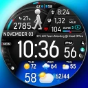
Screenshots
Analysis by Reviewed
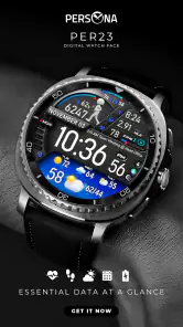
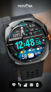
Choosing a watch face is a small decision, but it changes how often I enjoy looking at my smartwatch. The right design gives me useful information at a glance without making the screen feel crowded. PER23 Digital Watch Face takes a clean, digital approach for Wear OS, with a platinum-inspired visual style that feels more deliberate than the basic face included with many watches.
I see it as a personalization app for people who want their watch to look sharper while keeping the time easy to read. It is not trying to turn the watch into a miniature phone, and that is part of its appeal. The design is focused on the watch face itself rather than on extra distractions. After spending time with it, I found that its value depends less on novelty and more on whether its visual balance suits your daily routine.
What to expect from the platinum digital design
The app comes from PERSONA Watch Face and is built for Wear OS. Its store summary identifies it as the PER23 Platinum Pro Digital Watch Face, while the shorter description presents it simply as a digital watch face. That distinction is useful: this is primarily a face you apply to a compatible smartwatch, not a separate productivity tool or a full companion experience.
The overall impression is polished and contemporary. A digital layout usually works well for quick glances because the numbers can be read immediately, especially when you are walking, commuting, or checking the time during a meeting. The platinum styling gives the design a more refined character than a plain black-and-white digital display, although personal taste matters here. If you prefer a very colorful, playful, or heavily animated watch face, this one may feel restrained.
In my experience, the strongest reason to choose it is consistency. A face like this can work with casual clothing, office wear, and a more formal outfit without looking out of place. That makes it a better everyday option than a theme designed around one hobby or one color scheme. I would particularly recommend it to someone who has just bought a Wear OS watch and wants a more intentional appearance without spending time comparing hundreds of complicated designs.
The app has an average rating of 4.1 from around eight hundred ratings, with just over one hundred written reviews. It has passed the ten-thousand-install mark, so it is not an unknown experiment, but it also does not have the enormous user base of the most established watch-face collections. I read those figures as a sign of a reasonably established niche product rather than a universal choice. The response is positive enough to encourage a trial, while the middling average suggests that fit, readability, and device compatibility will matter from person to person.
It is offered for $2.99, which places it in the affordable paid-watch-face range. I think that price makes sense if you expect to keep the face on your watch for weeks or months. It is harder to justify if you change faces every few days or mainly want to experiment. The content rating is Everyone, and the app was released on January 26, 2024, so it feels like a relatively recent addition rather than an old design being left untouched for years.
More From Our News Desk

Clash of Clans Is Won Between the Battles

Android Auto Makes the Case for Quieter Car Software

MobiOffice: Transforming Mobile Productivity with Seamless Integration

EA SPORTS FC™ Mobile Soccer: Redefining Mobile Sports Gaming

How Microsoft OneDrive Became a Mobile Productivity Giant

How Google Translate Breaks Language Barriers Effortlessly
Who will get the most from it
I would put this face near the top of the list for someone who values a professional digital look, wants fast time reading, and does not need their watch display to resemble a dashboard. It is also a sensible choice for users who want one face that can stay installed through different parts of the day. The platinum character adds visual identity without forcing the rest of the watch or your clothing to match it.
There are also people who should skip it. If your priority is a large analog dial, a highly customized fitness display, a cartoon theme, or a face packed with unusual complications, an alternative from another designer will probably suit you better. I would also avoid buying it solely because the name sounds premium. The real question is whether you like the way a restrained digital layout sits on your particular watch screen.
Getting through the first setup
For a first-time user, the safest approach is to treat installation and application as two separate steps. Install the watch-face app through the Wear OS route you normally use, then open the watch-face selection area on the connected watch or its companion interface. Look for the PER23 design among the available faces and apply it from there.
I recommend doing this while the watch is connected and has enough battery for a normal setup session. That is not a special requirement of this particular face; it is simply a practical way to avoid blaming the design when the real problem is a delayed connection or a watch that is busy completing another task. If the face does not appear immediately, give the device a moment, check that the watch is connected, and revisit the face list rather than repeatedly reinstalling the app.
The first useful decision is not cosmetic. Before changing anything, look at the face in the lighting where you most often check your watch. A design that looks excellent in a bright room may feel different outdoors, in a dim hallway, or under office lighting. I find that judging readability in real situations is more valuable than staring at a preview on a phone.
Because this is a Wear OS face, the watch model and system version can influence how comfortably it fits. Screen shape, display size, brightness, and the way the watch handles face settings all affect the final result. I would not assume that the preview tells the whole story. Apply it, wear it for a normal morning, and notice whether you can read the time without deliberately focusing on the display.
The first successful action: make it part of your routine
The first meaningful success is simple: glance at the watch during an ordinary activity and read the time instantly. Try it while carrying a bag, waiting for transport, or moving between rooms. If the digital figures are clear and the visual treatment does not make you hesitate, the face is doing its job.
One realistic scenario is a busy workday. I might leave the phone in my pocket during a meeting, check the watch during a short pause, and return my attention to the conversation without opening another screen. Later, while walking outside, the same face gives me a quick time check without requiring a different style for the rest of the day. That continuity is more useful to me than a dramatic design that becomes tiring after repeated glances.
Another good test is the evening transition. Wear the face from daylight into indoor lighting and see whether the display remains comfortable. If you regularly check the time at night, be careful about brightness and visual intensity. A face that looks elegant at noon may feel too prominent in a dark room. I would adjust the watch’s display behavior where possible rather than judging the app after one quick look.
A less obvious tip is to test the face during movement, not only while standing still. While walking, the watch can sit at a changing angle, and reflections can make a decorative treatment less readable than it seemed on a desk. If the time remains easy to identify while your wrist is moving, that is a stronger sign of everyday usability than a perfect static preview.
Where new users may become confused
The most common point of confusion with watch-face apps is expecting the phone app to behave like a normal phone application. The important result is not a screen full of content on the phone; it is the appearance of the face on the watch. If you open the app and do not immediately see a large interactive experience, that does not mean the installation failed. The practical checkpoint is the Wear OS face picker.
Another source of uncertainty is the difference between selecting a face and customizing a face. Applying the design is one action. Any settings or adjustments available through the watch’s face controls are a separate part of the process. I would first confirm that PER23 is active, then explore the watch’s normal face-editing controls. This prevents a beginner from changing several things at once and losing track of what actually worked.
It is also easy to judge a digital face unfairly by comparing it with an analog face’s strengths. Analog designs can make elapsed time feel intuitive, while digital designs are usually better for exact, immediate reading. PER23 belongs to the second group. If you naturally prefer seeing hands and a traditional dial, the clean digital approach may never feel as comfortable, even if the finish is attractive.
Battery expectations deserve a realistic approach too. Installing a new face does not automatically mean your watch will behave exactly as it did with every other face. Display style, brightness, screen wake behavior, and the watch’s own settings all influence endurance. I would avoid making a decision after a single afternoon. Use the face through a normal day and compare how it feels, rather than assuming the price or appearance tells you anything about battery impact.
Compatibility is another practical question for first-time buyers. The product is intended for Wear OS, so it is not a general watch-face file for every smartwatch platform. If your watch does not use Wear OS, this is not the right purchase. If it does, the safest path is still to install through the platform’s own supported store and confirm that the face appears in the watch’s selection screen.
Small habits that make the face work better
I found three habits especially useful. First, keep the active face list tidy. If you install many designs and leave them all in rotation, it becomes harder to tell whether you genuinely prefer PER23 or simply forget why you selected it. Put it beside the few faces you actually use, then compare them over a full day rather than switching every few minutes.
Second, evaluate it against your clothing and watch hardware, not against the store preview alone. Platinum-style details can look especially good with a metal case or a neutral strap, but the same treatment may feel less natural with a brightly colored sport band. That is not a flaw; it is a styling trade-off. The face is most convincing when the watch itself supports the visual direction.
Third, decide whether you want the watch to be a quick information tool or a visible accessory. PER23 works best when those goals overlap: it gives the watch a finished appearance while keeping the central purpose clear. If you want the display to constantly show many kinds of information, you may end up preferring a more data-heavy alternative, even if it looks less elegant.
There is also a useful social consideration. A restrained face is less likely to draw attention than a bright animated design, which can be an advantage in classrooms, offices, appointments, or formal events. I would choose this style when I want the watch to look considered but not become part of the conversation. For a child or someone who wants a playful personal statement, the same restraint may feel dull.
How it compares with usual alternatives
The usual alternatives in this category fall into three broad groups: the default face supplied with the watch, minimalist third-party faces, and information-heavy designs. Compared with a default face, PER23 offers a more distinctive visual identity. That difference may be enough for someone who has grown tired of the same factory appearance but does not want to redesign every element manually.
Compared with a minimalist face, the choice becomes more personal. A very plain design may provide the cleanest possible reading, while PER23 adds a platinum finish that gives the display more character. I prefer PER23 when the watch is part of an outfit, but I would choose the plainer option for a purely functional setup where every decorative detail feels unnecessary.
Compared with a data-heavy face, PER23 is the calmer option. A packed layout can be better for users who constantly monitor several pieces of information without opening an app. The trade-off is visual breathing room. If your main goal is to check the time comfortably and keep the watch looking polished, the simpler direction is more convincing. If you want the face to act as a permanent control panel, seek an alternative designed around that purpose.
Price also changes the comparison. At $2.99, this is not a major purchase, but it is still a purchase rather than a free experiment. I would pay it when I already know I like the platinum digital style and expect to use it regularly. I would not pay it as a blind solution for a watch that I rarely wear. The best value comes from repeated daily use, not from the number of minutes spent browsing the preview.
Who should install it and who should pass
For a first-time Wear OS user, I think this is a reassuring place to start if you want a polished digital face without a complicated learning curve. Apply it, check it in real lighting, wear it through one normal routine, and then decide whether the visual balance feels natural. That path gives you a clear answer quickly and avoids overthinking small design differences before you have used the face on your wrist.
I would recommend it to office workers, commuters, students, and anyone who wants a watch that can move between casual and formal settings. It also suits people who are tired of default faces but do not want an aggressively themed replacement. The Everyone age rating makes it broadly approachable, although the more important question is still whether the design matches the user’s taste and watch model.
I would pass if you need a prominent analog dial, extensive information at a glance, or a face chosen mainly for sports-specific monitoring. I would also pass if you dislike paying for designs you may replace frequently. In those cases, a free default face or a more specialized alternative may offer better value, even if it has less visual polish.
My final take after using it
The best reason to choose PER23 is its balance between a dressed-up appearance and immediate digital readability. It does not need to dominate the watch to make the device feel more personal. For me, that makes it a practical everyday face rather than a novelty that looks impressive only in a screenshot.
Its limitations are equally clear. The design will not satisfy people who want a colorful theme, a traditional analog experience, or a dense information dashboard. The paid price means you should like the style before committing, and the final impression can vary with the watch’s screen and your own lighting conditions. Those are meaningful trade-offs, not reasons to dismiss it.
Overall, I see the app as a focused personalization choice from PERSONA Watch Face. The 4.1 average and more than ten thousand installs suggest that it has found an audience, while the design itself explains why it will appeal more strongly to some users than others. If you want an elegant digital face for Wear OS, install it, apply it through the watch-face picker, and test it during the parts of the day when you actually rely on your watch. If the time remains effortless to read and the platinum styling fits your watch, the modest one-time cost is easy to justify.
PER23 Digital Watch Face Frequently Asked Questions
Is PER23 Digital Watch Face free to download?
PER23 Digital Watch Face costs $2.99. It is a personalization app by PERSONA Watch Face, and the purchase is for a Wear OS watch face rather than a general phone app. Before purchasing, make sure your smartwatch is compatible and that you are signed in to the Google account you intend to use for the installation.
What does PER23 Digital Watch Face look like, and what information does it show?
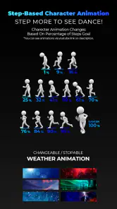
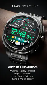
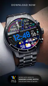
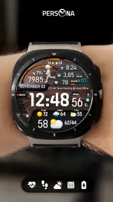
PER23 Digital Watch Face is presented as a platinum pro digital watch face for Wear OS. Its clean digital layout is intended to make key details easy to glance at, including the time, date, battery status, and other optional complications. The exact appearance and information available can depend on the watch model and the options supported by its software.
What is PER23 Digital Watch Face?
PER23 Digital Watch Face is a customizable watch face designed for compatible Wear OS smartwatches. It focuses on a clean digital layout with at-a-glance information such as the time, date, battery status, and other optional complications. Its usefulness depends on your watch model and the version of Wear OS installed, so checking compatibility before downloading is recommended.
Which smartwatches are compatible with PER23 Digital Watch Face?
Compatibility can vary depending on the developer’s current requirements, but PER23 Digital Watch Face is generally intended for Wear OS devices rather than standard Android phones or Apple Watch models. Before installing, review the listing in Google Play and confirm that your smartwatch uses a supported Wear OS version. Older watches may not support every feature or installation method.
Can I customize the appearance and information shown?
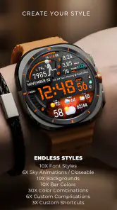
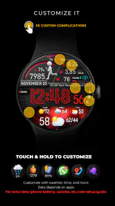
The available customization options depend on the version installed and the capabilities of your smartwatch. Typically, users may be able to adjust colors, choose available complications, and change which information appears on the screen. Some options can be configured through the watch face settings after installation, while others may require the companion Wear OS app on the connected phone.
Pros
- Clean digital layout makes the time easy to read at a glance.
- Supports useful complications for weather
- battery
- steps
- and other data.
- Offers multiple color and style options for personal customization.
- Designed for low-power smartwatch use with an uncluttered interface.
- Works well for both casual wear and more active outdoor use.
Cons
- Some customization options may depend on the connected watch model.
- Small complications can be difficult to read on compact watch displays.
- The design may feel too simple for users wanting animated watch faces.
- Advanced settings may require navigating through the Wear OS app.
- Battery impact can vary depending on complications and screen settings.
- Category
- Personalization
- Version
- Varies with device












