OneUI Widgets
- 203.00
- 4.6
- Installs
- 50.00K
- Price
- $0.99

Screenshots
Analysis by Reviewed
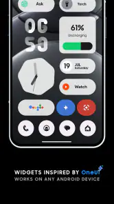
I installed OneUI Widgets from JustNewDesigns because I wanted my Android home screen to feel more like a carefully arranged dashboard than a collection of unrelated shortcuts. The app sits in the personalization category and focuses on widgets with a Samsung One UI-inspired look. That focus matters: this is not trying to replace your launcher or redesign every part of your phone. It is meant to improve the part of Android you see most often, using a consistent visual language.
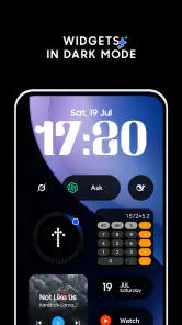
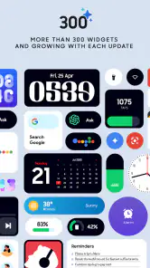
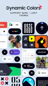
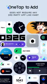
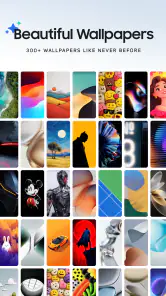
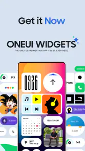
My first impression was that the app makes the home screen feel more deliberate. Instead of choosing a weather widget from one app, a calendar widget from another, and a clock from a third, I could work toward a more unified appearance. The collection includes more than three hundred widget designs, so the main challenge is not finding something at all; it is narrowing the choices to the layouts that suit the way I actually use my phone.
The app has a 4.6 average from around 3.6 thousand ratings, with over 50 thousand installs. It costs $0.99, is rated for Everyone, and requires Android 12 or newer. The current version is 2.1.004, and the app was released on July 19, 2025. In-app purchases range from $0.99 to $13.99 per item, so I would check which designs are available before assuming the initial price covers everything I want.
From a cluttered home screen to a usable daily dashboard
Starting with the real problem
My starting condition was familiar: I had useful information spread across several places, but none of it was visible at a glance. I could open the calendar for appointments, pull down notifications for reminders, and open another app for weather or device information. None of those steps was difficult, yet the repeated tapping made the home screen feel less useful than it should have been.
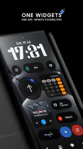
OneUI Widgets is most appealing when the goal is not simply decoration. I found it more useful to think of the home screen as a morning handoff: the phone gives me the information I need before I open anything. A large clock can establish the visual anchor, while smaller widgets can support a calendar check, a quick look at conditions, or another piece of information already supported by the selected design.
That approach also helped me avoid a common mistake with widget packs: filling every empty space just because attractive designs are available. The collection encourages experimentation, but a home screen with too many panels becomes another form of clutter. I got a better result by deciding what I wanted to know first, then choosing a widget size and style around that need.
Choosing a design without losing the phone’s rhythm
The One UI influence is most noticeable in the overall feel: rounded shapes, generous spacing, and a softer presentation than many highly technical widget packs. I would recommend browsing with the rest of the phone in mind. If your icons, wallpaper, and launcher already have a restrained appearance, these widgets can reinforce it. If your setup is intentionally colorful or heavily customized, some designs may feel visually disconnected.
More From Our News Desk

Clash of Clans Is Won Between the Battles

Android Auto Makes the Case for Quieter Car Software

MobiOffice: Transforming Mobile Productivity with Seamless Integration

EA SPORTS FC™ Mobile Soccer: Redefining Mobile Sports Gaming

How Microsoft OneDrive Became a Mobile Productivity Giant

How Google Translate Breaks Language Barriers Effortlessly
I also found that size is a practical decision rather than a purely aesthetic one. A compact widget is easier to fit beside frequently used icons, while a larger panel can be more readable but may push important shortcuts onto another page. I would begin with the smallest arrangement that gives you enough information, then expand only if the text or controls feel cramped.
A useful tip is to take a screenshot of your current home screen before changing it. That gives you a reference point when testing several layouts and makes it easier to restore the arrangement if a new design looks attractive in isolation but works poorly in daily use. Widget customization often feels reversible, but small changes can affect the entire balance of a page.
The step-by-step setup flow
My setup process was straightforward in principle. I opened the collection, looked through the available designs, selected a widget that matched the information I wanted, and added it through the normal Android home-screen workflow. The important part was not the tap sequence; it was deciding where the widget belonged before placing it.
I recommend preparing the destination first. Remove or move icons that compete with the intended panel, choose a wallpaper with enough contrast, and leave room for the widget’s actual footprint. Doing this beforehand avoids the frustrating cycle of adding a widget, discovering that it displaces several shortcuts, and then rebuilding the page around it.
After placement, I treated the widget as part of a visual hierarchy. The primary widget should answer the question I ask most often. A secondary one can provide context, but it should not compete for attention. For example, I would place the time or a central daily summary in the most visible position, then keep less urgent information lower on the page or on a second screen.
This is one of the less obvious strengths of the pack: the large selection makes it possible to design around a workflow instead of accepting the default arrangement from a single utility app. The trade-off is that more choice takes more time. Someone who wants one excellent widget immediately may find the browsing stage slower than using the first suitable option from a dedicated clock, weather, or calendar app.
Handoffs between the widget and the original app
A widget is not the final destination for most tasks. Its job is to provide a quick handoff to the underlying app or phone function when I need more detail. I found it helpful to judge each design by that transition: does the widget tell me enough to decide whether I need to open something, or does it merely add another decorative layer?
For a morning routine, the home screen can act as the first checkpoint. I glance at the time, scan the visible information, and then open the relevant app only when the widget signals that I need a closer look. That is a better workflow than opening several apps in sequence just to assemble the same overview. It also reduces the temptation to get distracted by unrelated notifications or feeds.
The handoff is especially useful for people who already have preferred apps. A widget pack does not need to replace an established calendar, weather service, or launcher for the visual layer to be valuable. I can keep the tools I trust while using a more consistent presentation on the home screen. That separation is important because a beautiful widget is not automatically a better source of information.
There is also a practical compromise here. A widget can show a concise view, but a full app remains better for editing events, reviewing a longer forecast, or managing detailed settings. I would use OneUI Widgets for awareness and quick access, not as a reason to abandon the apps that handle the underlying work.
A realistic everyday scenario
Imagine starting a workday with a phone that has several pages of icons and no clear priority. Before leaving home, I want to know the time, see whether anything important is scheduled, and decide whether I need to open another app. With a carefully arranged One UI-style page, those checks happen in one place. If the visible information looks normal, I move on. If something needs attention, the widget becomes the handoff point to the appropriate app.
That small change can make the phone feel calmer. I am not claiming that a widget eliminates distractions, because the rest of Android is still there. The benefit is that the first screen gives me a reasoned starting point instead of presenting every shortcut with equal weight. For a busy person, that reduction in visual noise may matter more than having the most elaborate design.
Where the collection earns its price
At $0.99, the app is easy to consider if you care about visual consistency and expect to keep the same home-screen style for a while. I see the value less in any single widget and more in having a broad set of coordinated choices. If I change wallpaper, icon style, or the amount of information I want visible, I have room to adjust without switching to an entirely different design language.
The additional purchase range means the total cost can depend on how much of the collection I want. That does not make the app poor value, but it changes the buying decision. I would start by identifying the specific widget types I need, then check whether the designs I prefer are included in the initial purchase or require an extra item. This is more sensible than buying several options simply because the previews look good.
The app is also a better fit for someone who enjoys arranging a phone than for someone who regards customization as a one-minute task. The initial purchase may be inexpensive, but the real investment is attention: comparing layouts, testing readability, and making sure the result remains convenient after the novelty wears off.
What I would test before settling on a layout
I would test the home screen in three situations: bright daylight, a dim room, and a quick glance while moving. A design that looks elegant in a preview can become difficult to read when contrast is low or when the phone is viewed briefly. This is particularly important with compact widgets, where decorative spacing can leave less room for practical information.
I would also check whether the page still works with notifications arriving. The widget should remain a guide, not compete with urgent alerts. If a layout pushes the most-used icons too far away or makes the screen feel crowded, I would reduce the number of panels rather than adding more pages to compensate.
Another useful test is the “empty phone” test: temporarily ignore the visual appeal and ask whether the arrangement helps me complete a real task faster. If I still need to open multiple apps for the information I expected to see, the widget may be attractive but not useful enough for that position.
Where the flow breaks
The experience is not frictionless. The biggest weakness is the gap between a polished widget preview and the realities of a particular launcher, wallpaper, screen size, and personal routine. A design that looks balanced on one home screen may require compromises on another. I would not buy this expecting every choice to fit perfectly without adjustment.
Android customization can also involve small setup annoyances, especially when a widget needs to be resized or repositioned after placement. Even when the process is familiar, it can take several attempts to achieve a clean result. That is not a reason to avoid the app, but it is worth knowing if you want a completely automatic makeover.
The other break occurs when the visual style becomes more important than readability. OneUI-inspired softness can make a screen feel refined, but I would skip a design if its text is too small or its information is too compressed. A widget should earn its space by reducing effort. If I have to stare at it to understand what it says, it has failed its main purpose.
I would also choose a different option if I wanted deep data customization, a highly specialized dashboard, or a widget pack built around one particular service. A dedicated app may offer more detailed controls for its own information. Likewise, people who already love their current widgets and only want a different wallpaper or icon set may not gain enough from adding another layer.
Who should use it and who should skip it
I would recommend OneUI Widgets to Android users who like the visual character of Samsung-style layouts, want a coordinated home screen, and are willing to spend a little time arranging it. It is particularly suitable for someone moving from a scattered collection of widgets toward a calmer daily dashboard without replacing the apps they already use.
I would be more cautious if you use an older Android device, since Android 12 is the minimum requirement. I would also skip it if you dislike tweaking layouts, expect every widget to be included without additional purchases, or prefer a highly technical information density over rounded, spacious presentation.
The Everyone content rating makes it approachable for a broad audience, but that should not be confused with universal usefulness. The app’s success depends on your launcher habits and your willingness to maintain a visual system. A person who changes home screens constantly may enjoy the experimentation; someone who wants a fixed setup may only need one or two designs and may not use most of the collection.
My result after living with the arrangement
The result I liked most was not a dramatic transformation. It was a more intentional first screen. I could decide what deserved attention, keep supporting information nearby, and preserve my existing apps underneath the new visual layer. That makes the app feel practical rather than purely ornamental.
JustNewDesigns has made a focused personalization tool rather than an all-purpose Android replacement. The breadth of the collection gives it flexibility, while the One UI direction keeps the experience recognizable. The downside is that the same breadth can make selection feel like work, and the extra purchase range means I would make a plan before exploring every option.
My honest recommendation is to try it when your current home screen feels visually inconsistent or makes simple checks unnecessarily slow. Start with one useful widget, build around a real routine, and judge the outcome after the novelty has faded. The best result comes from treating the widget as a handoff to your daily tools, not as decoration added to fill empty space.
For me, OneUI Widgets is worth considering because it connects appearance with everyday use. It will not solve every customization need, and it is not the right choice for people seeking maximum technical control. But if you want a softer, more unified Android home screen and are prepared to make a few thoughtful layout decisions, it offers a convincing way to turn the first screen into a useful starting point.
OneUI Widgets Frequently Asked Questions
What does the $0.99 price for OneUI Widgets include?
OneUI Widgets is a personalization app built around a collection of home-screen widgets inspired by Samsung’s One UI style. It costs $0.99 to download, and in-app purchases range from $0.99 to $13.99 per item. If you are comparing the purchase price with the available extras, check the app’s purchase screen so you can decide which options, if any, are worth adding.
What Android version do I need to use OneUI Widgets?
OneUI Widgets requires Android 12 or later. Its current version is 2.1.004, and it is rated for Everyone. Before downloading, check the Android version installed on your phone or tablet; a device running an older version may not be able to install or run the app. The app is developed by JustNewDesigns.
What are OneUI Widgets?
OneUI Widgets are home-screen tools designed to match Samsung’s One UI visual style and provide quick access to information or shortcuts. The app’s collection includes more than 300 beautifully crafted widgets inspired by OneUI. Depending on the widget you choose, it can provide glanceable content or a shortcut directly on your home screen. The app is intended for Android devices, particularly Samsung Galaxy phones and tablets running a compatible One UI version.
Are OneUI Widgets compatible with every Android phone?
Compatibility depends on the specific OneUI Widgets package, Android version, launcher, and device manufacturer. Samsung Galaxy devices usually offer the best integration because the widgets follow the One UI framework. On phones from other brands, some widgets may not appear, may look different, or may require a compatible launcher. The app requires Android 12 or later, so check your device’s version and launcher before downloading.
How do I add OneUI Widgets to my home screen?
After installation, touch and hold an empty area on your Android home screen, select the Widgets option, and look for the OneUI Widgets section. Choose the widget you want, drag it to an available space, and resize it if the launcher allows customization. Some widgets may request permissions for weather, calendar, location, or battery information before displaying complete data. The exact steps and available choices can vary by launcher.
Pros
- Clean
- Samsung-style widgets that match One UI devices.
- Offers useful clock
- weather
- calendar
- and system information widgets.
- Simple customization options for size
- color
- and transparency.
- Lightweight design with minimal impact on device performance.
- Helps non-Samsung phones achieve a more consistent One UI look.
Cons
- Some widgets may require additional permissions to display complete information.
- Compatibility can vary depending on Android version and device manufacturer.
- Customization is more limited than with advanced widget-maker apps.
- Certain features or widget packs may be restricted behind in-app purchases.
- Occasional layout issues may appear on unusual screen sizes or launchers.
- Category
- Personalization
- Version
- 2.1.004












