Everything Widgets
- 360.00
- 4.6
- Installs
- 100.00K
- Price
- $1.09

Screenshots
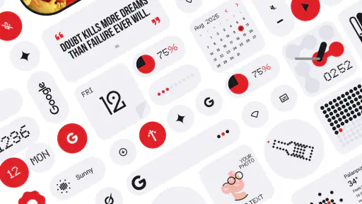
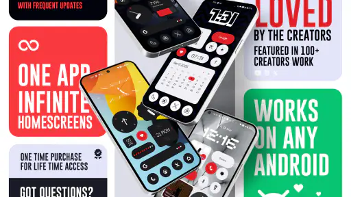
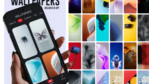
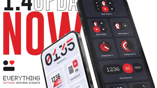
Analysis by Reviewed
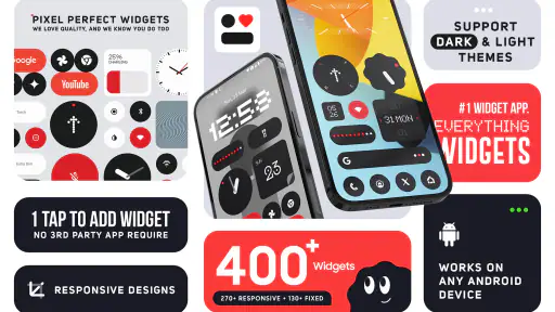
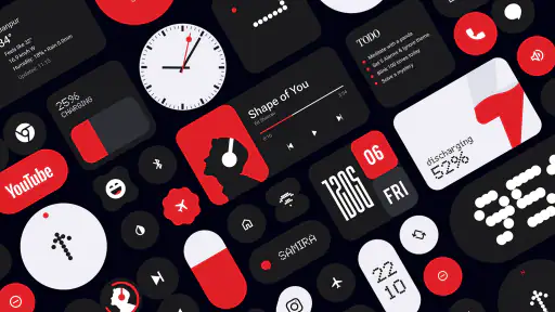
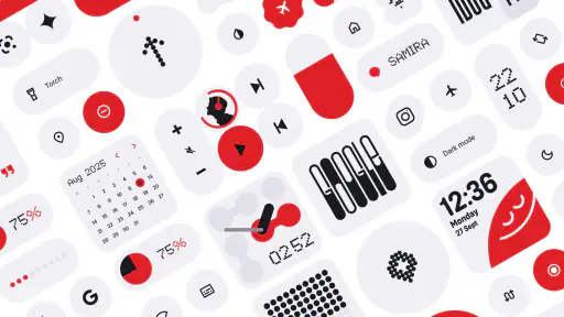
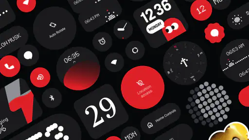
Everything Widgets is the kind of personalization app I would install when I want my home screen to feel more deliberate without replacing the whole launcher. It comes from JustNewDesigns and focuses on widgets with a Nothing-inspired visual language: monochrome elements, clean spacing, restrained shapes, and a technical look that works especially well on simple wallpapers. I found it more interesting as a system for building a consistent screen than as a collection of isolated decorations.
The app is listed as a paid download at $1.09, carries an Everyone age rating, and runs on Android 12 or later. Its current version is 2.1.014. Those details matter because this is not aimed at someone looking for a free pack to try for five minutes on an older phone. It makes more sense for an Android user who already knows the look they want and is willing to spend a small amount to get a large set of matching widgets in one place.
Building a useful home screen instead of a decorative one
My preferred way to approach Everything Widgets is to begin with a normal daily screen rather than immediately filling every empty space. I first decide what I actually check without opening an app: time, date, weather, battery, calendar information, or a shortcut to something I use repeatedly. Then I choose widgets that support those habits and leave the rest of the screen quiet.
That approach suits this app particularly well. The Nothing-inspired style depends on visual breathing room. If every available area is covered, the design loses its calm quality and starts to look like a busy dashboard. A smaller arrangement usually gives the widgets more presence, especially when the wallpaper has a plain background or a limited color palette.
The collection contains more than 400 widgets, so the first challenge is not finding something attractive. It is narrowing the choice down. I would treat the catalog as a toolkit: select one primary information widget, one secondary utility, and perhaps a shortcut-oriented element. This prevents the common mistake of installing a large pack and then spending more time browsing possibilities than using the finished layout.
A practical everyday setup could be a compact clock and date area at the top, a weather element near the middle, and a lower section reserved for the apps I open most often. Someone who checks appointments throughout the day might replace the weather space with a calendar-focused widget. Someone who wants a distraction-free phone could use only the time and a single shortcut. The strength here is that the visual language remains coherent even when the purpose of the widgets changes.
The best result comes from treating the home screen as a routine, not a poster. If a widget does not answer a question I regularly have, I remove it. That simple rule makes the large selection feel manageable and keeps the final arrangement useful after the novelty wears off.
More From Our News Desk

Clash of Clans Is Won Between the Battles

Android Auto Makes the Case for Quieter Car Software

MobiOffice: Transforming Mobile Productivity with Seamless Integration

EA SPORTS FC™ Mobile Soccer: Redefining Mobile Sports Gaming

How Microsoft OneDrive Became a Mobile Productivity Giant

How Google Translate Breaks Language Barriers Effortlessly
What the visual style gets right
The design direction is the clearest reason to choose this app. Its Nothing-inspired appearance gives ordinary home-screen information a recognizable identity without relying on bright gradients or oversized illustrations. The restrained presentation is a good match for users who prefer a technical, futuristic, or minimalist phone aesthetic.
I also like that this style can make different parts of a home screen feel related. Android widgets from unrelated apps often use different typefaces, colors, padding, and corner treatments. Even when each one is individually attractive, the combination can look accidental. A coordinated widget pack reduces that mismatch and makes the screen feel planned.
There is a trade-off, though. Minimal widgets are not automatically the easiest to read in every situation. Thin lettering, compact information, or low-contrast elements can become less comfortable over a bright wallpaper or in strong daylight. I would test the layout while standing near a window, not only in a dim room. A design that looks elegant at night may require more attention when the screen is competing with sunlight.
This is also not the right visual direction for everyone. If you prefer colorful weather illustrations, expressive calendars, large photographs, or playful icons, the pack may feel too restrained. Its appeal comes from consistency and understatement, so users who want every widget to stand out independently may be happier with separate apps that specialize in richer visuals.
Settings that deserve attention before settling on a layout
When I review a widget collection, I do not judge it only by how it looks in the picker. The real test is how much control Android gives me after placement. Before committing to a final arrangement, I would check the available resizing behavior, the way each widget responds to the launcher grid, and whether the information remains legible at different sizes.
Resizing is especially important with a large collection. A widget that looks balanced in its default footprint may become cramped when squeezed into a narrow column, while a wide version may dominate a small screen. I would place a candidate, resize it one step smaller, and then one step larger. If both alternatives remain usable, it is more flexible for real layouts. If only one size works, I would design around that limitation rather than forcing it into an awkward gap.
It is worth checking the launcher’s own behavior as well. Android launchers do not all use the same grid density, spacing, or widget margins. A layout that looks precise on one phone can shift on another. This is not necessarily a flaw in Everything Widgets, but it means that screenshots and recommendations from other users should be treated as inspiration rather than an exact template.
I would also inspect the widget configuration screen each time I add a new element. Some widgets may offer choices such as appearance, information type, or action behavior, while others may be more fixed. The useful habit is to configure one widget completely before adding the next. That makes it easier to remember which element serves which purpose and avoids a home screen full of nearly identical choices.
Another small but valuable check is readability against the chosen wallpaper. Monochrome designs depend heavily on contrast. A dark widget over a textured photograph may look stylish in a preview but become difficult to scan during a rushed morning. I prefer testing with the wallpaper I will actually keep, including both lock-screen and home-screen conditions if they differ.
Repeatable patterns that make the collection faster to use
The quickest way to get value from a large widget pack is to create a repeatable selection process. I would begin with one screen and assign each area a job: orientation at the top, information in the center, and action at the bottom. That structure reduces browsing because every new widget has to earn a specific place.
For example, I might reserve the upper area for time and date, keep the center for something that changes during the day, and use the lower area for a shortcut or compact utility. If the middle widget is too visually heavy, I would not compensate by adding more decoration elsewhere. I would choose a lighter alternative from the collection and preserve the overall balance.
A second useful pattern is to keep related widgets together rather than scattering them across several pages. If I use a weather widget, a calendar widget, and a clock, placing them on one primary page creates a quick glance screen. A separate page can then hold less frequent tools. This is more efficient than swiping through multiple pages just to gather basic information.
There is also a good case for using the pack selectively alongside existing Android shortcuts. I would not replace every app icon simply to make the screen look uniform. If a normal shortcut is faster to recognize or more reliable for a frequent action, it should stay. The widgets should improve the screen’s information flow, not force every interaction into the same visual style.
One non-obvious advantage of this approach is easier troubleshooting. If the weather area stops being useful, I know exactly which widget to reconsider. If the whole screen is built from many unrelated decorative pieces, it becomes harder to identify what is creating clutter. A small number of clearly assigned elements makes experimentation reversible.
Another practical habit is to save a mental template rather than constantly redesigning. Once I find a layout that supports my morning, work, or travel routine, I leave it in place for several days. This reveals whether I actually glance at the information or merely enjoyed arranging it. Personalization is most successful when it reduces small moments of friction, not when it demands daily maintenance.
Where the app fits among other Android personalization choices
Compared with using only the widgets included with Android or a phone manufacturer’s launcher, Everything Widgets offers a much stronger visual theme. The standard options are often perfectly functional, but they may not share one consistent aesthetic. This pack is a better choice when the appearance of the whole screen matters as much as the information it displays.
Compared with building a home screen from several specialized widget apps, it offers convenience and visual unity. Separate apps can be better when I need a very specific function, unusual data source, or deep customization from one widget category. The advantage of a broad collection is that I do not have to combine several design systems just to get a clock, date, and utility element that look as though they belong together.
It also occupies a different space from highly customizable widget builders. A builder can offer more control over individual layers, typography, and layouts, but that freedom usually requires more time and patience. Everything Widgets is more appealing when I want a finished design language with many choices inside it, rather than an open-ended design project.
The price makes that comparison straightforward. At $1.09, the decision is less about a major financial commitment and more about whether the aesthetic is genuinely useful to me. If I only want one highly specialized widget, a dedicated free option may be enough. If I want a coordinated Nothing-inspired screen and expect to experiment with several layouts, the small purchase is easier to justify.
The app has reached a 4.6 average from around 10K ratings, with over 100K installs, which suggests that the concept has found a substantial audience. I would still avoid treating popularity as proof that every widget will suit every phone. Launcher behavior, screen size, wallpaper choice, and personal reading preferences all affect the result more than a rating can show.
Limits experienced users should understand
The biggest limitation is the tension between visual minimalism and information density. A clean widget may show exactly what I need at a glance, but it may not replace a full app view. If I need detailed calendar entries, extensive weather information, or a long list of controls, I will still have to open the relevant app. These widgets are best for orientation and quick access, not for turning the home screen into a complete workspace.
The large catalog can also create decision fatigue. More than 400 choices sound generous, but a user who wants a finished screen immediately may feel lost without a clear personal plan. I recommend choosing the layout first and browsing with a purpose. Otherwise, it is easy to install several widgets that perform nearly the same role simply because their previews look different.
Another limitation is that the Nothing-inspired look can become repetitive if applied too aggressively. A completely monochrome screen may be attractive at first but less scannable when every element has similar visual weight. I prefer using the style as a foundation while allowing the launcher’s app icons or wallpaper to provide enough separation between areas.
Compatibility should also be considered before purchase. The app requires Android 12 or later, so it is not suitable for an older device that cannot meet that system requirement. Even on a compatible phone, the final appearance can depend on the launcher. Users who rely on a heavily modified launcher should expect to spend some time adjusting grid size and placement rather than assuming the default arrangement will transfer perfectly.
Finally, this is a personalization app, not a replacement for the launcher itself. It will not automatically solve issues such as poor app organization, distracting notifications, or an overcrowded dock. I would pair it with sensible folder placement, notification cleanup, and a wallpaper that supports contrast. The widgets can reinforce a good setup, but they cannot compensate for a chaotic one.
Who should install it and who should pass
I would recommend Everything Widgets to Android users who enjoy a controlled, monochrome-inspired appearance and want several coordinated options rather than one isolated widget. It is particularly suitable for someone who has recently simplified a home screen, bought a phone with a clean industrial design, or wants a more unified look without learning a complicated widget-building tool.
It is also a good fit for people who like to refine their setup over time. The broad selection supports small experiments: changing only the clock, moving the weather element, or replacing a large information block with a compact one. That makes the app more useful for gradual improvement than for a single dramatic makeover.
I would be less likely to recommend it to someone who wants colorful, highly illustrated widgets, deep data dashboards, or a completely free experience. It is also not ideal for a user who dislikes adjusting layouts manually. The app can provide the pieces, but the best result still depends on choosing sensible sizes, testing contrast, and resisting the temptation to use everything at once.
For an everyday example, imagine checking a phone before leaving home. A well-planned screen could show the time, date, current conditions, and a direct route to a frequently used app without requiring several swipes. During the day, the same restrained layout stays readable because each area has a job. That is the kind of improvement I noticed: not a dramatic new capability, but fewer small interruptions while using the phone.
A considered recommendation for long-term use
Everything Widgets works best when I approach it as a visual toolkit with practical rules. I would start with the smallest useful arrangement, check resizing and contrast, keep related information together, and give the layout several days before deciding whether it really helps. Those steps reveal the difference between a beautiful preview and a home screen that remains comfortable during ordinary use.
JustNewDesigns has made a focused personalization app rather than an all-purpose customization platform. That focus is its appeal. The Nothing-inspired design is distinctive, the collection is broad, and the low purchase price makes experimentation accessible. At the same time, the app cannot offer the deep specialization of a dedicated widget tool, and its minimalist presentation will not suit every reader.
My final view is positive, with a clear condition: choose it for a coherent Android aesthetic and repeatable daily shortcuts, not simply because the catalog is large. If that matches what you want, the combination of style and variety makes the purchase easy to recommend. If your priority is maximum data, vivid customization, or effortless automatic organization, a different category of widget solution will serve you better.
For my own use, the strongest reason to keep it installed is the way it encourages a calmer screen. I can select a few elements that support real habits, leave enough empty space to read them quickly, and avoid mixing unrelated designs. That balance gives Everything Widgets a purpose beyond decoration, which is why I would suggest it to a friend who wants a cleaner Android home screen without turning personalization into a full-time project.
Everything Widgets Frequently Asked Questions
Who makes Everything Widgets, and what kind of app is it?
Everything Widgets is a personalization app from JustNewDesigns, intended for people who want to change the look and usefulness of their device’s home screen. Its collection is inspired by NOTHING, with more than 400 crafted widgets to choose from. If you enjoy customizing your screen with distinctive widget designs, this app is built around that kind of experience.
What is Everything Widgets, and what can I use it for?
Everything Widgets is a customization app designed to place useful and attractive widgets on your device’s home screen. Depending on the available widget collection, you may be able to view information such as weather, time, calendar events, battery status, notes, or other shortcuts without opening separate applications. It is mainly intended for users who want a more personalized and practical home-screen experience.
Is Everything Widgets compatible with my Android or iOS device?
Compatibility can vary depending on your operating system version, device model, and the widget features supported by the platform. Before downloading, check the app store listing for the required Android or iOS version and any device-specific limitations. Some widgets may also behave differently across phones and tablets, particularly when the operating system restricts background updates or home-screen customization.
Does Everything Widgets drain the battery or use a lot of mobile data?
The impact on battery life and data usage depends on which widgets you install and how frequently they refresh. Simple clock, calendar, or shortcut widgets usually have a small impact, while weather, news, location-based, or live information widgets may update more often. To reduce consumption, review refresh settings, disable unnecessary widgets, and limit background or location access when those features are not needed.
Is Everything Widgets free to download, or does it include purchases?
Everything Widgets costs $1.09 to download. Before installing, check the app store page for the price shown in your region and for any additional purchase options. This helps you understand the cost upfront and decide whether the available widget designs and customization features suit what you want from a home-screen personalization app.
Pros
- Wide selection of useful widgets for everyday information.
- Clean designs fit well with different home-screen styles.
- Quick access to key details without opening multiple apps.
- Customization options help personalize the widget layout.
- Useful for organizing frequently checked information in one place.
Cons
- Some widgets may use noticeable battery or system resources.
- The best customization features may require a paid upgrade.
- Widget support can vary depending on the Android or iOS version.
- A large widget collection may make choosing the right one confusing.
- Occasional updates may change layouts or affect existing setups.
- Category
- Personalization
- Version
- 2.1.014












