My Premise Health
- 572.00
- 4.5
- Installs
- 100.00K
- Price
- Free

Screenshots
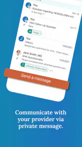
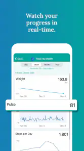
Analysis by Reviewed
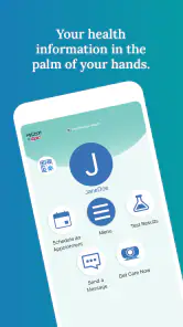
Managing healthcare often means moving between appointments, messages, records, and everyday decisions when you may already be tired, worried, or short on time. I found My Premise Health most useful as a central mobile doorway to health information rather than as a replacement for professional care. It is a free medical app from Premise Health Holding Corp, aimed at putting personal health information within easier reach on a phone.
My overall impression is positive, especially for people who already use Premise Health services and want a more convenient way to stay connected with them. The app has an average rating of 4.5 from around 1.3 thousand ratings, and it has passed the point of being a little-known download, with over 100 thousand installs. Those figures suggest that many users find it practical, although they do not remove the need to judge whether its particular healthcare workflow fits your needs.
How clearly the app supports everyday health access
Readability and navigation when you are trying to get something done
The strongest idea behind the app is straightforward access. Instead of treating health information as something that can only be reached through a desktop portal or during an appointment, it brings that relationship to a mobile device. In my experience, that matters most during small moments: checking something before leaving home, reviewing information after a visit, or trying to remember where a health-related task belongs.
That convenience does not mean every user will find the experience equally effortless. Healthcare apps can feel demanding because the information is personal and the consequences of misunderstanding it may be serious. Clear labels, predictable movement between areas, and readable text matter more here than decorative design. I would approach the app with the expectation that it is most comfortable for someone who can already use standard phone navigation, while recognizing that stress, fatigue, limited vision, or unfamiliarity with patient portals can make ordinary screens harder to interpret.
One practical habit improved my use of it: I treated the app as a place to check and organize information, not as a screen to explore casually. Before opening it, I decided what I wanted to find. That simple approach reduces wandering through menus and helps keep a short task—such as checking a health detail—from becoming an unnecessarily long session.
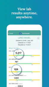
The app is also easier to evaluate when you separate two questions: “Can I reach my information?” and “Can I understand what I am seeing?” Mobile access addresses the first question, but medical wording can still make the second difficult. If a result, instruction, or status is unclear, I would not rely on a quick interpretation in the app; I would ask the relevant healthcare professional to explain it.
Different reading, motor, and sensory needs
For people with reduced vision, the key advantage of a phone-based health tool is the ability to use the device in a familiar setting. A user may already know how to enlarge text, adjust contrast, use a screen reader, or increase the device’s spoken feedback. Those system-level habits can make a major difference compared with handling printed paperwork or trying to remember a web address on a larger computer.
Still, device assistance cannot guarantee a smooth experience. If a screen uses dense medical text, unclear focus order, or controls that are difficult to distinguish, accessibility settings may only partly solve the problem. I would recommend testing the app with the same phone settings you depend on in daily life rather than assuming that a medical app will automatically accommodate them. This is especially important if you use voice control, magnification, or spoken output.
Motor access deserves the same practical attention. A phone interface can be easier than a keyboard for some people because it avoids extended typing, but it can be harder for anyone who has difficulty with precise taps, holding a device steady, or completing time-sensitive interactions. A stylus, larger system touch targets, voice input, or a stable surface may help, depending on the task. I would avoid trying to complete an important healthcare action while walking, carrying bags, or dealing with a shaky connection.
Sensory load also changes how usable the app feels. A quiet, well-lit room is not always available when health information is needed. Someone managing migraines, fatigue, anxiety, or attention difficulties may prefer short sessions with a clear purpose. Saving questions beforehand, using the phone’s display adjustments, and pausing between screens can make the experience less exhausting. These are not substitutes for thoughtful app design, but they are realistic ways to reduce friction.
Where it fits in real situations
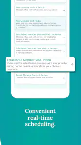
A realistic example is a person leaving work and realizing they need to review health information before an appointment the next morning. With the app on the phone, they can begin that check at home rather than waiting until they have access to a computer. If reading is difficult late at night, they can postpone the review, use device accessibility tools, or ask a trusted person to help navigate—while keeping the final medical interpretation with the care team.
Another useful situation is travel between familiar places. A mobile health portal is more practical than carrying a folder of papers, particularly when a user wants to look at information during a gap in the day. The trade-off is that a phone is easier to lose, share accidentally, or open in a public place. I would use a device lock, avoid displaying private details where others can see them, and sign out or close the app when using a shared device.
The app can also help family members who assist with healthcare, but this is where expectations need care. Helping someone navigate a screen is not the same as having permission to view or manage their health information. I would not assume that a relative, partner, or caregiver can use the app on another person’s behalf simply because they provide daily support. The patient should remain in control of who sees sensitive information and how assistance is provided.
For users with limited or inconsistent internet access, mobile access is convenient only when the phone can reliably connect at the moment it is needed. I would not make it the sole place for information that may be urgently required. Keeping essential contact details and instructions in an approved backup format is sensible, especially for people who travel through areas with weak service or share devices with other household members.
What it does better than the usual alternatives
The most obvious alternative is a browser-based health portal. A browser can be better for long documents, detailed comparison, and users who prefer a large screen. It may also be more comfortable for people who type slowly on a phone or who need several windows open while preparing questions. The mobile app wins when the priority is having health information available during ordinary parts of the day without sitting at a computer.
Paper records remain useful in some situations. They are visible without a battery, network connection, or login, and some people find them easier to annotate. They can also be helpful for a caregiver who is not comfortable with smartphones. Their weakness is that papers become outdated, are easy to misplace, and are awkward to carry in a complete set. I see My Premise Health as complementary to a sensible backup, not as a reason to discard every other record-keeping method.
Generic note-taking apps are another tempting substitute. A note can hold questions, appointment reminders, or a personal log, but it is not the same as reaching an official health-information channel. Notes are useful for preparation; they should not be treated as a replacement for the medical information available through the healthcare service. That distinction is one of the app’s most important practical strengths: it is connected to a healthcare context rather than being merely a private notebook.
Small workflows that make the experience more useful
I found three habits particularly worthwhile. First, I would open the app before an appointment and write down the exact information I want to discuss. This prevents the common problem of remembering a concern only after the visit ends. Second, I would review information when calm and alert rather than immediately after receiving news that may be confusing. Third, I would keep a separate, non-sensitive reminder of when to check the app again, instead of relying on memory alone.
A fourth habit is to verify identity and context before acting on what is displayed. If more than one person uses the same phone, take a moment to confirm that you are viewing the correct account or information. If a screen seems inconsistent with what a clinician told you, do not try to resolve the discrepancy by guessing. Use the app as a starting point for clarification, then contact the appropriate healthcare channel.
These workflows reveal a useful trade-off. Fast access can reduce delays, but it can also encourage people to read medical information without enough context. The best use is deliberate: check, note what you do not understand, and bring those points to a qualified professional. The app supports that process; it cannot replace the conversation around it.
Remaining barriers for inclusive use
The biggest limitation is that a mobile portal still assumes a baseline of digital confidence. Someone who has never used a patient app may not know what to expect from account screens, health terminology, or the difference between viewing information and taking action. A family member can offer practical assistance, but the user should be shown the process patiently rather than having the phone taken away from them.
Language and comprehension can create another barrier. Medical information is difficult even for fluent readers, and short mobile screens leave less room for explanation. I would be cautious about using automatic translation as the final authority for an important instruction. A qualified interpreter or healthcare professional is a safer choice when wording affects treatment, consent, or follow-up.
There is also an emotional barrier that technical design cannot completely remove. Opening a health app can feel stressful when a user is waiting for information or already concerned about a condition. A person who finds digital notifications overwhelming may prefer a planned schedule for checking rather than repeatedly opening the app. That approach preserves the convenience of access without allowing the phone to dominate the day.
People with older devices or different operating systems should check compatibility before making the app central to their routine. The current version is 11.7.3 and requires operating system 11 or later. For someone using an older phone that cannot meet that requirement, a browser portal, printed information, or direct contact with the healthcare provider may be the more dependable option.
Who should use it, and who should choose something else
I would recommend it to people who already receive care through Premise Health and want a convenient mobile route to their health information. It is also a reasonable choice for users who are comfortable with phone settings and prefer checking healthcare details in short sessions rather than managing everything through a computer.
I would be more cautious about recommending it as the only solution for someone with limited digital literacy, unreliable connectivity, significant motor difficulty, or a strong preference for large-print paperwork. Those users may still benefit from the app with support, but a desktop portal, telephone assistance, or a human explanation could be more accessible for particular tasks. The best option is the one that lets the person understand and act safely, not simply the one that is newest.
The app is free and rated for Everyone, which lowers the practical barrier to trying it. It has been available since October 6, 2017, and its developer is Premise Health Holding Corp. I see those details as useful context rather than a reason to install it automatically: the real question is whether your care relationship and daily access habits match what a mobile health portal can provide.
My inclusive verdict
My Premise Health succeeds most clearly as a convenient bridge between a person and their existing healthcare information. Its value is not flashy; it is found in reducing the number of steps between a question and the place where that question can be checked. For many users, that can make healthcare feel a little less scattered.
Its accessibility story is best described as practical but dependent on context. Familiar phone settings, a quiet moment, a stable connection, and occasional help can make it much easier to use. At the same time, medical language, account privacy, device compatibility, and the limits of mobile screens remain real barriers. I would not treat the app as proof that every user will receive the same experience.
My recommendation is to use it as one part of a personal healthcare routine, not as the entire routine. Keep a backup for essential information, ask for clarification when something is unclear, and choose the browser or human support when a larger screen or personal guidance would be safer. If you are already connected with Premise Health and want health information closer at hand, this free medical app is worth trying; just use it thoughtfully, especially when accessibility or medical complexity makes a quick tap-through inadequate.
Pros
- Secure access to health records
- appointments
- and care details in one place.
- Prescription tools make medication information easier to review and manage.
- Health reminders can help users stay on top of preventive care tasks.
- Supports biometric login on compatible devices for faster access.
- Useful for checking benefit and wellness program information on the go.
Cons
- Some features depend on your employer or health plan’s Premise participation.
- App usefulness may be limited if your provider does not share complete records.
- Certain services may require contacting support or visiting a care location.
- Health information may take time to update after appointments or test results.
- Requires an account and personal health details
- which may concern privacy-focused users.

- Category
- Medical
- Version
- 11.7.3