Muviz Widgets: Clock, Music.,
- 38.00
- 4.6
- Installs
- 100.00K
- Price
- Free

Screenshots
Analysis by Reviewed
I like personalization apps that make a phone feel more like mine without turning the setup process into a project. Muviz Widgets: Clock, Music. takes that idea seriously by focusing on home-screen widgets, especially clock designs, Material You styling, and music-related controls. After spending time with it, I see it as a visual customization tool rather than a complete replacement for a launcher or an always-on display system.
The app is free to start, belongs to the personalization category, and comes from Sparkine Labs, the team behind Muviz. It has built a solid audience, with an average rating of 4.6 from around 4.2 thousand ratings and more than 100 thousand installs. Those figures suggest that the concept is landing well, but the real question is whether the widgets fit the way you use your phone every day.
How Muviz Widgets feels in its current version
The current release is version 1.1.3.0, and the app was released on December 17, 2025. That places it in a relatively early stage compared with older, more established widget tools. In my experience, that is both appealing and important: the interface feels focused, but users who expect years of accumulated customization options may notice that it is more curated than endlessly configurable.
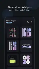
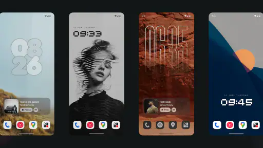
The central appeal is immediate. Instead of changing an entire launcher theme, I can alter the most visible part of the home screen: the clock, the arrangement around it, and the way colors relate to my wallpaper. That makes the app useful when I want a noticeable refresh without moving icons, relearning gestures, or replacing the phone’s default launcher.
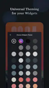
The Material You direction is especially practical on compatible Android phones. A widget that follows the system’s color language can look more integrated than one with a fixed palette. I found this more useful than simply choosing a bright design at random, because the home screen feels calmer when the clock and wallpaper share a visual relationship.
Music widgets add a second reason to keep the app installed. A clock alone is mostly decorative and informative, while a music widget can reduce the number of times I need to open an app or pull down the notification shade. That combination gives the home screen a job: it shows the time and keeps playback controls close at hand.
Still, I would not describe the experience as a universal answer for every Android home screen. The value depends on how much space you are willing to give a widget and how much you care about a coordinated appearance. If your home screen is already packed with calendar, weather, tasks, and communication tools, adding another visual layer may make it feel busier rather than better.
More From Our News Desk

Clash of Clans Is Won Between the Battles

Android Auto Makes the Case for Quieter Car Software

MobiOffice: Transforming Mobile Productivity with Seamless Integration

EA SPORTS FC™ Mobile Soccer: Redefining Mobile Sports Gaming

How Microsoft OneDrive Became a Mobile Productivity Giant

How Google Translate Breaks Language Barriers Effortlessly
What the clock designs change in daily use
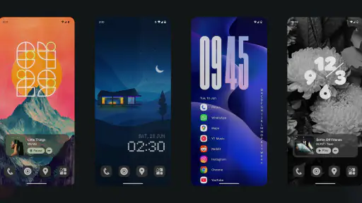
A clock widget is easy to underestimate because every phone already displays the time. The difference here is presentation. A large, distinctive clock can act as the anchor of a minimalist home screen, while a smaller design can sit beside icons without taking over. I prefer treating the clock as the first decision in the layout rather than adding it after everything else.
One useful workflow is to start with the wallpaper, then choose a clock style that supports its contrast instead of competing with it. Dark wallpaper usually benefits from a clear, restrained clock, while a colorful background may need a simpler shape so the time remains readable. This sounds obvious, but it prevents a common personalization mistake: selecting a beautiful widget that becomes difficult to read outside a controlled preview.
I also recommend testing the widget with the phone held at arm’s length, not only while editing the home screen. Fine details can look impressive up close but disappear when you are checking the time quickly. For a phone used during commuting, cooking, or a busy workday, legibility matters more than decorative complexity.
The strongest use case is a deliberately simple home screen. Put the clock near the visual center, leave enough breathing room around it, and keep only the apps you open most often. In that arrangement, the widget can make the phone feel designed rather than merely filled. On a dense home screen, its personality is easier to lose.
Material You styling is useful, but not magic
Material You support is one of the more convincing reasons to try the app. When the widget’s colors complement the system palette, it can look closer to a built-in element than a third-party add-on. That matters to me because mismatched widgets are one of the quickest ways to make an otherwise tidy home screen look fragmented.
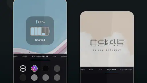
There is a trade-off, though. Automatic color coordination is convenient, but it may not produce the exact mood I want. A wallpaper can generate muted colors when I prefer stronger contrast, or it can create a palette that looks attractive in the preview but feels less readable in bright conditions. I would use the automatic styling as a starting point, then judge the result by clarity rather than by how closely it follows the wallpaper.
This is also where the app may be less suitable for people who want pixel-level control. A dedicated widget builder can be better if you need to specify every font, spacing value, color, and data element. Muviz Widgets is more appealing when the goal is a polished result with less manual work. I see that as a strength, not a flaw, but it sets a clear boundary around the product.
Where the music widget earns its space
The music side of the app is most valuable for people who regularly pause, resume, or skip tracks while doing something else. A control placed on the home screen can be quicker than opening the music service, especially when the phone is being used for navigation, messaging, or a timer.
My preferred arrangement is to keep the music controls close to the clock but not directly underneath it. Separating the information visually makes both elements easier to scan. If the controls are too small, they become frustrating; if they are oversized, the home screen starts to resemble a media dashboard. The best balance depends on how often you actually change tracks.
I would not install this app solely for music control if your main need is advanced playback management. A notification panel, lock-screen control, or the music service’s own widget may be more direct for that purpose. The advantage here is the combination of playback access and visual design, not necessarily a deeper music library experience.
Small adjustments that make the result better
One of the less obvious lessons from using a widget app like this is that placement affects perceived quality more than the individual design. Leave a little empty space around the clock, align its edges with nearby icons, and avoid placing it against a visually noisy part of the wallpaper. These changes cost nothing, yet they often produce a bigger improvement than switching between similar widget styles.
A second useful habit is to create the layout for the way you hold the phone. If you usually use one hand, placing the music controls within comfortable reach can matter more than centering them perfectly. A symmetrical layout may look excellent, but an asymmetrical one can be more practical when playback control is part of your routine.
Third, I would keep a simpler fallback arrangement in mind. A highly styled home screen can become tiring, and changing back to a clean clock-only layout takes less effort if the rest of the screen has not been redesigned around it. This makes the app easier to live with over time rather than treating personalization as a one-time makeover.
How the latest release affects the experience
Version 1.1.3.0 is the release currently associated with the app, so that is the version I would use when judging its present state. The release information gives useful context: this is a young product that is still establishing its identity, not a mature customization suite with a long history of accumulated tools.
For a new user, that can be a positive. A focused app is easier to understand than a control panel filled with options that are rarely used. The clock, Material You, and music emphasis gives the product a recognizable purpose. I did not approach it wondering whether it was trying to replace every personalization tool on the phone.
For an existing user, the more important issue is continuity. A widget can become part of a daily routine, so changes to appearance, sizing, or behavior matter even when they are technically improvements. I would take screenshots of a layout I particularly like and note the widget arrangement before updating, especially if the home screen is important for work or accessibility.
That is not a warning that the current version is unstable; it is simply sensible practice with a relatively new app. Product evolution can bring better polish, but it can also change the balance between simplicity and control. I would welcome improvements that preserve quick setup while making the visual result more predictable across different phones.
What existing users should consider
If you already use Muviz Widgets, the main benefit of staying with it is consistency. Once a clock and music layout becomes part of your muscle memory, replacing it with a different widget system can create more friction than expected. The app’s appeal is not just the design; it is having the same information in the same place whenever you unlock the phone.
At the same time, existing users should periodically check whether the widget still suits the current wallpaper and icon arrangement. Personalization can become stale when the background changes, and a design that worked on one screen may lose contrast on another. I find that adjusting the surrounding layout is often enough; there is no need to rebuild everything from scratch.
The free entry point also makes experimentation easy. In-app purchases cost $2.49 per item, so I would decide based on whether a particular paid element solves a real design or usability need rather than buying simply because it looks different. The free experience is enough to determine whether the app’s visual approach works for you before spending anything.
That pricing model makes the app less attractive to someone who wants one broad purchase covering every possible customization. It is better suited to a user who is comfortable choosing individual extras. If you dislike item-based purchases, the default or free selection may be the sensible stopping point.
Where the app still has room to grow
The biggest gap is not a missing headline feature; it is the natural limit of a focused widget collection. Users who want elaborate dashboards, extensive automation, or complete launcher-level control may outgrow it. A specialized widget builder or a launcher with deeper layout tools would be a better match for those needs.
There is also a practical issue with depending on a home-screen widget for information that must always be available. Different Android phones handle home-screen behavior in their own ways, and a widget’s usefulness can be affected by the surrounding launcher experience. I would not rely on any decorative clock or music panel as the only place for essential information.
Another limitation is visual commitment. Once the clock becomes the centerpiece, the rest of the home screen needs to support it. People who prefer a completely neutral interface may find the app unnecessary, while those who enjoy bold customization may want more freedom than a curated widget approach provides.
The app is also not the right choice for someone looking for a full music player. Its music-related value is tied to convenient home-screen access and appearance. For playlists, discovery, downloads, audio settings, or library management, the dedicated music application remains the proper tool.
Who should install it, and who should skip it
I would recommend Muviz Widgets to someone who wants a visible change with limited effort, especially if a clock is the main home-screen element and music controls would genuinely be useful. It is a good fit for minimalist layouts, Material You enthusiasts, and people who enjoy refreshing their phone’s appearance without replacing the launcher.
It is also a sensible option for a person setting up a new Android phone and wanting the first home screen to feel intentional. Start with one clock, add music only if you use it often, and resist filling every empty area. The app works best when it improves the hierarchy of the screen rather than becoming another collection of things to manage.
I would skip it if your current launcher already provides a clock and music widget that you find clear and attractive. There is little value in adding a second layer of customization when the existing tools meet your needs. I would also look elsewhere if you need extensive data widgets, complex automation, or complete control over every visual measurement.
The Everyone content rating makes it suitable for a broad audience, including people who simply want a more personal home screen without dealing with mature themes. The minimum operating-system requirement is Android 12, so anyone using an older Android release should choose a compatible alternative instead of planning around this app.
What I would watch as it develops
Because the product is still early in its life, I would watch how Sparkine Labs balances new options with the straightforward experience that makes the app appealing. More designs would be welcome, but not if finding a usable clock becomes harder. The best future direction would preserve quick browsing while giving advanced users a little more control over spacing, readability, and layout behavior.
I would also pay attention to how consistently the widgets fit different launchers and screen sizes. A design can look excellent in one setup and awkward in another, so refinement across real Android environments would matter more to me than simply adding a larger catalog.
For music controls, reliability and clarity should remain more important than decoration. The controls need to be recognizable at a glance, and the widget should continue to justify its space when the phone is being used quickly. If future updates improve that balance, the music side could become a stronger reason to choose this app rather than treating it as an extra.
My overall view is positive but specific. Muviz Widgets: Clock, Music. is best when you want a designed home screen, not an all-purpose customization laboratory. It gives the clock a stronger visual role, uses Material You in a practical way, and adds convenient playback access without forcing a launcher replacement.
I would begin with the free version, test one clock on the wallpaper you actually use, and judge it in normal lighting and one-handed use. If the result makes checking the time easier and the music controls earn their space, the app is doing its job. If you find yourself searching for complex dashboards or total design control, a deeper widget builder will be a better investment.
For my own recommendation, I would suggest it to friends who care about a clean, expressive Android home screen and want a quick way to change its character. The app is not trying to solve every personalization problem, and that focus is precisely why it can work. Just keep the layout restrained, treat paid items as optional refinements, and remember that the best widget is the one that remains readable and useful after the novelty wears off.
Muviz Widgets: Clock, Music., Frequently Asked Questions
Is Muviz Widgets: Clock, Music available on both Android and iOS?
Muviz Widgets: Clock, Music is a personalization app, and its widget experience depends on the operating system and the device’s home-screen features. Before downloading, check that the app is offered for your device and that your operating system meets its requirements. Widget placement and interactive features can differ between platforms, so the experience may not be identical on Android and iOS.
Who makes Muviz Widgets: Clock, Music, and what is the app’s overall focus?
Muviz Widgets: Clock, Music is developed by Sparkine Labs, the creators of Muviz. Its focus is on bringing Pixel Clock Widgets, Material You Widgets, and other designs to your home screen. It is intended for people who want a more personalized look alongside useful clock and music-related information, rather than a separate music streaming service or a replacement for their device’s clock app.
What is Muviz Widgets: Clock, Music?
Muviz Widgets: Clock, Music is a customization app designed to add attractive clock and music-related widgets to your device’s home screen. After exploring its interface, the app appears focused on combining practical information with visual style, offering widget designs that can complement different wallpapers, themes, and personal layouts. It is especially useful for users who want quick access to time, playback controls, or music information without opening another app.
What features does Muviz Widgets: Clock, Music offer?
The app provides a selection of customizable widgets centered mainly on clocks and music controls. Depending on the selected design and device compatibility, users may be able to adjust colors, sizes, layouts, and other visual elements to match their home screen. Music widgets can make playback information and controls easier to reach, while clock widgets provide a decorative alternative to the standard system clock. Available options may vary by version and operating system.
Is Muviz Widgets: Clock, Music free to use?
Muviz Widgets: Clock, Music can generally be downloaded without an upfront charge, but some designs, customization tools, or premium features may require in-app purchases. The app is free to download, with in-app purchases priced at $2.49 per item. Review the purchase details before choosing paid content, especially if you only want to use the free widget options.
Pros
- Offers stylish clock widgets with many customization options.
- Music controls are convenient from the home screen.
- Supports different widget sizes for varied layouts.
- Visual designs can complement wallpapers and home themes.
- Generally lightweight and easy to set up on Android devices.
Cons
- Some designs and features may require in-app purchases.
- Widget customization can feel overwhelming at first.
- Battery use may increase with animated or frequently updating widgets.
- Compatibility may vary across Android launchers and device brands.
- Ads can appear in the free version.
- Category
- Personalization
- Version
- 1.1.3.0












