Mockup Creator Pro
- 61.00
- 3.8
- Installs
- 10.00K
- Price
- Free

Screenshots
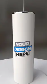

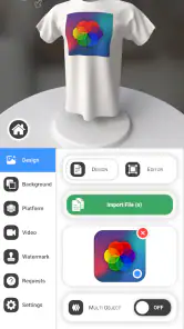
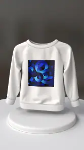
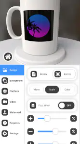
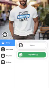
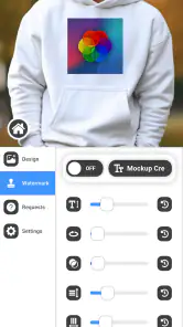
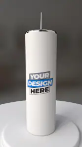
Analysis by Reviewed
When I first opened Mockup Creator Pro, I approached it as someone who wanted a polished product preview without building an entire 3D scene from scratch. That is the app’s main appeal: it is an Android art and design tool from Onion Tavern focused on creating three-dimensional product mockups. Instead of treating it like a full replacement for professional 3D software, I found it more useful as a practical presentation tool for quick concepts, social posts, portfolio images, and early client previews.
The app is free to install, rated for Everyone, and available on devices running Android 8.0 or later. Its store summary promises an easy way to design 3D product mockups, but the real question is how quickly a first-time user can move from a blank project to something worth showing. My experience is that the learning curve is manageable when I work in small steps, although the interface still demands patience when I want precise control rather than a fast visual result.
Getting from a blank screen to a useful mockup
What to expect before you begin
This is best understood as a focused design app, not a general drawing canvas or a complete modeling studio. I would reach for it when I already have a visual idea and need to place that idea into a product-like presentation. A logo on a package, a label on a container, a cover on a box, or artwork on a simple object can become more convincing when shown with depth and perspective.
The distinction matters because a beginner may install it expecting to sculpt complicated objects, animate a scene, or prepare production-ready files for manufacturing. That is not how I would judge it. The strongest use is communication: showing how a design might look on an object before spending time on photography, physical samples, or a more involved 3D workflow.
The app has a 3.8 average from around 429 ratings, with roughly 61 written reviews, and it has passed 10K+ installs. Those figures suggest a modest but real user base rather than a universally established design standard. I treat that as a reason to test it against my own workflow instead of assuming it will behave like a mature desktop package.
Because the app is free, it is easy to try without committing money at the start. There are in-app purchases ranging from $7.99 to $32.99 per item, so I would spend time learning the basic workflow before deciding whether any paid option is worthwhile. The free entry point is helpful for students, hobby designers, small sellers, and anyone who needs one convincing mockup rather than a complete visual identity system.
First setup: keep the first project deliberately simple
After installing it, I recommend beginning with one clear objective: create a single product image that communicates shape, artwork, and angle. Do not start by trying to reproduce an entire retail shelf or a complicated campaign. A simple package, card, box, or other familiar form gives you a better chance of understanding how the app handles placement and viewing.
The current version is 17, and the minimum operating system is Android 8.0. On a compatible phone or tablet, I would first make sure the screen is comfortable for design work. A larger display makes positioning and inspecting a mockup easier, while a phone is convenient for quick edits but leaves less room for controls and the canvas at the same time.
My first useful habit is to prepare the artwork before opening the project. Keep the main design clean, with important text away from the edges and enough contrast to remain readable after it is placed on a three-dimensional surface. A mockup can make a flat design look more professional, but it cannot rescue an overcrowded label or a logo that is already too small.
I also suggest choosing a name for the project that describes its purpose, such as “front package concept” or “social preview.” That small step prevents confusion once you create several variations. When experimenting with angles and layouts, I prefer changing one visual decision at a time. If I alter the object, artwork, and viewpoint together, it becomes difficult to tell which change improved the result.
Your first successful action
The first meaningful success is not simply opening a template. It is producing a mockup where the design feels attached to the object rather than floating beside it. To reach that point, I start with the most recognizable face of the product, place the artwork carefully, and then adjust the view until the shape supports the design instead of hiding it.
For a first attempt, I would use a bold central mark or a short title rather than a paragraph of copy. Large elements reveal alignment problems quickly. If the artwork appears tilted, too close to an edge, or oddly scaled, the mistake is easier to see with a simple design. Once that placement feels natural, I would move on to smaller details.
One of the most useful techniques I found is to judge the mockup at the size where it will actually be seen. A design that looks impressive when zoomed in may become unreadable in a phone feed or a small presentation slide. I often zoom out before finalizing the viewpoint, because this exposes weak hierarchy: the product shape should be clear first, the brand or main artwork second, and fine detail last.
Another practical tip is to create a front-facing version before attempting a dramatic perspective. An angled view can look more dynamic, but it also makes alignment and legibility harder. The straight view acts as a reference. Once the artwork is correctly positioned there, I can introduce depth without losing track of what the design is supposed to communicate.
For a realistic everyday scenario, imagine a small online seller preparing a new candle label. Before ordering printed packaging, the seller can use the app to create a visual preview for a product page or a conversation with a designer. The mockup does not replace a physical proof, but it can reveal that the label feels too low, the name disappears at an angle, or the overall presentation lacks contrast.
Where beginners usually get confused
The biggest source of confusion is the difference between editing the object and editing the artwork placed on it. When a result looks wrong, I first ask which layer or element I am actually manipulating. Moving the viewpoint will not correct artwork that is positioned badly, and resizing artwork will not fix an object that is being viewed from an unhelpful angle.
I also avoid making several large adjustments in a single gesture. On a touchscreen, it is easy to move farther than intended or lose a precise position while trying to rotate. Small changes followed by a pause are slower, but they produce a much more controlled result. If the interface feels crowded, I work with the canvas at a comfortable zoom and make one correction at a time.
Perspective creates another common misunderstanding. A design may appear smaller on a side surface simply because that surface turns away from the viewer. That is not automatically a scaling error. I compare the visible proportions of the artwork with the object’s edges before changing its size. Otherwise, I can overcompensate and end up with a front panel that looks unnaturally large.
Lighting and contrast can also change how I judge the design. A dark surface may make a colorful label appear stronger than it will be in ordinary use, while a bright setting can wash out pale artwork. I therefore check the mockup for structure first and mood second. If the product name is only readable under one flattering view, the concept needs more work.
Another point worth remembering is that a mockup is a presentation image, not proof of manufacturing accuracy. Curves, seams, material behavior, print limits, and real-world reflections can differ from what appears on screen. I use the app to make decisions and communicate direction, then rely on a proper sample or production specification when physical accuracy matters.
Three workflow lessons that make a difference
My first non-obvious lesson is to design for the viewpoint rather than for the object in isolation. A beautiful label can fail in a three-quarter view if the key information lands on a receding side. I place the most important message where it remains visible when the object is angled, then let secondary details occupy less prominent areas.
The second is to treat variations as decision tools, not just decoration. I like making one version with a clean front view, another with a moderate angle, and a third with a more expressive presentation. Comparing them side by side helps me decide whether the product needs a sales-oriented image, a design-review image, or a simple catalog view.
The third is to use the mockup to test hierarchy before polishing. I temporarily ignore tiny refinements and ask three questions: can I identify the product quickly, can I read the main name, and does the shape make the design more believable? If the answer to any of these is no, extra decoration will not solve the underlying problem.
These habits also reduce unnecessary frustration on a phone. Detailed adjustments are easier when the project has a clear visual target. Instead of endlessly rotating an object, I can decide whether I am trying to show the front, emphasize depth, or create a more attractive promotional image. Every adjustment then has a reason.
How it compares with familiar alternatives
Compared with a flat design app, this tool gives me a faster route to depth and product context. A conventional drawing editor is usually better for creating the artwork itself, arranging typography, and making pixel-level changes. I would prepare a logo or label in that kind of app when precision is the priority, then use this app when I need to show how the design might sit on an object.
Compared with full desktop 3D software, the advantage is approachability. Professional modeling programs offer far deeper control over geometry, materials, cameras, and lighting, but that control comes with a much heavier learning burden. For a quick concept on Android, I prefer a focused mockup workflow. For a technically exact scene, a complex product animation, or a production asset, I would choose the more advanced alternative.
Online mockup generators can be convenient when a user wants a ready-made result with minimal adjustment. Their trade-off is that the available scenes and layouts may dictate the presentation. With this app, I value the opportunity to work more directly on the mockup, even though that means I have to make more visual decisions myself.
That balance makes the app particularly suitable for someone who wants more control than a one-click generator but less complexity than a professional 3D package. It is less suitable for a designer who already depends on advanced modeling, exact material simulation, or a desktop-centered production pipeline.
Who should use it, and who should skip it
I would recommend trying it if you are a beginner who needs a convincing product visual, a student presenting a packaging concept, a small business owner testing a brand direction, or a designer who wants a quick mobile companion for early presentations. It can also help when a client understands a design better after seeing it on an object instead of on a flat artboard.
I would skip it if your main goal is detailed illustration, photo retouching, complex character modeling, or engineering-grade product visualization. It is also not the first tool I would choose for someone who needs a large library of professional assets and a carefully managed desktop workflow. In those cases, the convenience of mobile editing may not compensate for the limits of a focused mockup app.
Users who dislike experimenting with perspective may need a little extra patience. The first result can look merely acceptable rather than polished, especially if the artwork is not prepared for the object. I see that as a workflow issue more than a reason to dismiss the app, but it is important to understand that the tool does not remove the need for design judgment.
What to do after the first result
Once the first mockup works, I would not immediately add complexity. I would duplicate the idea mentally by testing a different angle, a different artwork scale, or a different visual emphasis. The goal is to discover whether the design remains clear across more than one presentation. A concept that works only from one exact viewpoint may need adjustment before it is ready to show publicly.
I also recommend using the app as part of a short review loop. Create the mockup, inspect it at normal viewing size, show it to someone who has not seen the original flat design, and ask what they notice first. If they miss the product name or misunderstand the object, that feedback is more valuable than another round of tiny alignment changes.
For a professional workflow, I would keep the source artwork separately and treat the mockup as a presentation layer. That makes it easier to revise the design elsewhere while preserving the visual idea. For a personal project, the same habit prevents a quick experiment from becoming the only copy of an important label or logo.
Since the app is free to start but includes paid items between $7.99 and $32.99, I would evaluate any purchase against frequency of use. If I only need one presentation image, the free experience may be enough. If I use it repeatedly for product concepts, the value depends on whether the available paid content solves a recurring problem in my own workflow rather than simply adding more options.
My final take after using it
Mockup Creator Pro is a useful, approachable choice for turning a flat product idea into a more tangible visual on Android. I like it most when I need to explain a concept quickly, test whether artwork survives perspective, or prepare a presentable preview without opening a full 3D workstation. Its free starting point makes that experiment easy, and the Everyone rating keeps it accessible to a broad audience.
My recommendation comes with a clear boundary: use it for communication and exploration, not as a promise of manufacturing accuracy or a replacement for every design tool. The best results come from preparing clean artwork, beginning with a simple object and viewpoint, checking the design at realistic size, and making controlled changes instead of chasing dramatic effects.
Onion Tavern’s app will not be the right answer for every designer, but it fills a practical middle ground between flat graphics software and complicated 3D packages. If you are a first-time user, start with one recognizable product, aim for one readable front view, and only then experiment with depth. That path gave me the quickest route to a mockup that actually communicated an idea, which is where this app feels most worthwhile.
My bottom line: I would install it when I need a fast, mobile-friendly product presentation and want more control than a preset generator offers. I would choose something more advanced when precision, complex modeling, or production-ready output matters more than speed and simplicity.
Pros
- Creates polished device mockups for app presentations
- Supports multiple device frames and screen layouts
- Useful for marketing images
- portfolios
- and store listings
- Offers quick editing without advanced design software
- Exports visuals suitable for sharing and promotional use
Cons
- Some premium templates or tools may require payment
- Large mockup projects can use considerable device storage
- Advanced customization may feel limited for professional designers
- Export quality and format options may vary by device
- Requires your own screenshots or artwork to create mockups

- Category
- Art & Design
- Version
- 17