minimalist phone: Launcher
- 4.92K
- 4.5
- Installs
- 5.00M
- Price
- Free

Screenshots
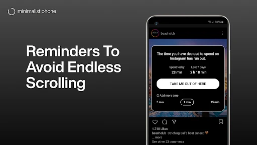
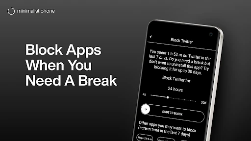
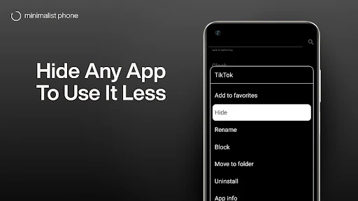
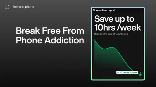
Analysis by Reviewed
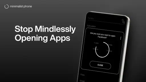
I find the most revealing test of a minimalist launcher happens when I’m in a hurry, not when I’m admiring a tidy home screen. If a familiar app takes longer to reach, or a notification pulls me into a scrolling loop, the calm design has to earn its place in my routine. Minimalist Phone: Launcher is best approached as a change to how you begin using your phone: it can make distractions less inviting, but it cannot decide what you open or how long you stay there.
What happens when a task needs a connection
A pared-back home screen can make it easier to choose an app, but what happens next still depends on that app and your connection. A message, map, or work service may need mobile data or Wi-Fi to finish the task. I would treat the launcher as an organization and attention tool, not as a way to make online services work differently. When a page or service is slow, the simpler layout may help me avoid opening unrelated apps while I wait; it does not remove the wait itself.
That distinction matters if your goal is a digital detox. Removing visual clutter can reduce casual app-hopping, yet a necessary online check can still turn into a longer session. I get the most value by deciding in advance what I need to do—reply to one message, check one item, then leave—rather than expecting a different launcher to enforce a boundary for me.
Built for specific moments, not every phone habit
For a student starting a study block, a commuter who wants fewer tempting icons, or someone trying to keep a work phone focused, a restrained home screen can create a useful pause before opening entertainment apps. A realistic routine might be checking a schedule before leaving home, then opening only the navigation or messaging app needed for the trip. The launcher supports that intentional choice; the usefulness of the destination app may still depend on connectivity.
I would be more cautious if you rely on a dense grid, quick access to many specialized apps, or a phone setup you have tuned around widgets and visual cues. A conventional launcher may be faster for those habits because it makes many options visible at once. Here, less on the screen can mean a little more effort when you need an infrequently used tool. Before committing, I’d think through the apps I reach for under pressure, not just the ones I want to use less.
When something goes wrong, keep the routine simple
If a connected app stalls, I’d first check whether the same task works through the app itself and whether the phone has a usable connection, rather than assuming the launcher caused the problem. If I’ve hidden or deprioritized an app and then need it urgently, I should know how to find it through the launcher’s own navigation before relying on that setup during a commute or appointment. That small bit of preparation is a practical trade-off: a quieter home screen works best when important tools remain easy to reach.
For data-conscious use, the launcher’s value is indirect. It may help me open fewer apps out of habit, but I wouldn’t count on it to reduce data use inside apps that stream, sync, or load content. I’d manage those needs in the relevant app or phone settings, while using the simpler layout to be more deliberate about when I go online. That separation keeps expectations realistic and makes the launcher useful even when connectivity is not the issue.
You May Like

Clash of Clans Is Won Between the Battles

Android Auto Makes the Case for Quieter Car Software

MobiOffice: Transforming Mobile Productivity with Seamless Integration

EA SPORTS FC™ Mobile Soccer: Redefining Mobile Sports Gaming

How Microsoft OneDrive Became a Mobile Productivity Giant

How Google Translate Breaks Language Barriers Effortlessly
Embracing Simplicity
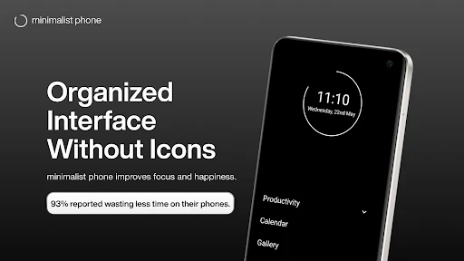
From the moment I installed Minimalist Phone: Launcher, I was greeted with a refreshing change. The interface is as clean as a whistle, designed with a focus on minimalism. Say goodbye to the endless app grids and hello to a sleek, straightforward layout. This launcher brings a breath of fresh air, allowing you to concentrate on what truly matters.
Intuitive Design
One of the first things that caught my eye was the intuitive design. Instead of bombarding you with options, it gently guides you to prioritize your tasks. The home screen is free from distractions, offering only the essential apps and widgets. I found this particularly helpful in reducing screen time and boosting productivity.
Customization at Its Best
While simplicity is the name of the game, the app doesn’t skimp on customization options. You can tweak the interface to reflect your personal style, whether it's changing icon shapes or adjusting the color palette. This level of personalization ensures that your phone feels like your own unique space.
Performance and Efficiency
Another standout feature is its performance. The launcher runs smoothly, even on older devices, without any noticeable lag. It’s optimized to be lightweight, which means it won’t drain your battery or hog your memory. I was pleasantly surprised to see how efficiently it managed resources, allowing for a seamless user experience.
Why Switch?
You might wonder why you should switch to this app. For me, the answer is clear: it offers a distraction-free environment that enhances focus. Whether you’re a student, a professional, or someone who simply values organization, this launcher can transform your smartphone experience.
In conclusion, if you’re on the hunt for a launcher that combines elegance with functionality, Minimalist Phone: Launcher is worth a try. It strips away the unnecessary and brings back the joy of using a smartphone. Give it a go and embrace the art of minimalism—it might just change the way you interact with your device.
Who should give it a try
As a free productivity app from Focus Experts, it has reached over five million installs and holds an average rating of 4.5 from around 45,000 ratings, which suggests many people are interested in a less cluttered phone. It is rated for Everyone, and the current version is 1.19.2v214; Android 6.0 is the minimum OS requirement. Optional in-app purchases range from $0.29 to $59.99 per item, so I’d check what any paid option actually offers before buying rather than assuming the basic setup requires a purchase.
The app was released on April 28, 2021, and has around 4,900 written reviews. Those figures offer context, but they don’t tell me whether its approach will suit my own habits. I’d recommend trying it if you want a simpler starting point and are willing to adjust which apps deserve a prominent place. If you mainly want a grayscale screen, a device setting focused specifically on display color may be a more direct fit; if you want complete control over folders and shortcuts, a feature-heavy launcher may suit you better.
A low-risk way to decide
I’d test the layout during an ordinary day rather than judging it after a quick glance. Keep the apps needed for work, travel, payments, or family easy to reach, and see whether the calmer screen helps you avoid opening something out of reflex. Then try a study session or an evening at home, when the difference between an intentional check and an automatic scroll is easier to notice. If finding a rarely used app becomes irritating, adjust the setup or return to a more conventional launcher; reducing clutter should not make essential tasks stressful.
My verdict is that this is a thoughtful option for people who want their home screen to encourage more deliberate phone use, not a fix for every distraction or a substitute for managing online habits. Its best result is a small, repeatable pause before tapping. If that is the change you’re after, I think it is worth trying; if speed through a large collection of apps matters more than a quieter interface, the usual app-grid approach may be the better choice.
Make the first week a practical test
I would avoid rebuilding the whole phone around a new launcher in one sitting. Start by deciding which few apps genuinely deserve immediate access: perhaps calls and messages, a calendar, a transit tool, or the service you use for work. Keep those visible, then give less essential apps a less prominent place. This makes the change easier to judge because you are testing the central idea—whether fewer obvious choices help you act with intention—without making everyday tasks needlessly awkward.
A useful test is to notice the moment you reach for the phone without a clear purpose. If the simpler screen makes you pause long enough to remember why you picked it up, that is a real benefit even if you still open social or entertainment apps later. If instead you spend the first days searching for routine tools, the setup may need adjustment, or a traditional launcher may simply fit your habits better. I would treat that friction as useful feedback rather than proof that you lack discipline.
Choose the right level of restraint
People often talk about reducing screen time as though one strict setup works for everyone. I find a more sustainable approach is to separate necessary access from automatic access. A person who needs a phone for work messages, family coordination, or travel information should not make those tasks harder just to create a severe-looking home screen. Keep the essentials convenient and make the apps you tend to open reflexively less prominent. The goal is not to punish yourself for using a phone; it is to make the first tap more deliberate.
This is also why I would not recommend the app to someone who enjoys organizing a large collection of apps into carefully arranged folders, or who depends on a busy home screen to see several kinds of information at once. A conventional launcher is often the better tool when speed and density matter more than restraint. A dedicated display setting may be simpler if grayscale is the only change you want. This launcher makes most sense when the starting point itself is the habit you want to rethink.
What to expect from connectivity
The launcher changes the way I approach apps, not what those apps can do over a network. If I open a map before heading out, its usefulness still depends on the map service and connection available at that moment. The same is true of a message that needs to send or a page that needs to load. I would not use a calmer home screen as a substitute for preparing important travel details or checking that a work service is reachable when I need it.
There is a small but worthwhile planning habit here: put time-sensitive tools where you can find them before leaving home, and know which app you will use for each task. That prevents a quiet interface from becoming a scavenger hunt when you are already on the move. It also helps separate two different problems. If an app is hard to locate, adjust your launcher setup; if it opens but cannot complete an online task, look at the app or connection instead.
A sensible verdict for everyday use
I see the strongest case for this approach in transitions: beginning a study session, settling down after work, or leaving home without falling into a string of unrelated checks. The launcher can make those moments feel less crowded, but the benefit comes from the choices you build around it. For a student, that might mean keeping course and note-taking tools easy to reach while moving entertainment apps out of the immediate path. For someone balancing work and family, it might mean making communication simple to access without letting every notification dictate the next few minutes.
It is a free app, but purchases are available within it, so I would take a moment to understand an optional item before paying. I would also judge it by whether the day-to-day setup feels comfortable, not by how minimal it looks in a screenshot. My recommendation is measured: try it if you want a home screen that nudges you toward fewer impulsive openings, and give yourself time to arrange essentials sensibly. Skip it if your priority is maximum shortcut density, or if what you really need is a stronger boundary inside specific apps. Its best contribution is modest but useful: it can make the phone’s first invitation quieter, leaving the next decision to you.
minimalist phone: Launcher Frequently Asked Questions
What is the current version of Minimalist Phone: Launcher, and what Android version does it require?
Minimalist Phone: Launcher is a productivity app for Android, and its current version is 1.19.2v214. It requires Android 6.0 or later, so checking your device’s operating system before downloading can help avoid compatibility problems. If your phone meets that requirement, the app offers a launcher built around a simpler home-screen experience.
How many people have installed Minimalist Phone: Launcher?
Minimalist Phone: Launcher has been installed by over 5 million users, giving prospective users a broad sense of its reach. Popularity alone cannot tell you whether its minimalist approach will suit your habits, but it does show that many people have tried it as a way to simplify their phone experience and spend less time on distracting screens.
Is Minimalist Phone: Launcher free to download, and does it include purchases?
Minimalist Phone: Launcher is free to download, so you can try its pared-back approach to your home screen without paying upfront. It also offers in-app purchases, with prices ranging from around 29 cents to just under 60 dollars per item. Consider whether optional purchases fit your needs before downloading, especially if you want to use the launcher without spending more.
What is Minimalist Phone: Launcher and what makes it unique?
Minimalist Phone: Launcher is a mobile application designed to streamline your smartphone experience with a clean, simple interface. Unlike traditional launchers, it focuses on reducing clutter by offering only essential apps and features. This app is ideal for users who want a distraction-free environment to boost productivity and focus, making it stand out for its simplicity and efficiency.
How does the Minimalist Phone: Launcher improve productivity?
By prioritizing essential apps and reducing digital clutter, Minimalist Phone: Launcher helps users focus on tasks without unnecessary distractions. The launcher’s straightforward design encourages a more mindful use of technology, allowing users to concentrate on what truly matters, thus enhancing overall productivity. Its minimalistic approach aligns with the needs of users seeking to minimize screen time.
Pros
- Clean and intuitive user interface.
- Boosts phone performance with minimal resource use.
- Simplifies navigation for quicker access.
- Highly customizable home screen.
- Reduces distractions with minimal notifications.
Cons
- Limited widget support compared to competitors.
- Lacks advanced features for power users.
- May not support all third-party apps.
- Some settings require manual adjustments.
- Ads present in free version.

- Category
- Productivity
- Version
- 1.19.2v214