Keyboard - Neon Love Theme
- 40.00
- 4.8
- Installs
- 1.00M
- Price
- Free
Screenshots
Analysis by Reviewed
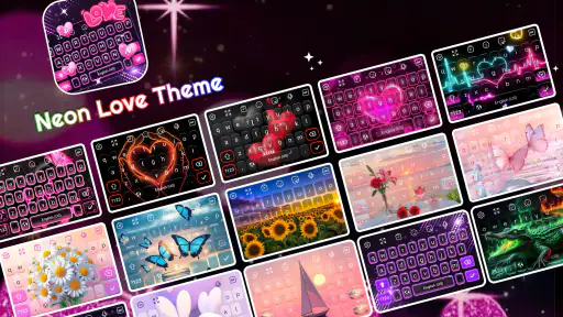
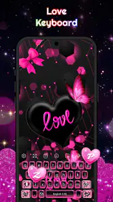
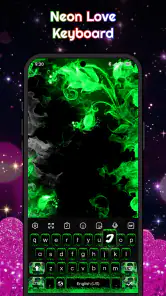
I spent time using Keyboard - Neon Love Theme as a personalization app, and my first impression was clear: this is aimed at people who want typing to feel decorative rather than invisible. The design leans into pink neon, hearts, glowing accents, playful fonts, and emoji styling, so it changes the mood of everyday messages instead of simply replacing a plain keyboard with another plain keyboard. If your phone is part of your personal style, that difference matters.
The app comes from akmobile and is free to install, with optional in-app purchases ranging from $0.49 to $9.49 per item. It is rated for Everyone, runs on Android 7.0 or later, and the current version is 1.4.8. Those details make it accessible to a broad range of Android users, including people with older phones who are not looking for a demanding game or a feature-heavy utility.
What I like most is that the theme has a definite personality. It is not trying to imitate a restrained productivity tool. The pink glow and heart-focused presentation are the point, and the app works best when you want your keyboard to match a romantic, cute, or expressive setup. The important question is whether that style remains comfortable when you use it repeatedly, not just whether it looks attractive in a screenshot.
How the current keyboard feels in everyday use
A visual change you notice immediately
The main appeal is the transformation of the typing area. Instead of treating the keyboard as a functional strip at the bottom of the screen, the theme makes it part of the phone’s overall look. The neon treatment gives messages a more playful atmosphere, while the hearts keep the design consistent rather than scattering unrelated decorations across the interface.
I found that this makes the most sense alongside a matching wallpaper, lock screen, or icon style. Used on its own, the keyboard still stands out, but a coordinated home screen makes the result feel intentional. This is one of the app’s less obvious strengths: it is not merely a keyboard choice; it can act as the finishing piece in a wider personalization setup.
The trade-off is that a bold theme will not suit every screen or situation. On a bright outdoor display, glowing pink elements may feel less subtle than a neutral keyboard. If you often switch between a professional phone layout and a playful personal one, you may eventually prefer a more restrained option for work-related conversations.
Fonts, emojis, and glow as separate style decisions
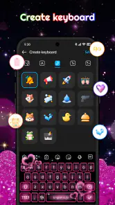
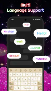
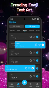
The app’s appeal is broader than a single background color because it combines several expressive elements. Fonts can change the character of messages, emojis add another layer of visual language, and the glow effect reinforces the neon identity. I would not treat all of these choices as equally useful, though. A decorative font may look fun in a short message but become tiring when you are writing longer replies.
My practical approach would be to begin with the standard-looking text arrangement and add decoration gradually. Keep the glow if it improves visibility and atmosphere, then test a more playful font in real conversations rather than judging it from the customization screen. This avoids a common problem with themed keyboards: choosing the most dramatic combination and discovering later that it slows down routine typing.
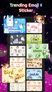
Emoji support is particularly useful for people who communicate in short, expressive messages. The theme feels natural in chats where hearts, reactions, and symbols are already part of the conversation. It is less compelling for someone who mainly writes notes, emails, or long documents and wants the keyboard to disappear while they concentrate.
Activation is part of the experience
Like any keyboard personalization app, this is not something you simply open once and forget. You need to make it your active keyboard before its design appears while typing. I recommend checking the keyboard selection carefully and testing it in a low-risk message field first. That small step helps you confirm that the theme is active and that the layout feels comfortable before relying on it for important writing.
It is also worth remembering that a keyboard is an input method, not just a wallpaper. If you are uncomfortable with the way the keys are arranged, the visual theme will not compensate for that. I would spend a few minutes typing ordinary sentences, numbers, names, and emoji combinations. A design that looks excellent in a preview still needs to work when you are answering quickly with one hand.
For privacy-conscious users, the right mindset is to treat any third-party keyboard as a serious input tool rather than a harmless decoration. I would only enable it if I was comfortable using that keyboard for the kinds of text I normally enter. People who prefer to keep their typing environment as conservative as possible may be happier with the keyboard already built into their phone, even if it offers less visual personality.
What the version tells us about the app’s current stage
Version 1.4.8 suggests that the app has moved beyond a first experimental release and is being maintained as a usable personalization product. I see that as a positive sign for someone considering installation today: the current offering is not presented as an unfinished concept, but as a named theme with a clear purpose and an established audience.
At the same time, a version number alone does not tell me how often the experience will change or which parts of the design receive the most attention. I would judge future updates by practical improvements: smoother setup, clearer customization, better legibility, and dependable behavior across different screen sizes. New decorative elements would be welcome, but they should not come at the expense of comfortable typing.
The app was released on November 27, 2025, so its product history is still relatively early compared with long-established keyboard platforms. That makes the current release especially important for first-time users. I would install it for the style available now, not on the assumption that a particular future feature is guaranteed.
Who will get the most from it
This is a good match for users who enjoy pink neon customization and want their keyboard to reflect a romantic or cute visual identity. It is also useful for someone refreshing an older Android phone without replacing the entire launcher or installing a complicated collection of customization tools. A themed keyboard can produce a noticeable change with less effort than rebuilding every part of the home screen.
I can also see it working well for a secondary device used mainly for messaging. If that phone is where you chat with friends, send affectionate messages, or use lots of emoji, the theme adds character without demanding much attention. The visual style becomes part of the device’s personality rather than an obstacle to serious work.
People who should skip it are those who want a plain, highly neutral keyboard, those who dislike glowing interfaces, and users who type long passages every day and prioritize a familiar productivity layout. A dedicated keyboard with stronger writing tools may be a better choice for them. This app’s strength is expression, not an attempt to cover every possible typing need.
A realistic daily scenario
Imagine checking your phone during a break and replying to several messages from a partner or close friend. You send a quick update, add a heart, switch to an emoji, and answer another short question. In that situation, the theme earns its place because the visual design supports the tone of the conversation. The keyboard feels like part of the exchange instead of a neutral control panel.
Now imagine writing a long address, filling out a form, or composing a detailed work message. The same glow and decorative styling may be less helpful. I would keep an alternative keyboard available and switch when accuracy, speed, or a quieter interface becomes more important. That is a realistic way to use this app without forcing one look onto every task.
This two-keyboard approach is one of my most useful recommendations. Use the neon theme when the visual mood matters, but do not assume it has to replace every other input method. The best personalization tools fit into a phone’s routine; they do not make the user compromise every time the context changes.
How it compares with ordinary alternatives
The usual phone keyboard is generally designed to be familiar, efficient, and unobtrusive. It is the safer choice when you want predictable typing and do not care about matching your keyboard to your wallpaper or personality. A large general-purpose keyboard may also offer a wider range of writing aids, languages, or productivity-oriented controls, depending on the phone and setup.
This app competes differently. Its reason to exist is the specific visual mood, not a promise to become the most comprehensive keyboard on Android. Compared with a standard keyboard, it offers a stronger identity. Compared with a broad keyboard platform, it may appeal more to someone who wants a ready-made romantic theme rather than a large customization system that requires extensive adjustment.
There is also a difference between using a theme inside an established keyboard and installing a dedicated themed option. The former may be more convenient for users who already like their current keyboard’s behavior. The latter can feel more complete visually because the design is built around the entire experience. I would choose this app when the pink neon look is important enough to justify trying a separate keyboard.
Costs, accessibility, and practical expectations
The app is free, which makes it easy to test without committing money at the start. Optional purchases between $0.49 and $9.49 per item mean that some decorative choices may sit behind paid options. I would begin with the free experience and decide whether the available style already satisfies me before buying anything. A theme should feel enjoyable before it becomes a purchase.
Its Everyone age rating also fits the broad, lighthearted design. That does not mean every user will enjoy the same visual intensity, but there is nothing about the stated positioning that limits it to a narrow age group. Families sharing an Android device should still let each person decide whether a bright romantic theme suits their own profile.
Compatibility with Android 7.0 or later is another practical advantage for people using older hardware. However, compatibility does not guarantee that every screen will feel identical. Display size, system keyboard settings, and the apps where you type can affect how comfortable the result feels. I would test it in the messaging and note-taking apps I use most rather than relying only on the installation screen.
Small workflow tips that make the theme easier to live with
First, judge the keyboard at the time of day when you normally type. Neon effects that look attractive in a dark room may feel too strong in daylight, while a dim environment can expose whether the keys remain easy to distinguish. This is a better test than admiring the design for a few seconds after installation.
Second, create a simple personal rule for decorative fonts. I would use them for short social messages and keep a cleaner style for addresses, passwords, forms, and longer text. That separation preserves the fun without allowing visual flair to interfere with accuracy. It also makes it easier to identify whether a typing mistake comes from the keyboard layout or from an overly ornate font.
Third, keep an eye on how often you use the emoji and symbol choices. If they genuinely reduce the number of taps needed to express yourself, they are useful customization. If they only make the interface busier, tone them down. The strongest setup is not necessarily the one with every effect enabled; it is the one that supports the way you actually communicate.
Finally, revisit the configuration after using the keyboard for several days. Initial excitement can hide small annoyances, such as a style that makes punctuation harder to spot or a glow that distracts you during quick replies. A short review after real use will tell you more than the first impression, especially if you are deciding whether an optional purchase is worthwhile.
What still feels limited
The focused design is both the attraction and the main limitation. If you want a keyboard that adapts to many moods, a single pink neon identity may feel narrow. The hearts and glow are memorable, but they also make the app less suitable for users who want a subtle theme that blends into every setting.
I would also avoid expecting this app to replace a full writing toolkit. Someone who depends on advanced composition features, a highly familiar professional layout, or a keyboard optimized for extensive work should compare those needs against the decorative benefits before switching. The app makes sense when appearance is a priority; it is not automatically the best answer for every typing problem.
There is a learning cost whenever you change keyboards, even if the basic idea is familiar. Your hands may need time to adjust, and the most attractive font may not be the easiest one to read. That friction is manageable, but it is real. I would not install the theme immediately before an important deadline or a day when I needed to type quickly without experimentation.
What I would watch in future updates
For future versions, I would pay attention to whether akmobile keeps improving the balance between decoration and readability. More heart themes and glow variations would be enjoyable, but the most valuable progress would be clearer controls, smoother switching, and consistent behavior across different Android phones.
I would also look for signs that existing users are being considered, not only new users attracted by fresh visuals. A good update should preserve the recognizable neon love style while making everyday typing less tiring. Small refinements can matter more than a larger collection of decorative choices if they improve the experience during repeated use.
The app currently has a 4.8 average from around 4.1 thousand ratings and has passed one million installs, which tells me that the concept has found a substantial audience. I would still treat popularity as a reason to investigate, not as proof that the theme suits everyone. Personalization is subjective, and comfort depends heavily on how and where you type.
My recommendation
I recommend Keyboard - Neon Love Theme to anyone who wants a distinctly romantic keyboard and enjoys turning everyday messaging into part of their phone’s visual style. The free starting point makes experimentation straightforward, and the combination of neon color, hearts, fonts, and emoji gives it more personality than a typical neutral keyboard.
I would not recommend making it your only keyboard without testing it in real situations. Keep your priorities clear: choose it for expressive chats, coordinated personalization, and a playful look; choose a conventional alternative when quiet design, long-form writing, or maximum familiarity matters more. The best reason to install it is not that it does everything, but that it makes one specific part of Android feel unmistakably yours.
After using it, my view is positive but selective. The concept is focused, the current version feels like a proper themed product, and the app can refresh an Android phone with very little effort. Its limits are equally clear, especially for users who want a universal productivity keyboard. If the pink neon love aesthetic matches your taste, this is a worthwhile personalization experiment; if you prefer invisible tools, your default keyboard is probably the better home.
Pros
- Bright neon visuals give the keyboard a fun
- eye-catching appearance.
- Theme installation is quick and requires little customization effort.
- Works well for users who enjoy colorful
- romantic keyboard designs.
- Lightweight theme should have a minimal effect on phone storage.
- Provides a simple way to refresh the look of a compatible keyboard.
Cons
- Requires a supported keyboard app to function properly.
- Neon colors may reduce text visibility in some lighting conditions.
- Limited usefulness if you prefer neutral or professional-looking themes.
- Some features or themes may depend on additional downloads or permissions.
- The design may feel repetitive compared with fully customizable keyboard apps.
- Category
- Personalization
- Version
- 1.4.8