Icon Pack Studio
- 827.00
- 4.3
- Installs
- 5.00M
- Price
- Free

Screenshots
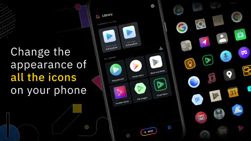
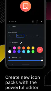
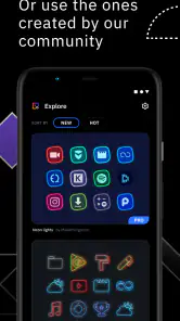
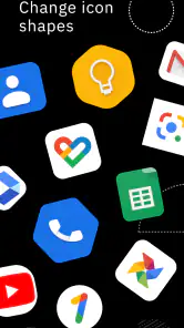
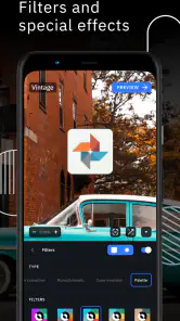
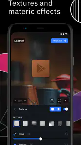
Analysis by Reviewed
I like changing my phone’s look, but a shared device makes that less simple: one person’s favorite colors can become another person’s hard-to-read home screen. That is where Icon Pack Studio feels useful to me. It is a personalization app from Smart Launcher Team that lets you build and edit icon designs rather than just pick a finished pack. I’d recommend it most to someone who enjoys shaping a consistent look and is willing to spend a little time testing it, rather than someone who wants a one-tap makeover with no decisions.
A home screen several people can live with
Picture a household tablet or a phone that gets passed around: one person wants bold colors, while someone else needs familiar app symbols that are easy to spot. Instead of choosing an elaborate theme that may suit only one user, I’d start with a restrained palette and recognizable shapes, then check that common apps remain easy to distinguish. That small compromise matters more in daily use than making every icon match perfectly.
The app is focused on icon artwork, not on coordinating everyone’s device habits. I would treat a design as a visual choice, not a shared household setting: people using the same device should agree before changing its appearance, and anyone with their own device can make a separate choice there. If you need separate profiles, household permissions, or controls over who can change a device, this is not the tool to look for.
Agree on a design before changing a shared device
On a shared phone, I’d make the first design conversation practical rather than aesthetic: which apps must stay instantly recognizable, and which parts of the screen can be more playful? That gives everyone a say without turning a small customization project into a debate about every color. It also creates a useful test: if a person who rarely uses the device can still find the key apps, the design is doing its job.
I would also keep a simple fallback in mind. Before applying a new look, take note of the existing arrangement and wallpaper, so it is easier to restore a familiar appearance if someone dislikes the change. This is ordinary device housekeeping, not a special sharing feature. Icon Pack Studio helps with the artwork; it does not decide whose preferences take priority or preserve separate visual settings for different people.
Unleashing Creativity with Icon Pack Studio
So, what exactly does Icon Pack Studio do? Imagine having the power to design your own icons from scratch. Yep, you heard me right! You can literally craft icons that match your personal style or mood. The app offers a range of tools that let you play around with shapes, colors, shadows, and even textures. The best part? You don't need to be a professional designer to create something that looks slick.
Getting Started
Diving into the app was a breeze. The user interface is super intuitive. After a quick download and install, I was greeted with a simple tutorial that got me up to speed in no time. The home screen showcases a gallery of pre-made designs to get those creative juices flowing. You can start from these templates or go rogue and create something entirely unique.
More From Our News Desk

Weather by Xiaomi Review: Clear at a Glance, Less Clear Up Close

X Under Pressure: Can It Recover When Posting Goes Wrong?

Clash of Clans Is Won Between the Battles

Android Auto Makes the Case for Quieter Car Software

MobiOffice: Transforming Mobile Productivity with Seamless Integration

EA SPORTS FC™ Mobile Soccer: Redefining Mobile Sports Gaming
Designing Your Icons
Here’s where the magic happens. I found myself experimenting with the color picker for ages (it’s oddly satisfying). The app lets you layer different colors and adjust their transparency, which is pretty neat. There’s also a selection of shapes to choose from, or you can draw your own if you’re feeling adventurous. And let's not forget about the shadows and gradients – they add a whole new dimension to your creations.
Making a design practical
One useful approach is to build a small test theme before committing to a full redesign. I’d try a few colors and shapes against the wallpaper and check the result on the home screen, where contrast and legibility matter more than they do in the editor. If a custom shape makes two frequently used apps look too similar, I’d simplify it rather than force the style. This is also a good way to avoid spending time polishing details that disappear at icon size.
There is a second reason to test at actual phone size: a design that looks balanced in the editor can become visually crowded beside widgets, notification badges, or a bright wallpaper. I’d begin with the apps I reach for most, then judge the design in the real places I use them. If icons blend into the background, adjusting contrast is more useful than adding another decorative layer. This kind of small correction can make a theme feel deliberate without requiring a complete redesign.
For a household device, I’d favor consistency that supports recognition over a clever visual code that only its designer understands. A distinct shape or color can help separate categories at a glance, but making every icon unusual may slow down someone who relies on familiar symbols. If accessibility or quick recognition is the main concern, preserving clear visual differences should come before achieving a perfectly uniform grid.
Choosing how much control you actually need
Compared with downloading a ready-made icon pack, the appeal here is control: you can tune the appearance instead of accepting someone else’s palette. The trade-off is that a preset is usually the easier choice when you want a finished look immediately. For example, I might use a restrained design on a shared device during a busy week, then experiment more freely on my own phone when I have time. The editing tools are most valuable when you enjoy that process, not when customization feels like another chore.
Compared with relying on a launcher’s built-in theme options, this app is a more focused route when the icons themselves are what you want to change. A launcher can be the better choice if you want a broader home-screen adjustment in one place, while a ready-made pack suits people who would rather browse than build. I’d choose Icon Pack Studio when I have a specific palette or visual idea and want to shape it; I would not switch launchers just for the sake of using an icon editor if my current setup already does what I need.
A helpful workflow is to settle on the wallpaper first, then make the icon design serve it rather than trying to coordinate both at once. I’d also keep the first pass limited to a few strong choices—shape, color, and contrast—before experimenting with texture, gradients, or shadows. That order makes it easier to tell which change improved the result. If I alter several details at once, I may like the finished look but have no clear sense of what made it work.
Applying Your Creations
Once you’ve crafted your masterpiece, applying your icons is straightforward. The app integrates seamlessly with most launchers. Just a few taps, and voila! Your home screen is transformed. And if you ever want to switch things up, you can go back and tweak your designs or create new ones. It’s like having a mini design studio in your pocket.
One practical question is whether it will suit a particular phone setup. The app’s current version is 2.3 build 003, and it requires Android 7.0 or later. Since applying icon designs depends on launcher compatibility, I’d check that the launcher I already use supports icon packs before spending time on detailed edits. If I prefer the default launcher and it does not offer the right support, a ready-made wallpaper or built-in theme may be a simpler route than changing my usual setup.
That compatibility check is worth doing early, not after finishing a design. I’d look at the launcher’s icon-pack options and confirm that it can apply a pack before investing time in fine adjustments. If the launcher does not support the format or the application process feels awkward, the app may still be enjoyable as a design exercise, but it may not deliver the home-screen result I want on that device. For someone who wants icons changed with no setup decisions, the phone’s own theme tools are often the more comfortable choice.
When a small redesign is enough
Not every use calls for a complete visual overhaul. If I were helping a relative make a crowded home screen easier to scan, I would change only the icon appearance while leaving app placement and daily habits alone. That keeps the learning curve small: the person still finds apps where expected, while a calmer palette or clearer shapes can make the screen feel less busy. On my own phone, I might take the opposite approach and use a more distinctive style because I am already familiar with its layout.
The app is especially appealing to people who notice visual details and enjoy an iterative task: make a version, use it for a while, spot an issue, and refine it. It is less compelling if you rarely look at your icons, do not care about matching colors, or want a complete interface makeover without touching settings. A useful question before starting is whether I want to create a design or simply get a different look. If it is the latter, a finished pack or built-in theme will probably save time.
Age, cost, and expectations
Icon Pack Studio is free to install and rated for Everyone, which makes it approachable for a household to explore together. Still, I would let a younger user experiment with the visual choices while an adult handles any purchase decisions. Optional in-app purchases range from $0.99 to $11.99 per item, so it is sensible to check the price shown for a specific item before buying; the core idea is icon design, not a requirement to pay before trying it.
For a shared device, I would agree in advance who can make purchases and who gets the final say on changes that affect everyone. That is a household boundary to set around the device, not a control I would expect the app to provide. If a child is exploring colors alongside an adult, keeping the task focused on design and reviewing any purchase prompt together is a straightforward way to avoid confusion about what is free and what costs money.
The Everyone age rating is reassuring as a general content signal, but it does not replace an adult’s judgment about a child’s access to device settings or spending. I’d treat the design process as a good opportunity to talk about why one icon needs to remain recognizable or why a particular purchase should be discussed first. For adults who want a child to customize independently, the more important question is whether the device itself has suitable account and purchase boundaries in place.
Its average rating is 4.3 from around 17,000 ratings, and it has been installed over five million times. Those figures suggest it has found a sizeable audience, but they do not answer the question that matters most: whether you enjoy adjusting icons yourself. I’d judge it by making one small theme and seeing whether the result feels clearer and more personal, rather than assuming popularity means it will fit every launcher or every household preference.
What I would check before settling on a look
Before I call a design finished, I’d check the home screen in the lighting and context where I actually use it: a quick glance in the morning, one-handed scrolling, or locating an app while someone else is waiting to use the phone. That reveals problems a careful look in the editor can hide. I’d also ask another person in the household to find a few familiar apps without coaching. If they hesitate, I would simplify the artwork rather than explain the design.
Another practical decision is how much uniformity matters. A perfectly coordinated set can look tidy, but visual sameness may make similar apps harder to tell apart. I would preserve a strong distinguishing feature for apps that serve different purposes, even if that means the overall theme is not mathematically consistent. For me, usable icons are successful icons; matching every detail is a bonus, not the goal.
My household verdict
I’d choose it for a visually minded person who likes refining a home screen and wants more control than a fixed icon pack offers. It is less suitable for someone who expects universal compatibility, shared-user management, or an instant result without trial and error. The app was released on May 5, 2017, and the developer is Smart Launcher Team; for me, the important decision is still practical: check launcher support, try a modest design, and see whether the extra creative control is worth the effort on the device you actually use.
For a household that shares one screen, my recommendation is to treat the first design as a low-stakes trial, not a permanent makeover. Keep the familiar layout, choose a readable style, and invite the people who use the device to try it before deciding whether it stays. That approach makes the app’s creative side useful without pretending it solves coordination or account management. If what you want is a distinct look you can shape yourself, it is worth exploring; if you want separate preferences, guaranteed support across every launcher, or no setup at all, another route will be a better fit.
Icon Pack Studio Frequently Asked Questions
Can I use Icon Pack Studio without changing my launcher?
Icon Pack Studio is designed to create icon packs, but applying those icons to your home screen depends on your launcher. If your current launcher supports custom icon packs, you can use it to apply your designs; otherwise, you may need to switch to a compatible launcher. Check this before downloading if you want to keep your current home-screen setup.
Can I use Icon Pack Studio to customize icons for individual apps?
Icon Pack Studio focuses on creating and editing icon packs, giving you a way to shape the look of icons on your Android device. The available customization options can help you build a consistent visual style, while applying the results depends on launcher support. If your main goal is changing only a few icons, consider whether the pack-based approach suits the way you want to personalize your screen.
Does Icon Pack Studio work on iPhone or iPad?
Icon Pack Studio is an Android personalization app, and its compatibility requirements are for Android devices. It is intended for creating icon packs for Android home screens, where a compatible launcher can apply them. If you are looking to customize icons on an iPhone or iPad, this app is not the right choice for that platform.
Can I use Icon Pack Studio alongside other icon packs?
Icon Pack Studio lets you create custom icon packs, so it can be part of a setup that includes other visual customization tools. Whether you can apply a created pack alongside or instead of another pack depends on the launcher you use and how it handles custom icons. Check your launcher’s options if you plan to switch between different icon styles.
Is Icon Pack Studio still receiving updates?
Icon Pack Studio’s current version is 2.3 build 003. If you already use the app, you can check its app-store page for the version available to your device before installing or updating. For new users, the key practical point is to confirm that your Android version and launcher work with the app’s icon-pack creation and application workflow.
Pros
- Highly customizable icon packs
- Supports various launcher apps
- Easy to use interface
- Regular updates and improvements
- No root access required
Cons
- Limited free features
- May drain battery life
- Occasional app crashes
- Ads in free version
- Initial setup can be time-consuming
- Category
- Personalization
- Version
- 2.3 build 003












