Flow Homescreen
- 226.00
- 4.5
- Installs
- 50.00K
- Price
- Free
Screenshots
Analysis by Reviewed
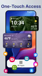
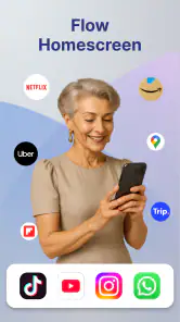
Flow Homescreen is a personalization app from Build4world that takes a different approach to the first screen on your phone. Instead of treating the home screen as a place to scatter icons and widgets, it is designed around the idea that the screen should help you get to the things you actually use. I found that appealing because a crowded phone often creates tiny delays all day: searching for an app, swiping through pages, or opening something by habit and then losing focus.
The app is free, aimed at everyone, and works on Android 8.0 or later. It has reached over 50 thousand installs and holds a 4.5 average from around 1 thousand ratings, which suggests that its focused approach is connecting with a meaningful group of users. The current release is version 1.2.6. I would describe it as a launcher-style personalization tool for people who want a more intentional starting point, rather than as a complete replacement for every part of the phone interface.
What to expect from Flow Homescreen
The first thing to understand is that this is not mainly about decorating your phone. Many personalization apps begin with wallpapers, icon packs, colors, or elaborate themes. Flow Homescreen is more useful when you think of it as a way to reduce friction. Its purpose is to make the home screen feel less like a storage area and more like a practical launch point.
That distinction matters before you install it. If your ideal setup is a highly customized visual theme with matching icons and a large collection of decorative widgets, another launcher or a dedicated theme tool may suit you better. If you want to look at the screen and quickly reach the few apps that matter most, this app has a clearer reason to exist.
My first recommendation is to approach it with a small target. Do not try to redesign every part of your phone immediately. Decide what you want to improve first: reaching communication apps, keeping work tools separate from entertainment, or reducing the number of distracting icons visible at a glance. A narrow goal makes the first session much easier to judge.
The app’s short store description is “Flow Homescreen,” while its broader summary presents it as a way to transform the phone and streamline daily use. In practice, the useful part of that promise is not a dramatic visual change. It is the possibility of creating a starting screen that reflects your routine instead of your download history.
That makes it especially interesting for people who have accumulated several pages of apps but still open the same handful every day. It can also work for someone setting up a simpler phone for a family member, provided that person is comfortable with a changed home-screen experience. The Everyone content rating makes it approachable for a broad audience, but ease of use still depends on how willing each person is to learn a new layout.
More From Our News Desk

Clash of Clans Is Won Between the Battles

Android Auto Makes the Case for Quieter Car Software

MobiOffice: Transforming Mobile Productivity with Seamless Integration

EA SPORTS FC™ Mobile Soccer: Redefining Mobile Sports Gaming

How Microsoft OneDrive Became a Mobile Productivity Giant

How Google Translate Breaks Language Barriers Effortlessly
Before changing your current home screen
I would take a quick mental inventory before making Flow Homescreen your default. Think about the apps you open without searching, the apps you need only occasionally, and the apps you want to stop seeing so often. This is more useful than choosing a layout based only on appearance because the success of a home-screen app is measured in repeated daily actions.
It is also sensible to remember where your current setup is comfortable. If you often rely on a familiar dock, a manufacturer-specific gesture, or a widget supplied by your phone brand, changing the launcher experience may introduce a short adjustment period. That is not necessarily a flaw in Flow Homescreen, but it is a real trade-off with any app that changes the starting point of the device.
A practical test is to choose one routine that currently feels annoying. For example, imagine arriving at work and needing to open your calendar, messaging app, and notes. If you can make that sequence clearer with the new home screen, you have a meaningful success to look for. If you cannot identify a routine that needs improvement, the change may feel cosmetic rather than useful.
Setting it up without making the phone feel unfamiliar
The first setup should be treated as an editing session, not a permanent commitment. Install the app, explore its initial presentation, and pay attention to the point where Android asks how the home screen should be handled. Because launchers affect a central part of the phone, read each system prompt rather than tapping through automatically. The important decision is whether Flow Homescreen should become the default home experience.
If you are cautious, keep your existing launcher arrangement in mind before switching. Take note of the apps you normally keep within immediate reach and any home-screen elements you would miss. This small preparation makes it easier to compare the new arrangement fairly and return to your previous setup if the workflow does not suit you.
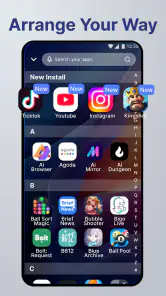
Once the app is visible, start with only the essentials. I would place the apps used every day into the most obvious area and leave less frequent tools out of the first experiment. A common mistake is to recreate the old clutter inside a new interface. If every app is given equal priority, the home screen cannot help you decide what deserves attention first.
A useful setup method is to divide your apps by action rather than by brand. Put things you use to communicate together, keep planning tools near each other, and separate occasional utilities from daily choices. This makes the arrangement easier to remember because you are building around what you do, not merely where an app came from.
For example, I would treat a messaging app, email, and a calendar as one daily coordination group, while banking, travel, and document tools might belong to a second group that appears only when needed. Entertainment apps can remain available without occupying the most valuable visual space. This small distinction is one of the easiest ways to make a new home screen feel purposeful.
Why a gradual setup works better
Flow Homescreen is most convincing after you have used it through several ordinary moments, not after staring at it for a few minutes. During the first session, you may be tempted to keep adjusting positions, labels, or visual choices. I found it more productive to make a basic arrangement, use the phone normally, and notice where my hand and attention went naturally.
That approach reveals problems that a static setup cannot. An app may look perfectly placed but still be awkward to reach with one hand. A group may seem logical on paper but take longer to recognize than a simple alphabetical search. The best home screen is not the most carefully arranged one; it is the one that reduces hesitation during repeated tasks.
There is also a privacy and attention benefit to a restrained layout. When fewer prominent icons compete for attention, the screen becomes less of an invitation to open whatever happens to be visible. I would not call this a replacement for dedicated digital-wellbeing controls, but it can support a calmer routine by changing what the phone presents first.
Your first meaningful success
The first successful action should be something concrete: completing a familiar task with fewer searches or fewer unnecessary taps than before. A good example is a morning check-in. You wake up, open the home screen, reach your calendar or weather tool, send one important message, and move on without wandering through unrelated apps. If the new arrangement makes that sequence feel direct, the setup is doing its job.
Another realistic scenario is preparing for a commute. You might need a transport app, a music service, a messaging tool, and a notes app. Rather than placing every possible travel-related utility on the screen, create a clear path to the small group you actually use. The benefit is not that Flow Homescreen knows your destination; the benefit is that your chosen tools are easier to find when you are in a hurry.
For work, I would use the home screen as a boundary. Keep communication and planning tools easy to reach, while leaving social or entertainment apps less prominent. This does not block anything, so it will not solve distraction for someone who wants strict restrictions. It does, however, remove some of the visual prompts that encourage automatic checking.
For a student, the same idea can be applied to study sessions. Place notes, documents, a calculator, and the relevant learning app where they are easy to identify, then avoid filling the same area with unrelated shortcuts. The trade-off is that this requires an intentional setup. Flow Homescreen can support a routine, but it cannot decide which routine you want.
One non-obvious tip is to judge the layout by recovery time. Ask yourself how quickly you can find an app after several days away from it. A clever arrangement that only makes sense while you are editing it is weaker than a plain arrangement you can remember under pressure. If you frequently forget where something is, simplify the grouping instead of adding more visual decoration.
Use repetition to refine the layout
After a day of normal use, look for the moments when you still searched through the app drawer or moved between pages. Those moments show what the first setup missed. You may discover that one tool deserves a more direct position, while another looked important during setup but is rarely opened.
I also recommend watching for accidental habits. If you keep opening an app simply because it is placed beside a frequently used one, move it away from the main path. This is a small but valuable use of personalization: the layout can be designed not only for speed, but also to make unwanted impulses less automatic.
Do not keep changing the screen every few minutes. Constant rearrangement makes it impossible to tell whether the workflow is improving. Make one or two thoughtful changes, then use the phone long enough to see whether the change survives real conditions such as one-handed use, quick replies, and rushed transitions between tasks.
Common points of confusion and friction
The biggest source of confusion is likely to be the difference between changing the home screen and changing the apps themselves. Flow Homescreen can alter how you reach your apps, but it does not turn those apps into a single combined service. You still need to understand the behavior of your messaging, calendar, browser, and other tools individually.
Some users may also expect a new launcher to preserve every detail of the manufacturer’s original experience. That expectation can lead to disappointment. Phone makers often build their own shortcuts, widgets, gestures, and visual conventions into the default launcher. If one of those elements is central to your routine, compare the new experience carefully before committing to it as your permanent default.
Another point of friction is the temptation to judge the app by its first visual impression. A minimalist home screen can look empty without being useful, while a busy one can look productive without improving access. I would focus on whether the arrangement helps with specific tasks rather than whether it resembles screenshots or other people’s setups.
There is also a learning curve for anyone who has used the same home screen for years. Even a better layout can initially feel slower because your muscle memory is tied to the old positions. Give yourself room to adapt, but set a clear standard: after regular use, finding essential apps should become easier, not remain an exercise in remembering a new puzzle.
People who depend heavily on specialized widgets should be especially selective. If your routine revolves around several live panels, detailed controls, or a manufacturer’s tightly integrated services, a focused home-screen replacement may not offer enough value to justify changing your setup. In that case, the standard launcher or a more feature-heavy alternative could be the better choice.
On the other hand, users who mainly need a clean route to a small set of apps may find that the simpler approach is an advantage. Compared with a conventional launcher packed with customization panels, icon options, and visual effects, Flow Homescreen feels better suited to someone who wants decisions reduced rather than expanded.
How it compares with familiar alternatives
The default launcher on an Android phone is usually the safest option for compatibility and familiarity. It tends to work naturally with the phone’s built-in gestures and widgets, so it is a strong choice for people who do not have a specific problem to solve. Flow Homescreen becomes more compelling when the default arrangement has gradually turned into a crowded collection of shortcuts.
Traditional customization launchers are often better for users who want fine control over grids, icons, animations, folders, and appearance. They can be rewarding for enthusiasts, but that flexibility can also turn the home screen into another project to manage. Flow Homescreen is a better fit when the goal is a more deliberate daily starting point rather than a showcase of settings.
Minimalist phone tools can go further by hiding apps or imposing stronger limits. That is useful for someone seeking firm boundaries around screen time. Flow Homescreen is less suited to that purpose because its value comes from organization and access, not from replacing self-control with hard restrictions. Choosing between them depends on whether your main problem is clutter or compulsive use.
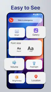
For families and older users, a simpler arrangement may be helpful, but I would still introduce it gradually. Familiarity matters more than elegance. If a person already knows exactly where the phone, messages, and camera controls are, changing those positions may create needless stress. In that situation, the best setup is the one that improves clarity without forcing a complete relearning process.
The next step after the first day
Once the basic layout works, refine it around your most repeated transitions. Think about what you do after receiving a message, when moving from work to personal time, or when leaving home. These transitions are where a home-screen design proves its worth because they involve quick decisions and little patience for searching.
One advanced but simple workflow is to create visual priority without trying to represent your entire life on one screen. Keep immediate actions visible, place occasional tools one step away, and let rarely used apps remain discoverable through the normal app list. This prevents the common mistake of treating visibility as the same thing as importance.
Another useful trade-off is to optimize for your weaker hand. Most people arrange a screen while sitting comfortably and looking directly at it. In real use, they may be carrying a bag, walking, or holding the phone at an awkward angle. Test the positions when one-handed access matters. A slightly less attractive arrangement may be much more practical.
I would also revisit the layout after a change in routine. A home screen built around commuting may not suit holidays, remote work, or a new study schedule. The advantage of a personalization app is that it can be adjusted, but adjustment should follow a real change in how you use the phone, not happen endlessly because rearranging feels productive.
For first-time users wondering whether the app is difficult to undo, the sensible approach is to treat the default-home choice as reversible and keep your old arrangement in mind before switching. For anyone asking whether it is suitable for an older relative or child, the answer depends less on the age label and more on whether that person benefits from a simplified, newly learned layout. For someone asking whether it replaces a digital-wellbeing app, I would say no: it can reduce visual temptation, but it is not the same as setting usage limits.
Users who want to know whether the free price changes the recommendation can try it without making a financial commitment. That makes experimentation easier, although your time and familiarity still matter. I would test it against one real routine instead of deciding based on the first screen alone.
My final view after using it as a daily starting point
Flow Homescreen is most valuable when you want your phone to reflect your routine instead of your download history. I like the fact that its appeal is practical: choose what deserves attention, make common actions easier to reach, and remove some of the visual noise that builds up over time. The app feels appropriate for a first-time user who is willing to make a few deliberate choices rather than expecting an automatic transformation.
Build4world has positioned it in the personalization space, but I would not recommend it to everyone. People who love elaborate themes, depend on tightly integrated manufacturer widgets, or want strict app blocking may be happier with a different kind of tool. The adjustment period is real, and a poorly planned layout can feel less convenient than the familiar default.
For me, the strongest reason to try it is the low-risk experiment. Start with one daily task, keep the first arrangement modest, and judge the result after ordinary use. If you can reach the apps you need with less hesitation, the change has earned its place. If the new layout makes familiar actions harder or removes features you rely on, returning to the standard launcher is the more sensible decision.
As a free Android personalization app with an Everyone rating and support beginning at Android 8.0, it is accessible to a wide range of users. Its 4.5 average and over 50 thousand installs show that it has found an audience, but the right question is personal: does your current home screen help you, or merely display everything you have installed? If the answer is the latter, Flow Homescreen is worth trying as a calm, focused alternative.
Flow Homescreen Frequently Asked Questions
Which devices can run Flow Homescreen?
Flow Homescreen is designed for Android devices, and its minimum operating-system requirement is Android 8.0. Before installing it, check the Android version on your phone or tablet in the system settings. If your device meets that requirement, you can try the launcher and decide whether its simpler home-screen approach suits the way you use your device.
Who makes Flow Homescreen, and is it suitable for all ages?
Flow Homescreen is made by Build4world and is listed for everyone. It is a personalization app for people who want to change the way their Android home screen looks and feels. Its general-audience rating makes it approachable for a broad range of users, though each person should still choose their own apps, notification settings, and other device preferences.
What is Flow Homescreen, and how does it change the Android home screen?
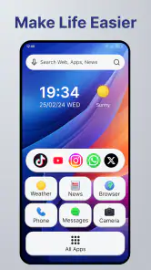
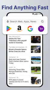
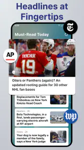
Flow Homescreen is an Android launcher designed to provide a cleaner, more focused alternative to a traditional home screen. Instead of relying on multiple pages filled with icons and widgets, it emphasizes quick access to essential apps, a simplified layout, and a less distracting visual experience. The exact appearance and available tools may vary depending on your Android version and the launcher settings you choose.
Can I customize Flow Homescreen to match my preferences?
Yes, Flow Homescreen generally offers customization options that allow you to adjust the way apps and information are displayed. Depending on the version, you may be able to change the layout, app organization, appearance, gestures, and other home-screen behaviors. However, it is intended to remain simple and uncluttered, so it may not provide the same extensive theme, icon-pack, widget, or animation controls found in more traditional Android launchers.
Does Flow Homescreen affect my existing apps, files, or Android settings?
Installing Flow Homescreen should not delete your applications, photos, documents, or other personal files. It works primarily as an alternative home-screen interface, while your apps remain installed normally. Android may ask you to set it as the default launcher, and you can usually switch back through the system’s default-app settings. Before making the change, it is sensible to note your current launcher preferences and backup important data.
Pros
- Clean
- minimalist interface keeps your home screen visually calm.
- Quick access to frequently used apps improves everyday navigation.
- Customizable layouts let you organize shortcuts around your routine.
- Low-distraction design can help reduce unnecessary phone checking.
- Lightweight experience should run smoothly on many Android devices.
Cons
- Limited customization may disappoint users seeking highly themed home screens.
- Some advanced features may require time to discover and configure.
- Compatibility can vary across Android versions and device manufacturers.
- Changing launchers may require resetting default home-screen settings.
- Users who prefer widgets may find the available options restrictive.
- Category
- Personalization
- Version
- 1.2.6













