Emoji Font Keyboard & Themes
- 6.50K
- 4.6
- Installs
- 10.00M
- Price
- Free
Screenshots
Analysis by Reviewed
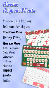
I usually notice a keyboard app most when I’m trying to send a quick message and it slows me down. Emoji Font Keyboard & Themes takes a different route: it makes the keyboard itself part of the message, with decorative text styles, emoji, and visual themes. After trying it as a personalization app rather than a replacement for every keyboard feature, I found its appeal clearest in casual chats and social posts. It is for people who enjoy adding a bit of character to everyday typing, not for anyone who wants a serious writing tool.
From a plain keyboard to a more personal message
The starting point is familiar: you open a conversation, tap the text field, and type as usual. The difference is that this keyboard gives you ways to change how your words look and to make the keyboard’s appearance feel less standard. That can be a small but welcome change when a plain message feels too flat for the occasion.
In my experience, the best use is selective. A playful font can make a short greeting, a profile line, or a caption feel more expressive, while ordinary text remains easier to scan in longer messages. I would not style every sentence. The effect works better as a little emphasis than as a permanent setting.
Emoji Font Keyboard & Themes is developed by BG.Studio and sits in the personalization category. It is free to install, with optional in-app purchases priced from $0.99 to $17.99 per item. That makes it easy to try before deciding whether any paid extras are worth considering.
Choosing a style before you send
A useful workflow is to decide where the message will end up before choosing a decorative style. In a private chat with a friend, a more playful look may suit the tone. For a work message, an appointment detail, or anything someone needs to read quickly, I’d keep the text plain. Stylized characters can be harder to recognize, especially when a message is viewed on a different device or copied into another app.
That trade-off is easy to miss when you are composing inside the keyboard. The keyboard can make a style look appealing, but the recipient’s experience matters more than the preview. I recommend trying a short, low-stakes message first. If the text remains legible in the conversation, the style is probably suitable for that use; if it looks crowded, switch back to standard lettering.
Emoji are most effective in the same restrained way. A few can add warmth or clarify tone, but a row of symbols can make a simple message feel busy. The keyboard’s creative options are most useful when they help the reader understand your mood, rather than making them work to decode the words.
Making a small everyday task smoother
Picture a familiar situation: I’m sending a friend a quick birthday message while waiting for a bus. I can type the greeting, give one short phrase a decorative treatment, and add an emoji that fits the relationship. The result feels more personal than a bare text without turning a two-line message into a design project.
For a social caption, I’d use a similar process but check the whole line before posting. A decorative opening phrase can draw attention, while the rest stays readable. If I’m writing a longer caption, I’d keep most of it conventional and reserve the special styling for a short heading or sign-off. This is a practical way to get the visual benefit without making the entire post difficult to follow.
One non-obvious tip is to keep a plain-text version in mind before applying a style. If the message depends on exact wording—such as a location, a time, or instructions—read it once in ordinary text first. That simple check helps prevent the visual treatment from distracting you from a typo or an unclear phrase.
What happens when the message leaves the keyboard
The handoff is the part I pay the most attention to. A keyboard is only one stage in communication: the text goes into a chat, social app, or other text field, then appears on someone else’s screen. Decorative characters may not look equally clear everywhere, so I treat them as presentation rather than a guarantee of consistent formatting.
For an important message, I would choose clarity over novelty. If a recipient needs to search, copy, or quickly understand a detail, standard text is the safer choice. For a casual greeting or expressive caption, a little styling is less likely to cause trouble. This distinction makes the keyboard easier to enjoy without assuming every font effect belongs in every app.
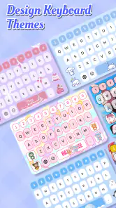
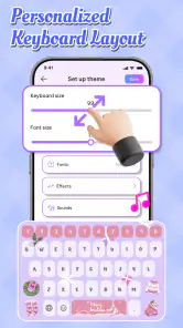
There is also a practical difference between changing the keyboard’s look and changing the message itself. A theme can make the typing surface feel more personal, while font styling changes how the text is presented. I’d choose a theme for my own day-to-day comfort and use decorative text only when it adds something to the message. Keeping those decisions separate makes the experience feel less cluttered.
How it compares with the usual choices
The usual alternative is simply to stick with the keyboard already on the phone and use its ordinary text and emoji options. That is the better choice if speed, familiar layouts, or straightforward typing are your priorities. A dedicated font-and-theme app makes more sense when you specifically want the keyboard to contribute visual personality, rather than just serve as an input method.
It is also different from styling a post later in a separate editor. Here, the creative step happens as you type, which can be convenient for short messages. A separate editing workflow may be preferable when you want to review a whole design before publishing or need more control over a finished graphic. I see this keyboard as a lightweight option for quick expression, not a substitute for a full design tool.
That distinction helps set expectations: this is not a reason to replace a keyboard you already find comfortable if you rarely use decorative text. But if you often add emoji, change visual styles, or enjoy matching your typing surface to your taste, the personalization is more directly useful.
Who will enjoy it—and who may not
I’d recommend it to people who send lots of informal messages, enjoy customizing their phone, or want a quick way to give short captions and greetings a distinctive look. It is also approachable for someone curious about keyboard themes: the app is free to start, and the content rating is Everyone.
I’d skip it if your typing is mostly work-related, you depend on highly legible text, or you dislike switching away from a familiar keyboard. It may also be a poor fit if you expect every decorative style to display identically wherever you send it. For accessibility or maximum readability, plain text and a conventional keyboard are usually the more dependable option.
The app has an average rating of 4.6 from around 302,000 ratings, alongside about 6,500 written reviews, and it has passed 10 million installs. Those figures suggest broad interest, but they don’t tell me whether a particular style will suit your habits. My advice is to judge it by your own real messages rather than by popularity alone.
Where the flow can break
The main friction is the tension between visual flair and reading comfort. A style that looks fun in the keyboard may be less convenient in a long conversation, and decorative text can feel out of place when the topic is serious. I’d also avoid making a stylistic choice in a hurry if the message contains details that must be understood at a glance.
Another point to keep in mind is that free access does not mean every optional item is free. In-app purchases range from $0.99 to $17.99 per item, so I would explore the basic experience first and only consider paying if a particular extra matters to me. There is no need to treat a purchase as part of getting started.
For someone who changes keyboard settings often, any new keyboard can involve a small adjustment as familiar habits meet a different visual setup. I’d take a moment to make sure the layout feels comfortable before relying on it for fast typing. If the change interrupts your normal rhythm, the customization may not be worth the trade.
A measured recommendation
The current version is 70, and the app supports Android 7.0 and later. Those details make it straightforward to check basic compatibility before installing. More importantly, the app’s purpose is clear: it gives casual typing a more decorative, personal feel without requiring a separate editing step for every short message.
My overall take is positive, with a clear limit. Emoji Font Keyboard & Themes is most enjoyable when I use its styling as a finishing touch—one expressive phrase, a suitable emoji, or a theme I like seeing while I type. It is less compelling as an all-purpose keyboard for people who value speed and plain readability above appearance.
If you enjoy personalizing your phone and often send informal messages, I think it is worth trying at no cost and seeing how its styles look in the apps you actually use. If your messages need to be universally clear or you rarely care how text looks, your usual keyboard is probably the better fit. The best result comes from using the decoration where it adds warmth, then letting the words stay simple when clarity matters most.
Emoji Font Keyboard & Themes Frequently Asked Questions
What is Emoji Font Keyboard & Themes?
Emoji Font Keyboard & Themes is a keyboard customization app that combines text-entry tools with decorative fonts, emoji, and visual themes. It is intended for people who want their messages and social posts to look different from standard text. Available features can vary by app version and device, so check the listing and in-app descriptions to confirm which fonts, themes, and emoji options are currently included.
How do I install and use the keyboard?
Download the app from your device’s official app store, then follow its setup instructions to enable the keyboard in your system settings and select it as an input method. You may also need to grant permissions requested by the app. Keyboard settings differ between Android and iOS, and some features may not work in every app. If you decide not to use it, you can switch back to your default keyboard in system settings.
Is Emoji Font Keyboard & Themes free to use?
The app may be available to download without an upfront charge, but that does not necessarily mean every feature is free. Themes, fonts, or other extras may involve in-app purchases, subscriptions, advertisements, or usage limits, depending on the current version and platform. Review the store listing and the payment details shown in the app before purchasing or starting a trial, and check how to cancel any subscription.
Is it safe to use, and what should I know about keyboard privacy?
A keyboard can handle sensitive information, including messages and passwords, so review the app’s privacy policy and requested permissions before enabling it. Avoid entering highly sensitive information through a third-party keyboard unless you understand how that data is handled. Install the app from a trusted store, check its developer and recent reviews, and use your device’s privacy settings to manage access. Store disclosures and practices can change over time.
Will the fonts and emoji look the same on every device and app?
Not always. A decorative font may appear differently—or revert to ordinary text—depending on the receiving app, device, operating system, and font support. Some emoji designs also differ across platforms, so the recipient may see a different image from the one shown on your screen. Before relying on a particular style for an important post or message, preview it in the target app and consider how it may appear to other people.
Pros
- Large emoji library makes it easy to find expressive symbols.
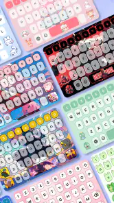
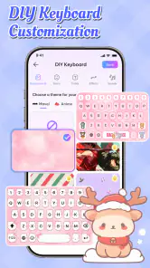
- Theme options let you personalize the keyboard’s appearance.
- Predictive text can help speed up everyday typing.
- Supports multiple languages for multilingual users.
- Simple layout is easy to navigate and customize.
Cons
- Keyboard apps may request access to sensitive typing data.
- Some themes
- emojis
- or features may require in-app purchases.
- Ads may interrupt browsing or customization.
- Predictive suggestions may not always match your intended wording.
- Switching from your default keyboard can take time to get used to.
- Category
- Personalization
- Version
- 70