Dynamic Notch Notification Bar
- 1.37K
- 4.6
- Installs
- 5.00M
- Price
- Free
Screenshots
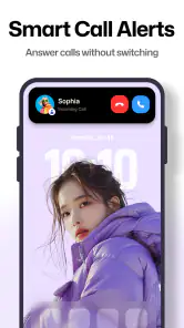
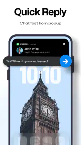
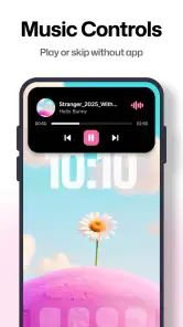
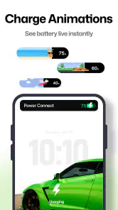
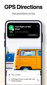
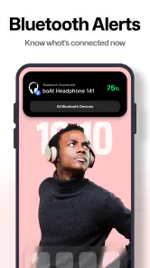
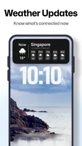
Analysis by Reviewed
I spent time with Dynamic Notch Notification Bar as a small productivity utility rather than a full notification manager. Its purpose is simple: it adds a dynamic notch-style area to the phone interface, giving notifications and selected status information a more visible place to appear. That sounds like a cosmetic change, but it can affect how quickly I notice an alert, how much I rely on tiny status icons, and how comfortable the phone feels during ordinary tasks.
The app comes from Mahashivratri App and is free to install, with optional in-app purchases ranging from $2.99 to $104.99 per item. It is listed for Everyone, works from Android 8.0 onward, and its current version is 6.3. The large audience is reflected in its average rating of 4.6 from around 220 thousand ratings, while its install count has passed five million. Those figures suggest that the basic idea is easy for many people to understand, but popularity alone does not tell me whether the overlay suits every phone, eyesight, hand movement, or daily routine.
How the notch changes readability and navigation
The first thing I noticed is that the app is built around visibility, not deep organization. Instead of asking me to open a separate dashboard every time I want to check a notification, it places a dynamic visual element near the top of the screen. For someone who often misses small icons or prefers a more noticeable cue, that can be useful. It turns a passive status area into something I am more likely to glance at.
That benefit depends heavily on the phone’s existing layout. A notch-style overlay can look natural on a device with a centered camera cutout, but it may feel less integrated on a display with a different camera position or unusual status-bar spacing. I found that the effect is most convincing when the visual element stays aligned with the phone’s hardware design. When it does not, the feature can feel like a floating decoration rather than part of the system.
Navigation is also a question of restraint. A notification bar that appears briefly or remains visually quiet can help me identify an event without leaving the current app. A bar that is too prominent can compete with the content I am reading. This matters when I am working through a document, watching a tutorial, or using a form where the upper edge already contains important controls. The app’s central idea is strongest when it improves recognition without becoming the thing I keep watching.
For readers with reduced visual acuity, the larger and more noticeable presentation may be easier to spot than a tiny icon. However, a larger visual cue is not automatically clearer. Contrast, color choices, animation, and the amount of information shown all affect whether a person can interpret it quickly. I would treat the notch as an extra signal, not as a replacement for readable notification text or the phone’s standard notification shade.
One practical workflow worked better for me than leaving the feature to attract attention all day. I used the dynamic area as a quick glance point while the phone was on a desk, then opened the normal notification panel when I needed details. This division keeps the overlay focused on awareness and leaves the operating system to handle sorting, full messages, and actions. It is a useful distinction because the app is not a substitute for Android’s notification controls.
You May Like

Clash of Clans Is Won Between the Battles

Android Auto Makes the Case for Quieter Car Software

MobiOffice: Transforming Mobile Productivity with Seamless Integration

EA SPORTS FC™ Mobile Soccer: Redefining Mobile Sports Gaming

How Microsoft OneDrive Became a Mobile Productivity Giant

How Google Translate Breaks Language Barriers Effortlessly
Reading at a glance without losing context
The most convincing use case is a busy moment when I cannot afford to switch apps. Imagine cooking while following a recipe on the phone: a visible notification cue can tell me that something arrived, while the recipe remains open. The same applies when I am carrying groceries, commuting, or checking a timer during a task. In those situations, a quick visual change is more convenient than repeatedly pulling down the shade.
There is a trade-off, though. A person who depends on full text, sender names, or detailed notification actions may still need the regular shade. The notch presentation is better for awareness than for reading long content. I would not choose it as the only notification interface for someone who needs every alert to be self-explanatory at a glance.
The app also makes sense for people who like a visual reminder that something has happened but do not want a large widget taking up home-screen space. Compared with a conventional widget, the dynamic area stays closer to the system status region and does not require a dedicated block on the launcher. Compared with a third-party notification dashboard, it is more immediate but less suited to reviewing a history of alerts.
Motor comfort and sensory load
From a motor perspective, the main attraction is reduced reaching. If the information I need appears near the top of the display, I may not have to swipe repeatedly or stretch toward a small control. That can be helpful for one-handed use, for people with limited reach, or simply when the other hand is occupied. The benefit is modest, but small reductions in repeated gestures can make a phone less tiring over a long day.
At the same time, an overlay near the top does not necessarily make interaction easier. If I need to tap, dismiss, or investigate what appears there, I may still have to reach to the upper edge. A person with tremor, limited precision, or difficulty holding the phone steady may prefer the standard notification shade, especially if the overlay’s active area is narrow. The app should therefore be viewed as a visibility aid first, not as a complete motor-access solution.
Sensory comfort is another important consideration. Dynamic effects can draw attention, which is useful for people who overlook static icons. For someone sensitive to motion, flashing, or repeated visual changes, that same behavior may be distracting. I would test it during a quiet activity such as reading before making it part of a work setup. If the eye keeps being pulled toward the top of the screen, the convenience is probably not worth the interruption.
Audio and vibration remain important here. People who cannot rely on visual changes may need the phone’s existing sound or haptic signals, while people who avoid sound may prefer a visual cue. I would not assume this app covers either need by itself. Its value is in adding a visual layer to the phone experience, and the phone’s own notification settings still determine much of the broader accessibility picture.
Color perception can also change the experience. If the design relies on subtle color differences, some users may find alerts harder to distinguish. A useful habit is to judge the app under several conditions: bright daylight, a dim room, and a screen viewed at an angle. A visual treatment that looks clear indoors may become less legible outdoors, while a bright animation that stands out in daylight may feel harsh at night.
Different situations call for different notification habits
The app is most helpful when the phone is visible but not constantly in my hand. On a desk, kitchen counter, bedside table, or workbench, a dynamic notch can act as a quick status cue. I can glance at the screen before deciding whether an alert deserves a full response. That is more efficient than unlocking the phone for every change, particularly when I am trying to stay focused.
It is less useful when the phone is in a pocket, bag, or mounted where the top edge is difficult to see. It also cannot solve the problem of a person being away from the screen. In those contexts, vibration, sound, a wearable, or a standard accessibility feature may be a better fit. This is one of the app’s clearest boundaries: it improves access to visible information, not access to information that is physically out of sight.
For people who use large text or display magnification, the overlay deserves a careful trial. Enlarged system content can change the available space near the status area, and a notch-style element may feel more crowded than it does on default display settings. I would check whether the visual cue remains easy to interpret after changing text size. If the phone’s own interface becomes cramped, the extra layer may reduce clarity rather than improve it.
Users who regularly rotate the device, use split-screen tasks, or switch between apps with very different top bars may also experience the feature differently from one screen to another. The practical question is not whether the effect looks attractive in one screenshot, but whether it remains understandable during the situations in which notifications matter. I recommend testing it while reading, typing, watching video, and using navigation, because those activities expose different kinds of interference.
There is a useful privacy angle as well. A visible notification treatment can make an alert easier for me to notice, but it may also make it easier for someone nearby to notice that something arrived. I would be cautious with sensitive messages in shared spaces. The app’s convenience is greatest on a personal desk or in a private room; in an office, classroom, or public transport, a subtler system indicator may be preferable.
Where the experience still has barriers
The biggest barrier is that a visual overlay can add complexity to a phone that already has a status bar, notification shade, lock screen, and possibly other floating tools. People who prefer a calm, predictable interface may find the extra layer unnecessary. I also think first-time users should resist enabling every visual option at once. Starting with the least distracting presentation makes it easier to tell whether the app genuinely helps.
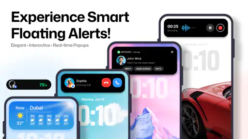
Compatibility is another practical concern. Android phones differ in camera cutouts, screen proportions, manufacturer interfaces, and notification behavior. An effect that looks neatly integrated on one model may sit awkwardly on another. I would not judge the app from promotional images alone; the real test is whether the notch aligns well, remains readable over different backgrounds, and avoids covering controls I use often.
Battery and background behavior are worth watching during the first day. I am not claiming a particular battery impact, because that can vary by phone and configuration, but any app that displays dynamic information deserves observation. If the phone feels warmer, notifications behave inconsistently, or the overlay becomes unreliable after the system limits background activity, the visual benefit may not justify the extra layer. Checking the phone’s battery and notification settings is a sensible part of setup.
Purchases are another point to approach carefully. The app is free to start, but optional items are priced from $2.99 to $104.99 each. That wide range makes it important to understand what is included before paying. For my purposes, I would first decide whether the basic notch experience improves daily use at all. A decorative upgrade is difficult to justify if the underlying visual cue is already distracting or poorly aligned with the device.
People who need strong accessibility support should also compare this app with built-in Android tools before committing to it. Screen magnification, larger text, notification history, sound controls, vibration settings, and other system options address different barriers. A notch-style presentation may complement those tools, but it does not replace them. If a user needs spoken feedback, robust keyboard navigation, or detailed control over notification priority, a dedicated accessibility or notification solution is likely the better direction.
Who should use it, and who should skip it
I would recommend trying it if you enjoy visual customization, often miss small notification icons, or want a glanceable cue while the phone is resting nearby. It is particularly appealing to people who like the appearance of a dynamic notch but use a device whose hardware does not provide that style naturally. The free entry point makes experimentation straightforward, provided the user is comfortable reviewing optional purchases before selecting them.
I would be more cautious for anyone who is sensitive to motion, easily distracted by changing elements, or dependent on high-detail notification reading. The app may also be a poor fit for a phone with a crowded top edge or for a user who already has several floating indicators enabled. In those cases, the cleanest solution may be to simplify the existing notification setup instead of adding another visual layer.
Compared with the usual Android notification shade, this app offers faster visual awareness but less complete control. Compared with a widget, it uses less home-screen space but gives me less room for detailed information. Compared with a full notification-management app, it is narrower in purpose and potentially easier to understand, but it is not designed to organize a long stream of alerts. That trade-off is the key to deciding whether it belongs on a particular phone.
My advice is to test it in three conditions: while the phone is stationary and visible, while using a one-handed grip, and while reading content that reaches the top of the screen. Watch for alignment, legibility, accidental distraction, and whether the cue actually saves a gesture. If it helps in all three situations, it has a meaningful place in the setup. If it only looks interesting in a static view, the standard interface is probably more practical.
An inclusive verdict on Dynamic Notch Notification Bar
My overall impression is positive but specific. This is a focused productivity app that changes how notifications are noticed, not a complete accessibility package and not a replacement for Android’s notification system. Its strongest quality is immediacy: a visible notch-style cue can make an incoming event easier to notice without forcing me to leave the task on screen.
Its inclusive value depends on context. It can support people who overlook tiny icons, reduce repeated swipes for some one-handed users, and offer a more noticeable visual signal when the phone is resting nearby. It can also create new friction through motion, crowding, privacy concerns, or poor alignment on certain displays. Those differences are not minor details; they determine whether the app feels helpful or intrusive.
I would install it as an experiment rather than as an essential system replacement. Start with the free experience, use it alongside the phone’s normal notification controls, and judge it under the lighting, text-size, and hand-use conditions that define your day. The right question is not whether the notch looks modern, but whether it makes important information easier for you to notice without making the rest of the phone harder to use.
Dynamic Notch Notification Bar Frequently Asked Questions
What does Dynamic Notch Notification Bar add to an Android phone?
Dynamic Notch Notification Bar is a productivity app focused on adding a dynamic notification bar style to your phone. Its central idea is to make the area around a front camera cutout or notch more interactive. The app is intended for people who want notifications and related phone information presented in that area rather than only in the usual notification shade.
Is the app suitable for someone who only wants a simple notification display?
It may suit users looking for a visual way to bring notifications and other phone information closer to the camera cutout. The app’s store summary describes its focus as Dynamic Notch Bar Style features, so it is centered on this kind of display rather than being a general-purpose productivity suite. Whether it feels simple depends on the settings you choose and how your phone’s screen is shaped.
Is Dynamic Notch Notification Bar free to download, and are there optional purchases?
Dynamic Notch Notification Bar is a free productivity app from Mahashivratri App. It also offers in-app purchases, with individual items priced from $2.99 to $104.99. You can start with the free version and decide whether its available features meet your needs before considering any optional purchase. The app is rated for Everyone.
What is Dynamic Notch Notification Bar and how does it work?
Dynamic Notch Notification Bar is an Android customization app that places an interactive notification area around the phone’s front camera cutout or notch. Depending on the device and selected settings, it can display incoming notifications, music controls, battery information, charging status, and other shortcuts. Its appearance and behavior may vary because notch shapes, screen layouts, and Android versions differ between phones.
Is Dynamic Notch Notification Bar compatible with every Android phone?
The app may work on many Android smartphones, but compatibility is not guaranteed for every model. Results depend on the device’s notch or punch-hole position, screen resolution, Android version, and manufacturer’s interface. Before downloading, check the app’s store listing and test the positioning controls. Some phones may require manual adjustment so the notification bar aligns correctly with the camera cutout.
Pros
- Keeps key alerts visible without opening the full notification panel.
- Offers a more iPhone-like notification style on compatible Android phones.
- Can make music controls and incoming calls easier to access.
- Includes customization options for appearance
- position
- and displayed alerts.
- Useful for phones with a centered punch-hole or notch camera design.
Cons
- Requires sensitive notification access to display alerts over other apps.
- Some features may not work correctly on every Android model or launcher.
- Persistent overlays can distract you while gaming or watching videos.
- May increase battery use slightly when animations and live updates are enabled.
- Free features may be limited by advertisements or optional paid upgrades.
- Category
- Productivity
- Version
- 6.3