Cool Fonts Keyboard & Themes
- 1.84K
- 4.6
- Installs
- 1.00M
- Price
- Free

Screenshots
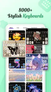

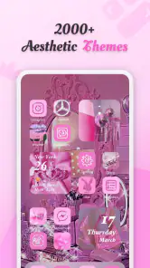
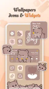
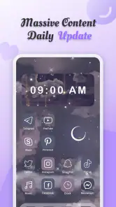
Analysis by Reviewed
I tend to notice my keyboard most when it feels dull: it is on screen every day, yet it rarely gets the attention I give my wallpaper or app icons. Cool Fonts Keyboard & Themes is aimed at changing that with expressive lettering and visual customization. My main question after the initial appeal is whether those choices stay enjoyable once the novelty wears off—and whether they fit the way you actually type.
A quick burst of personality
The first reward is immediate and visual. A new font or theme can make an ordinary chat feel a little more personal, especially if you enjoy matching your phone’s appearance to your mood. I’d explore the options with a specific purpose in mind instead of trying to make every screen look different at once. A playful style for a short message may be charming; the same style across a long conversation can become tiring to read.
That distinction matters because a keyboard is not just decoration. You use it while thinking about what to say, and any change that makes typing feel less natural can outweigh a striking design. I’d spend the first few days testing a couple of looks in familiar conversations, rather than judging them only by how they appear in the app’s previews.
The first-week appeal
That first burst of customization is easy to understand: changing the look of the keyboard makes an everyday screen feel less routine, and trying several font styles is more engaging than picking one wallpaper and forgetting about it. I’d start by choosing a readable style for ordinary messages, then test a more decorative one in a note or casual chat. That small trial helps you see whether the novelty works in your actual typing habits, rather than only in a preview.
For a realistic use case, imagine sending a friend a playful birthday message, then switching back to a plain style before writing a work email. That kind of occasional change is where a customizable keyboard can feel useful without turning every sentence into a design project. I would not assume that decorative characters display identically in every app or on every recipient’s device, so I’d check an important message before sending it.
Unleashing Creativity with Fonts and Themes
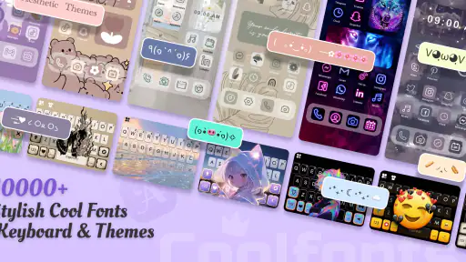
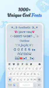
First things first, when I installed Cool Fonts Keyboard & Themes, it felt like I was opening a treasure chest of fonts. From quirky to elegant, the variety is insane! I mean, who knew I needed a typewriter font until I had it? It’s like having a wardrobe for your texts. Not only does it make your messages stand out, but it also adds a personal touch that’s just so you.
Now, let’s talk about the themes. Oh boy, the themes! Say goodbye to the mundane and hello to a vibrant, colorful world. You can switch things up based on your mood or the season. Feeling festive? There’s a theme for that. Want to keep it sleek and professional? Yep, got you covered there too. The customization options are limitless, and it’s so easy to switch between them.
More From Our News Desk

Clash of Clans Is Won Between the Battles

Android Auto Makes the Case for Quieter Car Software

MobiOffice: Transforming Mobile Productivity with Seamless Integration

EA SPORTS FC™ Mobile Soccer: Redefining Mobile Sports Gaming

How Microsoft OneDrive Became a Mobile Productivity Giant

How Google Translate Breaks Language Barriers Effortlessly
Finding value beyond the novelty
For month-to-month use, I’d judge the app less by how many styles I can browse and more by whether I settle on a few I genuinely enjoy. A practical approach is to keep one expressive look for personal chats and a calmer one for messages where clarity matters. That gives the customization a recurring purpose, while avoiding the effort of changing the keyboard every time your mood shifts.
Compared with the usual option of sticking with a phone’s standard keyboard and changing only its color or wallpaper, this app puts more emphasis on font personality. That is appealing if you want your typed messages to look distinctive; it is less compelling if you mainly want faster typing, predictive text, or a familiar layout. I’d choose a standard keyboard instead if reliability and typing tools matter more to me than visual variety.
Small habits that help it last
A useful way to decide whether the app belongs on your phone is to give it a short trial with a clear stopping point. Pick one everyday style and use it for ordinary chats, then try a more decorative choice for a few short messages. After that, ask whether you still notice and enjoy the difference. If you have to keep browsing for a new look to make the keyboard feel interesting, the visual variety may be entertaining in brief bursts but not valuable as a daily habit.
I’d also make a note of which styles are comfortable to read at a glance. That simple check is more useful than choosing the most eye-catching option: you can keep the expressive look for a contact name or a short greeting, while using a plainer one when you are replying quickly or writing several sentences. The trade-off is that switching styles can interrupt a task, so I would avoid changing the keyboard in the middle of an important exchange.
Ease of Use and Compatibility
The app is super user-friendly. Even if you’re not tech-savvy, navigating through the options is a breeze. The interface is intuitive, making it easy to find what you’re looking for without any hassle. Plus, it integrates seamlessly with most apps, so you’re not limited to where you can flaunt your new fonts and themes. Texting, emailing, or even jotting down notes – it’s all covered!
One thing that really impressed me was how lightweight the app is. It doesn’t bog down my phone like some other customization apps do. Quick to install, quick to use – just how I like it.
Where to test a font before relying on it
I would treat compatibility as something to check in practice, not assume from the appearance of a sample. Try a chosen style in a private note first, then in a casual message and any app where you write regularly. If the text is going to someone else, check the sent result when the message matters. Decorative characters can be handled differently across apps and devices, so a style that looks appealing on your screen may not be the best choice for a detail that needs to be understood clearly.
This also gives you a low-effort way to separate keyboard appearance from the text itself. If you only want a colorful keyboard while you type, a theme may be enough; if you want the characters in your message to look different to other people, you should test that exact use. I would not use ornamental lettering for a password, an address, a booking detail, or anything I might need to search and copy later. For those jobs, plain text is easier to trust and reuse.
Maintenance without turning it into a chore
Personalization apps can become less appealing when every spare moment turns into another round of browsing. I’d avoid treating every new mood as a reason to rebuild the keyboard. Keep a familiar default for most typing and make a change only when you have a real reason, such as a seasonal refresh or a special message. That approach makes customization feel like a small pleasure instead of another setting to manage.
If the keyboard ever feels distracting, the simplest test is to switch back to a restrained look for a day and see whether typing feels easier. If you do not miss the elaborate style, there is no need to keep it active just because you spent time choosing it. That is a fair measure of recurring value: the app should make a routine feel a little more yours, not demand attention to justify its place.
Cool Fonts Keyboard & Themes is a free personalization app from Art Maker Studio, with optional in-app purchases priced from $0.99 to $9.99 per item. It is rated for Everyone, and its current version is 1.5.9, with Android 6.0 as the minimum requirement. The app has a 4.6 average from around 4.9 thousand ratings, and more than one million installs. Those details make it easy to try, though I’d still decide whether the customization earns a regular place in my routine before paying for anything.
What the purchase decision comes down to
I’d begin with the free experience and decide what I actually use before considering an optional purchase. The key question is not whether another style looks appealing while browsing; it is whether it solves a small, recurring desire that the styles I already use do not. If I keep returning to the same few choices, I would be cautious about paying for more options simply because they are available. If I rarely open the app after setting a look, extra variety is unlikely to change that habit.
The version and device requirement are practical details to check before installing, especially if you use an older Android phone. Since the app is listed for Android 6.0 and newer, I’d confirm the device’s software first rather than plan around a keyboard that may not be compatible. Its Everyone age rating also makes it broadly approachable, but in a shared or family setting I’d still check that the visual style suits the person who will be typing, rather than assuming one look works for everyone.
Who will enjoy it, and who may not
I’d recommend giving it a try if you enjoy personalizing your phone and want a keyboard that can add character to short, informal messages. It is also a reasonable fit for someone who likes changing visual details now and then rather than keeping every screen at its default. On the other hand, if you rarely notice your keyboard’s appearance, prefer a strictly conventional look, or depend on specialized typing tools, the standard keyboard may suit you better.
One question I’d ask before installing is whether the fonts will work the way I expect in every app. The practical answer is to try them in the apps I use most and check how they appear after sending or saving text; the visual result can depend on where the text is viewed. Another is whether I need to pay to begin: the app is free to try, while some purchases are optional. And if I’m concerned about fit, the listed Android minimum is version 6.0, so I’d check my device’s software before downloading.
When a different keyboard is the better choice
If you want your keyboard mainly to improve speed, correct mistakes, predict words, or support a particular writing workflow, I would compare dedicated typing-focused options before choosing a style-first app. The appeal here is visual expression; it should not be mistaken for a promise of advanced writing tools. Likewise, if you want to customize the whole phone rather than the keyboard, a broader theme or launcher approach may fit better, while a simple wallpaper change is enough for someone who only wants a fresh screen now and then.
The distinction is useful because these alternatives solve different problems. A standard keyboard is usually the safer choice when you value consistency and muscle memory, while this app makes more sense when changing the visual character of typing is itself the point. I would not call one universally better: the right choice depends on whether you want your keyboard to feel familiar, work-focused, or expressive.
Why It's Worth a Try
So, why should you give Cool Fonts Keyboard & Themes a shot? Well, if you’re like me and love adding a bit of flair to your digital communications, this app is a must-have. It’s not just about aesthetics either; it’s about making your device truly yours. And who doesn’t love a bit of self-expression?
In conclusion, if you’re tired of the same old keyboard and want to inject some personality into your typing, this app is definitely worth checking out. Trust me, once you start customizing, you’ll wonder how you ever lived without it!
Does it earn a lasting place?
My long-term verdict is more measured than that early excitement: the appeal is real, but it depends on whether the styles remain fun after the first round of browsing. I’d keep it for the easy visual changes and use a restrained setup most days, switching to something more playful when the occasion calls for it. If the novelty fades and I stop noticing the customization, there is no reason to force the habit. For someone who enjoys expressive typing, it can be a pleasant personal touch; for everyone else, the default keyboard may be all they need.
Cool Fonts Keyboard & Themes Frequently Asked Questions
What devices and operating systems support Cool Fonts Keyboard & Themes?
Cool Fonts Keyboard & Themes is a personalization app for Android devices running version 6.0 or later. It is rated for Everyone, so its stated age rating is suitable for a general audience. Before downloading, check that your device meets the minimum operating-system requirement and has enough space for the app and any customization content you choose to use.
Who makes Cool Fonts Keyboard & Themes, and is it popular?
The app is made by Art Maker Studio and has an average rating of 4.6 from around 4.9 thousand ratings, with about 1.8 thousand written reviews. It has over one million installs, suggesting that many users have tried it. Ratings and reviews can help you gauge other users’ experiences, but your own preference for fonts and themes will determine whether it suits you.
What are the main features of Cool Fonts Keyboard & Themes?
Cool Fonts Keyboard & Themes offers a wide range of fonts and keyboard themes to personalize your typing experience. With over 100 fonts and themes, users can customize their keyboards to match their style. Additionally, the app includes emoji and sticker support, making conversations more expressive and fun. It also offers real-time font preview, allowing users to see changes instantly.
Is Cool Fonts Keyboard & Themes free to use?
While Cool Fonts Keyboard & Themes is free to download, it offers in-app purchases for premium features. The free version includes a limited selection of fonts and themes, but users can unlock additional content by subscribing to the premium service. This subscription often includes ad-free usage and access to exclusive fonts and themes. The app’s listed in-app purchase range is $0.99 to $9.99 per item, so review purchase details before buying.
How does Cool Fonts Keyboard & Themes affect device performance?
Cool Fonts Keyboard & Themes is designed to be lightweight and efficient, ensuring minimal impact on your device’s performance. It runs smoothly in the background without consuming significant battery power or memory. Regular updates help optimize its performance, making sure it works seamlessly on most Android and iOS devices.
Pros
- Extensive variety of fonts available.
- User-friendly interface.
- Customizable keyboard themes.
- Supports multiple languages.
- Easy integration with other apps.
Cons
- Contains ads which can be annoying.
- Some features require in-app purchases.
- Occasional lag on older devices.
- Limited free font options.
- No offline mode available.

- Category
- Personalization
- Version
- 1.5.9