Color Wheel
- 73.00
- 4.6
- Installs
- 50.00K
- Price
- $1.99
Screenshots
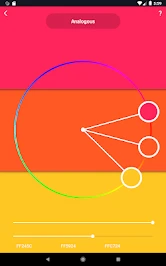
Analysis by Reviewed
When I’m choosing colors for an illustration, a room, or even a small graphic, I usually have a rough idea but not a palette I trust yet. That’s the gap Color Wheel is meant to fill: it gives me a place to test relationships between colors before I commit them to a project. I find it most useful as a focused Art & Design app, rather than an all-purpose design studio. Roman Sevastianov’s app costs $1.99, is rated for Everyone, and has a 4.6 average from around 1.1K ratings, which suggests it has found an audience among people who want a dedicated color tool.
What I bring to the wheel
The app makes the most sense when I arrive with a small question, not an expectation that it will design something for me. I might know that a page needs to feel calm, or that a room has a dominant green already, but still be unsure which supporting colors will sit comfortably beside it. In those moments, a focused wheel gives me a practical first move: choose a starting color, look at its relationships, and compare a few directions before opening a larger creative app.
I also find it useful to separate a color decision into two stages. First I explore the relationship, then I test the candidate in its actual job. A palette that looks appealing as a set of swatches may not work once a headline, illustration, or large painted surface is involved. Keeping that distinction in mind prevents me from treating a pleasing combination as a finished answer.
Starting with a color, not a blank canvas
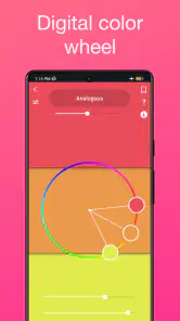
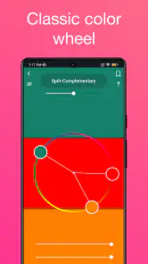
My practical starting point is a color I already like: a fabric, a photo, a paint sample, or a shade picked for a poster. From there, the interactive wheel and its harmony guides help me explore complementary, triadic, and analogous combinations. That is more useful than choosing several attractive swatches independently, because the relationships give me a reason to try a palette rather than relying only on instinct.
For a quick everyday example, imagine I’m making a birthday invitation and have already settled on a warm coral background. I can use the wheel to look for contrasting accents, then compare a more restrained neighboring palette with a livelier combination. I still need to judge whether the text is readable and whether the colors suit the person receiving the invitation, but the app gives me a sensible shortlist to take into the design itself.
From exploration to a usable palette
So, what exactly does the Color Wheel app do? At its core, it’s a comprehensive color guide that helps you explore and create stunning color combinations. Whether you’re a professional designer or just someone who loves playing around with colors, this app offers a ton of features to make your life easier. One of the standout features has to be its color harmony guides. You can easily experiment with complementary, triadic, or analogous colors, which is super handy when you’re trying to nail down that perfect shade for a project.
Intuitive and User-Friendly Interface
One of the first things you’ll notice about Color Wheel is its intuitive interface. The developers have done a stellar job at ensuring that even those who aren’t tech-savvy can navigate through the app with ease. The color wheel is interactive and allows you to drag and drop colors as you please. Plus, the app’s minimalistic design means you won’t get overwhelmed with too many options at once. It’s all about making the process as seamless as possible.
More From Our News Desk

Clash of Clans Is Won Between the Battles

Android Auto Makes the Case for Quieter Car Software

MobiOffice: Transforming Mobile Productivity with Seamless Integration

EA SPORTS FC™ Mobile Soccer: Redefining Mobile Sports Gaming

How Microsoft OneDrive Became a Mobile Productivity Giant

How Google Translate Breaks Language Barriers Effortlessly
A useful habit is to move one choice at a time rather than changing the whole palette whenever something feels off. If the combination seems too loud, I can test a neighboring relationship or adjust my starting point, then compare that result with the first option. That gives me a clearer sense of what caused the difference. It is a small workflow choice, but it makes the wheel more instructive than simply tapping through colors until one happens to look appealing.
Features That Pop
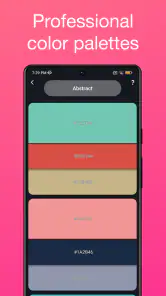
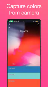
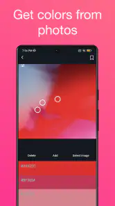
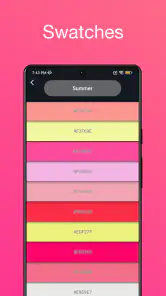
Aside from the basic color wheel functionality, the app also comes packed with additional features that are worth mentioning. For instance, it includes a feature where you can save your favorite palettes for future reference. This means you can build a library of your go-to color combinations without having to recreate them from scratch every time. There’s also an option to generate a color palette from any image on your device. Just snap a photo or upload an existing one, and the app will do its magic to pull out a cohesive palette. It’s like having a pocket-sized color consultant!
Saving is most useful when I give each palette a clear purpose in my own notes or project routine. I might keep one combination for a poster’s background and another for its accents, rather than saving several similar sets without remembering why I liked them. When I return later, the distinction helps me choose quickly and avoids repeating the same exploration. For ongoing work, I would also keep the source reference nearby so I can judge the saved colors against the actual design, not just the memory of it.
That image-based route is particularly handy when I want colors to feel connected to a real reference instead of an abstract theory. For example, I could start with a photo of a café window display, extract a set of colors, and then use the wheel to think through which accents might work together. I would treat the extracted palette as a starting point, not a finished design: a photo can contain distracting colors from shadows, reflections, or objects I do not want to include. Cropping or choosing a cleaner image before importing it can make the result more relevant.
Passing the palette into the next step
A color tool is only part of a creative workflow. Once I have a promising combination, I still need to apply it in a drawing, layout, room plan, or shopping decision. Saving palettes is valuable here because it gives me a reference to return to while I work, rather than making me rely on memory. I can also keep a few alternatives for the same project: one bolder option and one quieter option, for instance, then decide in context which better supports the subject.
For a handoff to another person, I would treat the saved palette as a visual brief rather than assume it explains itself. I can show the options and say which color is intended to dominate, which is an accent, and which should remain limited. That matters when sharing ideas with a friend helping choose paint, or with a collaborator laying out a graphic: the same group of colors can feel very different if each person gives them equal weight. A little context makes the app’s output easier to use outside the app.
This is where the app differs from a general graphics editor. An editor is better when I need to build the finished artwork, adjust typography, or see colors in a complete composition. A color wheel is better earlier, when I want to explore relationships without being distracted by layout controls. I would use both in sequence, not expect this app to replace the rest of my creative toolkit.
Compared with browsing color inspiration online, the wheel is more useful when I already have a starting shade and want to reason about alternatives rather than collect examples. A web search can show finished palettes in context, which is helpful when I need visual references or a particular style. The app’s advantage is a more direct, hands-on comparison of relationships; its limitation is that a wheel cannot show how a palette behaves in a finished composition by itself. I would switch to a graphics editor or reference gallery when context matters more than generating options.
Where the process can stumble
Color harmony is guidance, not a guarantee that a palette will work everywhere. Two colors that look balanced on a wheel may feel too harsh together in a large room, or lose contrast when used for small text. A phone display can also make a shade look different from paint, fabric, or another screen. I use the app to narrow choices, then check the finalists in the setting where they will actually appear. For accessibility-sensitive graphics, I would separately verify text contrast rather than assume a pleasing harmony is readable.
That extra check is especially important before buying materials. If I am choosing paint, I would take the suggested direction as a shortlist, then compare physical samples in the room and in the light where they will be seen. If I am choosing colors for a screen-based graphic, I would put them into the actual layout and inspect small text and interface details. The app can help me make a better-informed choice, but the final test belongs to the surface and conditions where the colors will live.
Another point of friction is deciding when to stop exploring. Because the wheel makes it easy to compare combinations, I can spend too long looking for a theoretically tidier answer when the project only needs a clear, workable palette. I try to set a simple limit: keep a small number of plausible options, then judge them in context. That keeps the tool from turning a quick decision into an endless hunt for a perfect color relationship.
The app is a good fit if you enjoy making visual choices but want a little structure, or if you regularly need color ideas for illustration, crafts, decorating, or simple design work. It is less suited to someone looking for a full drawing app, a complete room-planning tool, or a professional color-management workflow. If your main need is to edit images or produce finished layouts, a graphics editor will be the more direct option; if you want to understand why colors relate as they do, the wheel is the more focused companion.
Intuitive and User-Friendly Interface
One of the first things you’ll notice about Color Wheel is its intuitive interface. The developers have done a stellar job at ensuring that even those who aren’t tech-savvy can navigate through the app with ease. The color wheel is interactive and allows you to drag and drop colors as you please. Plus, the app’s minimalistic design means you won’t get overwhelmed with too many options at once. It’s all about making the process as seamless as possible.
For someone new to color theory, I would start with one familiar shade and compare only a couple of harmony approaches at first. That is less intimidating than trying to learn every relationship at once, and it gives the result a practical purpose. Someone who already understands the terminology can move faster and use the same interface to test variations. In either case, the value is in making comparison easy, not in replacing a designer’s judgment or teaching every part of color theory.
Why You'll Love It
One of the reasons I love the Color Wheel app is its versatility. It’s not just for artists or designers; it’s for anyone who deals with colors in their daily life. Planning a wedding? Picking out a new wall color? Trying to design a website? This app has got your back. The color theory tips are also a great resource if you’re keen on learning more about how colors work together. Trust me, once you start using this app, you’ll wonder how you ever managed without it.
A realistic use for me would be planning a small set of social graphics for an event. I could take a photo of the room or decorations as a visual starting point, extract colors, then use the wheel to see whether a stronger accent would help the design stand out. I would save a quieter and a more energetic direction, move both into the layout tool I use for the finished graphic, and check the words at their actual size. The useful outcome is not a finished graphic produced inside the wheel; it is a considered palette and a clearer handoff to the tool that can finish the job.
It is also a low-pressure way to learn by comparison. Instead of memorizing color theory first, I can move a color and observe how a suggested relationship changes, then decide whether the result fits my goal. That makes it approachable for a beginner, while someone experienced can use the same quick exploration to break out of a familiar palette. The trade-off is that the app helps me generate possibilities; it cannot make the final subjective call about mood, material, or audience.
Color Wheel is version 1.44 and runs on Android 6.0 or later. It has passed 50K installs, and its February 29, 2020 release date places it among established, focused tools rather than a newly launched experiment. I would consider the $1.99 price worthwhile if I expect to return to palette exploration often; for a one-off choice, a free basic wheel or a manual search may be enough. The right question is whether a dedicated place to compare and save color ideas will become part of my routine.
That makes the purchase decision fairly straightforward for me. If I only need to settle one color choice, I can use a free reference or a basic wheel and move on. If I regularly collect visual references, compare harmony options, and revisit saved combinations across small creative tasks, paying for a dedicated tool feels easier to justify. The app is aimed at that recurring moment of uncertainty, not at people who need a broad production suite with drawing, layout, and detailed output controls under one roof.
In conclusion, if you’re in the market for an app that simplifies the process of choosing and harmonizing colors, Color Wheel is definitely worth checking out. It’s user-friendly, packed with useful features, and most importantly, it makes working with colors a fun and engaging experience. So go ahead, download it, and let your creative juices flow!
Color Wheel Frequently Asked Questions
Is Color Wheel suitable for beginners, or is it mainly for professional artists and designers?
Color Wheel is designed for exploring and experimenting with color schemes, so it can be useful whether you are just starting out or already work with color regularly. Selecting and adjusting colors on the digital wheel offers a straightforward way to build custom palettes. Artists, designers, and hobbyists can all use it as a practical tool for their projects.
How much does Color Wheel cost, and what should I know before downloading it?
Color Wheel costs $1.99. It is an Art & Design app developed by Roman Sevastianov, and its content rating is Everyone. Before downloading, check that your device runs Android 6.0 or later if you are using Android. Its current version is 1.44, and the app’s short description is simply “Color Wheel.”
What is Color Wheel and how does it work?
Color Wheel is an innovative app designed to help users explore and experiment with color schemes. It offers a digital color wheel that allows users to mix and match colors, making it ideal for artists, designers, and hobbyists. By simply selecting and adjusting colors on the wheel, users can create their own custom palettes suited for any project.
Is Color Wheel available for both Android and iOS devices?
Yes, Color Wheel is available for both Android and iOS platforms. Users can download it from the Google Play Store for Android devices and the Apple App Store for iOS devices. The app is optimized to provide a seamless experience on both operating systems, ensuring that all features are accessible regardless of the device used.
What features does Color Wheel offer to its users?
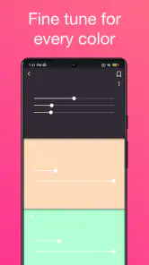
Color Wheel offers a range of features including a customizable digital color wheel, pre-set color palettes, and the ability to save and share custom palettes. Users can also access detailed color information, such as hex and RGB codes, and a history of recently used colors. These features make Color Wheel a versatile tool for anyone working with colors.
Pros
- User-friendly interface for beginners.
- Customizable color palettes.
- Real-time color preview.
- Supports multiple color models.
- Includes advanced color tools.
Cons
- Limited free version features.
- Occasional app crashes.
- Requires internet for full features.
- Ads can be intrusive.
- Limited export options.
- Category
- Art & Design
- Version
- 1.44