Color Identifier Color Finder
- 38.00
- 4.3
- Installs
- 50.00K
- Price
- Free

Screenshots
Analysis by Reviewed
When I need to identify a color quickly, I usually want more than a vague label such as “blue” or “beige.” I want a name I can remember, a code I can reuse, and enough technical detail to make the color useful in a design project. That is the narrow problem Color Identifier Color Finder tries to solve. It is an Art & Design app from AppCraftingMinds, built around scanning a color and presenting its tone and code in several familiar formats.
After using Color Identifier Color Finder, I found its main appeal easy to understand: it turns a visual guess into a practical reference. Instead of opening a full design suite just to inspect one shade, I can use a focused tool and move on. The app is free to install, rated for Everyone, and available for Android devices running version 8.0 or later. Its current version is 2.0.4, and its average rating sits at 4.3 from around 1.3 thousand ratings.
That does not make it a replacement for a professional color-management workflow. It is better viewed as a quick color companion for people who work with images, interiors, crafts, branding ideas, clothing, or everyday visual decisions. The most important question is not whether it can identify a color in theory, but whether the result is useful enough to act on.
Turning a visible shade into usable color information
The capability that matters most
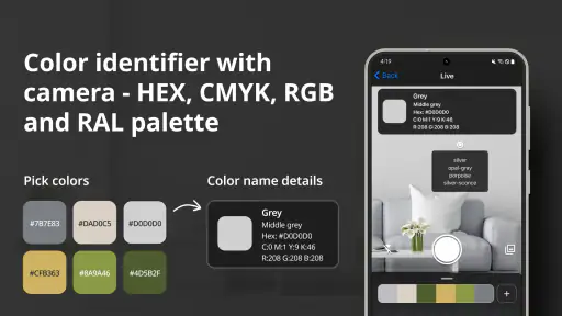
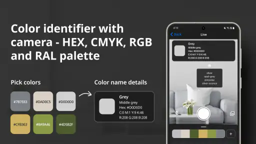
The app’s central capability is color identification. Its store summary points to color names, tones, and codes, including RGB, HEX, CMYK, and RAL. That combination is more useful than a simple color-name dictionary because each format serves a different purpose. HEX is convenient for web work, RGB fits many digital tools, CMYK is familiar in print-oriented conversations, and RAL can be helpful when discussing standardized physical colors.
I like this range because it changes the app from a novelty into a small bridge between what I see and what I need to communicate. If I spot a muted green in a room, for example, I can record the result instead of trying to describe it from memory. If I am choosing a background color for a digital mockup, a HEX value is immediately more practical than “soft sage.” If I am speaking with someone who thinks in print or paint references, another code may be easier for them to understand.
The color name is still valuable, especially when I am collecting visual references. A name gives a shade a human-friendly identity, while the numerical codes make it repeatable. Those two layers work well together: one helps me remember the color, and the other helps me use it again.
The real strength is the conversion from visual impression to a reusable reference. That is the feature I would focus on when deciding whether to install it. People who only want decorative palettes may find the app more technical than necessary, while anyone who regularly needs to match or discuss colors can get much more from it.
More From Our News Desk

Clash of Clans Is Won Between the Battles

Android Auto Makes the Case for Quieter Car Software

MobiOffice: Transforming Mobile Productivity with Seamless Integration

EA SPORTS FC™ Mobile Soccer: Redefining Mobile Sports Gaming

How Microsoft OneDrive Became a Mobile Productivity Giant

How Google Translate Breaks Language Barriers Effortlessly
Why multiple formats change the workflow
Many casual color tools stop at a basic RGB value or a broad name. That is fine for a quick curiosity, but it leaves extra work when the color needs to move into another context. Here, having several coding systems in the same experience reduces the need to search for a separate converter.
There is an important limitation, though: different color systems do not promise that a screen color will look identical everywhere. A phone display, a laptop, printed paper, fabric, paint, and room lighting can all change the apparent result. I treat the app’s output as a useful starting reference, not as a guarantee that a physical object will match perfectly.
This matters especially with dark, pale, or low-saturation colors. Two shades may look nearly identical in a photograph but produce noticeably different codes, while the same code may appear different on two screens. I get better results when I use the app to narrow a choice and then check the color in the actual environment where it will be used.
How the result helps in ordinary decisions
A practical example is choosing a wall accent, fabric, or accessory to coordinate with an existing object. I can inspect the object, note the identified color, and use that reference while comparing products. Instead of relying on memory, I have a consistent point of comparison. The app is particularly helpful when the object is not available in a catalog with a formal color label.
It can also help when I am preparing a small design brief for someone else. A phrase such as “a warm gray with a slight green cast” may be interpreted differently by different people. Adding a color name and code gives the conversation more precision without requiring a full design application.
For students and hobbyists, this makes color theory more concrete. Rather than looking at a shade and guessing whether it is warm or cool, they can inspect examples from real objects and compare those observations with their own visual judgment. The app does not replace learning, but it gives that learning a practical reference point.
What using it feels like in practice
A simple workflow for a real object
My preferred workflow is deliberately short. I start with the object or image I want to examine, use the color-identification function, and then decide which output matters for the next step. If I am saving a digital reference, I pay attention to HEX or RGB. If the conversation is about print or a standardized physical shade, I look at the other available formats. I then write down or copy the value in the same place as the project notes.
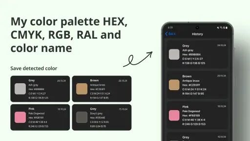
That last step is easy to overlook. A color result is only useful if I can find it later. I would not rely on memory after identifying several similar shades, particularly when working on a palette with multiple neutrals. Keeping the name and code together avoids the common mistake of remembering the description but losing the exact value.
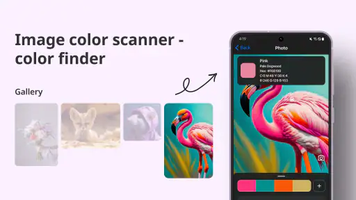
For a photograph, I try to choose a representative area rather than a highlight or deep shadow. A glossy surface can reflect nearby colors, and a textured surface can contain several shades within a small space. The app can report what it sees, but I still need to choose the right part of the image. That is a human judgment, not something a color identifier can completely remove.
Using it with screenshots and digital references
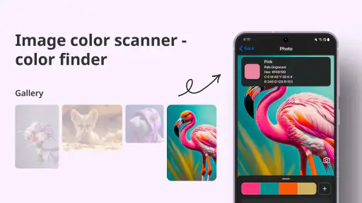
The app is also useful when I am looking at a screenshot, illustration, or online reference and want to capture a particular shade. In that situation, the result is usually more consistent than trying to estimate the color from a visual picker alone. I can identify the background, a button, a line of text, or a decorative element and use the resulting code as a starting point for a recreation.
There is a trade-off between speed and precision here. A screenshot may contain compression, transparency, gradients, or color changes caused by the original display. If I am recreating a design, I use the identified value as a close match and then adjust it by eye inside the design software. For a casual project, that is usually enough. For brand-critical work, I would still use the official source color or a professional color-management process.
When the code is more useful than the name
Color names are approachable, but they can be subjective. One person’s “dusty rose” may be another person’s “muted pink.” Codes remove some of that ambiguity. If I am sharing a color with a developer, designer, printer, or craft partner, the code is normally the part they can use most directly.
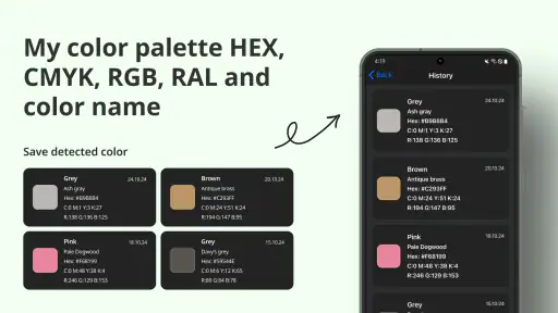
At the same time, a code without context can be hard to remember. I find it helpful to keep the name, the code, and a short note about where the color came from. For example, a note might identify a fabric sample, a room wall, or a screenshot element. This small habit makes the app more valuable over time because the scan becomes part of a usable reference library, even if the app itself is not being treated as a full project-management tool.
What a first-time user should expect
The app is focused rather than expansive. Someone opening it for the first time should expect a color utility, not a complete illustration environment, photo editor, or advanced palette laboratory. That narrow scope is a benefit when I need one answer quickly, but it may feel limited if I want to draw, edit, organize complex palettes, or prepare finished artwork in the same place.
The free price makes trying it straightforward, although in-app purchases range from $4.99 to $59.99 per item. I would check the purchase screen carefully before confirming anything and decide whether the free experience already covers my needs. For occasional color checks, paying for a broader workflow may not be worthwhile. For repeated professional use, the value depends on how much time the app saves compared with the tools I already have.
The strongest everyday scenario
Matching a room, object, and digital mood board
The clearest scenario for me is planning a room update. Imagine finding a cushion, ceramic piece, or piece of artwork with a color that looks right, but without a useful product name. I can identify the shade, save the result with a note, and use the code while comparing paint samples, curtains, furniture accents, or a digital mood board.
This workflow is better than taking a quick mental snapshot because home lighting changes throughout the day. A color that looks neutral in daylight may appear warmer under a lamp. I would scan in the lighting where the object will normally be seen, then treat the result as a reference rather than an absolute physical match. That approach gives me consistency without pretending that a phone camera can replace a real sample.
The app is especially helpful when several people are making the decision. Instead of passing around a phone and saying “this is the color I mean,” I can share a name and code. That reduces misunderstandings when shopping separately or preparing a visual plan. It also helps me compare alternatives that look similar at first glance but have different undertones.
A second scenario: building a small digital palette
For a personal website, presentation, invitation, or social graphic, I can scan colors from photographs or physical objects and build a palette around them. The useful insight is that the app can connect an offline inspiration source to a digital design process. A leaf, notebook cover, piece of clothing, or painted surface can become the starting point for a set of digital colors.
I would not blindly use every sampled color together. A palette can become muddy when several shades have similar brightness and saturation. Instead, I use the identified color as an anchor, then choose supporting colors in my design tool. The app supplies the reliable starting value; the visual balance still requires judgment.
A third scenario: communicating with a print or craft partner
If I am discussing a handmade project, poster, label, or printed item, having a code is more useful than a casual description. The app can help me explain which shade I am trying to approach before the other person checks materials or prepares a proof. I would still ask for a physical sample when exact production matching matters, because screen-based identification and real-world materials are not interchangeable.
This is a good example of the app’s proper role. It improves the first conversation and makes the reference clearer, but it should not be treated as a final quality-control instrument for color-sensitive manufacturing.
Trade-offs that affect the result
Lighting and surface quality remain important
The biggest practical weakness is not unique to this app: color identification depends on the input. Warm indoor bulbs, strong sunlight, shadows, reflections, and surrounding colors can all influence what a camera sees. A glossy red object may include reflected highlights that are not part of the actual base color. A textured sweater may contain several related threads rather than one uniform shade.
I get more dependable results by avoiding extreme lighting, filling the viewing area with the target shade, and checking more than one spot when the surface is uneven. If the results vary, that variation is useful information. It may mean the object is multicolored, the lighting is interfering, or the color itself changes across the surface.
Digital codes are not physical guarantees
RGB and HEX are excellent for digital communication, but they do not guarantee how a printed or painted version will look. CMYK is closer to print conversations, yet printers, paper, ink, and calibration still affect the outcome. RAL references can be useful for standardized physical color discussions, but a phone display remains a visual approximation of the physical standard.
For this reason, I would use the app early in a project, not as the final authority. It is ideal for collecting references, narrowing options, and explaining an intended shade. If the project involves a brand identity, a large print run, or expensive materials, I would move to approved swatches and calibrated tools before committing.
Focused tools versus full design suites
Compared with a full design application, this tool is quicker to approach for a single color question. I do not need to open a large workspace or manage layers just to identify a shade. That simplicity is its main advantage.
The opposite side is that a full design suite usually offers more control after the color has been found. I may want to adjust saturation, test accessibility, create gradients, build a palette, edit an image, or export a finished asset. Color Identifier Color Finder is not the better choice for those tasks. I would use it as a companion, then continue in the appropriate design software.
Compared with a basic online color picker, the app is more convenient when I am working from a physical object or need several color-code systems in one place. An online tool may be preferable when the color already exists as a digital pixel and I want to inspect it directly inside a browser-based workflow. The better option depends on where the color begins: camera-facing object, saved image, or existing design file.
Free access and purchase decisions
Because the app is free, I can test whether its identification workflow fits my habits without making an immediate commitment. The presence of in-app purchases means I would pay attention to which parts are available without payment and whether an upgrade solves a real problem for me. I would not purchase simply because I use the app occasionally.
For someone who scans colors every week and values having several code formats together, a paid option may make sense if it removes a repeated inconvenience. For someone checking a shade once while redecorating or preparing a small craft project, the free access may be sufficient. The right choice depends more on frequency and workflow than on the app’s headline capability.
Who will get the most from it
Good fit for visual learners and practical creators
I would recommend it to hobby designers, students, decorators, crafters, photographers, social-content creators, and anyone who often asks, “What color is that?” It is particularly useful for people who move between physical inspiration and digital work. The ability to connect a real-world object with a reusable color reference is more valuable than the short store description might suggest.
It can also help people who struggle to describe undertones. A name and code do not replace visual language, but they give the conversation a stable anchor. That is helpful when choosing clothing combinations, planning a room, reviewing a mood board, or asking another person to find a similar material.
Who should choose another tool
I would skip it if I need a complete drawing or photo-editing workspace, sophisticated palette management, or guaranteed production accuracy. A professional designer working with established brand standards should start from official color specifications rather than sampling a screen or photograph. Likewise, someone who only wants to pick colors from an existing image may find a desktop or browser color picker more direct.
I would also be cautious if my main goal is exact physical matching. The app can make the process more informed, but lighting, cameras, displays, and materials introduce variables that no quick scanner can completely remove. In that situation, physical samples and calibrated equipment deserve the final say.
My recommendation after using it
Color Identifier Color Finder succeeds because it keeps one useful task in focus: identifying a visible shade and translating it into information I can reuse. The combination of a friendly color name with RGB, HEX, CMYK, and RAL references gives the result practical value beyond simple curiosity.
Its limits are equally clear. The quality of the answer depends on the object, lighting, image, and screen, and the app should not be mistaken for a professional color-control system. It also will not replace the creative work that comes after identification. I still need to judge contrast, harmony, accessibility, material behavior, and overall design.
Still, I think it is worth trying for everyday color decisions, especially because the app is free and has already passed 50 thousand installs. Developed by AppCraftingMinds and suitable for Everyone, it offers a focused way to turn visual inspiration into a code I can actually use. My advice is to scan carefully, record the result with context, and treat it as a strong starting point rather than a final promise of a perfect match.
Color Identifier Color Finder Frequently Asked Questions
What devices and operating systems can run Color Identifier Color Finder?
Color Identifier Color Finder is an app in the Art & Design category, and it requires Android 8.0 or later. Before downloading, check that your device meets this requirement and that you can grant camera access if you plan to scan colors from objects. The developer is AppCraftingMinds, and the app is intended for identifying colors rather than replacing professional color-measurement equipment.
What is Color Identifier Color Finder used for?
Color Identifier Color Finder is designed to recognize and name colors from images or objects viewed through your device’s camera. It can be useful for designers, artists, students, decorators, and anyone who needs to identify a specific shade quickly. The app’s description highlights color names and formats such as RGB, HEX, CMYK, and RAL, which can help when carrying a color reference into creative or digital projects.
How accurately does Color Identifier Color Finder recognize colors?
The app can provide helpful color estimates, but its results should not be treated as laboratory measurements. Accuracy may change depending on lighting, shadows, camera quality, screen calibration, reflections, and the material being scanned. For the most reliable result, use natural or neutral lighting, keep the camera steady, and avoid glossy or transparent surfaces that can distort the visible color.
Does Color Identifier Color Finder require access to the camera?
Yes, camera access is generally necessary if you want to identify colors in real time or scan objects around you. The app may also request permission to access photos if it supports analyzing saved images from your gallery. You can review or change these permissions in your Android or iOS settings. If camera access is denied, some image-based features may be unavailable.
Can I use Color Identifier Color Finder without an internet connection?
Basic color detection may work offline if the application processes the camera image directly on your device. However, certain features could require an internet connection, including advertisements, online color databases, synchronization, updates, or additional tools provided by the developer. Availability can vary according to the app version and operating system, so it is worth testing the main functions before relying on it while traveling.
Pros
- Quickly identifies colors from photos or camera input.
- Useful for designers
- artists
- and color-matching projects.
- Simple interface makes basic color detection easy to use.
- Can help users learn color names and recognize subtle shades.
- Convenient for checking colors when no physical color chart is available.
Cons
- Results can vary with lighting
- shadows
- and camera quality.
- Some shades may be identified inaccurately or too broadly.
- Camera access is required for real-time color detection.
- Advanced color tools may be limited compared with professional apps.
- Ads or premium features may interrupt the identification process.

- Category
- Art & Design
- Version
- 2.0.4