Color Call Theme, Call Screen
- 228.00
- 4.6
- Installs
- 10.00M
- Price
- Free

Screenshots
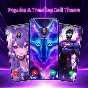
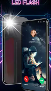
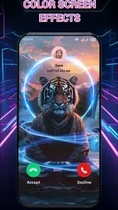
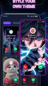
Analysis by Reviewed
I see Color Call Theme, Call Screen as a small, visual upgrade rather than a replacement for the phone app. Its appeal is straightforward: make incoming calls more noticeable and give their screen a look that feels more personal. That can be enjoyable, and sometimes useful, but it depends on how you use your phone. If you want call filtering or a new way to manage contacts, this is not the tool I would choose.
What to check before choosing a call theme
I would start by asking whether I usually notice calls in time. If the phone is often across the room or its standard screen blends into the background, a distinct call display may help. If I always carry it in my hand or rely on a watch or other connected device, the visual change may be mostly for fun. That difference matters more than choosing the most elaborate design.
There is a trade-off between a striking theme and quick legibility. Caller information needs to remain easy to pick out when the phone rings unexpectedly, so I would favour a design with clear contrast over one that is busy throughout the screen. A theme that looks appealing while browsing can feel distracting during an actual call. Trying a restrained option first is a sensible way to see whether the effect suits your habits.
Where the flashlight alert fits
The flashlight alert gives the app a practical angle beyond changing the screen’s appearance. It may be useful when the phone is face down and a ringtone is inconvenient or easy to miss. I would test it in a quiet place before using it as part of my everyday setup: a flashing light can draw attention in a meeting, disturb someone nearby, or be unnecessary when the phone is already visible.
It also helps to think of the alert as a situational choice, not an all-purpose improvement. For example, it could make sense when I am working in a room where I cannot keep checking the display, then be less suitable in a shared office or during a film. If the light feels intrusive, the screen themes can still be the main reason to use the app.
How it compares with built-in options
The usual alternative is simply to keep the phone’s standard incoming-call screen. That is the more sensible choice if I prefer a clean, familiar interface or do not want another layer of personalization. Colorful call themes are for people who want that moment to feel different; they do not make the app a better choice for call routing, blocking unwanted numbers, or organizing contacts. I would keep using the regular phone app for those tasks.
This distinction is useful when deciding whether to install it at all. If my goal is just to identify callers or avoid unwanted calls, a visual theme does not address the main problem. If I already like how my phone handles calls and want a more noticeable or playful display, customization is the point. It is best understood as a visual accessory for incoming calls, not a new call-management system.
More From Our News Desk
Weather by Xiaomi Review: Clear at a Glance, Less Clear Up Close

X Under Pressure: Can It Recover When Posting Goes Wrong?

Clash of Clans Is Won Between the Battles

Android Auto Makes the Case for Quieter Car Software

MobiOffice: Transforming Mobile Productivity with Seamless Integration

EA SPORTS FC™ Mobile Soccer: Redefining Mobile Sports Gaming
A quick everyday trial
For a fair test, I would choose one theme and use it for a normal day rather than repeatedly changing designs while browsing. I would notice whether the caller details remain readable, whether the display catches my eye from where I usually leave the phone, and whether the overall look still feels pleasant after the novelty fades. This gives a more useful answer than judging a theme only by its preview.
I would test the flashlight separately, because changing the screen and the alert together makes it harder to tell which part is actually useful. Try the light only in a setting where it will not bother other people, then decide whether it adds anything to your routine. These small checks make it easier to keep the parts that help and ignore the parts that do not.
Who should look elsewhere
I would skip this kind of personalization if a minimal call screen is important to me, if I rarely notice the phone itself while it rings, or if I am looking for more control over incoming calls. It may also be a poor fit when an animated display or flashing alert would be distracting in the places I spend time. In those cases, the standard call screen is likely the calmer option.
On the other hand, someone who enjoys changing their phone’s appearance and wants incoming calls to be more visually distinctive may find the app worthwhile. The best reason to keep it is not that every call needs a dramatic entrance; it is that a chosen theme feels enjoyable or makes the phone easier to notice without making the call details harder to read.
A more practical way to judge the visual change
A bright incoming-call screen is most useful when it helps you notice a call at the right moment, not just when you are sitting with your phone in hand. I would test a theme in the places I actually take calls: on a desk, in a dim room, or while the phone is across the room. If the animation makes the screen easier to spot, it has a practical purpose; if it only adds visual noise, a quieter design may suit you better.
The app’s other central idea is a flashlight alert. That can be handy when a phone is face down or when a ringtone would be easy to miss, but it is not a substitute for checking how your own phone behaves in different settings. I would try it in a calm environment first, then decide whether the extra signal is useful in shared spaces, where a flashing light might distract people nearby.
Why Choose Color Call Theme?
First off, the variety of themes available on Color Call Theme, Call Screen is just mind-blowing. From neon lights to cute animations, there’s something for everyone. I personally loved the galaxy themes that make it look like your phone is a portal to another universe every time someone calls. The customization options are endless, and you can switch up the themes as often as you like, depending on your mood or even the season!
Choosing a theme that works beyond the preview
When picking a design, I would weigh readability alongside style. A busy animation may look lively in a preview but compete with the caller details when a real call comes in. For everyday use, I’d start with a theme that has strong contrast and a clear centre, then try a more decorative option later. That small bit of testing can prevent a pretty screen from becoming harder to use at a glance.
There is also a useful distinction between personalization and call management. This app changes the look and alert experience; it is not the reason to switch if your main need is organizing contacts, filtering unwanted calls, or changing how calls are routed. The regular phone app remains the better choice for those jobs. I see this as a visual layer for people who already like their calling setup and want to make its arrival more noticeable.
Easy to Use Interface
One of the things I really appreciated about this app is its user-friendly interface. You don’t need to be a tech guru to navigate through it. Everything is laid out clearly, and you can easily preview and apply any theme with just a tap. It’s perfect for those of us who want to enjoy a bit of eye candy without spending ages trying to figure out the settings.
Make Every Call Special
With Color Call Theme, Call Screen, every call feels like an event. I found myself actually looking forward to receiving calls just to see the flashy animations and bright colors pop up on my screen. It’s a great conversation starter too! Friends and family often asked me how I got such a cool call screen, and it was fun showing them the app and watching them get excited to try it out themselves.
A realistic use is a busy afternoon at home: you leave your phone nearby while cooking, and a distinctive screen or light alert can make an incoming call easier to notice without keeping the display open. On the other hand, if you keep your phone in a pocket, rely on a connected wearable, or prefer silent notifications, a visual call theme may add little. I’d treat the flashlight alert as an optional cue, not something to leave on automatically in every setting.
It is a free personalization app from Prop studio, rated for Everyone, and it has reached over 10 million installs. Its average rating is 4.6 from around 96,000 ratings, which suggests broad interest, though those figures alone cannot tell you whether its visual style will match your taste. The app first appeared on May 22, 2024, and version 2.2.9 supports Android 7.0 and later. If you are choosing between this and a phone’s built-in call display, the built-in option is simpler and more restrained; this one makes sense when expressive visuals are the point.
Battery and Performance
Now, you might be wondering if all these cool graphics would drain your battery or slow down your phone. Surprisingly, I didn’t notice any significant battery drain or performance issues while using the app. The developers seem to have optimized it well to ensure it runs smoothly without hogging too many resources.
My practical advice is to try one theme at a time and keep the flashlight alert only if it genuinely helps you notice calls. That makes it easier to tell whether the visual effect is comfortable in daily use, rather than changing several things and not knowing what you prefer. If a screen feels too busy or the flashing is inconvenient, switching back to a simpler look is a sensible trade-off.
Who will enjoy it most
I’d recommend it to someone who enjoys expressive phone customization, wants incoming calls to stand out, and is happy to spend a moment choosing a look that suits their habits. It is less compelling for anyone who values a minimal interface, rarely sees the phone while it rings, or wants call screening and contact tools rather than decoration. The key question is whether a more colorful call moment adds a little pleasure or useful visibility to your routine.
My verdict for everyday use
My recommendation is to treat the app as a personal style choice with a possible practical bonus, rather than expecting it to improve every part of calling. I would keep a theme if it makes the screen easier to notice and remains readable when someone actually calls. If the novelty wears off, or the visuals compete with the caller information, returning to the standard display is a reasonable choice rather than a failure to use the app properly.
The main decision is simple: do you want a more expressive incoming-call screen, and does that suit the way you use your phone? People who answer calls at a desk or enjoy refreshing their phone’s look have a clearer reason to try it. People who need dependable call controls, prefer quiet visuals, or rarely look at the screen while it rings are better served by their existing setup.
In conclusion, if you’re looking to add a splash of color and fun to your calling experience, Color Call Theme, Call Screen is definitely worth checking out. It’s easy to use, packed with features, and doesn’t compromise on performance. Plus, it adds a personalized touch to your device that makes it stand out from the rest. So go ahead and give it a try, and let your calls be as colorful as your personality!
Color Call Theme, Call Screen Frequently Asked Questions
Can I use Color Call Theme, Call Screen on an iPhone?
Color Call Theme, Call Screen is an Android personalization app, so it is intended for Android phones rather than iPhones. If you are looking for a call-screen customization app for an iPhone, check that app’s platform compatibility before downloading. On Android, the key compatibility check is whether your device meets the app’s minimum operating system requirement.
What does Color Call Theme, Call Screen change when someone calls me?
The app is focused on personalizing the appearance of incoming calls. Its description highlights call themes and a flashlight alert, giving users a way to make the call experience look more distinctive than a standard screen. If your main goal is to change how incoming calls appear, that focus may be a good fit; it is not presented as a replacement for your phone or messaging service.
Is Color Call Theme, Call Screen compatible with my phone?
Color Call Theme, Call Screen is an Android personalization app, and its minimum operating system requirement is Android 7.0. If your phone runs that version or a newer one, it meets the stated system requirement. Checking your Android version before downloading is a useful first step, especially if you use an older device or have not updated it recently.
Who makes Color Call Theme, Call Screen, and what can I expect from it?
The app is made by Prop studio and focuses on changing the look of phone calls. Its store summary describes colorful call themes and a flashlight alert, so it is intended for people who want incoming calls to feel more visually distinctive than the standard call screen. It is a personalization app rather than a general-purpose phone or messaging service.
What is Color Call Theme, Call Screen and how does it work?
Color Call Theme, Call Screen is a mobile application that allows users to customize their call screen with vibrant themes and unique designs. It works by providing a variety of colorful templates and animations that can be applied to incoming and outgoing call screens, enhancing the visual experience of phone calls. Users can select from different themes and set them as default, making each call more personalized and visually appealing.
Pros
- Vibrant and customizable call screens.
- User-friendly interface for easy navigation.
- Low battery consumption
- runs efficiently.
- Compatible with most Android devices.
- Regular updates with new themes.
Cons
- Contains in-app ads that can be intrusive.
- Limited customization in free version.
- May require internet for theme updates.
- Some themes are not very unique.
- Occasional lag on older devices.
- Category
- Personalization
- Version
- 2.2.9












