AIO Launcher
- 913.00
- 4.5
- Installs
- 1.00M
- Price
- Free

Screenshots
Analysis by Reviewed
I approached AIO Launcher expecting another Android home-screen replacement, but its idea is more focused than that. Instead of filling the display with colorful icons and decorative widgets, it turns the home screen into a compact information panel. The result feels closer to a personal dashboard than a traditional launcher, and that difference explains both its appeal and its limitations.
After spending time with it, my main conclusion is simple: this is a strong choice if you want to see useful information immediately and open apps through a text-based interface. It is less suitable if you enjoy arranging icons, using large visual widgets, or treating your home screen as a design project. Developed by AIO Mobile Soft, it belongs to the personalization category, but its real strength is not appearance alone. It changes how I interact with the phone.
A home screen designed around information rather than decoration
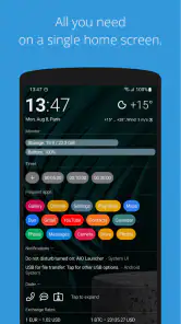
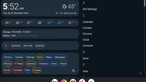
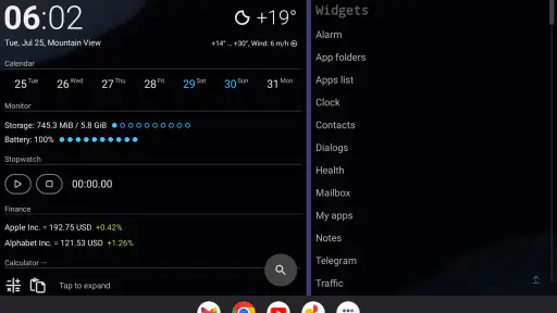
The first thing that stands out is the reduction of visual clutter. A conventional Android launcher usually presents a grid of icons, perhaps a dock, a wallpaper, and several widgets. AIO Launcher takes a different route by placing practical details directly on the main screen. The home page is intended to answer the small questions that normally make me open separate apps: what is happening today, what needs attention, and which application I want to reach.
That approach made my phone feel calmer. I did not need to swipe through several pages or hunt for a widget that had been pushed aside by another one. The interface gives priority to readable information and quick access. It is not trying to imitate a desktop or reproduce the standard Android layout, which means there is a short adjustment period. Once I understood that the launcher was built around a single working surface, the design became much more logical.
The store summary describes the product as everything needed on one home screen, and that is a fair description of its ambition. I would not interpret it as a promise that every phone task happens there. Rather, the launcher gathers the information and shortcuts I use most often so that the home screen becomes a useful starting point instead of an empty backdrop.
In daily use, this can save more time than expected. When I picked up my phone to check the next appointment or launch a frequently used app, the information was already in front of me. That small reduction in tapping matters most for people who repeatedly perform the same quick checks throughout the day.
Why the compact dashboard works so well
The strongest part of the experience is the relationship between glanceable information and search. A text-oriented launcher can feel plain at first, but it also makes the screen easier to scan. I am not distracted by a collection of bright icons or decorative panels. The design encourages me to look for an item by name or move through the available information in a more deliberate way.
This is particularly useful on a phone used for practical tasks. I can imagine a workday in which I check the home screen before leaving, see the day’s relevant information, open a messaging app, and then return to the same central view. With a conventional launcher, I might place several widgets across multiple pages and still end up opening an app to get the detail I wanted. Here, the home screen is built around that first glance.
Another advantage is that AIO Launcher does not require me to maintain a carefully organized icon layout. Traditional launchers reward users who enjoy sorting apps into folders and deciding which page should hold each shortcut. That can be satisfying, but it also becomes a chore when new apps arrive or old ones are removed. AIO Launcher reduces the importance of that manual arrangement.
The key trade-off is control versus clarity. I give up some of the visual freedom associated with standard Android launchers, but I gain a more consistent way to reach information. For me, that trade is worthwhile when the phone is primarily a tool. Someone who sees the home screen as a personal canvas may feel restricted instead.
Useful workflows beyond the first impression
One practical workflow is to treat the launcher as a triage screen. Rather than opening every service separately, I first use the home page to decide what actually needs attention. This prevents the familiar habit of opening an app merely because its icon is visible. The launcher’s structure supports a more intentional routine: glance, decide, then open only what matters.
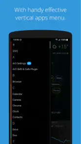
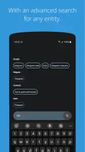
A second useful habit is to rely on text access for apps that I use irregularly. I do not need to remember which folder contains an application I installed weeks ago. Searching or navigating by its name is more reliable than scanning several pages of icons. This is a small feature in concept, but it becomes valuable on a phone with a large and changing app collection.
I also found the single-screen approach helpful for reducing accidental browsing. A conventional home screen often places social, shopping, video, and news apps beside genuinely important tools. AIO Launcher makes the opening view feel less like a row of invitations and more like a control panel. It will not remove distractions from the phone, but it creates a little more distance between picking up the device and launching something impulsively.
There is also a useful distinction between information density and visual busyness. A screen can contain a lot of information without feeling crowded if the hierarchy is clear. AIO Launcher generally aims for that balance. The interface is not minimal because it shows very little; it is minimal because it tries to show the right things in one place.
Where the design asks for patience
The biggest weakness is the learning curve. Users arriving from a familiar Android launcher may instinctively look for a grid, a dock, or a standard long-press customization routine. Those expectations do not map perfectly onto this design. The first session can feel as though something is missing, even though the difference is intentional.
I also think the experience depends heavily on personal comfort with text-based navigation. If you identify apps by their colorful logos and prefer tapping a fixed icon position, the interface may feel slower rather than faster. The launcher is most convincing when I allow it to replace that habit instead of trying to force it to behave like a conventional launcher.
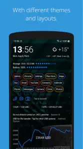
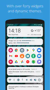
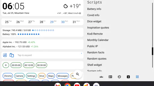
Visual customization is another meaningful limitation for some people. AIO Launcher is not the obvious choice for someone who wants elaborate icon packs, a carefully staged wallpaper, or a home screen that changes dramatically from one page to another. Its personality comes from its information layout and restrained presentation, not from endless decorative options.
That does not make it unattractive, but it does make it specialized. I would not install it simply because I wanted a prettier home screen. I would install it because I wanted a more functional one. The distinction matters, especially for users who compare launchers mainly by themes, transitions, and widget placement.
Performance, cost, and practical expectations
AIO Launcher is free to install, which makes experimenting with its unusual design relatively easy. Optional in-app purchases range from under a dollar to just under thirteen dollars per item. I would begin with the free experience and decide whether the workflow genuinely improves my routine before spending anything. The value is not in collecting visual extras; it depends on whether the launcher’s central concept suits the way I use my phone.
The app has an Everyone content rating, so its intended audience is broad. It supports Android 8.0 and later, which covers a wide range of devices while still leaving older phones outside its supported range. The current version is 7.4.2, and the product has been available since November 4, 2017. Those details give it a longer presence than a brand-new experiment, but I would still judge it by the actual interaction style rather than by its age.
Its public reception is encouraging: the app holds a 4.5 average from around seventeen thousand ratings, with more than nine hundred written reviews and over a million installs. I see those figures as evidence that the concept has found a real audience, not as proof that every Android user will enjoy it. A launcher can be well liked and still be the wrong fit for someone who wants a conventional layout.
One practical question is whether switching back would be difficult. In my view, users should treat the change as an experiment rather than a permanent commitment. Before making it the daily launcher, I would spend enough time performing ordinary routines: opening communication apps, checking information, finding a rarely used tool, and returning to the home screen. If those actions feel natural after the initial adjustment, the design is probably working for you.
Another question is whether it replaces every widget or app. I would not think of it that way. Its purpose is to make the home screen more useful, not to eliminate the need for dedicated applications. I still open separate apps when I need their full features. The benefit is that the launcher gives me a clearer starting point and reduces the number of unnecessary steps before I reach them.
Who should use it, and who should skip it
I would recommend AIO Launcher to people who value efficiency over decoration. It suits users who want a quick overview, dislike maintaining several icon pages, or frequently search for apps by name. It also makes sense for anyone trying to create a calmer relationship with a busy phone. The interface encourages checking purposefully rather than wandering through a collection of visual shortcuts.
It may be especially appealing to someone who has tried ordinary widgets but found them inconsistent. Widgets often occupy separate areas and can require their own arrangement. AIO Launcher’s central idea is more unified: the home screen itself is the information surface. That can make a phone feel more coherent, particularly when the user wants practical details available without building a complicated layout.
I would be more cautious about recommending it to users who love customization for its own sake. If your favorite part of Android is choosing icon shapes, arranging multiple pages, matching colors, and changing wallpapers frequently, this launcher may feel too opinionated. The same applies to people who depend on muscle memory from fixed icon positions. A standard launcher will probably remain faster for them.
It is also not the best fit for someone who wants the home screen to behave exactly like the phone’s original interface. AIO Launcher asks for a change in habits, and that change is the product rather than an incidental detail. If you are not willing to learn a different way of navigating, the unusual layout will feel like friction every time you unlock the device.
My final recommendation
After using it as a practical home-screen replacement, I see AIO Launcher as a focused tool rather than a universal upgrade. Its best quality is the way it turns the first screen into a place for decisions: check what matters, find the app you need, and move on. It removes much of the visual noise that makes conventional launchers feel busy, while giving up some of the freedom and familiarity those launchers provide.
The strongest reason to try it is not the promise of a different look. It is the possibility of changing your phone routine. If you regularly lose time searching through pages, forget where an app is stored, or open distracting services simply because their icons are nearby, the dashboard approach can feel refreshingly direct. The improvement is subtle but practical.
My reservation is equally clear: this is not a neutral launcher. It has a point of view, and that point of view will not suit everyone. Users who want a highly visual, endlessly customizable Android home screen should choose a more traditional alternative. Users who want information first and decoration second should give this one a fair trial.
For me, the verdict is positive with that qualification. AIO Launcher is worth trying when you want your home screen to function like a personal dashboard instead of an app shelf. Start with the free version, allow yourself time to adjust to its text-centered workflow, and judge it by how quickly you complete everyday tasks. If that change makes the phone feel clearer, it is a thoughtful personalization choice; if it makes you miss icons and familiar gestures, returning to the standard launcher will be the better decision.
Pros
- Puts essential phone information on one uncluttered screen.
- Highly customizable layout
- widgets
- colors
- and information blocks.
- Fast access to contacts
- apps
- messages
- and device settings.
- Text-based interface uses very little storage and system resources.
- Includes useful tools such as weather
- calendar
- battery
- and usage stats.
Cons
- The minimalist interface may feel confusing to users who prefer traditional icons.
- Many advanced customization options require time to configure properly.
- Some features and personalization tools are limited to the paid version.
- Not ideal for users who rely heavily on visual widgets and app folders.
- Appearance can seem plain compared with conventional Android launchers.

- Category
- Personalization
- Version
- 7.4.2