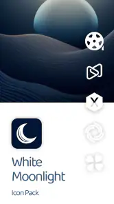
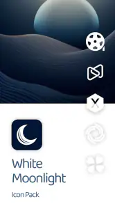
White Moonlight Icon Pack
- 26.00
- 4.6
- Installs
- 10.00K
- Price
- $0.69

Screenshots
Analysis by Reviewed
White Moonlight Icon Pack is the kind of personalization app I would consider when I want my Android home screen to feel calmer without rebuilding every part of the interface. I tried to judge it as more than a collection of pale icons: the real question is whether the visual change is useful day after day, whether the setup feels manageable, and whether the purchase is sensible for someone who simply wants a cleaner phone.
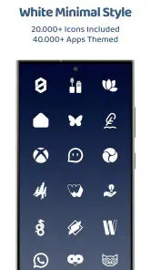
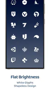
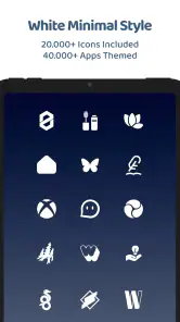
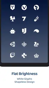
Created by PizzApp Design, it focuses on a white, shapeless icon style rather than bright colors, glossy effects, or highly illustrated artwork. That choice gives the pack a quiet appearance that works especially well with dark wallpapers, grayscale layouts, and minimalist widgets. It is an app in the personalization category, and its appeal is very specific: this is for people who want their icons to recede into the overall design instead of demanding attention.
How the white icon style changes a daily home screen
The first thing I noticed is that the pack’s visual identity depends on consistency. White icons can make a home screen look remarkably tidy when most of the frequently used apps receive a matching treatment. The shapeless approach also avoids the uneven mixture of circles, squares, and rounded rectangles that normally appears across an Android launcher.
That does not mean every wallpaper will suit it. On a bright image, the icons can lose contrast, while a busy photograph may compete with the deliberately restrained design. I found the style more convincing over a dark or muted background, where the white artwork becomes easy to scan without turning the screen into a wall of color.
A realistic use case is a phone used for work and personal tasks throughout the day. I would place only the essential apps on the first page, use the white icons there, and move less important shortcuts into folders on a second page. That arrangement makes the home screen feel less like an app drawer and more like a simple control panel. The pack is particularly suitable for someone who checks a calendar, messages, maps, notes, and music several times daily and wants those shortcuts to share one visual language.
There is also a useful trade-off here. Minimalism improves visual calm, but it can reduce instant recognition. A colorful social media logo is often identifiable before I read its label. With a monochrome white design, I rely more on position and text. After a short adjustment period that may be fine, but anyone who depends on color to distinguish apps should think carefully before replacing familiar icons across the entire launcher.
Installation is only part of the personalization process
Icon packs are not completely independent of the launcher they are used with. In practice, the experience depends on whether the launcher recognizes external icon packs and how it handles applying them. This is one of the first things I would check before paying: the pack itself can have an attractive design, but the final result still depends on the launcher’s support and settings.
More From Our News Desk

Clash of Clans Is Won Between the Battles

Android Auto Makes the Case for Quieter Car Software

MobiOffice: Transforming Mobile Productivity with Seamless Integration

EA SPORTS FC™ Mobile Soccer: Redefining Mobile Sports Gaming

How Microsoft OneDrive Became a Mobile Productivity Giant

How Google Translate Breaks Language Barriers Effortlessly
White Moonlight supports devices running Android 7.0 or later, which covers a broad range of Android phones. That compatibility is helpful for people keeping an older device, although the age of the phone does not guarantee that every launcher behaves in exactly the same way. If the icons do not appear as expected, I would first inspect the launcher’s icon or theme settings rather than assuming the artwork is missing.
My preferred workflow would be to apply the pack after simplifying the home screen, not before. Remove unused shortcuts, decide which apps belong on the first page, choose a background with enough contrast, and then apply the icons. This prevents the common problem of judging a new pack while the screen is still crowded with unrelated widgets and duplicate shortcuts.
Another practical tip is to keep the original arrangement in mind before making broad changes. If the new appearance feels too uniform, I would apply the pack only to the main page and leave secondary pages closer to the system look. That creates a visual hierarchy: the most important actions receive the quiet treatment, while less frequently used apps remain easier to identify in their familiar form.
What the design does well, and where it asks for patience
The strongest quality is restraint. The white artwork does not try to turn the phone into a themed fantasy world. Instead, it creates a neutral surface that can sit behind a chosen wallpaper, a monochrome widget, or a carefully spaced grid. For users who already like clean typography and limited color, that is more valuable than a pack filled with dramatic illustrations.
The weakness is equally clear: a minimalist icon pack has less room to hide inconsistencies. If one frequently used app does not receive a matching icon, the gap may be more noticeable than it would be in a colorful collection. I would therefore inspect the apps I use most before committing to a full redesign. The main page matters more than the total number of icons, because that is where an unsupported or visually different shortcut will be seen repeatedly.
The pack is also not a replacement for a complete launcher customization system. It changes the appearance of icons, but the overall feel still comes from wallpaper, spacing, widget style, notification badges, and the launcher’s grid. Someone expecting one tap to transform every part of the phone may find the result limited. Someone who enjoys making small, deliberate adjustments will probably appreciate the focused scope.
Cost, support, and the decision to buy
White Moonlight costs $0.69, placing it in the inexpensive paid-app range. There are also in-app purchases priced from $0.49 to $2.99 per item. That means I would look at the purchase screen carefully and decide whether the basic pack already provides the design I want before adding anything else.
The low entry price makes experimentation relatively easy, but value still depends on how long the style remains useful. If I change wallpapers and launchers frequently, the pack may be a short-lived visual experiment. If I keep the same home-screen layout for months, a small one-time purchase can make the phone feel more personal without committing to a larger theme subscription.
The public response is encouraging without being overwhelming: the app has a 4.6 average from around 339 ratings and about 26 written reviews. It has also passed 10K+ installs. I read those figures as a sign that the concept works for a modest but real audience, not as proof that it will suit every device or launcher. A small icon pack can be excellent for its niche while still being the wrong choice for someone seeking a broad, highly animated theme.
The app is rated Everyone, so the visual concept is suitable for a general audience. Its current version is 6.9, and it was released on Jan 10, 2024. Those details are useful when checking compatibility and deciding whether the project appears active enough for your expectations, but they do not remove the need to test the pack with your own launcher.
Trust should be judged by what the screen actually lets you control
For a personalization tool, I pay attention to the moments where the app asks me to make a choice: selecting the pack, applying it through a launcher, reviewing an optional purchase, or deciding whether to keep the changes. Those are the points where a clear interface matters more than decorative presentation.
I would avoid treating a clean visual design as evidence of a particular privacy practice. The icon artwork tells me how the home screen may look; it does not, by itself, explain permissions, data handling, account controls, or retention. My practical approach is to read the permission prompts shown on my device and inspect the app’s visible settings and purchase screens before proceeding. If a request feels unrelated to applying icons, I would pause rather than approve it automatically.
The same caution applies to optional purchases. Since the app includes items in addition to its listed price, I would distinguish the initial purchase from any extra content and confirm the amount before completing a transaction. This is especially important when testing a personalization app casually: the visual change may be appealing, but there is no reason to buy extras until I know the basic experience fits my launcher.
I also prefer to make changes in stages. Apply the pack, use the phone normally for a day, and then decide whether the white icons remain comfortable for messaging, navigation, banking, and other routine tasks. This gives me a better sense of user agency than changing every page at once. If the design makes an important shortcut harder to identify, I can reverse part of the change without losing the layout I already understand.
Who should use it and who should choose another route
I would recommend White Moonlight to Android users who want a subdued home screen, already enjoy dark or neutral wallpapers, and are comfortable doing a little launcher setup. It is a good match for a phone with a carefully selected first page, a small number of widgets, and a preference for visual consistency over colorful app branding.
I would be more hesitant to recommend it to someone who wants automatic customization across every device, a large collection of elaborate themed elements, or a launcher-independent experience. A complete launcher theme may be better for that person because it can coordinate icons, folders, gestures, grids, and wallpapers in one broader system. The usual free icon alternatives may also be preferable if the priority is trying many styles without paying, even though they may offer less focused artwork or a less coherent visual direction.
It is also not the best fit for users who need icons to remain strongly differentiated by color. White shapeless symbols can look elegant, but they ask me to remember location and label more than a standard colorful layout does. For a family phone shared by several people, or for anyone who frequently changes launchers, that extra adjustment may outweigh the aesthetic benefit.
My most useful recommendation is to treat the pack as a design layer rather than a complete phone makeover. Start with the apps you genuinely use, choose a contrasting wallpaper, and keep the first page uncluttered. If the result feels too plain, restore a few original icons instead of abandoning the whole style. That mixed approach can preserve the calm appearance while keeping critical shortcuts recognizable.
My cautious verdict after living with the concept
White Moonlight Icon Pack succeeds because it understands the appeal of a quiet Android interface. Its white, shapeless treatment can make a crowded screen feel more deliberate, particularly when paired with a dark background and a restrained layout. PizzApp Design has chosen a narrow visual direction rather than trying to satisfy every personalization taste, and that focus is its main strength.
At the same time, I would not buy it purely because the screenshots or summary sound minimalist. The launcher relationship, icon coverage, contrast, and your own recognition habits determine whether the change feels polished or inconvenient. The optional in-app purchases also make it sensible to review each visible choice before spending beyond the initial price.
My final view is positive but selective. For someone who wants a clean home screen and is willing to make a few thoughtful adjustments, the $0.69 price is reasonable and the style has a clear personality. For someone seeking a full theme system, maximum launcher flexibility, or instantly recognizable colorful shortcuts, another option will likely be more practical. I would try it with one main page first, check the visible controls and prompts carefully, and keep it only if the calmer appearance genuinely makes everyday phone use easier.
White Moonlight Icon Pack Frequently Asked Questions
Is White Moonlight Icon Pack suitable for someone who wants a simple, uncluttered home screen?
Yes. White Moonlight Icon Pack is designed around a clean, minimalist look, using white tones and shapeless icon designs to give the home screen a more consistent appearance. It is a personalization app for people who prefer a bright, restrained style over colorful or highly detailed icons. Keep in mind that the overall result also depends on your wallpaper, widgets, and launcher.
What is White Moonlight Icon Pack?
White Moonlight Icon Pack is a customization app for Android devices that replaces standard app icons with a clean, bright, moonlight-inspired design. Its icons generally use white tones, soft shapes, and a minimalist appearance, making it suitable for users who want a more elegant and consistent home screen. It works through compatible third-party launchers rather than changing the entire Android interface by itself.
Which launchers are compatible with White Moonlight Icon Pack?
Compatibility depends on the launcher installed on your Android phone or tablet. Icon packs commonly work with popular launchers such as Nova Launcher, Lawnchair, Smart Launcher, Action Launcher, Apex Launcher, and other systems that support custom icon themes. Before downloading, check the app’s current Play Store description or launcher settings, because compatibility can vary by Android version and some manufacturer launchers may not support third-party icon packs.
How do I apply White Moonlight Icon Pack to my home screen?
After installing White Moonlight Icon Pack, open the application and look for an option such as Apply, Apply Theme, or Apply Icons. Select your preferred compatible launcher from the list, then confirm the change. You can also open your launcher’s customization settings and choose the icon pack manually. If some icons remain unchanged, they may not be included and can usually be replaced individually with the pack’s available alternatives.
Does White Moonlight Icon Pack include icons for every application?
No icon pack can guarantee coverage for every application, especially newly released or less popular apps. White Moonlight Icon Pack may include a large collection of themed icons, but unsupported apps can keep their original appearance or use an automatically generated icon. Many launchers allow you to request missing icons, while some versions of the pack may also provide alternative icons that can be assigned manually to improve consistency.
Pros
- Elegant white moonlight design gives icons a clean
- premium appearance.
- Consistent icon styling helps create a more unified home-screen layout.
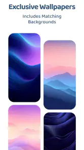
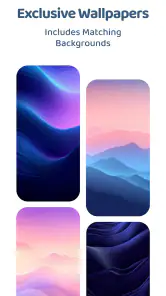
- Includes matching wallpapers for a more complete visual customization.
- Works well with dark themes and minimalist Android setups.
- Lightweight design should have little impact on device storage.
Cons
- Requires a compatible launcher to apply the icons correctly.
- Some apps may use generic or missing icons.
- The bright style may reduce contrast on light wallpapers.
- Updates may arrive slowly for newly released app icons.
- Customization options can vary between supported launchers.
- Category
- Personalization
- Version
- 6.9











